CSS @supports block doesn't work in Microsoft Edge

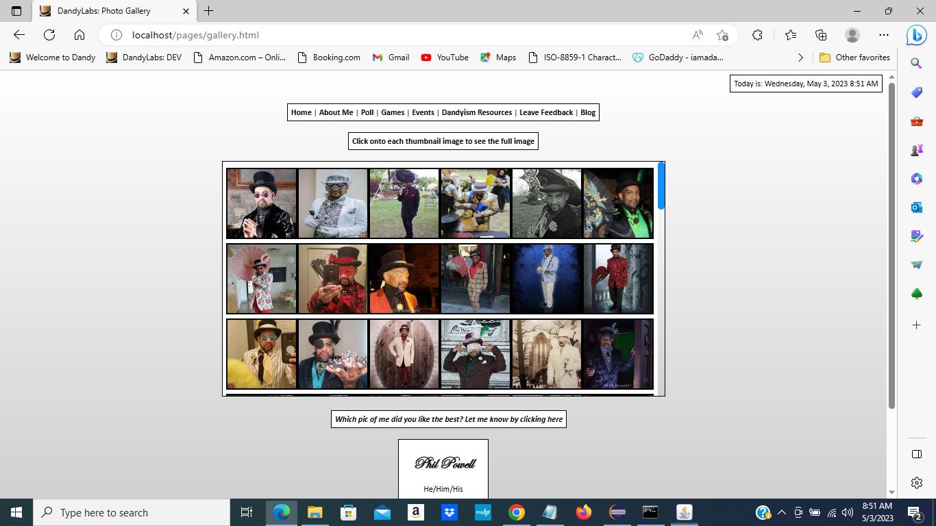
I have my own website, and on it I have a Gallery page ([My Gallery Page] - (http://www.iamadandy.com/iamadandy/gallery.html) - click here). The page looks just fine in Chrome and Firefox, however, the images are too close together in Microsoft Edge. I suspect that it’s due to justify-content: space-evenly; in my CSS Flexbox I am using to display the images in the gallery. I tried using CSS @supports to be able to add padding to the images for Edge only, since it’s unnecessary in Chrome and Firefox:

.gallery, .game {
    display: flex;
    flex-direction: row;
    flex-wrap: wrap;
    justify-content: space-evenly;
    align-items: center;
    align-content: space-around;
    text-align: center;
    min-height: 0px;
}

/* DEFAULT FOR PCs AND NON-TOUCHSCREEN DEVICES */
.gallery-thumb, .game-thumb {
	margin: 0.5%;
	margin-left: 0;
	margin-right: 0;
}

@supports (-ms-ime-align: auto) {
	[class*="gallery-thumb"] {
		padding-left: 2px;
		padding-right: 2px;
	}
}

However, the padding never takes place in Edge. Furthermore, I did some testing in Edge using Javascript:

if (CSS.supports('-ms-ime-align', 'auto')) {
  alert('Is Edge');
} else {
 alert('Is Not Edge');    // This is what appears, even in Edge!
}

Basically, I don’t know how to successfully implement @supports to be able to evenly space the images apart in my gallery in Edge. Can someone please help? This is frustrating.

Thanks

1 Like

The current and recent versions of Edge are based on Chrome. I don’t see any difference in your site viewed in current versions of Edge or Chrome (as I would expect).

The -ms prefixes do not apply to current versions of Edge anyway.

1 Like

I may be going about this wrong:

How many images per row do you see? I see 6 images per row in all browsers (vs 2 on my tablet or 1 on my phone)

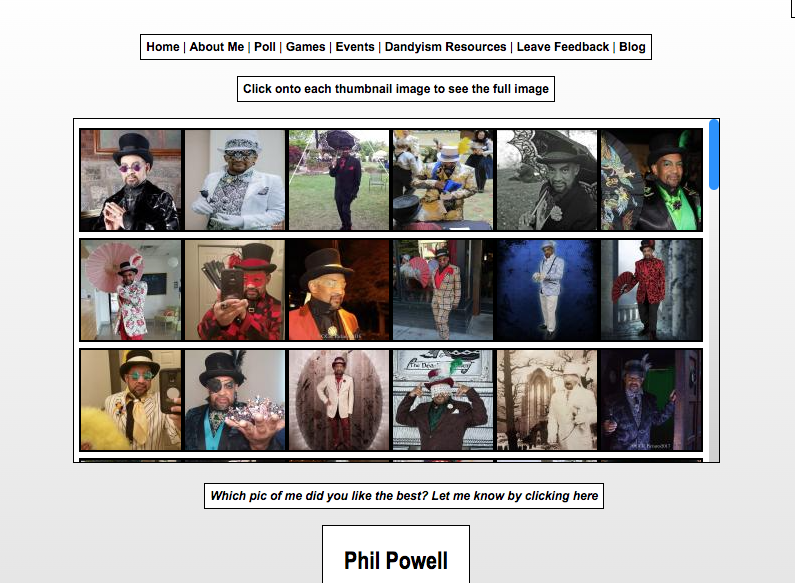
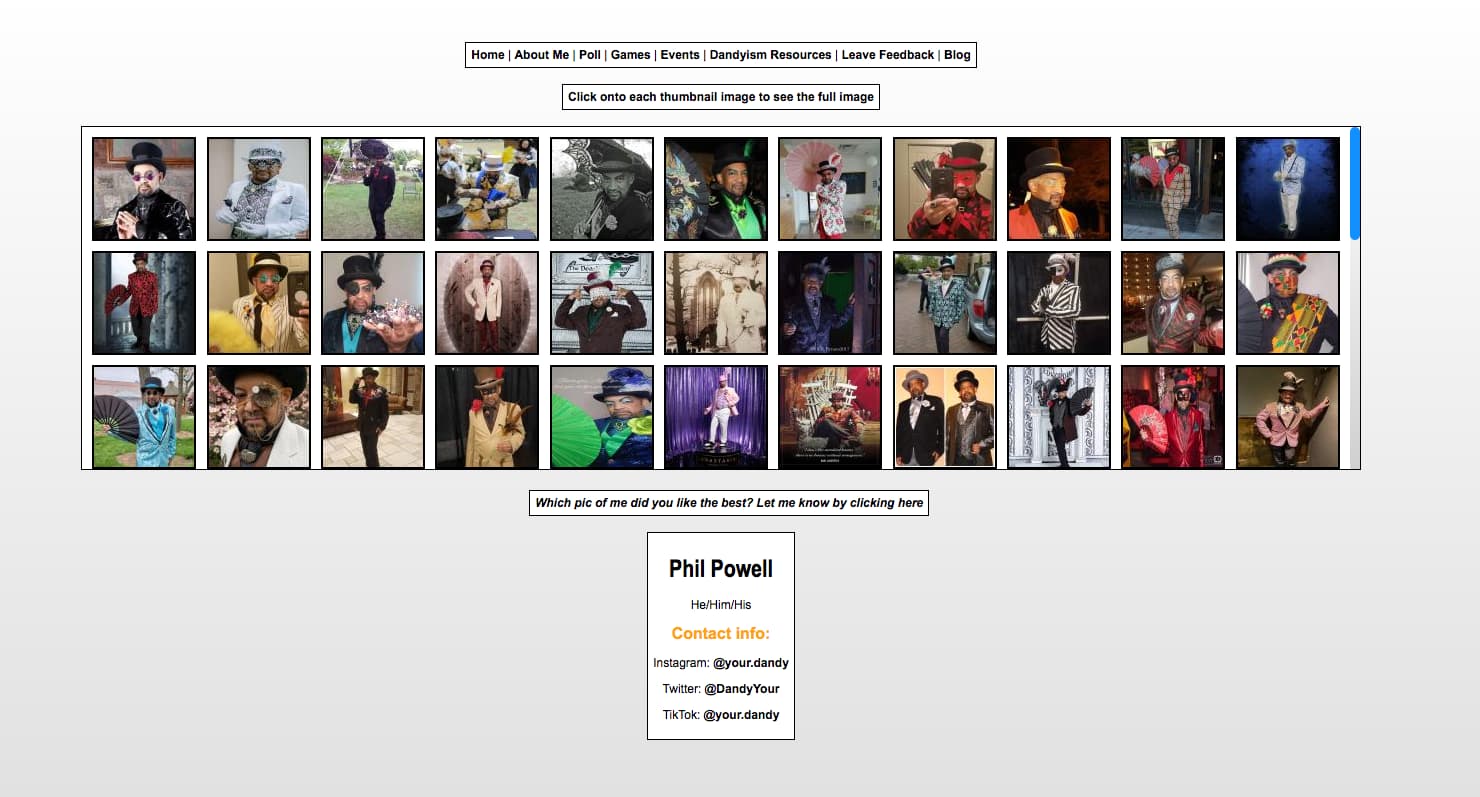
Just as I suspected! Others are seeing fewer images per row than I am, so, basically, somehow I am seeing more images per row than I should for reasons that I cannot understand (I still suspect that Edge has a funky relationship with justify-content: space-evenly within the CSS Flexbox)

This is what I see

Which version of Edge are you using?

I mean, I see 12 images per row.
The number of images you see in a row is going to be controlled by how wide the gallery is. You dont lock the width of the gallery to a fixed number, you fix it to 50%, so…for me, my 50% is 1258.67 pixels, and your images are 100x100, so… 12 fit in the row.

1 Like

It’s the basic fact that people have different size screen and browsers have different widths available depending in their interface.

You have no spacing between the images so if you resize your browsers you will see the images butt up together.

On my mac there are 12 images across.

You need to reinstate the margin you negated here.

.gallery-thumb, .game-thumb {
    margin: 0.5%;
    margin-left: 0; 
    margin-right: 0;
}

Remove the margin:0; and use maybe 5px instead and then all browsers will get a margin and the images won’t squash together.

.gallery-thumb, .game-thumb {
    margin: 5px;
}

The gallery box is a flex container, so should we be using margin at all? shouldnt we be using some flexspacing stuff?

Yes it is already using space evenly which spaces the images out evenly across the width. The problem is that at some widths there is no extra space so the images butt together.

A simple margin on the image will act as a minimum margin. The images will still space out across the width as space allows but the gap will always be the 5px margin.

1 Like

gap: 5px; ?

1 Like

Yes that would have the same effect as the margin if applied to .gallery and probably a better approach :slight_smile:

1 Like

What @PaulOB said. You can’t expect to see the same # of images/row in every screen size and different browser widths. The larger your screen size, the more width you’re going to get, so more images are going to appear per row.

I think it would be same if your screen was tall (height). You will have more images per column appearing :slight_smile:

Ok I tried implementing changes that will accommodate more images per row and put into Production. Can anyone help me verify?

My Gallery Page

Did you change the spacing between the images in the last row? It should look like the previous rows…unless the changes you made won’t let it.

Not specifically; I added padding per image per row everywhere

I can’t see any changes and the image still butt together.

What did you change (I cleared cache).

Wildly discouraging… I really don’t know what to do other than to “punish” all users with correct-looking gallery images with margins or padding, but, meanwhile, I tried this solution from within the React component class that paints the gallery in the first place:

handleImageRowsEdge() {
		if (!HAS_QS && isEdge() && !isChrome() && !isFirefox() && getNumPerRow() > MAX_IMAGES_PER_ROW_EDGE) {
			const numImages = (this.state.json != null && this.state.json.length > 0) 
			? this.state.json.length
			: JSON.parse(IMAGE_JSON_ARRAY_STR).length;
			let obj;
			
			for (let i = 0; i < numImages; i++) {
				obj = document.getElementById(`image${i + 1}_box`);
				if (typeof obj !== 'undefined' && obj != null) {
					obj.style.paddingLeft = '0.5px';
					obj.style.paddingRight = '0px';
				}
			}
		}
	}

Ok added another patch and moved live: I hope this works

My Gallery Page