Create Stunning Image Effects with CSS Backdrop-filter

Today, we are going to learn about the CSS backdrop-filter property, which was introduced in the Filter Effects Module Level 2 specification. In particular, we will cover the backdrop-filter property’s syntax, browser support and practical applications.
All images included in this article’s demos are from Pixabay.com.
Backdrop-filter Is Not the Same as Filter
You have probably already heard about CSS filters. If you need a refresher on this topic, CSS Filter Effects: Blur, Grayscale, Brightness and More in CSS! is a great read.
While the filter property helps us apply effects like blur and sepia on a given element, the backdrop-filter property will help us apply the same effects to the area behind the element. Here is a demo to illustrate the difference (make sure you use a capable browser like Chrome with the Experimental Web Platform Features flag enabled — more on browser support in the next section):
See the Pen Filter vs Backdrop Filter by SitePoint (@SitePoint) on CodePen.
In the first case, the filter was applied to the whole image, in the second case it was just applied to the part right behind our text content. I would like to make it clear that the effect is not applied to the element’s own background but to what lies below the element. You also have to keep the element’s own background at least slightly transparent otherwise visitors won’t be able to see the intended visual effects.
Syntax and Browser Support
The backdrop-filter property shares a number of features with the filter property that you are probably already familiar with. You can apply it on any element using the following syntax:
backdrop-filter: <filter-function> [<filter-function>]* | noneJust like the filter property, you can apply multiple filters to the element’s backdrop. All the values that are valid for the filter property are also valid for the backdrop-filter property. This property is also animatable.
Despite the many similarities between both properties, backdrop-filter does not enjoy the same wide browser support as the filter property. Right now, only Safari 9 supports this property without a flag, and even in this case you have to use the -webkit- prefix.
For Chrome and Opera, you can enable the “Experimental Web Platform Features” flag under ‘chrome://flags’. The property is not supported at all in Firefox and Edge. You can read more about browser support for backdrop-filter on Can I use.
Using Backdrop-filter
The backdrop-filter property needs at least two elements to work properly — a target element and another element right under our target, to which the effects will be applied. To create the backdrop effect in our demo above, we used the following markup:
<div class="backdrop">
  <div class="content">
    <h3>A Heading</h3>
    <p>Some random text related to the heading.</p>
  </div>
</div>
We also used the following CSS to apply the filter on our element’s backdrop and set a background for our text content:
.backdrop {
background: url('path/to/image.jpg');
}
.content {
position: relative;
top: 30%;
background: rgba(100,150,100,0.35);
backdrop-filter: hue-rotate(180deg);
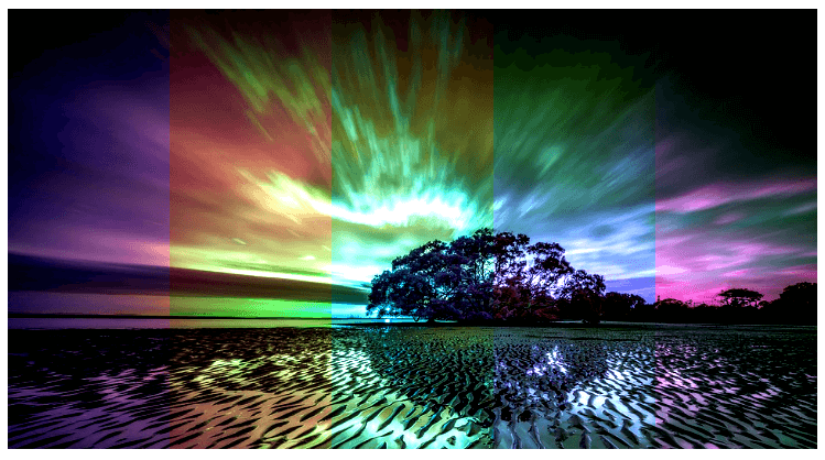
}Another interesting use for this property is to apply different filters to different parts of the image. I am not talking about applying multiple filters simultaneously to the whole image, which, by the way is also possible. I am talking about applying, let’s say, the grayscale filter on the left part of our image and the sepia filter on the right side, or divide the image into multiple parts and apply hue-rotate on all parts with different values. One way to achieve this is by setting the opacity of our target elements to zero so that they do not interfere with the image below them that we are trying to apply the filters to.
Here is the markup that you need:
<div class="backdrop">
  <div class="target a">
  </div>
  <div class="target b">
  </div>
  ....
</div>
And this is the CSS:
.target {
  position: absolute;
  top: 0%;
  height: 100%;
  width: 20%;
  opacity: 0;
}

.a {
  left: 0%;
  backdrop-filter: hue-rotate(30deg);
}

.b {
  left: 20%;
  backdrop-filter: hue-rotate(90deg);
}

/* Filters for other sections of the image */
This is the final result in my case:
See the Pen Multiple Side by Side Filters by SitePoint (@SitePoint) on CodePen.
How good the image finally looks will depend on your image as well as the filters you choose to apply, but if used properly this property can create some really cool effects. You should experiment with different filters to see what you can come up with yourself.
We can also animate different properties of our target elements. For example, in the following demo there are two divs at the top of our image and I have applied a different filter to each of them.
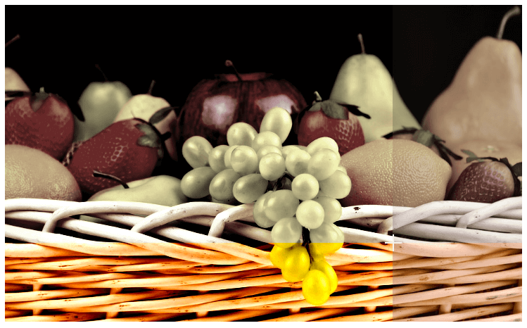
When someone hovers over the image, the width of the first div and the height of the second one change from 0% to 80% over a period of 0.5s. This divides our image into four different sections, each with its own combination of filters applied to it:
See the Pen Animating Target Elements by SitePoint (@SitePoint) on CodePen.
Other possibilities include using SVG filters and animating the filters applied to target elements.
Applications
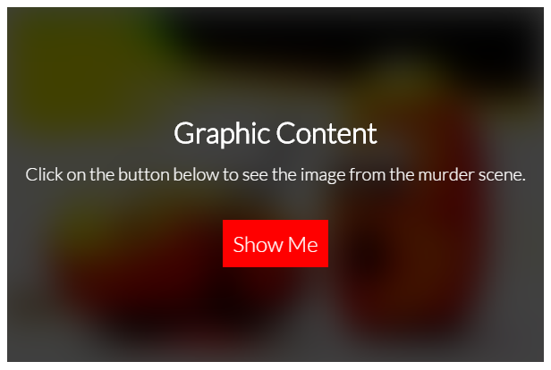
Creating all these fancy effects using backdrop-filter is nice but the property can have a lot of practical applications too. One thing that immediately crossed my mind when I came to know about this property was how we can use it to blur an image and warn users before showing them some graphic content.
This is the markup that we need to get started:
<div class="graphic-content">
  <img src="path/to/graphic/image.jpg">
  <div class="warning">
    <p>Click on the button below to see the image from the murder scene.</p>
    <button>Show Me</button>
  </div>
</div>
We wrap both the image that we intend to blur and the warning text inside a div. The warning text is further wrapped inside another div which will have a width and height equal to that of the image.
And here is the CSS to create the blurring effect on the image:
.warning {
  background: rgba(0,0,0,0.75);
  backdrop-filter:contrast(4) blur(20px);
}
You can experiment with different background colors and filters to see what suits you best. In the demo, I have also added some JavaScript to hide the warning text after the user clicks on the “Show Me” button. You should give it a try:
See the Pen Blurring Out Graphic Content by SitePoint (@SitePoint) on CodePen.
You can also use the backdrop-filter property to create a blurry background when showing a modal to the user or to blur out the background behind an off-canvas menu when it pops up. Another use for backdrop-filter is to blur the images on your webpage until they are fully loaded like they do it on Medium.
Conclusion
Using the backdrop-filter property, you will be able to recreate a lot of effects that previously required JavaScript. However, I would recommend that you wait until there is sufficient browser support before using it in production. One more thing that you should keep in mind while using backdrop-filter is performance. Using this property on a significant number of elements or on a large area of your webpage will have adverse effects on performance.
You can read more about the backdrop-filter property in the W3C draft and the MDN documentation.
Can you suggest any other interesting uses for this property? How are you planning on using it in the future? Let us know in the comments.