5 Stunning and Usable Mobile Website Designs

I’m not going to lie; it’s tough to find quality mobile website designs. The problem is that it’s a lot easier to search around on a desktop computer, but then you have to use an app to change your user-agent or change your screen size to see how the site responds. So this roundup has been a labor of love, for sure.
Modern mobile websites fall into two general categories:
- Those that detect the user-agent and forward to a separate mobile website, usually at m.site.com or something along those lines.
- Those that detect the screen size using the @media screen max/min-width logic to style a page based upon the screen size, usually referred to as “responsive” web design.
My preference is the second option for a number of reasons, but this list of mobile website design examples isn’t focused on either design architectures. I just looked for nice designs that were very usable.
What exactly is “usable” you might ask? This is less technical and more subjective, so you may completely disagree with some of my choices. But, I look for designs that allow me to quickly find content on the site, have a clean design, and load quickly. I know that these qualities are fairly subjective too, so let me know what you think of these designs in the comments below. Enjoy!
Love and Luxe

Love and Luxe was one of my favorite discoveries. I’ll admit I love everything — the colors, the typography, and especially the responsive design. Notice how when you make your desktop browser window smaller, the design adapts to your browser size. This is responsive design in action.
Notice also how the menu shifts and the entire layout changes as you shrink the horizontal screen size? The prominent design element, namely the typography on the right side of the page, actually disappears altogether on small screen sizes. Instead, the menu becomes the first thing the mobile user sees.
This is a flawless implementation of usable mobile website design. I’m sure there are small changes that could be made and recommendations we’ll get in the comments below, but overall this is a wonderful example.
Orbital Devs

Orbitaldevs.com is another amazing example of responsive design, as opposed to a separate mobile website design. If you view this site on a large screen, the site has some fun effects that move and float around, but small screens hide this, putting the menu front and center.
What I don’t like is that the site doesn’t have any “Go to Top” buttons. You have to scroll all the way back to the top of the page to get to the menu, which is cumbersome on mobile devices. This should be common practice when you design a single page site.
Otherwise, this site is amazing and does a great job of detecting and adapting to screen sizes.
Sephora
Sephora’s mobile website (viewable at m.sephora.com) is an example of a separate mobile website design with its own subdomain and everything. While I’m not thrilled with the method of creating a separate mobile site, Sephora does a great job of winning me back. The layout for the mobile site is clean, and the buttons make navigation a breeze. The mobile site is also much smaller than its desktop counterpart in terms of download size.
The brand is consistent on both desktop and mobile accommodations. This is a big issue for some sites that use the divide and conquer approach — the brands don’t always stay consistent. But in this case, Sephora mobile and desktop sites are in sync and work well.
What saves the day for Sephora is that the desktop site actually has features that won’t work on a mobile device. So, it makes sense to create a separate mobile website in Sephora’s case. I think it’s rarely a good idea to create an entirely seperate mobile version of the site just to fix basic layout issues for mobile devices.
Timberland
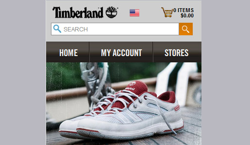
Timberland’s mobile site (viewable at mshop.timberland.com) is another good example of a separate mobile experience that is appropriate: shopping. Timberland does a great job of making the site easy to navigate, and they still manage to fit reviews, product pictures, and prices into a two-column grid within a very limited screen size. The site loads quickly, and finding what I was interested in was a breeze.
Note the search bar and shopping cart features that stay at the top of the site. This is very important for e-commerce sites, as customers often research multiple products. So, this technique make it easy for them to find and purchase several items at once.
The brand was tied in closely with the desktop site as well. The main site mas much more graphic-intensive, so it made sense to make a mobile website design that is much more lightweight.
Carnation Group

The Carnation Group’s mobile site (m.carnationgroup.com) could serve as an example of what not to do. I included this one in the list to provide an example of a site that made several mistakes. I just hope it stays up long enough that my readers will get a chance to see this site in action — or rather, in inaction.
To be fair, I like many of the design ideas for this site. The colors and layout are very attractive. The desktop and the mobile design do tie in together well. But, that’s where the compliments end for me.
The site doesn’t respond consistently after you load it the first time. So if you load the site with your mobile device in the vertical (tall) position and rotate it while the site is loading, it doesn’t respond to you. You may be stuck with the initial layout until you reload a screen. When I tested this design, on some mobile browsers it worked fine. In others, not so much.
The top graphic slider on the home page looks nice and responds well, but they shouldn’t attempt to cram all those graphics onto a mobile site. The page loads them first, giving you a timer to stare at while multiple large, off-screen banner images load. And, the menu in the upper right-hand corner only worked in certain layouts. I couldn’t get it to work consistently, which left me stuck.
You can tell I’m not too thrilled with Carnation Group’s mobile website design. There are far worse implementations out there, so I don’t want to be too harsh. What caught my attention was that they went through a lot of trouble to create a nearly-identical mobile site when they could have put that same effort towards creating a truly different mobile experience. Essentially, they accepted all of the downsides of creating a separate mobile site without taking advantage of the benefits.
But, they’re not a company with complex offerings nor a shopping cart system. So why the over-commitment to a certain look and feel? Who knows, but I hope this at least makes people think through their mobile design and architecture a little bit more.
Have you stumbled onto a mobile site that is wonderfully designed with a responsive layout and small footprint? What about a mobile bomb that should be wiped off the mobile map? Let me see what you find and tell me why it’s a winner or a loser! And, if you love mobile design, you should take a look at our partner site, BuildMobile.