7 Worst UX Mistakes Limiting Your Growth
Growth. Growth! GROWTH!

Growth is often the top focus for businesses that are “onto something.” They’ve found what makes customers tick, their special recipe, and now they’re ready for the world to see.
However, scaling doesn’t only scale success.
If there’s friction in the UX, bugs, technical limitations, or any other types of UX flaws, these flaws are magnified as a product scales, which is why the most successful businesses are the ones that take their time and try not to grow too rapidly.
It’s why software teams build for one platform at a time, and it’s why MVPs and betas are only available to a subset of users.
Let’s take a look at some of the worst UX mistakes we’ll really, really want to avoid while trying to “scale up” our businesses.
1. Time Wasting
The majority of design decisions will have only a small impact. Sure, collectively, these decisions may amount to improved UX, but only one in a few will have a detrimental effect on growth.
Also, UX design is not a task. UX design is a continuous effort, and attempting to solve everything all at once can result in stress, anxiety, OCD, and eventually severe burnout.
Perfectionism is a serious growth-stopper.
The fact is, some design changes will skyrocket conversions whereas others will be much less effective, but it is really easy to obsess over these tiny details. A fantastic way to approach this is to tackle design in short, focused bursts using well-known design methodologies such as the design sprint. Design sprints help to identify problems, reframe them as opportunities, and then decide which of the problems might yield the best results, if solved.
In short, don’t waste too much time on the small things by focusing on the high-growth opportunities first. This ensures that we’re tackling the bigger problems while not creating too many bugs and flaws, as too many can be a serious hindrance.

2. Focusing on Pixels
Performance, meaning, how fast the app or website feels and loads, is a vital aspect of the user experience. While this is a task typically assigned to developers, designers should remember that it’s they who’ll design what’s to be implemented, which is why we’d recommend working design handoff tools into the workflow.
This way, developers (and other stakeholders) can weigh in with certain expertises that us designers might not necessarily have.
In this case, neglecting performance would be a huge UX mistake, as slow apps and websites turn users away faster than anything (the irony, right?). Most importantly though, performance issues account for majority of complaints seen in product reviews, which are vital for social validation, so there’s a huge knock-on effect that can limit future growth.
Designers, bring your devs into the design process!
3. Skipping UX Research
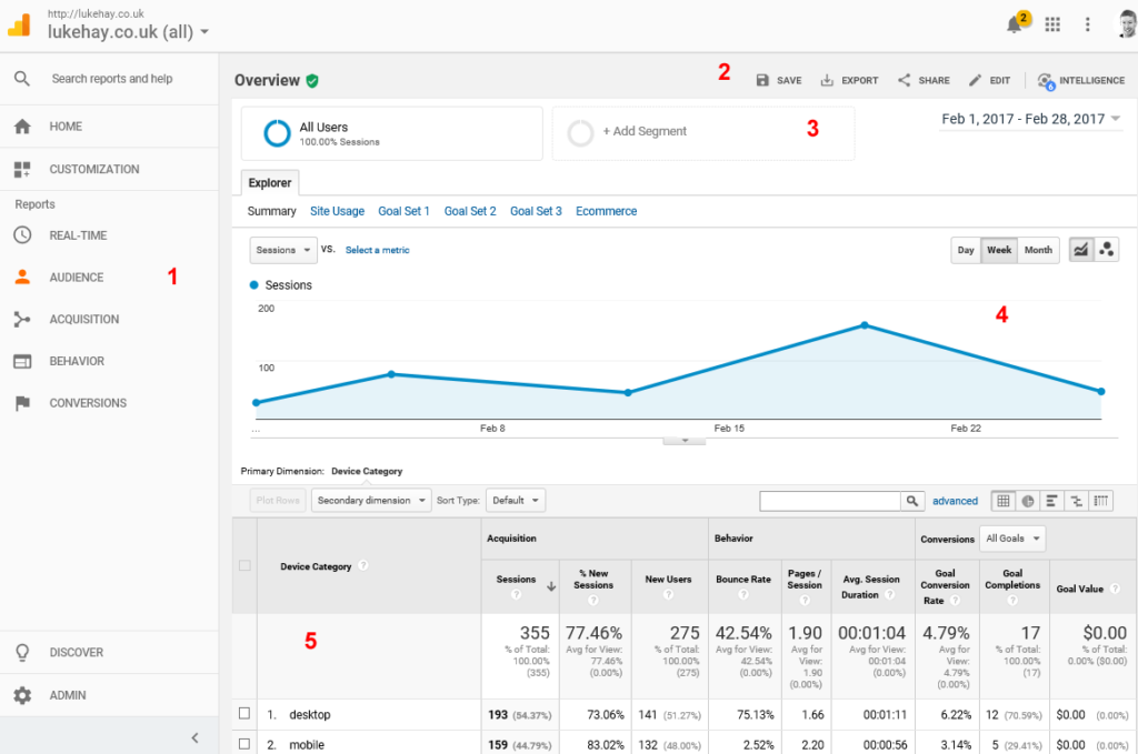
Since time is money, it’s best to validate design ideas as quickly as we can, rather than debate them tirelessly. We can do this with analytics, A/B testing, or straight-up user testing.
The data is there, we just need to analyze it.
Wasting valuable hours debating on which direction to take a design is an easy trap to fall into. Instead, add UX research to your workflow and let quantitive and qualitative data decide the fate of the design. It’s much harder to argue with decisions when they’re backed up by data and insights.
If you don’t measure growth, how do you even know you’ve grown?

4. Excluding Accessibility
- “The ROI isn’t worth it”
- ”It’s too much extra work”
- ”Those aren’t our users anyway”
In most scenarios, none of these things will be true. The fact is, we already design responsive websites for mobile users and fast websites for those on slower connections, because we know that it affects our organic search ranking. So why not make the effort with accessibility design, to include everyone?
Besides, if you’re already designing high-usability products, then you’re already half-way there in terms of accessibility anyway, as accessibility design barely requires any extra work.
19% of users are disabled in some way. Although I’ll concede that the ROI may differ depending on the nature of the business, the opportunity to grow your audience is worth it considering how easy it to design inclusively. Plus, there’s the added bonus if your competitors aren’t doing it.
5. Playing by the Rules
There was a time when we thought the earth was flat, so I’m inclined to think that facts shouldn’t always be taken as the gospel truth. On that note, best practices are, at the end of the day, simply recommendations. We don’t have to follow them.
For example:
- Design for mobile first
- [x] is trendy right now
- Minimalism is everything
But the best designers know when to tune out the chatter and call the right decision, even if said decision is a little unorthodox. After all, not all industries are mobile-dominated, design trends change with the day of the week, and minimalism actually means ”No more than what’s needed,” not ”Stripped to the bone.” And it certainly doesn’t mean “What Apple’s doing.”
Cookie-cutter designs usually fail to stand out from the rest, so if somebody else is offering what we’re offering in the same way that we’re offering it, that will make growth much harder.
6. Optimizing for Delight
- “Animations are slow”
- ”UX is what really matters”
In recent years we’ve somewhat turned over a new leaf, finally conceding that design shouldn’t be dead-focused on designing ”beautiful” user interfaces. They should be intuitive, and not necessarily flat and minimal. But have we done a complete 180?
Animation, color, and visual design play a huge role in captivating the user emotionally beyond the usual tips and tricks usually implemented for branding reasons — i.e. a funny quip here, a kind word there, or a dazzling but subtle animation to make a micro-interaction look just a little more impressive.

All of these increase delight, and while the usefulness and intuitiveness of the product (i.e. the needs) certainly outweighs the delightfulness (i.e. the wants), meaningful interactions nonetheless contribute to the overall experience and will naturally increase both user retention and engagement, two attributes known to contribute heavily to long-term growth.
7. Crafting a Forgettable Story
Design and art are thought to be two different things, but that’s not always the case. In this article we’ve talked a lot about the importance of measuring UX as a whole, which certainly relies heavily on insights and data, but there’s still a lot of room for creativity, and one such example is storytelling.
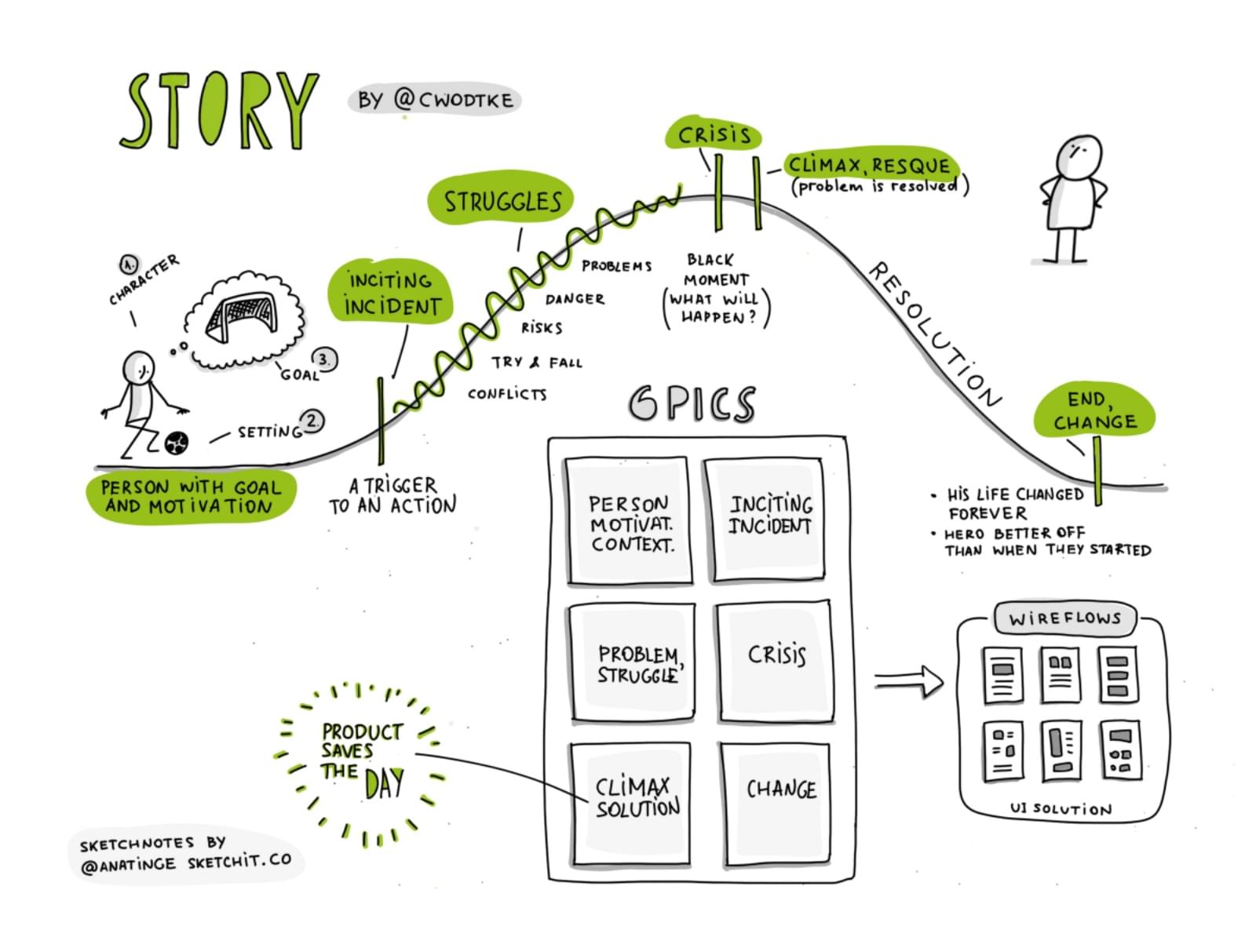
In language class, we were taught that an epic tale should have a captivating beginning and ending, and the same applies to UX too. For example, letting the user accomplish something before requesting that they sign up, and crafting a killer thank you email after they have signed up, would be a brilliant way to engage the user and wrap up the story in a very memorable way.

Psychologically, the reason for this is that users will often forget what they did, but they’ll never forget how they felt while doing it, and this applies especially to beginnings and endings. If we want users to return, and thus boost our long-term growth, these moments must be far better than any other.
This concept also applies to micro-interactions. Where the user starts off as the underdog, a micro-interaction should end with the user being hailed a hero after acquiring superpowers and then completing the task that they set out to do. Delight can also play a role in this, where how the user completes their task can also effect how the user remembers their experience.
Think about it: Superman would be way less cool if his opponents died of sudden death, rather than laser eyes, right?
Conclusion
UX encompasses a whole variety of things, and unfortunately, there isn’t much room to drop the ball anywhere. Well…not if we want to promote healthy growth anyway. Designing UX can often feel like juggling multiple balls in the air, but if we take a slowly but surely approach, we can reduce the risk of hindering growth.
Share your top growth hacks in the comments!
