Insights into Form and Function from The Web Designer’s Roadmap
In this excerpt from SitePoint’s latest book, The Web Designer’s Roadmap, author Giovanni DiFeterici explores balancing form and function as part of the web design process.
Over to you Giovanni …
” … Until now, we’ve focused mainly on ideas for how to prepare for the design process. We’ve explored resources for inspiration, techniques that help generate concepts, and methods for organizing our loose visual ideas into deliverables that we can use to communicate with clients.
Once all the planning is done and our initial thoughts have been hashed out, we must start putting together concrete items for design and structure. Eventually, we’ll reach the point when we’re working in Photoshop (or the browser, if that suits you) and delicately crafting pixel-perfect designs, but first we need to establish what we’re designing.
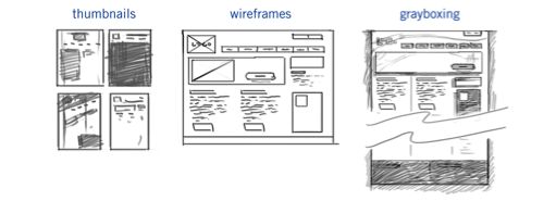
Figure 4.1. Steps in the design process
In this chapter, we’ll discuss thumbnails, wireframes, and grayboxes, which you can see in Figure 4.1. We’ll see how they fit into our workflow and what purpose they serve.
Why not go straight to Photoshop?
Honestly, it depends on how you prefer to work. No sole process works for everyone, and you may trust your instincts enough to just go for it and hammer out your designs in one sitting. More power to you, if that’s the case, but I’d doubt it. Most of us require a little structure to sort out our thoughts and ideas before we can work with them.
I know a number of designers who essentially skip over the predesign phase of the process and go straight to Photoshop for their mockups. They push around pixels until they find a design they’re happy with and serve it up to the client. Sometimes it works and the design is accepted, marked up, and shipped out. Sometimes it doesn’t.
More often than not, the designers that can make a great design without sketching or wireframing have a fast internal decision-making process. The designer either goes with the first idea, or they have the ability to quickly and decisively accept or reject ideas on the fly. Really, they are going through the same process that I’m outlining, they just do it internally. Either way, a process still takes place when they attack that blank Photoshop canvas.
Be forewarned that usually the ability to solve these problems internally takes a great deal of experience. I just believe that the structure provided by a definite process can help ensure that you give every aspect of the design the attention that it needs and deserves.
Structure and Form
When I refer to the structure of a design, I’m talking about two things. A design must be structured visually, on a per-page basis. The layout must be easy to parse and the content should be organized in such a way as to let the user know what’s important and what’s ancillary. In addition to organizing a page’s content, our designs must make the rest of the site accessible and easy to parse. It should give the user feedback about where they are, what they’ve just done, and how they can reach the next piece of information or functionality that they want.
I think of it as giving structure to the information that is seen (the visible information on the page) and hidden (all the content not on the current page). Both are equally important, and the best designs find a way to blend the two.
Wireframes
“With client services, sometimes you need to develop a wireframe that’s a deliverable for the client, sometimes you don’t. When you don’t, sometimes you’ll still develop it, but for yourself … I think there shouldn’t be one way of doing everything every time.”
—Dan Rubin
Alrighty. Now is the time for us to tackle the good stuff.
Wireframes are super-low fidelity (which means simple: lines, boxes, text) designs that focus on content hierarchy, general layout, and functionality. A wireframe should exclude color, texture, or imagery. Instead, it’s a purely structural document that tries to organize content and interaction without all the visual clutter that design elements can create. See Figure 4.2 for two wireframe examples from the same project.
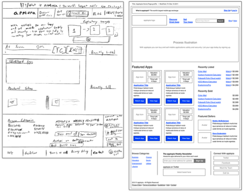
Figure 4.2. Two wireframes, one project: quick and loose versus tight and detailed
In some firms, the UX designer and the interface designer are the same person, but that’s not always the case. If you’re working in an agency or within a team, the wireframing task will probably fall to another person. Whoever is doing UX will likely hand you a stack of wireframes to work from, so I’d recommend talking candidly with that person to ensure that you receive wireframes of a level of detail that works for you.
How detailed should I make my wireframe?
The level of detail that goes into a wireframe is a subjective decision. The depth of a wireframe often depends on how much of the decision-making process is left to the interface designer and how much is controlled by the UX designer. A detailed wireframe means that the UX designer is already making strong choices about the layout and content hierarchy. Often, wireframes aren’t “set in stone” documents, so the interface designer has quite a bit of latitude to move content around when crafting a final mockup.
Wireframe detail can also be affected by the amount of content on a page, or the type of content, as Figure 4.3 proves. A home page with a few lines of text and a couple of big images won’t require a detailed wireframe. Because very few elements are on the page, carefully organizing them hierarchically is virtually unnecessary.
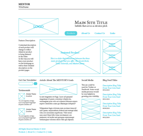
Figure 4.3. Wireframes can be as simple or as complex as you wish
By contrast, a home page for a news site with multiple columns of content, featured stories, social media feeds, and video clips will require preplanning. On a busy website like a news site, the wireframe should be given more attention because of the need for structure.
More often than not, the quality of a wireframe is dependent upon how the wireframe is used. In some cases, a wireframe can be used to hammer out very concrete layout and hierarchy decisions. In other cases, the wireframe serves as a general guide for the designer to reference when crafting designs.
Very low-fidelity wireframes can give you plenty of flexibility when designing your layout, but often provide few clues about the details of functionality and the structural necessities of a design. High-fidelity wireframes can provide lots of info about the details of a page, but can make you feel boxed in with your design choices. Your designs don’t have to follow the wireframes exactly either, as shown in Figure 4.4.
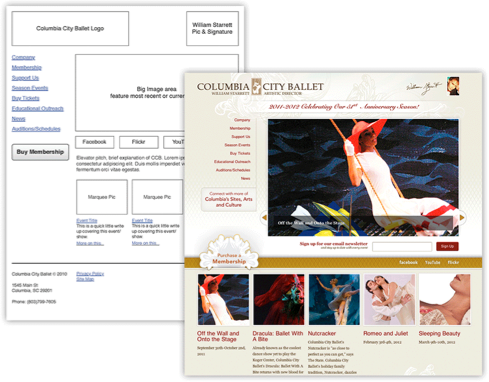
Figure 4.4. Wireframes can be a quick reference for the design elements required and their intended location
Wireframes are a kind of shorthand for final designs. As such, common elements have a simplified representation. Images are represented as a square with lines crossed through it. Forms are boxes with titles over the top line. Horizontal nav elements are long boxes with evenly spaced titles. Text is … well, text. But let me emphasize: nothing fancy! A wireframe can have almost nothing to do with how the final design will look, as Figure 4.5 shows.
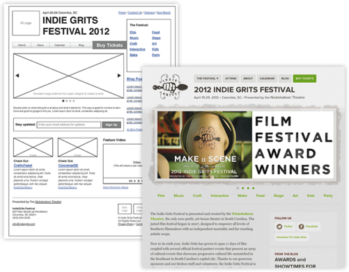
Figure 4.5. Use a wireframe loosely if that fits your process
When drafting a wireframe, you should be asking yourself four questions:
- What content needs to be on the page?
- How do the different pieces of content relate to one another?
- How might they possibly be arranged?
- How should the user interact with the content?
That’s it. If you’re thinking about fonts and imagery, it’s likely you’re getting ahead of yourself. Just focus on content and structure …”
—
Gain more insights into Giovanni’s new book and the web design process:
- Download a free sample chapter
- Watch video highlights … from interviews with Don Norman, Shaun Inman and more.