React Storybook: Develop Beautiful User Interfaces with Ease


When you start a new front-end project, the first thing you usually do is create a beautiful design. You carefully plan and draw all of your UI components, as well as each state or effect they may have. However, during development, things usually start to change. New requirements, as well as unforeseen use cases pop up here and there. The initial beautiful component library cannot cover all of these requirements and you start to expand it with new designs.
It’s good if at this point you still have a design expert around, but all too often they have already switched to a different project and left the developers to cope with these changes. As a result, the consistency of the design begins to slip. It becomes difficult to track what components you already have in your library and what states and appearances they may have.
To avoid this artistic mess it’s usually a good idea to create separate documentation for all of your components. There are various tools for such purposes, but in this article, we’ll focus on a tool designed particularly for React applications — React Storybook. It allows you to easily browse your collection of components and their functionality. A living example of such an app is the gallery of React Native components.
Why Do You Need React Storybook?
So how does this showcase help? To answer this question, let’s try to put together a list of people who take part in the development of UI components and assess their needs. Depending on your workflow this list might differ, but the usual suspects are the following:
Designer or UX expert
This is the person responsible for the look and feel of the user interface. After the mockup phase of the project is finished, often the designer leaves the team. When new requirements arise, they need to quickly catch up on the current state of the UI.
Developer
The developer is the one who creates these components and probably the main beneficiary of a style guide. The two major use cases for the developer are being able to find a suitable component from the library and be able to test them during development.
Tester
This is the meticulous person who makes sure the components are implemented as expected. A major part of a tester’s work is making sure that a component behaves correctly in every way. And although this does not eliminate the need for integration testing, this is often more convenient to do separately from the project itself.
Product owner
The person who accepts the designs and the implementation. The product owner needs to make sure each part of the project looks as expected and that the brand style is represented in a consistent manner.
You’ve probably noticed that a common denominator for everybody involved, is having a single place containing all of the components at once. Finding all of them in the project itself can be quite tedious. Think about it, how long will it take you to find all possible variations of buttons in your project, including their states (disabled, primary, secondary etc)? That’s why having a separate gallery is much more convenient.
If I’ve managed to convince you, let’s see how we can set up Storybook in a project.
Setting up React Storybook
To set up React Storybook the first thing you’ll need is a React project. If you don’t have a suitable one at the moment, you can easily create one using create-react-app.
To generate a Storybook, install getstorybook globally
npm i -g getstorybook
Then navigate to your project and run
getstorybook
This command will do three things:
- Install @kadira/storybook into your project.
- Add the
storybookandbuild-storybookscripts to yourpackage.jsonfile. - Create a
.storybookfolder which contains the basic configuration and astoriesfolder with a sample component and story.
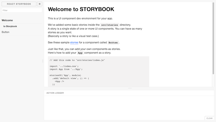
To run Storybook, execute npm run storybook and open the address displayed (http://localhost:9009/). The app should look like this:
Adding New Content
Now that we have React Storybook running, let’s see how we can add new content. Each new page is added by creating stories. These are snippets of code that render your component. An example story generated by getstorybook looks like this
//src/stories/index.js

import React from 'react';
import { storiesOf, action, linkTo } from '@kadira/storybook';
import Button from './Button';
import Welcome from './Welcome';

storiesOf('Welcome', module)
  .add('to Storybook', () => (
    <Welcome showApp={linkTo('Button')}/>
  ));

storiesOf('Button', module)
  .add('with text', () => (
    <Button onClick={action('clicked')}>Hello Button</Button>
  ))
  .add('with some emoji', () => (
    <Button onClick={action('clicked')}>   </Button>
  ));
The storiesOf function creates a new section in the navigation menu, and the add method creates a new subsection. You are free to structure the storybook however you see fit, but you cannot create hierarchies deeper then two levels. A straightforward approach to structuring your Storybook is creating common top-level sections such as “Form inputs”, “Navigation” or “Widgets” for groups of related elements, and sub-sections for individual components.
You are free to choose where to place your story files: in a separate stories folder or next to the components. I, personally, prefer the latter since keeping the stories close to the components helps to keep them accessible and up to date.
Stories are loaded in the .storybook/config.js file which contains the following code:
import { configure } from '@kadira/storybook';

function loadStories() {
  require('../src/stories');
}

configure(loadStories, module);
By default, it loads the src/stories/index.js file and expects you to import your stories there. This is slightly inconvenient since it would require us to import each new story we create. We can modify this script to automatically load all of the stories using Webpack’s require.context method. To distinguish story files from the rest of the code, we can agree to add a .stories.js extension to them. The modified script should look like this:
import { configure, addDecorator } from '@kadira/storybook';
import React from 'react';

configure(
  () => {
    const req = require.context('../src', true, /.stories.js$/);
    req.keys().forEach((filename) => req(filename));
  },
  module
);

configure(loadStories, module);
If you’re using a different folder for your source code, make sure you point it to the correct location. Re-run Storybook for the changes to take effect. The Storybook will be empty since it no longer imports the index.js file, but we’ll soon fix that.
Writing a New Story
Now that we’ve slightly tailored Storybook to our needs, let’s write our first story. But first of all we need to create a component to showcase. Let’s create a simple Name component to display a name in a colored block. The component will have the following JavaScript and CSS.
import React from 'react';

import './Name.css';

const Name = (props) => (
  <div className={'name ' + (props.type ? props.type : '')}>{props.name}</div>
)

Name.propTypes = {
  type: React.PropTypes.oneOf(['highlight', 'disabled']),
}

export default Name;
.name {
  display: inline-block;
  font-size: 1.4em;
  background: #4169e1;
  color: #fff;
  border-radius: 4px;
  padding: 4px 10px;
}

.highlight {
  background: #dc143c;
}

.disabled {
  background: #999;
}
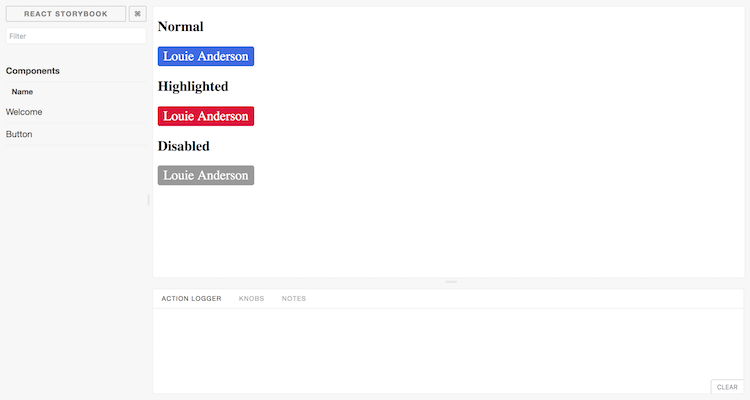
As you’ve probably noticed, this simple component can have three states: default, highlighted and disabled. Wouldn’t it be nice to visualize all of them? Let’s write a story for that. Create a new Name.stories.js file alongside your component and add the following contents:
import React from 'react';
import { storiesOf, action, linkTo } from '@kadira/storybook';

import Name from './Name';

storiesOf('Components', module)
  .add('Name', () => (
    <div>
      <h2>Normal</h2>
      <Name name="Louie Anderson" />
      <h2>Highlighted</h2>
      <Name name="Louie Anderson" type="highlight" />
      <h2>Disabled</h2>
      <Name name="Louie Anderson" type="disabled" />
    </div>
  ))
Open Storybook and have a look at your new component. The result should look like this:
Feel free to play around with how the component is displayed as well as with its source. Note that thanks to React’s hot reloading functionality, whenever you edit the story or the component, the changes will instantly appear in your Storybook without the need to manually refresh the browser. However refreshing might be required when you add or remove a file. Storybook doesn’t always notice such changes.
View customization
If you would like to change how your stories are displayed, you can wrap them in a container. This can be done using the addDecorator function. For example, you can add an “Examples” header for all your pages by adding the following code to .storybook/config.js:
import { configure, addDecorator } from '@kadira/storybook';
import React from 'react';

addDecorator((story) => (
  <div>
    <h1>Examples</h1>
    {story()}
  </div>
));
You can also customize separate sections by calling addDecorator after storiesOf:
storiesOf('Components', module)
  .addDecorator(...)
Publishing Your Storybook
Once you’re done working on your Storybook and you feel that it’s ready to be published, you can build it as a static website by running
npm run build-storybook
By default, Storybook is built into the storybook-static folder. You can change the output directory using the -o parameter. Now you just need to upload it to your favorite hosting platform.
If you’re working on a project on GitHub you can publish your Storybook just by building it into the docs folder and pushing it to the repository. GitHub can be configured to serve your GitHub Pages website from there. If you don’t want to keep your built Storybook in the repository, you can also use storybook-deployer.
Build Configuration
Storybook is configured to support a number of features inside of the stories. You can write in the same ES2015+ syntax as in create-react-app, however, if your project uses a different Babel configuration, it will automatically pick up your .babelrc file. You can also import JSON files and images.
If you feel that this is not enough, you can add additional webpack configuration by creating a webpack.config.js file in the .storybook folder. The configuration options exported by this file will be merged with the default configuration. For instance, to add support for SCSS in your stories, just add the following code:
module.exports = {
  module: {
    loaders: [
      {
        test: /.scss$/,
        loaders: ["style", "css", "sass"]
      }
    ]
  }
}
Don’t forget to install sass-loader and node-sass though.
You can add any webpack configuration you desire, however, you cannot override the entry, output and the first Babel loader.
If you would like to add different configuration for the development and production environments, you can export a function instead. It will be called with the base configuration and the configType variable set to either ‘DEVELOPMENT’ or ‘PRODUCTION’.
module.exports = function(storybookBaseConfig, configType) {
  // add your configuration here

  // Return the altered config
  return storybookBaseConfig;
};
Expanding Functionality with Addons
Storybook is extremely useful by itself, but to make things better it also has a number of addons. In this article, we’ll cover only some of them, but be sure to check out the official list later.
Actions and Links
Storybook ships with two pre-configured addons: Actions and Links. You don’t need to undertake any additional configuration to use them.
Actions
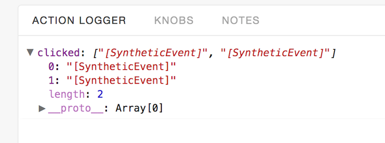
Actions allow you to log events triggered by your components in the “Action Logger” panel. Have a look at the Button story generated by Storybook. It binds the onClick event to an action helper, which displays the event in the UI.
Note: you might need to rename the file containing the Button story and/or change its location based on the modifications made in .storybook/config.js.
storiesOf('Button', module)
  .add('with text', () => (
    <Button onClick={action('clicked', 'test')}>Hello Button</Button>
  ))
Try clicking on the button and note the output in the “Action logger”.
Links
The Links addon allows you to add navigation between components. It provides a linkTo helper which can be bound to any onClick event:
import { storiesOf, linkTo } from '@kadira/storybook';

storiesOf('Button', module)
  .add('with link', () => (
    <Button onClick={linkTo('Components', 'Name')}>Go to Name</Button>
  ));
Clicking on this button will take you to the section “Component” and sub-section “Name”.
Knobs
The Knobs addon allows you to customize your components by modifying React properties during runtime, straight from the UI.
To install the addon run:
npm i --save-dev @kadira/storybook-addon-knobs
Before you can use the addon, it needs to be registered with Storybook. To do that, create an addons.js file in the .storybook folder with the following contents:
import '@kadira/storybook/addons';
import '@kadira/storybook-addon-knobs/register';
After that, wrap your stories with the withKnobs decorator. You can do this globally in .storybook/config.js:
import { withKnobs } from '@kadira/storybook-addon-knobs';

addDecorator(withKnobs);
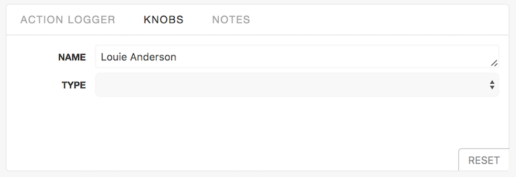
Once we’ve done with that, we can try to alter our Name component story. Now, instead of having all three variations of component state at once, we’ll be able to select them in the UI. We’ll also make the name editable as well. Change the contents of Name.stories.js to:
import React from 'react';
import { storiesOf, action, linkTo } from '@kadira/storybook';
import { text, select } from '@kadira/storybook-addon-knobs';

import Name from './Name';

const types = {
  '': '',
  highlight: 'highlight',
  disabled: 'disabled'
}

storiesOf('Components', module)
  .add('Name', () =>  (
    <div>
      <h2>Normal</h2>
      <Name name={text('Name', 'Louie Anderson')} type={select('Type', types)}  />
    </div>
  ))
The addon provides various helper functions to create user inputs of different types, such as numbers, ranges or arrays. Here we’ll use text for the name, and select for the type. Open the “Name” page and a new “Knobs” tab should appear next to “Action Logger”. Try to change the input values and see the component being re-rendered.
Info
The Info addon allows you to add more information about a story, such as its source code, description and React propTypes. Having this information accessible is very handy for developers.
Install this addon by running:
npm i --save-dev @kadira/react-storybook-addon-info
Then register the addon with Storybook in the .storybook/config.js file:
import { setAddon } from '@kadira/storybook';
import infoAddon from '@kadira/react-storybook-addon-info';

setAddon(infoAddon);
This will add an additional addWithInfo method to the storiesOf object to register your stories. It has a slightly different API and accepts the title of the story, description, render function and additional configuration as parameters. Using this method, we can rewrite our Name story like this:
import React from 'react';
import { storiesOf, action } from '@kadira/storybook';

import Name from './Name';

storiesOf('Components', module)
  .addWithInfo(
    'Name with info',
    `
    A component to display a colored name tag.
    `,
    () =>  (
      <Name name="Louie Anderson" />
    ),
    { inline: true },
  )
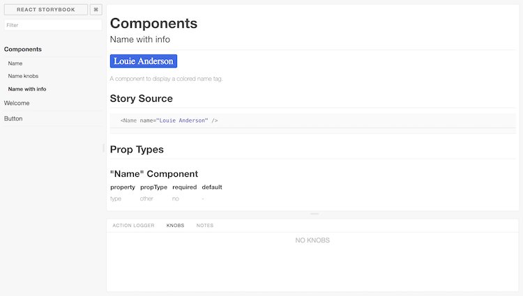
The inline parameter will make the information be displayed by default, instead of being accessible via a link in the corner. The result will look like this:
Automated testing
An important aspect of Storybook which wasn’t covered in this article is in using it as a platform to run automated tests. You can execute any kinds of tests, from unit tests to functional and visual regression tests. Unsurprisingly, there are a couple of addons aimed at boosting Storybook’s capabilities as a testing platform. We won’t go into details about them since they deserve an article of their own, but still, would like to mention them.
Specifications
The Specifications addon allows you to write unit tests directly in your story files. The tests will be executed whenever you open Storybook and the result displayed in the UI. After some tinkering, you can also run this tests on a CI environment using Jest.
You might also like: How to Test React Components Using Jest
Storyshots
Storyshots allows you execute Jest Snapshot Tests based on the stories. Snapshot tests allow you to check if the DOM rendered by the components matches the expected result. Very convenient for testing whether your components have been rendered correctly. At least from the DOM point of view.
Storybook as a Service
Kadira also provides the Storybook as a service called Storybook Hub. It allows you to host your storybook with them and take collaboration to a new level. Apart from the standard features, it also integrates with GitHub and can generate a new storybook for each pull request to your project. You can also leave comments directly in Storybook to discuss the changes with your colleagues.
Conclusion
If you feel that maintaining the UI components in your projects is starting to become a pain, take a step back and see what you’re missing. It might be that all you need is a convenient collaboration platform between all of the parties involved. In this case, for your React projects look no further, Storybooks is the perfect tool for you.
Are you using Storybook already? Are you intending to give it a try? Why? Or indeed, why not? I’d love to hear from you in the comments.
This article was peer reviewed by Tim Severien and Giulio Mainardi. Thanks to all of SitePoint’s peer reviewers for making SitePoint content the best it can be!