Designing Experiences for Responsive Web Sites
Before You Get Started
Responsive Web design is intended to ensure that a site’s layout and content scale fluidly to the available screen real estate. This is a great approach for focusing your investments on improving site content and user functionality while ensuring that users have a good experience regardless of what device and screen size they use to visit your site. If you didn’t read the first article in this series, “Why the Web Is Ready for Responsive Web Design,” be sure to read it first.
It’s worth taking a step back, however, to think through your site’s experience and understand whether the device with which a user accesses your site changes the user’s expectations of the site’s functionality. Is the user checking your site for quick updates with her cellphone while she’s on the go? Is he sitting down, 10 feet away from a large TV screen, looking to immerse himself in a relatively passive consumption experience of rich content, videos and games? Are other users sitting down at their PCs, looking to get the most from your site content? Most of all, how do these expectations affect the site layout and functionality that you provide at those corresponding screen sizes?
What Kind of Site Is This?
Planning the content hierarchy for your site across different form factors is definitely the first step to having a great responsive-site experience. Consider the following examples, which evaluate and compare the top experiences that customers want to have when they access your site from a 4-inch phone while they walk or take public transportation, when they’re sitting at their computer desk, and when they’re lounging on their couches in their living rooms.
News Site (Content Consumption)
People visit ContosoNews.com primarily to do one thing—catch up on the day’s current affairs. When you see how this site is presented on a PC screen, it’s designed to have a layout like a newspaper. More important, the single home page is expected to attract and retain different kinds of readers, with interests in current affairs, business, sports, entertainment and other topics, and show them that ContosoNews has content that will interest them. The home page has a rich layout with slide shows, cycling of recommended articles, various categories of news available below the fold if you scroll down, recommended editorials and even the weather. Figure 1 shows a schematic illustration of the site at different resolutions.
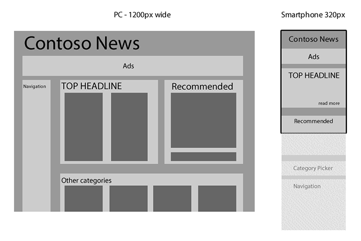
Figure 1. Comparing Layouts for ContosoNews.com
If you visit this site on your mobile phone browser, you see a subset of the content, with menu and link navigation to the remaining content. The content that was available on the PC has been prioritized, and the top headline has been given focus above the fold. The slide show of recommended articles is replaced by a series of blurbs with links. The top articles from the Other Categories section are gone, replaced with a single category picker that navigates away from the home page.
In this way, users visiting the site on a phone can, in a cursory glance, become aware of the content available for consumption and dig deeper at their convenience.
Local Attraction (Hyper-Local Site)
Contoso Station is a hip new restaurant in Seattle. When people visit the restaurant’s site on their PC or TV screen, the restaurant proudly shows its latest Yelp reviews, news articles and tweets from users who add the hashtag #i<3contoso.
However, when you visit the site on a smartphone, the company makes a fair assumption that you’re visiting its site on the go with hopes to find its location, hours of operation and phone number. The phone might even request your location and show you a map with the quickest route to the restaurant. Some of the remaining content can be presented with much less detail—for example, the Yelp reviews are boiled down to one-line snippets—and the rest of the content (the Twitter feed, for example) can be hidden altogether for users visiting the site on their phones. Figure 2 shows an example of this scenario.
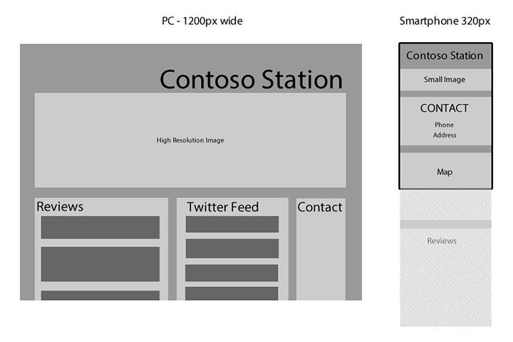
Figure 2. Comparing Layouts for Contoso Station
As seen in Figure 2, local businesses should prioritize and show an entirely different set of content to phone users and make their mobile experiences more sensitive to location.
Media Site (Rich Audiovisual Content)
ContosoTube is a popular Internet service where people share all kinds of videos. Users can see the latest top-rated and most frequently watched content. As they sign-in and explore the site, they can create and edit playlists of videos, get personalized recommendations, subscribe to other users’ playlists and even send each other messages.
The experience of ContosoTube on a phone is geared toward showing videos that a user has opened from other apps (instant messages, email, Twitter and so on), searching to view a video, and letting logged-in users access their existing subscriptions and playlists. Their experience is very limited for content curation.
What’s interesting about ContosoTube is that the Xbox site experience is similar to the phone experience from a user-functionality perspective, although the Xbox site is laid out differently based on screen real estate because even when ContosoTube users visit the site on their large screens, they are probably accessing it from their living room and doing so with controls less precise than a mouse. While the screen size of the TV might tempt developers to provide a more PC-like experience in terms of available functionality, it would be highly likely that users accessing ContosoTube on their TVs would focus primarily on watching content and not on creating it, managing it and messaging with others. Figure 3 compares site layouts for ContosoTube.
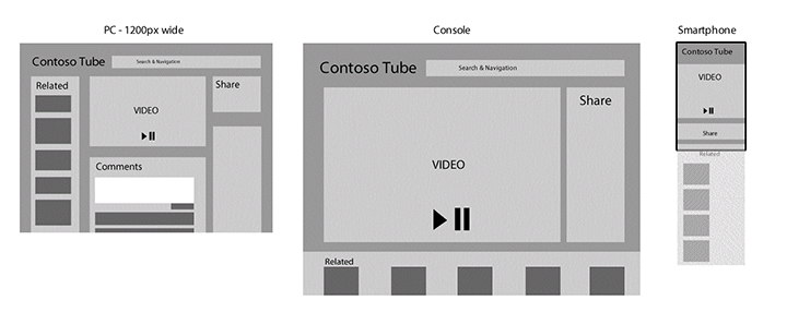
Figure 3. ContosoTube on a PC, TV and Smartphone.
HTML5 Games
On Build New Games, a website that explores HTML technologies for creating immersive gaming experiences on the browser, Jack Lawson provides a great discussion about what a gaming experience might be like for a responsively designed Web site.
A game is a great example of site design where users expect entirely different experiences based on the context in which they visit the site. For example, if a user visits the site WorldOfContosoCraft.com from his PC, he probably expects a full-fledged gaming experience—he can play the game himself, interact and communicate socially with other players through the in-game chat feature, make customizations and settings to his avatar and even participate in the in-game marketplace to buy upgrades, armor and other goodies.
On the console, this user might expect a similarly feature-rich experience, but he would also have expectations about being able to use his controller to drive the experience instead of the mouse and keyboard. (There are currently libraries for Chrome and Firefox—although with limited cross-browser support, as Nikhil Suresh points out in his discussion of controller support in JavaScript libraries.)
On the phone itself, the user might be looking to perform simpler actions, such as checking up on his inventory and gamer stats, performing some customizations on the avatar and maybe buying some add-ons from the in-game marketplace. Game developers, who can provide such a contextually relevant experience to users who visit their site from their cellphone for a few minutes, can keep their users engaged in the overall experience even when they can’t play the game.
Considerations for UI Design (aka Fat Fingers)
In addition to information design, you need to think about modes of user input. Today, first and foremost, this means that your site UI be touch-friendly. Visitors are not using touch for your Web site only on phones and tablets; they also use touch-screen-based PCs. Moreover, when you think about users on the Xbox, they’re interacting with the UI elements of your Web page by using a joystick, which is not as precise as a mouse.
Ideally, you do not want to design and code your user interface elements (buttons, links, form controls and so on) differently for touch (tablets and phones) than for PCs with traditional mouse-keyboard elements. In fact, Windows 8 makes this distinction nonexistent, with users able to run Microsoft Surface with a USB mouse as well as desktops with touch-screens. Moving forward, it’s reasonable to assume that more traditional PCs will be equipped with touch-screen functionality.
That’s why the best approach is to design a one-size-fits-all interface for user inputs that is comfortable for touch users to access. Mouse and keyboard users can still interact with these pages just fine.
To highlight some paradigm shifts in this approach, let’s take the example of one of the most common forms of navigation, the drop-down menu, on my favorite local radio station, Contoso Music. (See Figure 4.) This is just one example of a solution to links and navigation menus for touch, but it illustrates the most important considerations we need to take.
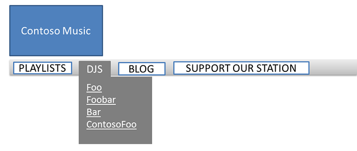
Figure 4. The Drop-Down Navigation Menu for Contoso Music
This navigation menu has a couple of issues that go beyond responsive layout, but they are still an integral part of building a unified site experience that scales across multiple devices.
- First, a lot of sites use navigation menus on which links are revealed when a user mouses over the menu titles. This is absolutely unacceptable because a mouse-over does not translate well to touch browsers. In fact, touch-input aside, you shouldn’t rely on a mouse-over to reveal any useful information at all because it is not keyboard accessible and goes against W3C accessibility guidelines.
- Second, look at the relative sizes of the links Playlists and DJs. These two pieces of information are supposed to be at the same level in the hierarchy. However, the size of the link is determined by the size of the text. This makes the DJs link less prominent, and also harder to precisely tap on a touch-screen. The DJs link could be as small as 20 px by 40 px, which is not accessible.
- Another subtle problem, which you can see by glancing at the menu list items, is that only the text items themselves are hyperlinks. Here again, the touch user would be better served if the target for the link Foo was the entire width of the flyout menu instead of just the text width.
Moreover, users on all-in-one devices might utilize the same machine in different device configurations, in which case they might access your site with a mouse at one point and then revisit it later by using touch. It’s beneficial to provide the user with touch-friendly, well-spaced hyperlinks and navigation.
A common example of touch-friendly navigation that lots of sites use for their menus, especially on mobile apps or in a sidebar for tablets, is shown in Figure 5.
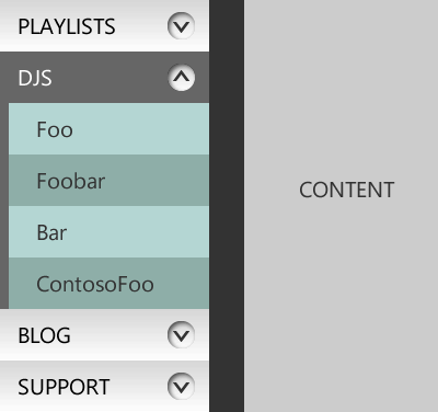
Figure 5. A Touch-Friendly Redesign of the Contoso Music Navigation Menu
The navigation menu utilizes touch, mouse or keyboard to expand and collapse the accordion-style submenus. All the links are the same width (even the submenu items), and for each link, the entire rectangle is clickable, not just the text.
A good example of a site that has made this transformation is MSN.com. The old MSN.com (shown in Figure 6) sports a significantly higher content density, with lots of text links (with smaller clickable areas) that are tightly packed (creating room for error when using touch and gaming joysticks), as well as a mouse-over to reveal the subcategories of news (see the menu under Entertainment).
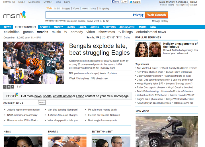
Figure 6. The Old MSN.com
Figure 7 shows the new touch-friendly version of MSN.com. While currently offered only on Windows 8, the touch-friendly UI will be rolled out across the board for all browsers after testing. Notice the more spacious layout and larger hit targets.
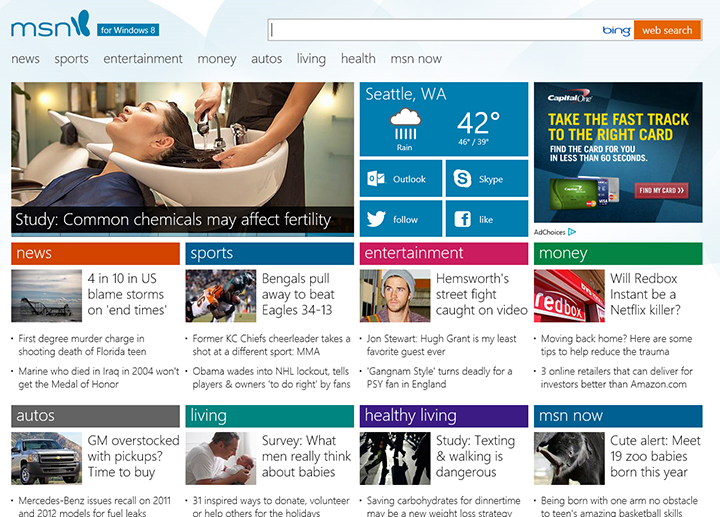
Figure 7. The New Look for MSN.com
One Site Fits All
Responsive Web design should not only be about resizing the same content gracefully based on user screen sizes. To best connect with your users across multiple screens, your site should not only be aware of the device’s physical characteristics (such as screen size) but also infer the user’s physical circumstances, modes of input and the kind of information she is seeking.
In the next article in this series, I’ll cover some implementation techniques for responsive design.
This article is part of the HTML5 tech series from the Internet Explorer team. Try-out the concepts in this article with three months of free BrowserStack cross-browser testing @ http://modern.IE.