The 21-Step Checklist for Bulletproof Mobile User Onboarding
User Onboarding is the user's first date with your app. Delight them and this will lead you to the second date; confuse them, ignore them, ask too much from them and you will never hear from them again.
Onboarding Is the Most Crucial Element of UX
A staggering statistics says that out of the 2.5 million apps out there, only 25% of them are used more than once [1]. Samuel Hullick, through his observation [2], points out that “40-60% of the free trial users will never see a second sign-in“. This reiterates the fact that user onboarding on most apps is broken, users are not getting to the “aha moment” early enough to invest more time.
User Onboarding Is Not a Fix for Crappy UX
Most apps follow standard design principles and self-explanatory UX. However, every app faces a unique challenge to convey the message and many apps in order to improve UX, often uses non-standard interactions.
Take an example of the app Clear:
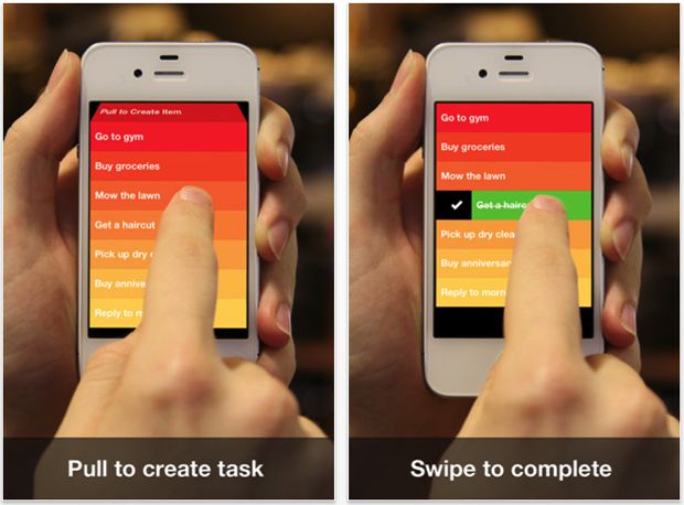
Image source: Gizmodo
The app presents a unique minimalistic UI, controlled almost entirely by gestures. This unique user interface has set Clear app apart from the rest (over 2.5 million people use Clear and the app has received numerous design awards [3]).
However, the distinctiveness introduces a new set of challenges for the publisher to convey the non-standard interactions used in the app. The app uses ‘walkthrough user onboarding’ technique to introduce these non-standard interactions to the new users.
The lesson here is, onboarding is not a substitute for poor design, it is there to be used to enhance the user experience.
Now that we understand when to use user onboarding techniques, let’s review the checklist of techniques for a successful mobile user onboarding.
Checklist of Techniques for a Successful Mobile User Onboarding
In this section we introduce a checklist of techniques to follow for a successful mobile user onboarding:
1. Welcome the User
A warm welcome to your guest sets the tone for the whole evening. It's similar with your app. The welcome is important as it is usually the first point of contact between a user and your app. It sets the tone of the relationship the user will have with your app.
2. Have a Conversational Tone
“Welcome to our system. We will help you toggle the ASCII strings into Floating number using our python script and Node.js” Do not do this. On the other side of your app, there is a human with emotions and feelings, express to them as a human through your app.
3. Show Benefits Not Features
People do not want a bed, they are looking for a good night sleep. Phrase your copy to sell the benefit they get from using your app, not the features in your app.
4. Simplify Login and Ask for a Login Only at the Right Moment
Most apps these days use a social login to reduce friction. It’s a good practice as it offers one-click login, helping users deal with sign-up fatigue and simplifying cumbersome tasks such as importing the user’s contacts. Note that lot of users are concerned about privacy so allow them to create a separate account.
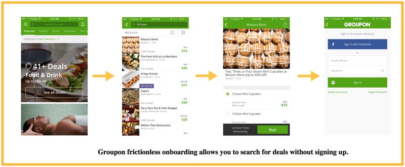
Some companies (for example, Groupon) have gone a step ahead by introducing frictionless onboarding, i.e. you can use the product straight away without having to sign up.
5. Show One Idea per Screen
Don't overwhelm the user with multiple ideas on one screen, a screen should communicate only one idea.
6. Explicitly Show Advancement to the User
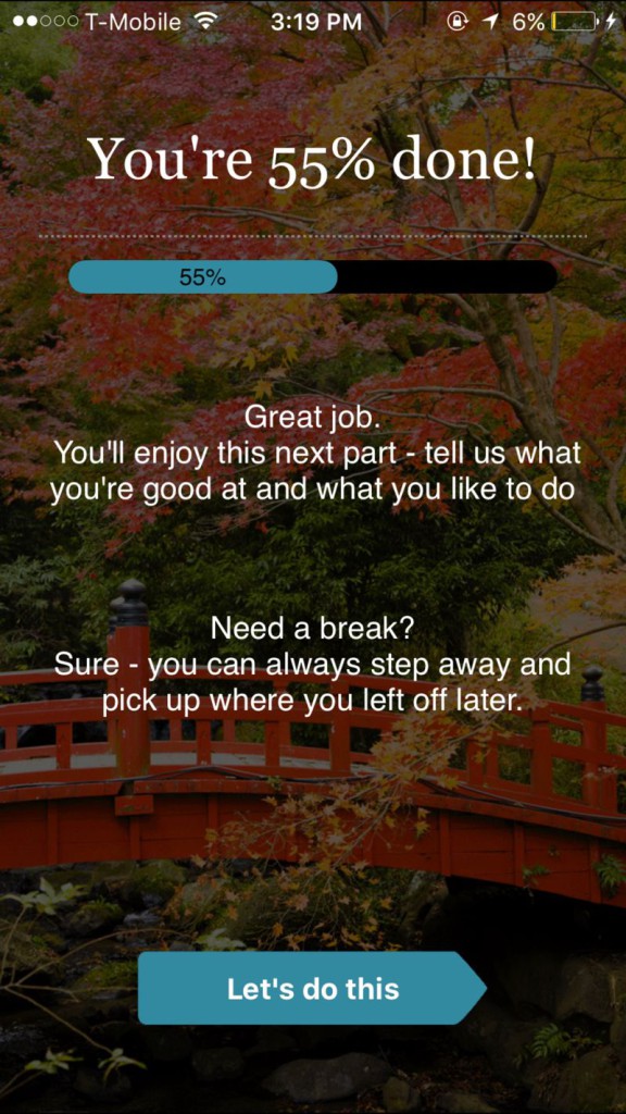
When people feel they have made some progress towards a goal then they will become more committed towards continued effort and likely to complete their journey (“Endowed Progress Effect”).
Show how far a user has advanced on the journey and how many screens/tutorials/steps are remaining to decrease abandonment.
7. Onboard Progressively
Focus on only one benefit at a time, start with the core benefit. As a user advances to the next page, onboard them there to the next benefit.
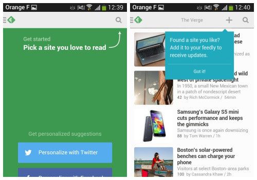
Image source: Smashing Magazine
8. Allow Users to Skip
Some users like to be guided while others like to explore. For explorers, allow the tutorial to be skipped.
9. Use Images Instead of Text
Visual content reaches people’s brain faster and in a more understandable way than textual information. According to research, it takes a human brain 0.25 seconds to process visual content, 60,000 times faster than textual content.
10. Remove Tooltips Where Possible
Your product must be self-explanatory and easy to walk through, remove tooltips where possible.
Samuel Hullick in User Onboarding puts it, “Companies have come to believe that this UI technique (tooltips) is onboarding. This is flat-out incorrect. It is also, ironically, a strong indicator that the onboarding experience was tacked on as an afterthought."
11. Personalize Onboarding Where Possible
Personalize onboarding by reminding users who recommended the app or which other friends are on the app.
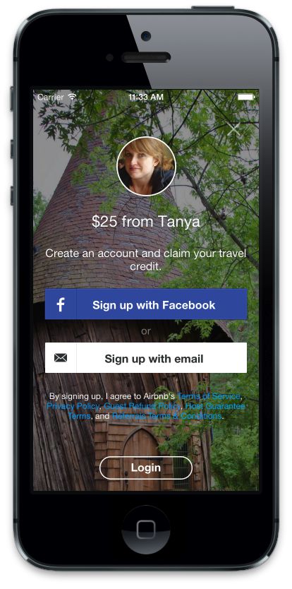
Image source: AirBnB Nerd
AirBnB personalizes onboarding a new user when they install the app via a referral link.
12. Allow Users to Come Back to Onboarding Later
For function-oriented onboarding, allow a user to come back to it later. Collect this data to work on simplifying this functionality.
13. Give Users Quick Wins
Give wins as early as possible even if it’s small. These wins should be easily achievable by the user. Example: YouTube app allows you to watch and search videos right away when you launch the app.
14. Social Proof
People reference the behavior of others to guide their own behavior. Use social proof for your product such as testimonials, the number of downloads, etc where possible.
15. Don'T Show Users Are Failures
Be sensitive with your wording. Instead of saying “You have zero friends“, show how to add/invite friends.
16. Reach out to Users Proactively
Onboarding starts before a user downloads your app and continues after they close the app. Reach out to users proactively and allow them to get in touch via emails, SMS, push notification, others tools and always keep iterating.
17. Explain Interactively:
Use animations and interactivity for onboarding and attention instead of just text and images.

A good example is how “Slide to Unlock” animates when an iPhone is locked to show how to unlock and if the password is incorrect, “Try again” shakes grabbing your attention.
18. Empty States
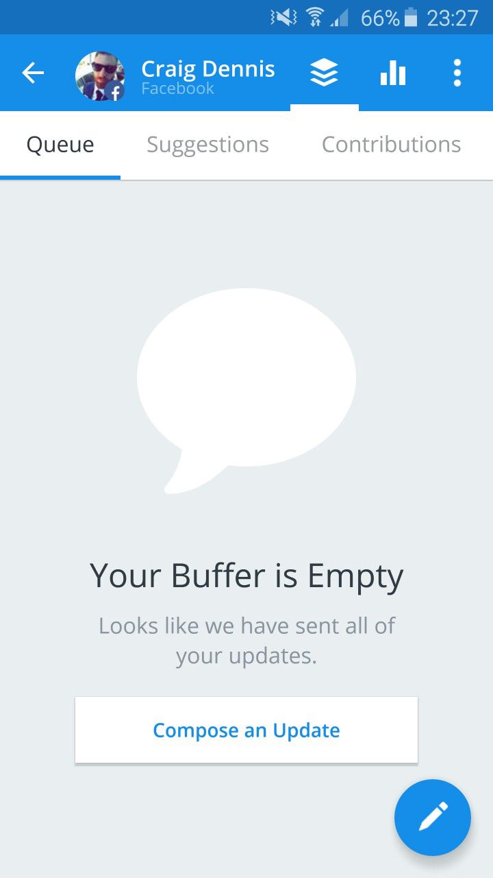
Empty states: i.e. places in the app without content, data, results shouldn’t be empty. It should be used to educate the user and/or prompt them to take an action to fill it up.
A good example is Buffer app which leverages the empty state for getting the user to compose an update.
Image source: EmptyStates
19. Context before Asking Permission
Don’t ask a user for access (such as camera, push notification) to features until you need them. When you do, educate users on the benefit of the permission before asking for permission.
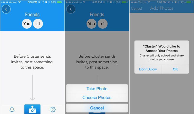
Image source: Techcrunch – The right way to ask users for iOS Permissions
20. Congratulate Users on Success
Congratulate them when they have achieved an onboarding or finished a certain goal.
21. Use Visual Analytics to Test and Iterate
User Onboarding is an iterative process. It changes as your product and business evolves and there is always room for improvement. Use qualitative UX analysis tools such as UXCam [*Disclosure: I work for UXCam] for mobile or Crazyegg and Clicktale for the web to test, iterate and improve the onboarding process.
Key Features of Visual Analysis Tools Are:
Touch Heatmaps:
Heat Maps allows you to understand how users are interacting on each screen by aggregating all user gestures (taps, swipe, scrolls).
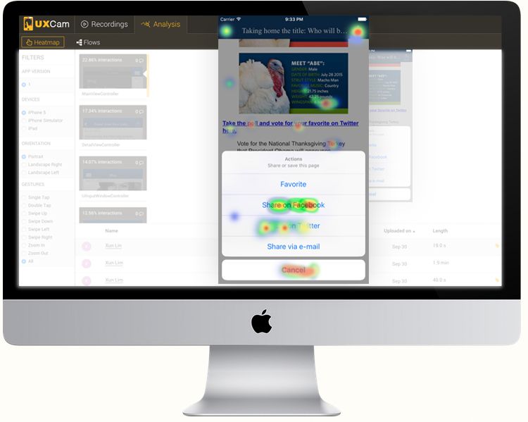
This allows you to see which part of your screen is being used the most and which needs rework, enabling you to redesign and optimize the UI for conversion.
User Recording:
A picture is worth 1000 words or in this case, a video is worth gigabytes of data. Qualitative analysis tools provide user recording that enables you to see how a user is using your product along with all touch interactions through session replay.
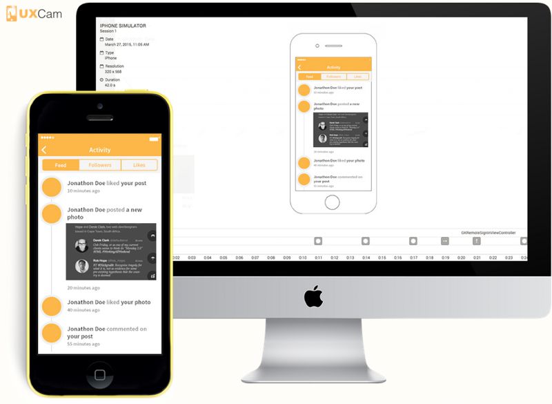
This enables you to understand where in the product, your users are struggling.
The Final Word
You don’t get a second chance to make a great first impression. What happens after a user lands on your product is the delicate opportunity to make or break a relationship. Every app brings a unique set of challenges. Use the tools and techniques learned above to measure, test and validate onboarding ideas.
Sources:
- 1). Localytics: http://info.localytics.com/blog/app-user-retention-improves-in-the-us
- 2). Samuel Hullick: The Elements of User Onboarding
- 3). Clear app: http://realmacsoftware.com/clear/
