Grid System Comparison: Bootstrap 3 vs. Foundation 5

Bootstrap and Foundation are two of my favorite front-end frameworks, especially for rapid website prototyping. Both come with ready-to-use components that speed up my workflow. Beyond their small differences, most of their fundamental features look similar to me.
In this article, I’ll cover the basics of their grids. First, I’ll show you how they’re structured, describing their key components, and how they differentiate depending on the screen size. Then, I’ll go over a real example that will help you put the knowledge gained into practice.
Let’s get started!
Comparing Media Queries
Before analyzing Bootstrap’s and Foundation’s grid structure, let’s first look at the breakpoints that both offer for responsive layouts. These are used to set the number of the available grids that each framework offers.
Bootstrap specifies four pixel-based media query breakpoints. The table below shows them:
| Screens | Viewport Size | Container Width | Class Prefix |
|---|---|---|---|
| Extra small screens | < 768px | auto | .col-xs-* |
| Small screens | ≥ 768px | 750px | .col-sm-* |
| Medium screens | ≥ 992px | 970px | .col-md-* |
| Large screens | ≥ 1200px | 1170px | .col-lg-* |
Foundation includes five em-based media queries. These are shown in the following table:
| Screens | Viewport Size | Class Prefix (Default Grid) | Class Prefix (Block Grid) |
|---|---|---|---|
| Small screens | ≤ 40em (640px) | .small-* .column(s) |
.small-block-grid-* |
| Medium screens | ≥ 40.063em (641px) | .medium-* .column(s) |
.medium-block-grid-* |
| Large screens | ≥ 64.063em (1025px) | .large-* .column(s) |
.large-block-grid-* |
| XLarge screens | ≥ 90.063em (1441px) | Not Activated | Not Activated |
| XXLarge screens | ≥ 120.063em (1921px) | Not Activated | Not Activated |
To give you an idea of how these media queries work, I suggest you take a look at a Bootstrap demo and the related Foundation demo. But if you’re still a little confused, the upcoming sections will clarify things.
Note: Foundation’s grids for XLarge and XXLarge screens are by default deactivated. If you want to use them, you have to “uncomment” and set the values of the $include-xl-html-grid-classes and $include-xl-html-block-grid-classes variables to true. You can find those variables in the _settings.scss partial.
Grid Structure
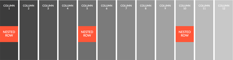
Bootstrap and Foundation each offer a mobile-first 12-column grid consisting of rows and columns. Columns are nested inside a row. They scale up to 12 for each row. Rows can be nested within the columns as well.
Both frameworks come with many predefined classes you can use to set the size of your columns. As mentioned above, Bootstrap includes four media query breakpoints and Foundation has five. For each grid, there’s a different class prefix that can be used to set the size of the columns (see the two tables).
Bootstrap’s grid also requires a wrapper element for rows. This should have a class of either container or container-fluid. An element with the container class has a fixed width, which varies depending on the viewport (see the first table above), while an element with a class of container-fluid expands to fill the entire width of the browser window.
Columns != 12?
It’s possible the number of columns in a grid is not exactly 12. In such a case, Bootstrap will float the last column to the left, while Foundation will float it to the right. If you want to override Foundation’s default behavior, add the end class to the last column.
To see this difference in action, you can take a look at a Bootstrap example and a Foundation example.
Utility Classes
Both frameworks offer extra classes that give you great flexibility to customize their grids.
Visibility classes let you show or hide content based on specific screen sizes. Offset classes allow you to center incomplete columns or adjust the amount of spacing between them. There are also classes that specify the order of columns across different devices.
Examples of all these different classes can be shown in this Bootstrap demo and this Foundation demo.
Block Grid
Beyond the default grid, Foundation supports another grid feature, called block grid. This allows you to create equal-sized columns with minimal markup. In order to use it, define the row as a ul element and the columns within it as li elements. Then specify the column sizes by applying the related classes (see the 2nd table above) to the ul element.
At this point you might be thinking, what are the differences between the regular grid and the block grid? Let’s briefly look at two of them:
- Unlike the default grid, which applies a
max-widthto each row, the block grid always fills the full window width. - The block grid can be used only for equal-sized items.
To better demonstrate how the grids differentiate, here’s a demo.
Using the Grids
Now that we have a good understanding of the grids of these two frameworks, let’s see how we can use them to build a Bootstrap page and the corresponding Foundation page.
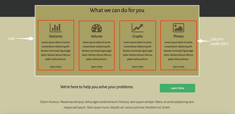
The screenshot below shows the first layout that we’ll build:
Starting with Bootstrap, we define an element with a class of container. As discussed earlier, this class sets a fixed width to the element with the value depending on the screen size (see the Bootstrap table). Then, we add an element with a class of row to it.
Now, we’re ready to set up our columns. For large screens, we want four equal-sized columns. So we define four div elements each with a class of col-lg-3. However, for small and medium devices we prefer having two columns per row. For this reason, we use the col-sm-6 class. Finally, for extra-small devices we want the columns to be stacked. This is the default behavior of mobile-first frameworks, and thus, there’s no need to define the col-xs-12 class.
Here’s how the HTML looks:
<div class="container">
    <div class="row">
        <div class="col-sm-6 col-lg-3">
            <!-- content -->
        </div>
        <div class="col-sm-6 col-lg-3">
            <!-- content -->
        </div>
        <div class="col-sm-6 col-lg-3">
            <!-- content -->
        </div>
        <div class="col-sm-6 col-lg-3">
            <!-- content -->
        </div>
    </div>
</div>
Let’s continue with Foundation.
Foundation’s grid is very similar to Bootstrap’s, but it’s a bit simpler. First, we have to define an element with a class of row that will contain our columns. This class sets the element’s max-width to 62.5rems (1000px). Next, we add the columns. To achieve this, we specify div elements each with a class of column or columns, and set their width using the corresponding grid classes (see the Foundation table above). Again, for small devices we don’t have to define the small-12 class.
Here’s the HTML based on Foundation’s grid:
<div class="row">
    <div class="medium-6 large-3 columns">
        <!-- content -->
    </div>
    <div class="medium-6 large-3 columns">
        <!-- content -->
    </div>
    <div class="medium-6 large-3 columns">
        <!-- content -->
    </div>
    <div class="medium-6 large-3 columns">
        <!-- content -->
    </div>
</div>
At this point I hope you’ve started to become more familiar with the grid system of the two frameworks. But maybe another example will help make this clearer.
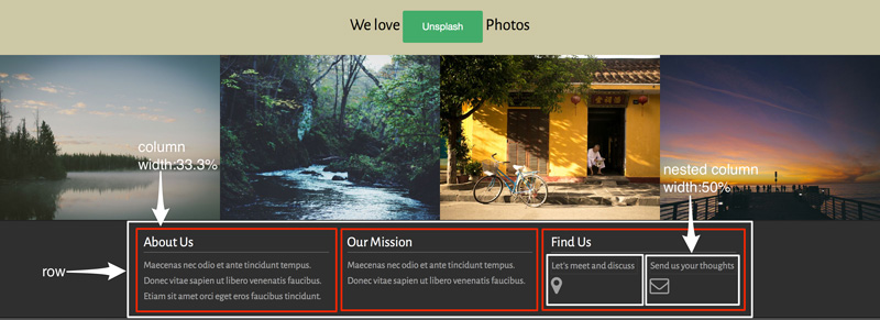
In this next case, we’ll structure the footer. The following graphical representation shows how we want to style it:
Here we’ll choose a different layout mode compared to the previous example.
For medium screen sizes and up (or small and up for Bootstrap’s grid), we want to display three columns. Notice, however, that there is a nested row in the last column. This consists of two columns. We’ll set their width to be 50% of a row’s width for all devices. Finally, we’ll adjust the visibility of the icons that are appearing in the nested columns.
Here’s the code for Bootstrap:
<div class="container">
  <div class="row">
    <div class="col-sm-4">
      <!-- content -->
    </div>
    <div class="col-sm-4">
      <!-- content -->
    </div>
    <div class="col-sm-4">
      <div class="row">
        <div class="col-xs-6">
          <a href="#">
            <p>Let's meet and discuss</p>
            <i class="fa fa-map-marker fa-2x visible-lg"></i>
          </a>
        </div><!-- .col-xs-6 -->
        <div class="col-xs-6">
          <!-- content -->
        </div>
      </div><!-- .row -->
    </div><!-- .col-sm-4 -->
  </div><!-- .row -->
</div><!-- .container -->
And with Foundation:
<div class="row">
  <div class="medium-4 columns">
    <!-- content -->
  </div>
  <div class="medium-4 columns">
    <!-- content -->
  </div>
  <div class="medium-4 columns">
      <ul class="small-block-grid-2">
          <li>
            <a href="#">
              <p>Let's meet and discuss</p>
              <i class="fa fa-map-marker fa-2x show-for-large-up"></i>
            </a>
          </li>
          <li>
            <!-- content -->
          </li>
      </ul>
  </div><!-- .medium-4 .columns -->
</div><!-- .row -->
Note: Instead of the block grid, we could have used Foundation’s default grid for creating the nested row.
Conclusion
If you want more info on Bootstrap’s grid system, you might want to also read Syed Fazle Rahman’s article Understanding Bootstrap’s Grid System.
To conclude, in this article, I introduced the grid structure of both Bootstrap and Foundation. Then we looked at how to take advantage of their grids in a real project. As you can see, both grids look similar and can be further customized.
I hope you enjoyed reading this article and maybe you can apply what you learned here to your own projects. As always, feel free to share your thoughts about these frameworks in the comments below.