The Complete Guide to Reducing Page Weight
Total page weight increased by 32% in 2013 to reach a ludicrous 1.7Mb and 96 individual HTTP requests. That’s an average figure; half of all sites will be larger. Website obesity has become an epidemic and we web developers are to blame. There are no excuses.
An overweight site will adversely affect your bottom line:
- The larger the download, the slower the experience. Not everyone has a 20Mb connection and this is especially true in developed western countries with aging copper infrastructures. It doesn’t matter how good your site is: users will not wait.
- Mobile web access has increased rapidly to reach almost one in four users. On a typical 3G connection, a 1.7MB page will take almost a minute to appear. Is there any point adopting Responsive Web Design techniques when your site won’t work effectively on those devices?
- Google’s page speed algorithms will downgrade your site and harm Search Engine Optimization efforts.
- The more code you have, the longer it takes to update and maintain.
I predicted page weight will drop this year — and I hope not to be proved wrong. Fortunately, there are a number of quick fixes which will have an instant effect on site performance. All these techniques are well known, use today’s technologies, do not take considerable time, and can be implemented on an existing codebase without the need for redevelopment. Later on I’ll move on to more advanced techniques, then outline some tools to help you measure your success.
The first three don’t actually slim your website, but put it in a corset and flattering clothing…
1. Activate GZIP compression
According to W3Techs.com, almost half of all websites do not enable compression. This is normally a server setting which should be enabled by your web host, although it may be possible to configure it yourself.
2. Encourage browser caching
If the browser can easily cache a file, it won’t necessarily need to download it again. Simple solutions include setting an appropriate Expires header, Last-Modified date or adopting ETags in the HTTP header.
You may be able to configure your server to handle this automatically, e.g. here is an Apache .htaccess setting to cache all images for one month:
<IfModule mod_expires.c>
ExpiresActive On

<FilesMatch "\.(jpg|jpeg|png|gif|svg)$">
ExpiresDefault "access plus 1 month"
</FilesMatch>

</IfModule>
3. Use a Content Delivery Network (CDN)
Browsers set a limit of between four and eight simultaneous HTTP requests per domain. If your page has 96 assets loaded from your domain, at best it will take twelve sets of concurrent requests before all appear. (In reality, file sizes differ so it doesn’t happen exactly like that, but the limitation still applies.)
Requesting static files from another domain effectively doubles the number of HTTP requests your browser can make. In addition, the user is more likely to have that file pre-cached because it’s been used on another site elsewhere. Easy options are JavaScript libraries such as jQuery and font repositories, but you could also consider dedicated image hosting.
These first three options help improve page speed but we’ll need to examine your code before we can actively reduce page weight…
4. Remove unused assets
Websites evolve. If you’re no longer using a widget, you can remove the associated CSS and JavaScript. If they’re contained in separate files that’s a simple job. If not, you may need to use tools such as Chrome’s Audit Developer Tool, JSLint, Dust-Me Selectors, CSS Usage, unused-css.com or build tools such as grunt-uncss.
5. Concatenate and minify CSS
Ideally, you require one CSS file (although a couple may be necessary if you’re using RWD to support old versions of IE). While it may be sensible to build and maintain separate CSS files, you should join them and remove unnecessary whitespace prior to hosting on your production server.
Pre-processors such as Sass, LESS and Stylus can do the hard work for you. Build tools including Grunt.js or Gulp can automate your workflow or, if you’d prefer a GUI, Koala provides a free cross-platform application.
If that sounds like too much effort, you can manually concatenate files in your text editor or from the command line, e.g. in Windows:
copy file1.css+file2.css file.cssor Mac/Linux:
cat file1.css file2.css > file.cssThe resulting file can be run through an online CSS minifier such as cssminifier.com, CSS Compressor & Minifier or CSS Compressor.
Finally, remember to load all CSS in the head so the browser knows how to style the HTML that follows and doesn’t need to redraw the page again.
6. Concatenate and minify JavaScript
The average page loads 18 individual script files. While it’s practical to keep libraries such as jQuery as separate files, your own JavaScript code should be concatenated and minified on your production server. Again, build tools can help or you can use online tools such as the YUI Compressor, Closure Compiler or, my personal favorite, The JavaScript CompressorRater which passes your code to multiple engines so you can choose the best.
Admittedly, you need to be slightly more careful since a JavaScript compressor can fail if you have bad code — even a missing semi-colon. However, simply concatenating the files will provide a performance boost because you’re making fewer HTTP requests.
Finally, it’s best to load JavaScript just before the closing HTML body tag. This ensures the scripts don’t block loading of other content and page content is readable before scripts are downloaded and executed.
7. Use the correct image format
Using the wrong image format can bulk up your pages. In general:
- use JPG for photographs
- use PNG for everything else.
GIF may compress better when you have small graphics with limited color sets — although it’s rare. Some images are also more appropriate as vectors, but we’ll discuss that in a later article.
You’ll need a decent graphics package to convert images but there are plenty of free options available and some such as XnView allow you to batch process files. Remember to play with the settings:
- JPG is a lossy format with a quality between 0 (poor, smaller file) to 100 (best, larger file). The majority of images will look fine somewhere between 30 and 70 but experiment to find the lowest acceptable value.
- PNG is available in 256 and 24-bit color varieties. If you don’t need transparency and can limit the color pallet, the 256-color version may compress better.
8. Resize large images
An entry-level smart phone with a 3 mega-pixel camera will produce an image that is too large to display on a web page. Unfortunately, content editors will upload images directly from their camera. A little education and an automated resizing system is recommended.
Image dimensions should never exceed the maximum size of their container. If your template has a maximum space of 800 horizontal pixels, the image will not need a greater width. That said, those using high-density/Retina displays may appreciate a double 1,600 pixel width image, but that’s still smaller than typical camera output.
Resizing images has a significant effect on page weight. Shrinking the image dimensions by 50% reduces the total area by 75% and should considerably reduce the file size.
9. Compress images further
Even if you’ve switched to the correct format and resized the dimensions, it’s possible to shrink image files further using tools that analyze and optimize the graphic. These include OptiPNG, PNGOUT, jpegtran and jpegoptim. Most can be installed as standalone executables or integrated into your build process. Alternatively, online tools such as Smush.it can do the work in the cloud.
10. Remove unnecessary fonts
Web fonts have revolutionized design and reduced the need for graphic-based text. However, custom fonts have a cost and may add several hundred kilobytes to your page. If you’re using more than two or three fonts, you’re possibly overdoing it. Your client/boss may love awful handwriting typefaces but, if it’s only used for one title, is it worth downloading a 200KB font file?
I suspect many sites can reduce their weight by 30-50% with a few hours of effort from a non-developer. For the average site, that’s a saving of more than 800Kb and it’ll become noticeably faster.
Is your site still overweight? Some tougher solutions
But if your pages are still obese after following those steps, there are more drastic dieting options you can contemplate.
1. Remove social network buttons
Do you have Facebook, Twitter, Google+ and LinkedIn sharing buttons on your pages? That’s 580Kb of content you’re serving to frustrated end users. Much of it is JavaScript that must be executed by the browser and some networks stipulate it must be loaded before your content appears.
Bloated social widgets are completely unnecessary — you can add fat-free social buttons to your pages with a few lines of HTML. A little JavaScript can progressively enhance the experience and show a pop-up window on desktop devices.
While simple buttons won’t show click statistics, you can discover far more information with event tracking in Google Analytics.
2. Check all third-party widgets
Social networks aren’t the only culprits. Adding third-party widgets to your page has a hidden cost that significantly exceeds the included markup. Even if the content is loaded from another domain, it may contain hundreds of kilobytes of data, JavaScript, CSS, and images.
If you must use a widget, consider one that is better written. Ideally, the widget JavaScript should be lightweight, loaded at the end of the page but able to place content in a specified HTML container. Alternatively…
3. Consider lazyloading — or on-demand content
Presume you’re showing a video hosted by a specialist provider. While the video is downloaded only when the user hits “play”, you are probably loading video API code and other related resources regardless of whether the user plays the video or not. Why not load all that content when the user requests it?
You can also consider on-demand images and content that download as the user scrolls the page. I’m not a fan of the technique; it can potentially have a negative impact on usability or SEO. However, it is useful for some types of web applications–for example image galleries.
4. Replace images with CSS3 effects
Are you slicing images to create gradients, rounded borders and shadows? I hope not — CSS3 makes such techniques redundant.
The effects won’t work in IE8 and below but oldIEs are dying and users won’t be aware because they won’t compare your site in multiple browsers. You can add clever shims such as CSS3 PIE but I wouldn’t recommend it: they can bulk up your page and make the older browsers slow to a crawl.
CSS3 effects generally degrade gracefully so it’s rare you need worry about older browsers. Pixel perfection has always been futile and is utterly ridiculous when you’re building responsive designs that adapt to different screen sizes.
A note of caution though: CSS shadows and gradients have been shown to be costly during browser repaints, especially if you’re displaying dozens of elements with these features added. So use the effects sparingly and test scrolling performance and repaints before committing to overusing these effects to replace images.
5. Replace JavaScript with CSS3 effects and animations
Is your JavaScript littered with $("#x").fade() and $("#y").slideDown() effects? That may have been necessary a few years ago but CSS3 animations, transitions and transformations have to a large degree superseded JavaScript effects. The reasons:
- CSS3 animation is natively handled by the browser; if it’s done right, it will often be much faster and smoother than JavaScript execution.
- CSS3 animation is easier to write and requires significantly less code.
- CSS3 offers 3D transformations which are extremely difficult — if not impossible — in JavaScript alone without a specialized library.
There are situations when you want fine-grained JavaScript control but they are rare exceptions. Again, effects won’t work in old browsers but should degrade gracefully.
6. Consider Scalable Vector Graphics (SVGs)
SVGs contain points, lines, and shapes defined as vectors in XML. SVGs are ideal for responsive designs since they will scale to any size without loss of quality and the file size is often smaller than a bitmap.
SVGs aren’t suitable in all situations. Photographs and complex images will always be better as a JPG or PNG. However, logos, diagrams, and charts are usually appropriate. What’s more, SVGs can be manipulated on the client using CSS and JavaScript.
There are tools that convert bitmaps to vector format, but starting from scratch will yield the best results. Packages such as Illustrator, Inkscape, and SVG edit provide a good start, although learning XML basics will help you produce cleaner code.
7. Replace images with icon fonts
You may have dozens of small icons in use throughout your site and managing individual image files isn’t fun. Fortunately, icon fonts can save space and sanity. A single font can contain hundreds of vector-based images which can be set to any color and scaled to any size in all browsers (going back to IE6).
You can use a dedicated font or, for optimal bandwidth-saving, use a tool such as Fontello, IcoMoon or Flaticon to create a font pack containing the icons you need.
8. Use image sprites
Bitmap images should be the last choice once CSS3, SVG and icon font options have been rejected. Often-used bitmaps can be packaged into a single sprite file so individual images can be accessed in CSS, e.g.
.sprite {
	width: 16px;
	height: 16px;
	background: url("sprite.png") 0 0 no-repeat;
}

.sprite.help { background-position: 0 -16px; }
.sprite.info { background-position: 0 -32px; }
.sprite.user { background-position: 0 -48px; }
The advantages:
- You require a single HTTP request to load the sprite.
- A single sprite will normally result in a smaller overall file size than the total weight of the individual images.
- All images appear when the sprite has loaded.
Image sprites can be created in a graphics package or using tools such as Sprite-Cow and Instant Sprite. You can alternatively incorporate sprite production in your Grunt workflow.
9. Use data URIs
Data URIs encode binary and text assets as if they were external resources. Bitmap images and SVGs can be encoded directly in HTML, JavaScript, or — more usefully — CSS:
.bullet {
	background-image: url("data:image/png;base64,iVBORw0KGgoAAAANSUhEUgAAABAAAAAQAQMAAAAlPW0iAAAABlBMVEUAAAD///+l2Z/dAAAAM0lEQVR4nGP4/5/h/1+G/58ZDrAz3D/McH8yw83NDDeNGe4Ug9C9zwz3gVLMDA/A6P9/AFGGFyjOXZtQAAAAAElFTkSuQmCC");
}
This will reduce the number of HTTP requests — although maintenance is more difficult unless you can automate the process in some way. I would only recommend it for small, often-used images that are unlikely to change.
Tools such as DataURL.net and data: URI Generator will convert files to data URIs for you.
10. Use website assessment tools
You won’t know whether your diet has been successful unless you’re monitoring your page weight and the resulting download speed improvements. Browser developer consoles and free online tools such as Google Page Speed Insights can help. A comprehensive list is coming in my next article before we discuss more radical, liposuction-like page weight reduction techniques in the last part of this series.
Site still not lean enough? Some more drastic solutions
Webpage diets are tough. You can implement quick fixes. Perhaps you’ve taken tougher action such as optimizing your CSS and JavaScript. But all your great work is thrown out as soon as your boss/client demands yet another shiny new widget, frivolous social networking button or wacky font.
Unfortunately, diets often have limited benefits. Drastic lifestyle changes, on the other hand, can ensure your site never becomes obese. Several of the suggestions below are controversial and won’t be for everyone but, at the very least, I hope these make you more aware of page weight issues…
1. Never trust third-party code
Would you grant an unknown developer unfettered access to your website code? If not, why are you trusting third-party code? It’s easy to add useful widgets to your page and it’s rare they’ll compromise security. That said, always check what resources they’re pulling in. For example, social network buttons can add half a megabyte of content, making your pages slower; can you do without them?
2. One JavaScript library is more than enough
Perhaps you’re using jQuery. That’s fine — stick with it. But don’t then browse the Prototype or YUI plug-in libraries looking for cool widgets and effects.
You should also consider more extreme options:
- Can you obtain a custom build if you’re not using all features provided in a library?
- Are there lightweight alternatives, such as Zepto.js or Minified.js which provide API-parity with core jQuery methods?
- Is a library required? If it’s primarily being used to smooth over browser inconsistencies, perhaps those issues no longer exist. Are you using a library because it’s familiar and comforting?
3. Beware of CMS templates
Few Content Management Systems generate overweight pages … but then you start adding stuff.
A free or commercial template can make financial sense. Why employ a developer when off-the-shelf code does everything you need for a few dollars? They can be ideal for simple brochure sites, but there’s a hidden cost. Generic templates must sell hundreds, if not thousands of copies to recoup the development effort. To attract buyers, developers bundle every feature they can; you may only use a fraction of them but they still exist in page code.
Perhaps I’ve been unlucky, but the WordPress themes I’ve experienced often weigh in at more than 2Mb. I’m sure there are lightweight options, but finding one is another matter.
4. Cut the framework fat
Boilerplate frameworks such as Bootstrap and Foundation are useful for prototyping or as a starting point for a new project. Unfortunately, like generic templates, they come with CSS, JavaScript and other resources you’ll never need. The HTML also tends to be fairly verbose and littered with unsemantic class names.
Personally, I prefer the lego-like modular approach in web development (that’s classic lego blocks rather than the packs that limit you to building one specific thing). You start with nothing and add required components. Frameworks are more like sculpturing in marble; you chip away at the parts you don’t need until the site’s complete. That’s what should happen — but it’s easier to leave stuff in.
I won’t say “don’t use frameworks”, but be aware of the additional bulk they carry. A tool such as grunt-uncss can help remove unnecessary code but never adding the framework code in the first place may be preferable.
5. Embrace progressive enhancement
The term progressive enhancement has fallen from favor, but that’s essentially what you’re doing in a mobile-first responsive website. In essence, you’re creating a basic usable experience with enhancements as the browser supports or requires it. A simple example: you can reference a large image in CSS when a desktop screen media query is triggered — most modern mobile browsers will not request the file. You may be able to enhance this further using conditional JavaScript loaders and the Network API.
Progressive enhancement rarely incurs significant additional effort; it’s a development approach rather than a technology.
6. Adopt a build process
You should ensure you’ve done everything to reduce image, CSS and JavaScript files prior to deployment. This can be a manual process but automation tools like Grunt.js and Gulp.js can make it reasonably painless.
7. Know thy code
CSS and JavaScript preprocessors such as Sass, LESS, Stylus, CoffeeScript, TypeScript and Dart may have revolutionized your productivity and workflow. However, the source is abstracted from the final generated code. Preprocessor output is only as good as the input and it’s possible to programmatically add thousands of superfluous lines unintentionally. Therefore, always check to ensure the output is efficient.
8. Consider the offline AppCache
Web applications have the ability to work offline using the the HTML AppCache. It’s possible to use the AppCache to supplement or enhance browser caching of regularly-used assets.
9. Simplify your site
During the past few years, web sites and applications have eschewed complexity to provide a streamlined, customer-focused experience. But not everyone got that memo and, admittedly, simplification can be tougher than it sounds. Many clients are wannabe software designers and add frivolous features because they:
- mistakenly think more functionality attracts more customers,
- consider they’re getting better value for money from their developer, and
- they don’t know any better.
Fortunately, a little user testing can help you identify never-used options which can be ripped out of the product or replaced with sleeker, lightweight alternatives.
10. Change your development lifestyle
Who’s to blame for the average webpage reaching 1.7Mb? Developers. It doesn’t matter how or why a website became obese; a developer let it happen.
Of course, development speed and cost-cutting is important — but not if the result is a slow, clunky product that’s never used. Your client/boss may not understand the technical issues but, if you don’t highlight potential pitfalls in layman’s terms, you’ll never become a conscientious coder earning the respect and rewards you deserve.
Lightweight pages are a direct result of efficient coding practices and should be an important consideration for any project. Unfortunately, accomplishing this is often pushed into the “do it later” bin along with content, SEO, and usability testing. My suggestions:
- It’s easy to forget bandwidth issues when you’re sitting on a fast 50Mbps connection. Limit connectivity or try loading your site in an area with poor 3G reception or on a busy hotel wifi network. Your frustration could be experienced by thousands of users every day.
- Consider page weight in every project and question every asset added to the page. Is that font necessary? Can you reduce background image dimensions? Could CSS3 animations replace that JavaScript library? etc.
- Change your attitude. Webpage obesity is an epidemic but it’s evident few developers care. Creating slimline pages is a valuable skill that will help you stand out from the crowd.
Tools to help you measure your success
Unless you continually monitor page weight, you won’t know how your diet is progressing. The average page now exceeds 1.7Mb and increased by 32% in 2013 alone. If your developers are secretly gorging themselves on fattening widgets, any of the following assessment tools will highlight their gluttony. They’re all free and take a few seconds to run — what are you weighting for…
1. Pingdom 
Pingdom is one of my favorite online tools. It reveals everything you could possibly need to know: page weight, download speed, code analysis, performance grades, development suggestions and even a historical timeline to record your dieting progress. If you only use one analysis tool, Pingdom should be it.
2. Firefox Web Developer Add-on 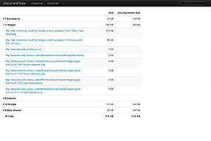
Chris Pederick’s Web Developer toolbar has been around since the dawn of creation (of Firefox). To use it to view both the compressed and uncompressed page size, select View Document Size from the Information menu.
Note that Web Developer is available as a Chrome extension but, unfortunately, doesn’t have this feature.
3. GTmetrix 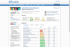
GTmetrix shows an aggregated report generated from Google’s PageSpeed Insights and YSlow as well as additional information such as the total page size and number of requests. The online tool is better than both systems, although you can still use them separately.
4. Google PageSpeed Insights 
PageSpeed Insights doesn’t show total page weight or download speed statistics but it does indicate where you can make improvements for both desktop and mobile devices. Sites are allocated a score out of 100 so you can quickly evaluate how improvements are progressing.
5. YSlow 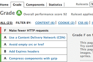
Yahoo’s YSlow is an online tool and plug-in available for most browsers. Like PageSpeed Insights, it evaluates pages and issues a grade between A (you’ve done everything you can) and F (you’re failing dismally) for a range of factors.
6. Browser Developer Consoles 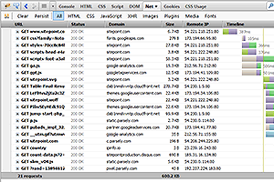
If you don’t want to use anything new, Firebug, Chrome Inspector, Firefox Web Developer and IE Developer tools all offer network analyzers and profilers to help assess the size of your pages. Note they won’t necessarily download cached assets so you may need to use Ctrl+F5 or clear the cache prior to testing.
7. PageScoring Website Speed Test 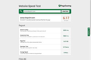
If you require a quick and easy tool, Website Speed Test does the job. It concentrates on download time but file sizes are also displayed, along with the download time for each individual file which could be handy to isolate problem areas.
8. Uptrends Speed Test 
As well as the usual size and download speed tests, the Uptrends tool is unique in that it allows you to test responsiveness from specific geographic locations. The report also highlights which domain each resource is served from to help assess CDN effectiveness.
9. Page Speed Tool 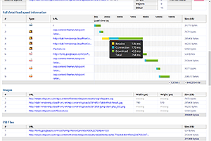
Page Speed Tool is well-presented and highlights file sizes, assets, resource groups, and download speeds. Note that the estimated load time appears to be calculated for the HTML source only — not for all files. However, you can get a good estimate of total load time by examining the accompanying waterfall chart that’s generated.
10. Web Page Analyzer 
If you can forgive its age and the dated purple and orange design, Web Page Analyzer provides a range of file size statistics as well as download time estimation for modems going all the way back to 14.4K!
Phew!
I hope you found this exhaustive guide useful, and at least a few of the solutions presented helped trim the fat. Best of luck with your new weight-loss regime!