Extending HTML the Aurelia.io Way

Teaching the old dog HTML new tricks is a major focus of today’s modern JavaScript frameworks. Be it by following potential standards like WebComponents, creating custom Directives or by extending existing classes, chances are high that your framework of choice provides a means to extend HTML’s markup itself. In a previous article, written by Brad Barrow, you were introduced to a new player: Aurelia. This article will build upon Brad’s article and code and show you how to create custom elements as well as custom attributes by following Aurelia’s conventions.
The complete code for this article can be found on our GitHub repo and you can see a demo of what we are going to build here (please allow some time for the app to initialize).
Why the Need for More Markup?
Before jumping straight into the action let’s first understand the potential use case for creating new components. To do so we will take a conceptual look at the introductory example as shown in the figure below. We have two pages, represented by a ViewModel (VM) and a View, showing funny pictures and gif videos. Each of those has a repeated list which itself renders posts containing an image and a text block.
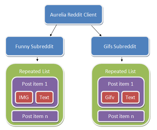
Aurelia Reddit Client conceptual diagram
By looking at the View we can see that data acquisition, as well as rendering, is tightly coupled in one VM/View pair.
<template>
  <ul class="list-group">
    <li class="list-group-item" repeat.for="p of posts">
      <img src.bind="p.data.thumbnail" />
      <a href="http://reddit.com${p.data.permalink}">
        ${p.data.title}
      </a>
    </li>
  </ul>
</template>
This might not be a problem with a simple example, but can turn into a major drawback as the system grows and more and more requirements are gathered.
Enhancing Existing Elements with Custom Attributes
Imagine we get a request to provide a popover for each of the funny pages posts. In order to do that we could easily wire up Bootstrap’s feature directly into the markup by placing the necessary data- attributes followed by an initialization inside our FunnyVM. But what if we suddenly need to do it on the other page as well? Providing the feature by declaring a custom attribute can make our lives much easier. These are particularly useful in following scenarios:
- Wrapping existing plugins
- Shortcuts for common bindings such as style or class
- Altering existing HTML elements / custom elements without direct code access
Now let’s get our hands dirty and see what it takes to build our first custom attribute.
Creating the popover
Let’s start by looking at what we’d like to achieve. The new attribute popover should accept parameters for the placement, title and content of the popover. The placement is fixed to the right, so a simple string as value is enough. For the other two properties we’re going to use Aurelia’s data binding to map the iterated values. In order to load the file we make use of Aurelia’s require feature. The from attribute contains the relative path to the resource to be imported.
<require from="./popover"></require>
...
<img src.bind="p.data.thumbnail"
     popover="placement: 'right';
              title.bind: p.data.url;
              content.bind: p.data.title" />
In order to make that happen, we start by creating a new JavaScript file in the src folder called popover.js. The custom attribute, like all other Aurelia constructs, is a simple exported ES6 class rather than a collection of functions passed into a predefined API (as many legacy frameworks do).
import {customAttribute, bindable, inject} from 'aurelia-framework';
import $ from 'bootstrap';
import bootstrap from 'bootstrap';
...
Compared to other frameworks, Aurelia declares constructs by describing them via metadata. But instead of using static functions or complicated APIs, Aurelia leverages cutting edge ES7 Decorators to achieve that. We’re going to import the necessary decorators from the package aurelia-framework. As for the control itself, we will use the Popover JavaScript control provided by Twitter Bootstrap. So we import the jQuery handle $ as well as bootstrap in order to initialize Bootstraps’ JavaScript code.
The next step is to apply the previously mentioned metadata so that Aurelia knows what it gets when it loads the file. By attaching the customAttribute decorator we name our component with the given value. The bindable decorator on the other hand is declaring a property which our View can bind to. We simply repeat this decorator for each available property.
@inject(Element)
@customAttribute('popover')
@bindable('title')
@bindable('content')
@bindable('placement')
export class Popover {
...
The first inject decorator takes care of providing the actual DOM element as a parameter to our constructor method, which is then stored for later use.
constructor(element) {
  this.element = element;
}
Now that we have all the necessary information we can opt into the Behaviors life cycle by declaring a method called bind. This makes sure we initialize the component at the proper timing, comparable to jQuery’s ready method.
bind() {
  // initialize the popover
  $(this.element).popover({
    title: this.title,
    placement: this.placement,
    content: this.content,
    trigger: 'hover' });
}
Last but not least, we add the changed handlers. Note that these aren’t actually executed in our example, since the binding source is not changing over time.
titleChanged(newValue){
  $(this.element).data('bs.popover').options.title = newValue;
}

contentChanged(newValue){
  $(this.element).data('bs.popover').options.content = newValue;
}

placementChanged(newValue){
  $(this.element).data('bs.popover').options.placement = newValue;
}
View the complete file on GitHub
Now that we’ve seen how you can add new features by providing attributes to existing elements, let’s move on and start writing our own custom elements.
Create New Tags with Custom Elements
In order to create entirely new elements, Aurelia leverages a very similar approach to custom attributes. As an example we’re going to re-build the gif page’s posts to be represented by a custom element called reddit-gif and provide the possibility to toggle the actual video on and off. The resulting markup for our View should be this:
<require from="./reddit-gif"></require>
...
<ul class="list-group">
    <li class="list-group-item" repeat.for="p of posts">
      <reddit-gif data.bind="p.data"></reddit-gif>
    </li>
</ul>
As you can see we use the new tag and provide necessary information via data bindings to the data property.
The next step is to create the actual element. We do that by creating the element’s view reddit-gif.html and its VM reddit-gif.js in the folder src. The view, seen next, is leveraging the previous markup from gifs.html and adding a button which toggles an iframe that is used to embed the actual video. Again, Aurelia’s views are wrapped inside a template tag:
<template>
  <button click.delegate="toggleGif()">Toggle Gif</button> <br />
  <img src.bind="data.thumbnail == undefined ? '' : data.thumbnail" />
  <a href="http://reddit.com${data.permalink}">
    ${data.title}
  </a> <br />
  <iframe class="reddit-gif" show.bind="gifActive" src.bind="gifSrc"></iframe>
</template>
Looking at the VM part, we do follow a similar process as when creating a custom attribute. But this time we leverage a different decorator which will tell Aurelia that we’re going to create a customElement with only one property named data.
import {customElement, bindable} from 'aurelia-framework';

@customElement('reddit-gif')
@bindable('data')
export class RedditGif {
...
Next we are defining a gifActive member to keep track of whether the iframe should be displayed. We also initially set the gifSrc member to empty, in order to not pre-load any contents if the iframe is invisible.
constructor() {
  this.gifActive = false;
}

bind() {
  this.gifSrc = '';
}
Last but not least, we add the toggleGif function used by the toggle button which flips the visibility and source on each call.
toggleGif() {
  if(this.gifActive) {
    this.gifSrc = '';
  } else {
    this.gifSrc = this.data.url + '#embed';
  }

  this.gifActive = !this.gifActive;
}
You can view the complete HTML file here and the JS file here
Reducing the Amount of Code with Conventions
Aurelia is all about making the developer experience as pleasant as possible. Let’s face the truth: many of us don’t like to type a lot. So, in order to save you some valuable keystrokes and improve maintenance over time, Aurelia uses a set of simple conventions. For example, the full version of a bindable decorator actually might look like this, which we worked around by just providing the property name. All other options will be automatically inferred.
@bindable({
  name:'myProperty', //name of the property on the class
  attribute:'my-property', //name of the attribute in HTML
  changeHandler:'myPropertyChanged', //name of the method to invoke when the property changes
  defaultBindingMode: ONE_WAY, //default binding mode used with the .bind command
  defaultValue: undefined //default value of the property, if not bound or set in HTML
})
Another thing to look at is how to shorten up usage of multiple properties. So instead of defining each of them one by one, we can also tell our custom attribute to expect dynamic properties. To do so we decorate our class with the dynamicOptions decorator. Now we can still reuse the same view markup but don’t have to manually define all property declarations which, as the name suggests, is quite helpful in dynamic contexts. This means we can write one general changed-handler called dynamicPropertyChanged, which gets called whenever any bound property gets changed.
import {customAttribute, dynamicOptions, inject} from 'aurelia-framework';
import $ from 'bootstrap';
import bootstrap from 'bootstrap';

@inject(Element)
@customAttribute('popover')
@dynamicOptions
export class Popover {
  constructor(element) {
    // store it for later use
    this.element = element;
  }

  bind() {
    $(this.element).popover({
      title: this.title,
      placement: this.placement,
      content: this.content,
      trigger: 'hover'
    });
  }

  dynamicPropertyChanged(name, newValue, oldValue) {
    $(this.element).data('bs.popover').options[name] = newValue;
  }
}
But what about custom elements? Well we’ve implicitly used some conventions already without even realizing it. The system automatically pulled together the View and VM pair just by them having the same name. If you need to use a different view though you may use the decorator @useView(relativePath). Or maybe not use a view at all by declaring @noView. We can even go crazy and let our view be rendered in the ShadowDOM by adding the decorator useShadowDOM. If you are unfamiliar with that term, please take a look at this article
Conclusion
We, the Aurelia Team, hope to have given you a quick overview of how to extend HTML itself by leveraging custom elements and attributes. Throughout the examples we hope that you’ve been able to see our focus on developer experience by offering you a flexible, yet easy to use framework, which doesn’t stand in your way or make you use a strange API. We’d like to invite you to join our Gitter channel if you have any questions. We would also love to hear of your experiences as you write your first custom elements and attributes.