UI Motion : Can You Tell a Story with Movement?
This week I’ve been designing microinteractions for a calendar function. Though the ‘visual design’ part had been finalized long ago, the motion was tougher to get right in the code.

“It’s like.. the first bit hovers for a moment, then sort of folds up..”
I found myself with developer Stu ‘body-rocking’ hand gestures in the air to describe how I wanted two UI components to move.
It worked too! But it did make me wonder how we would have fared if we weren’t in the same room. It’s harder to ‘body-rock’ over Slack or email.
Lots of apps cater for simple screen transitions, fades, and buttons states (Invision, Marvel, Adobe XD), but there are fewer complete ‘UI motion authoring tools’. Atomic.io looks like our next stop.
Does it Really Matter HOW Your UI Moves?
Or, won’t a simple ‘ease-in’ do?
Sometimes it will — but often it won’t. We know that when we make a color choice, it has an effect on the content. Motion has meaning.
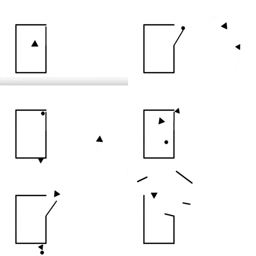
Below is a short animation dating from 1944. It was created by experimental psychologists Fritz Heider and Marianne Simmel. They asked 34 of their undergraduate students to watch it and then describe what they saw.
It’s fun. Watch it for yourself and tell me what you see.

Heider & Simmel’s animation (1944)
What did you make of the animation?
- Did you see characters?
- Was there a story?
- Did you see relationships between the shapes?
If you DIDN’T see any of the above, you would be unusual. Most of us can’t help seeing something like the following:
The large triangle is an authority figure — possibly an older male.
The two smaller shapes are usually seen as a younger couple. We watch as the larger triangle chides them, and tries to intimidate the smaller triangle into staying away from the small circle. However, unbowed, the smaller triangle returns to reunite with the circle and eventually they run away together.The large triangle responds with destructive rage.
Of the undergraduates asked to describe what happened in the animation:
- 32 referred to the geometric shapes as people
- 1 referred to the geometric shapes as birds
- 1 referred to the geometric shapes as… well, shapes.
Most were able to imply subtle and complex human traits on the shapes such as jealousy, hatred, courage, and love.
Of course, this is all despite the fact that these ‘characters’ have almost none of the normal traits we expect in story characters. They have no face, eyes, mouth, or limbs. They can’t talk or make sound and there are no subtitles filling in the cognitive gaps.

Animators use ‘Squash and Stretch’
The shapes don’t even stretch, compress or distort — a traditional and well-loved story-telling tool of animators. In purely technical terms, it makes South Park look like 3d motion capture.
Yet, somehow we’re able to get a tiny Romeo and Juliet played out in the motion of simple black shapes. In short, we read a lot of meaning into how something moves.
So, now every sliding menu becomes Kevin Spacey?
Of course not.
But if UI elements have to move — to shrink, expand, glide, bounce, spin and rock — sometimes the way it moves is as important to the UX as what happens when it gets there.
