A Guide to Positive Reinforcement in UX Design
We love to point out others’ mistakes. However, what about providing positive feedback when a user completes a critical action?
Often, applications lack positive feedback mechanisms that contribute to a more positive user experience. Positive reinforcement focuses on rewarding or strengthening correct user behavior.
We show the user a fun badge when they create their first invoice using our invoicing application. By turning a key action into a positive experience, the user can learn the application quicker and feel more confident using it.
In this article, we’ll discuss the following topics:
- What’s the difference between positive and negative reinforcement?
- How to use positive reinforcement in UX design (examples)?
- How to use positive reinforcement to reduce worries?
- What’s the link between Nudge Theory and positive reinforcement?
- When should we use positive reinforcement?
Positive vs Negative Reinforcement
First of all, we need to understand the difference between positive and negative reinforcement.
Positive reinforcement strengthens the likelihood of a particular response by adding a stimulus after performing the behavior.
Negative reinforcement also strengthens the likelihood of a particular response. However, it accomplishes this by removing an undesirable consequence.
For example, every student has experienced both positive and negative reinforcement when studying for exams. Let’s say your parents allow you to meet some of your friends if you study every night during the week. This is an example of positive reinforcement as you receive the desired outcome as a consequence of particular behavior.
Let’s say you don’t have to mow the lawn during the weekend when you study all week. This is an example of negative reinforcement as you remove an undesirable consequence. Who likes mowing the grass anyway?
Note that in both examples, the goal of getting good grades is strengthened by adding a stimulus or removing a negative consequence.
Positive Reinforcement in UX Design
Now that we have a clear understanding of positive reinforcement, let’s apply this information to UX design.
Positive reinforcement is essential for frequently used applications as it helps to strengthen a behavior. Often, a user isn’t motivated to take action. However, motivation is crucial for creating a specific behavior.
Therefore, positive reinforcement can generate the right motivation for the user to take action. By rewarding the user for taking action, we strengthen their behavior. However, note that consistent and predictable rewards will weaken the reinforcement. The article “Use Unpredictable Rewards to Keep Behavior Going”, by Psychology Today, teaches us that we should use unpredictable behavior to keep this behavior going.
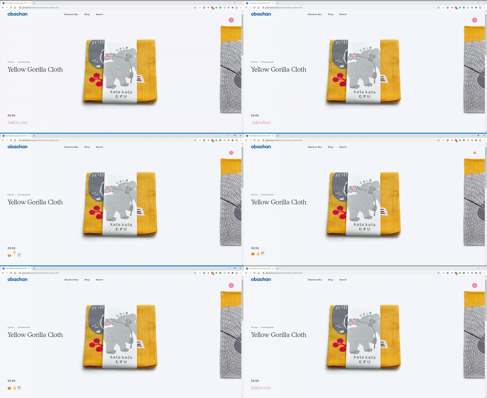
Obachan implements a great, yet small, example of positive reinforcement on its website. Each time a customer adds a product to their shopping basket, the website shows some animation paired with celebratory emojis. Even a short response like this can encourage users to add items to their basket, which is the most important webshop action.
Source: getobachan.com webshop
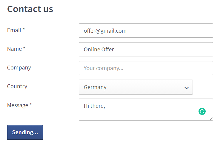
Let’s take a look at AdEspresso’s contact form. Once you submit their contact form, the button text will update to “Sending…” to display the current status. In other words, the website lets you know they’ve received your submission and are processing your request.
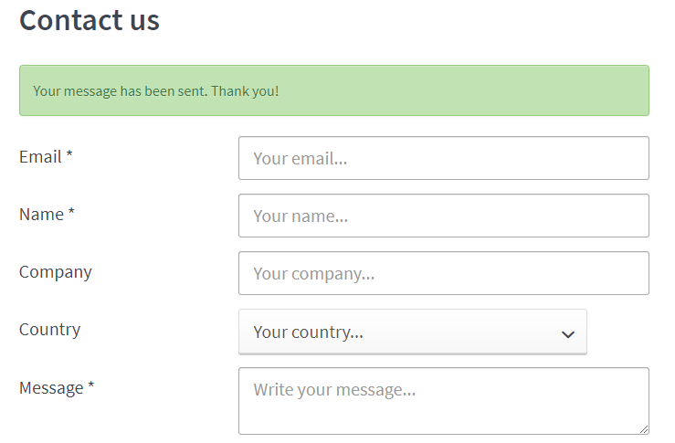
Once the request finishes, we’ll see a toast message that confirms our submission. This example shows how positive reinforcement can remove the user’s feeling of being left hanging in the air.
We should not only warn the user when they’ve made a mistake, such as not meeting the requirements for the password field. It is as important to tell the user that they are doing things right.
We understand this might seem like a small UX addition. However, who doesn’t like to receive a pat on the back? Communicating the form submission’s success to the user is like patting the user on the back, creating a pleasurable user experience.
Let’s take a look at other real-life examples.
Examples of Positive Reinforcement in UX Design
First of all, Taxfix’s application helps expats file their taxes in Germany. The app takes you through a series of questions to end up with your tax declaration. On top of that, the app tells you how much money the tax office will refund in many cases.
When we complete the tax declaration, Taxfix shows us a positive message for completing the daunting task of filing your taxes.
On top of that, this action is reinforced by showing the amount of money we’ve saved by using Taxfix. They do an excellent job at creating a positive user experience by directly showing the positive benefits we’ve gained from completing our tax declaration.

Source: YouTube promotion video for Taxfix
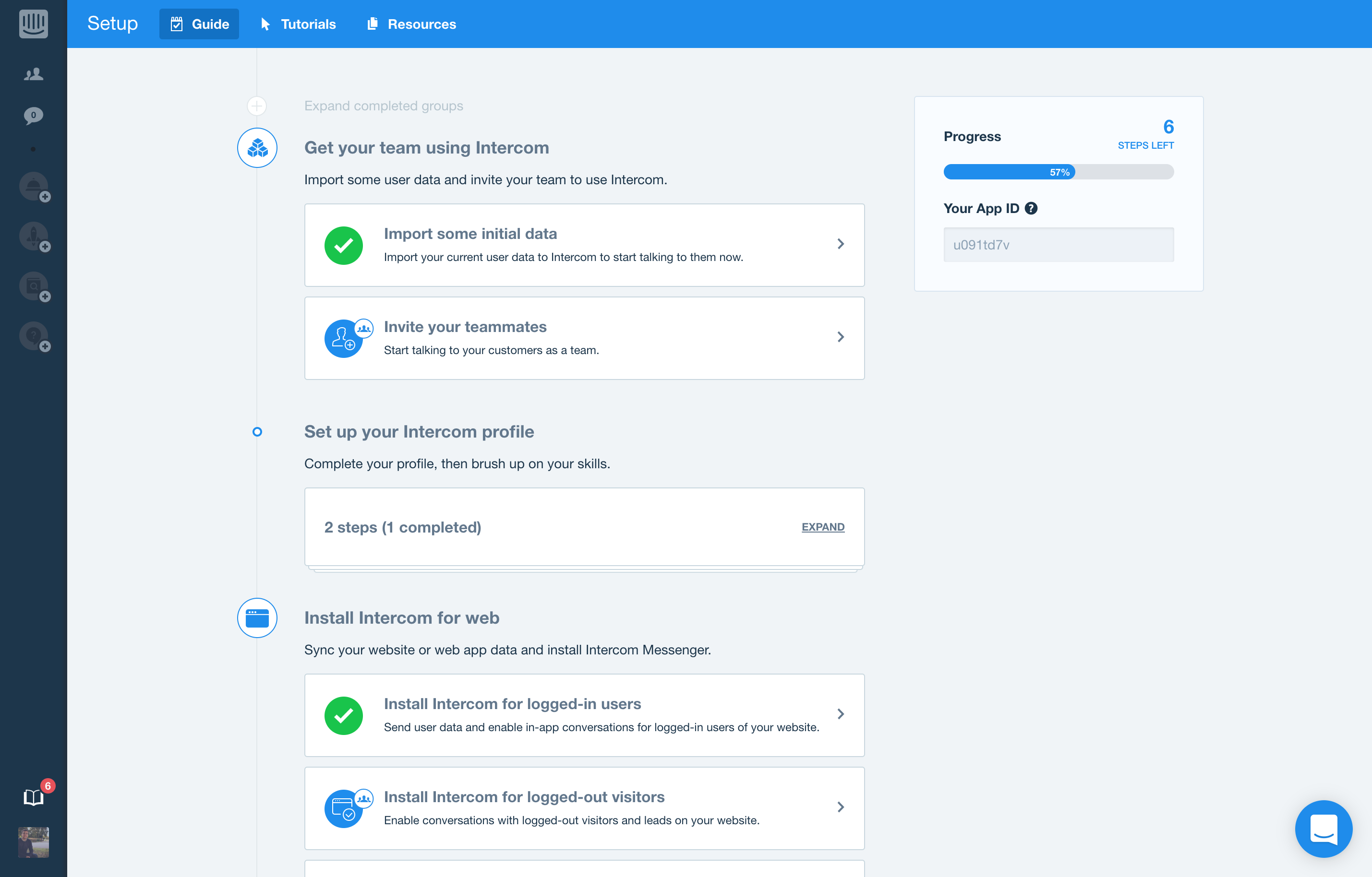
Further, let’s take a look at Intercom.com. They offer a great onboarding workflow for users trying to set up their first Intercom conversational project. They both show the overall progress as the progress for different individual onboarding steps. It gives you a detailed overview of what information is still required. Furthermore, you can leave the onboarding process and pick it up later where you left off.
Some other simple examples of positive reinforcement include:
- Telling users what they’ve accomplished, such as a form submission.
- Rewarding users for completing key actions on your web app.
- Telling users how to prevent this mistake in the future, instead of telling what they did wrong. For example, offer them the option to set a default value for a form element, or to switch on a particular setting that prevents a particular mistake.
- Adding visual feedback to user interactions.
- Using animations to provide users with positive feedback about their progress.
- Reducing worries by providing feedback, which allows users to build confidence with the tool they’re using.
- Providing information about why a form submission might take longer than expected, or about what’s happening in the background. For example, converting a video from one video format to another takes time. Communicate this openly using a toast message that informs the user about the slower process and that provides the user with a progress bar to prevent anxiety that the tool isn’t working.
In short, we can reinforce a user’s positive actions by providing positive feedback through messages, toasts, notifications, or status updates.
Use Positive Reinforcement to Reduce Worries
A user might feel worried or even anxious when an interaction with an interface doesn’t provide any feedback.
Let’s get back to the example of the submission form. What if AdEspresso didn’t provide any status update on the submit button or didn’t show a toast message confirming that they’ve received our submission?
Many users will try to fill out the form a second time while the submission might have been successful. It’s a natural human reaction when we receive no feedback about our actions. However, this increases feelings of worry or anxiety for users.
Let’s look at this small example, where not providing positive feedback for a submission form can cause more significant issues.
Let’s say a competitor allows users to upload their finished projects. However, the submission form doesn’t provide any feedback. Therefore, many participants try other means of communication to get in touch with the competition organizers, as they’re unsure of the project submission status.
Participants could use an alternative email address the website lists, social media platforms, or even submit via a LinkedIn connection. The competition organizers receive submissions through many different communication channels, which adds extra overhead to stay on top of all submissions.
In short, positive reinforcement can prevent this behavior by simply providing feedback about the participant’s project submission. In other words, positive reinforcement can provide clues to the user about what’s happening.
Positive Reinforcement and Nudge Theory
First, let’s explain the “Nudge Theory”. Nudging is an umbrella term for methods to change people’s behavior by modifying the choice context.
Imagine you go to a grocery store where they put unhealthy products at eye level. Next, you go to a grocery store where they put healthy products at eye level. By placing healthy foods at eye level, we create positive reinforcement and encourage users to buy more healthy products, while the first grocery store encourages the opposite behavior.
A similar experiment has been conducted by iNudgeyou to discover the effect of the size of the food’s units. They offered both apples and cake at a two-day conference. On the first day, they served whole units of apple and cake. Here, participants ate 93.9 grams of the cake on average per person compared to 12.7 grams of apple.
The next day, iNudgeYou cut the apples and cake into smaller pieces. Now, participants ate 61.2 grams of cake on average per person and 20.4 grams of apple. Participants ate 60% more apples while reducing cake intake by 35%.
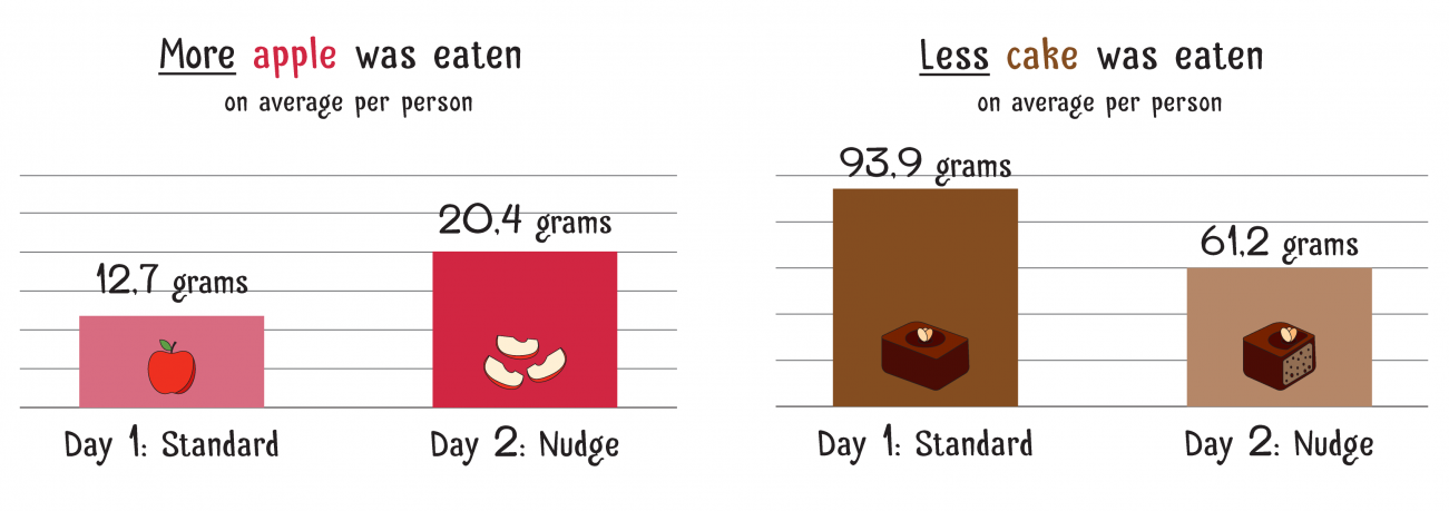
Image source: iNudgeYou experiment about nudging people to healthier food
Now, we can simulate Nudge Theory in interface design. Adding a small animation to the “Add to cart” button that’s triggered whenever the user scrolls down the product page, we can nudge the user into clicking the button.
Some webshops try to draw attention to the shopping basket when you’ve added a couple of items and haven’t added anything new for the last ten minutes. Here, the website wants to draw your attention to the shopping basket to remind you about checking out the products you’ve already added.
When Should We Use Positive Reinforcement?
The most obvious place to add positive reinforcement to web interactions is during data-entering actions and form submissions. Most online actions are centered on data entry — actions such as logging in, signing up, commenting, entering details for a purchase, or updating a status.
Here, we find the greatest likelihood of errors introduced by users. To reinforce those actions, we should provide positive feedback about the user’s interactions. Often, users feel insecure about the required data format. Here, we can take away any doubt by providing positive feedback. Let’s say the user fills in a supported postal code format. Here, we show a green checkmark confirming the data is correct. This way, we take away any doubt and make the experience of filling out a form much more pleasurable.
Moreover, we can strengthen the relationship of a user with a particular tool through positive reinforcement. A user can quickly gain confidence in using the tool by providing frequent positive confirmation for their actions. For example, an invoicing tool can show the user a badge or celebratory emojis when they’ve created their first invoice.
In short, positive reinforcement is vital for improving the UX of a website.
To end with, here are some interesting articles I recommend as further reading:
- “How to Use Gamification to Reinforce Learning”, by Sarah Gallo
- “6 Proven Techniques for Getting Clients to Pay You on Time”, by Joseph Ola
- “New Experiment: Just A Simple Trick Can Nudge You To Eat Healthier”, by Pelle Guldborg Hansen.