8 Tips for Improving Bootstrap Accessibility
A few years ago, I wrote about my experiences on developing a Bootstrap version 3 project to be fully accessible for people with disabilities. This focussed mostly on Bootstrap accessibility in terms of front-end design. (It didn’t cover accessibility in terms of screen readers, as that’s a whole other story.)
While I could see that the developers behind Bootstrap were making an effort, there were a few areas where this popular UI library fell short. I could also see that there were issues raised on the project that showed they were actively improving — which is fantastic, considering how approximately 3.6% of websites use Bootstrap.
Recently, Bootstrap version 4 was released, so let’s take a look and see if any of the issues I had in the past have improved.
What We’re Looking For with Design Accessibility
There are a few things to consider when designing a website with accessibility in mind. I believe these improve the user experience for everyone and will likely cover a lot of points you would consider anyway.
Layout
One way to achieve accessibility is by having a clean, easy-to-use layout that looks good on all devices, as well as looking good at a high zoom level. Up to 200% is a good guide.
Bonus points: having front-end code that matches the layout is also good for users who access the Web with a screen reader or by using a keyboard instead of a mouse.
This allows people to use your website easily irrespective of how they’re viewing it.
Font
An easy-to-read font is also a big plus for accessibility, as there are some disabilities which make it difficult to read adorned or cursive fonts.

Cursive fonts can be difficult to read
As much as people are against comic sans, for example, it’s actually one of the easiest fonts to read if you have dyslexia, which is as high as 15% of the population.

Comic Sans, whilst disliked, is easy to read
Sans-serif fonts like the widely used Roboto and Open Sans are easy to read in general, so picking one from that family is a good choice.
Color
Color choice is also a big consideration. If your colors are too similar contrast-wise, they can make text difficult to read.

So it’s important to pick colors that stand out. You can test this by using a color contrast checker tool.

Let’s Start Testing Bootstrap Accessibility
Let’s take a look at how Bootstrap stacks up against these criteria.
Layout
While your website might need a custom layout, there are quite a few example layouts that Bootstrap provides, as well as a grid system. Quite often people use Bootstrap just for the responsive grid system, as it’s very robust — showing content in columns on desktop and collapsing gracefully onto tablet and mobile views.
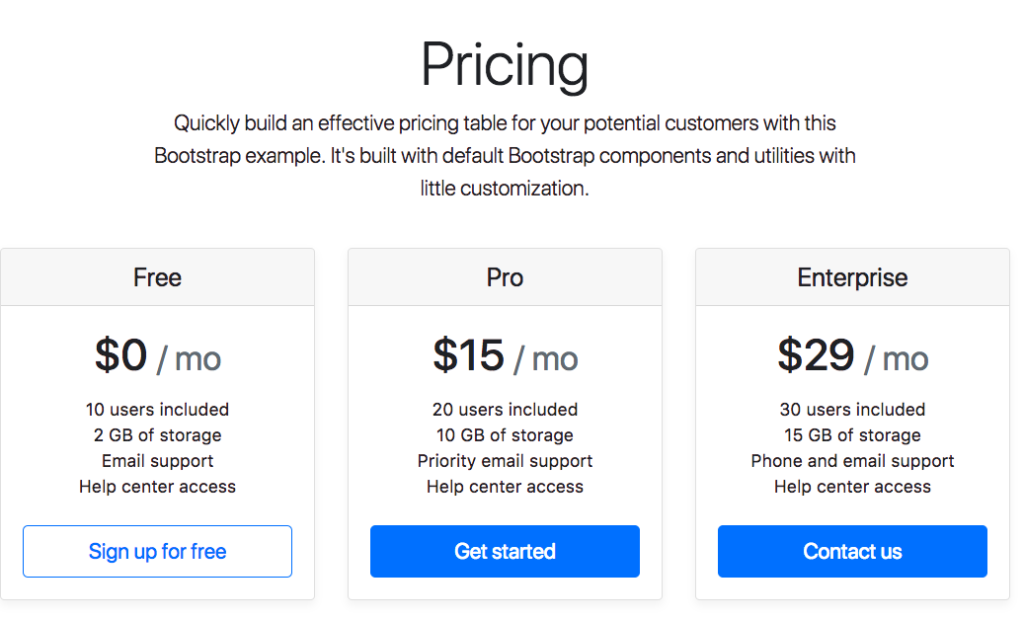
Desktop view
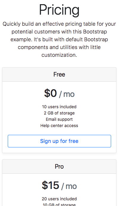
Mobile View
Bonus points: the layout part where it can get a bit tricky to implement is getting the code to match the layout, so when you’re navigating with the keyboard (pressing the tab key) as opposed to the mouse, it follows a logical order and you can access all areas.
In the example below, there’s a Back to top link, but after that there are two more navigation links, so if you select it by keyboard your view goes up to the top, but if you press tab again, you go back down to the bottom links.

Another example is this form where the keyboard focus goes to the sidebar before the main form, which might be a bit confusing.
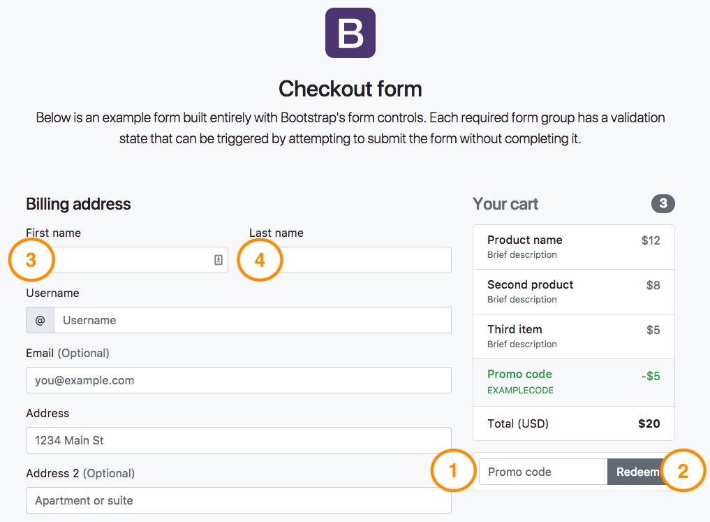
While these examples are a little annoying, it’s an improvement over last time when I tested Bootstrap 3’s keyboard focus and it was nearly impossible to use their website with a keyboard. Another thing they need to add in order to improve Bootstrap accessibility is replicating their hover mouse styling to match their focus keyboard styling. For example:
a:hover,
a:focus {
  text-decoration: underline;
}
At the moment, when navigating by keyboard, there are no visual cues to show you where you are on the page. Adding this in for focusable elements such as links, inputs, and buttons would greatly improve the Bootstrap accessibility rating.
Font
By default, Bootstrap comes with Helvetica Neue which is a sans serif font stack.

Sans Serif is a very friendly and easy to read font, so I think this is an accessible choice. They’ve also set it up so it’s compatible with a number of browsers and mobile devices, so it looks consistent no matter what you’re using. The font sizes are also set up using em units (as opposed to px) so will scale well on smaller devices and on zooming.
Color
The default colors that Bootstrap comes with are not accessible as per the developers’ own Bootstrap accessibility documentation.
Most colors that currently make up Bootstrap’s default palette — used throughout the framework for things such as button variations, alert variations, form validation indicators — lead to insufficient color contrast.
They have gotten better from version 3 to version 4, but it’s still important to test any color combination you have on your website to make sure it has a high enough contrast. Webaim has a good color contrast checker, otherwise you can get a browser plugin to help check.
For example, here’s the outcome when you test their default blue color. It has a rating of 3.98:1 (up from 3.63:1 from last version). Which is okay if the font size is larger than 18px, but otherwise it’s not high enough.
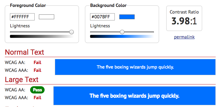
Default blue color contrast
Another example is their alert box coloring. It has a very high rating of 8.25:1, which easily passes (up from 4.53:1 last version, which only just passed).
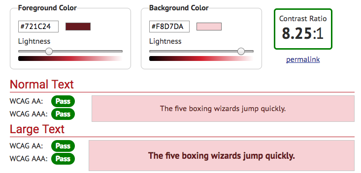
Default alert color contrast
The other alerts had a similar rating — which is great, as they aren’t normally customized, unlike the default blue which would be replaced with the website brand color. Just make sure whatever color scheme you do override it with passes the color contrast check.
Bonus points: Running your colors through a color blindness check is also a great thing to do for accessibility. Approximately 8% of the male population has red green color blindness so will have trouble with some color combinations. There are a few tools that show your site with a color blind filter, if you’re unsure.
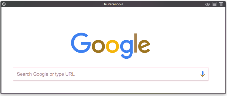
Using Sim Daltonism
Double extra points: Checking out your website with high contrast color settings is also good for accessibility. Some people with low vision customize their browser settings for high contrast to help them see more clearly. For example, if you head into Firefox’s preferences settings, you can set the browser’s background and text color:
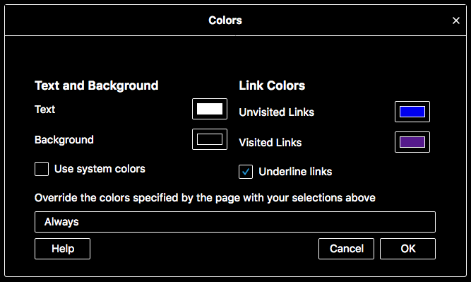
Firefox color preferences for high contrast
Last time when I tested Bootstrap version 3 this way, the parts that suffered were the inputs and buttons. The text on both was completely obscured when this setting was turned on, which made the site unusable. This time it faired a little better in some parts.

High contrast good example
However, in other examples, the background stays black and you can’t see the text you type into the input or that on the button:
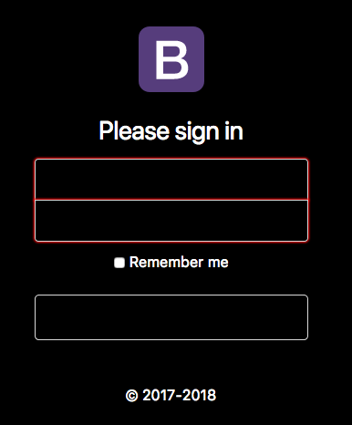
High contrast poor example
Thankfully, this is a fairly easy fix: the inputs just need their background color to be transparent rather than white.
input {
  background-color: transparent !important;
}
The outlined buttons (and link buttons), rather than the block buttons, fair much better as well.
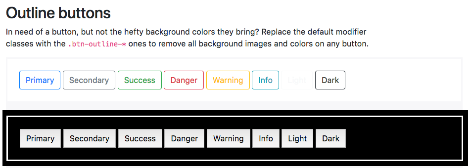
Outlined buttons high contrast
So Is Bootstrap Accessible?
Out of the box, the short answer is no, not quite. The developers have added in a lot of Bootstrap accessibility features with their documentation, and it’s clear they value it, which is a great step. However, that isn’t the end of the story.
Designers and developers also need to have accessibility in mind when working on a website. With some care and modification, a framework like Bootstrap can become accessible like any website, but it’s up to website developers to take the next steps to ensure their sites can be used by as many people as possible.
If you’ve heard about Bootstrap but have been putting off learning it because it seems too complicated, then play through our Introduction to Bootstrap 4 course for a quick and fun introduction to the power of Bootstrap.
