Introducing Microsoft’s Fluent Design System
We've seen leading companies implementing either their own design languages, or existing ones such as Google's Material Design, to offer their users a more unified, rock-solid user experience. Think of a design language as a well-documented guideline for creating apps and websites with an intuitive, engaging and consistent appearance.
Microsoft recently unveiled their Fluent Design System, which is intended for use on a wide range of Windows 10-based devices (i.e. Universal Windows Platform (UWP) Apps). It's meant to extend the already-existing "Microsoft Design Language 2", unofficially yet broadly known as "Metro". Also, at the time of writing, 80% of the Fluent Design System has been integrated into Microsoft's already-existing web framework, named Microsoft Web Framework (MWF).
While that's a story for another time, it's worth knowing that the design concepts outlined in the Fluent Design System (which we'll discuss) can be implemented for both the web and apps. Let's lay out the key characteristics of the the Fluent Design System and acquaint ourselves with its methodologies, and how developers can implement the language into Windows UWP apps.
TL;DR…
If you're curious about Fluent Design and you'd rather watch a summarising video, here are the official Introduction to Fluent Design and Build Amazing Apps with Fluent Design videos that were watched at the Build 2017 event.
It should be noted that the Fluent Design System is in active development, so some of the design principles and features may change as the design language progresses. Always make sure to check the official documentation for up-to-date information.
Design Concepts and Principles
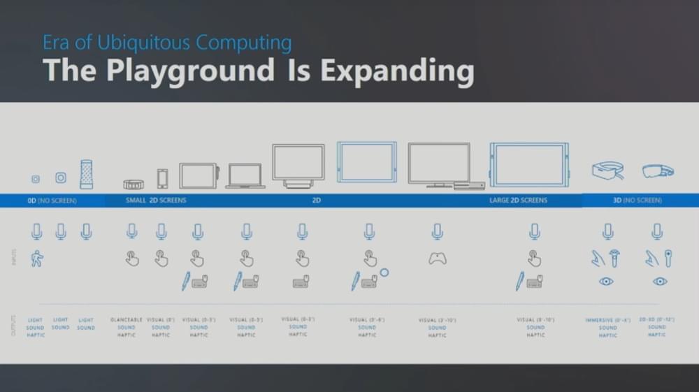
We're living in the era of smart devices, which goes beyond desktop, laptop or tablet devices to include any kind of equipment with networking capabilities (i.e. wearable technology and so on…). Many of them (e.g. smartphones) are bundled with screens of different sizes and resolutions, while others (e.g. sensors) don't offer a display. Microsoft aims to make their design language adaptive to all these kinds of devices.
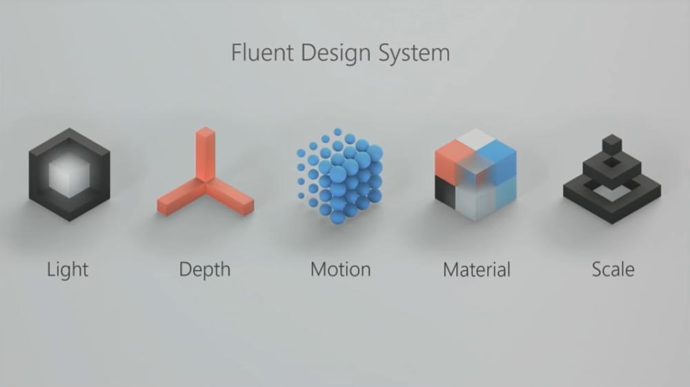
Microsoft's new Fluent Design System is based on the following five foundational elements. Each and every element brings a unique look and feel to the UI and UX.
- Light: enhancing user orientation during selection and navigation, creating the necessary atmosphere for user guidance.
- Depth: utilizing the z-axis to add an extra dimension to the 2D display, a sort of revision of flat design withed added layers, stacks of elements and 10000% more clarity.
- Motion: introducing smooth, natural transition between elements as well as seamless shifting between windows and screens, giving the feel of continuity between each user action.
- Material: equipping elements with an exclusive feel and touch experience, tempting users to interact.
- Scale: focusing on design consistency and interoperability across all kinds of devices, from 2D to 3D.
Getting Started
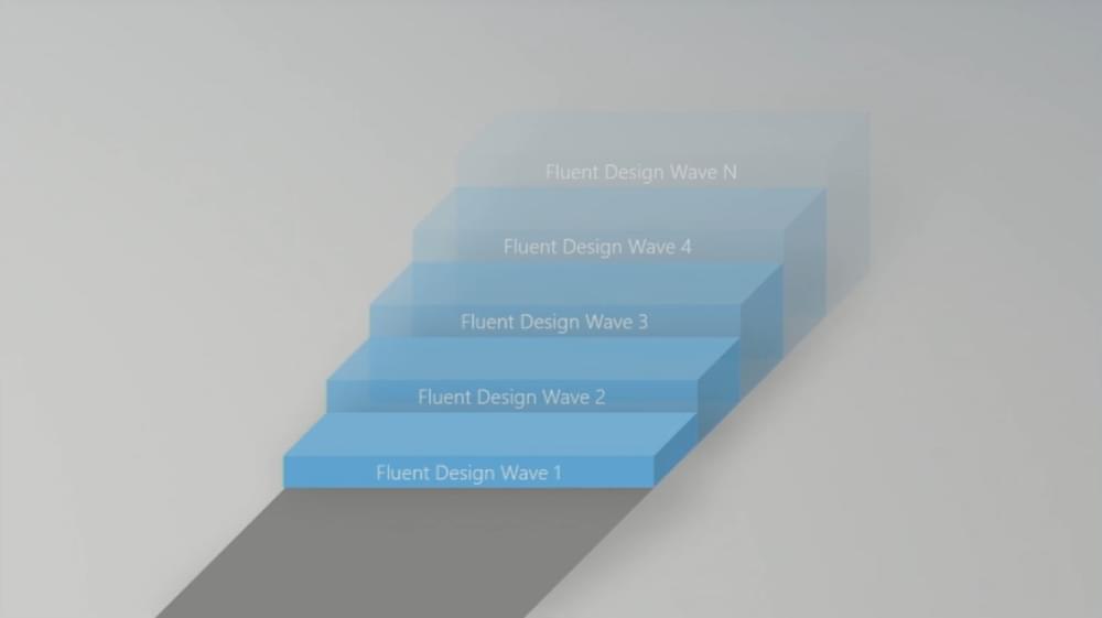
Let's take a look at the new features that have been adopted into the Universal Windows Platform app framework, and how the Fluent Design System concepts aids their implementation. The four features are:
Acrylic
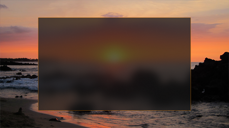
Acrylic enables us to apply tint and opacity to graphical objects and subsequently offers the UI a materialized look which does not innately rely on solid colors. For the developers out there, it exists as a C# brush class. It's also worth noting that Fluent Design incorporates Microsoft's Universal Color Palette, a diverse set of colors frequently used in Windows apps. UWP apps generally use 48 colors, whereas on Xbox recommends 21 TV-safe colors.
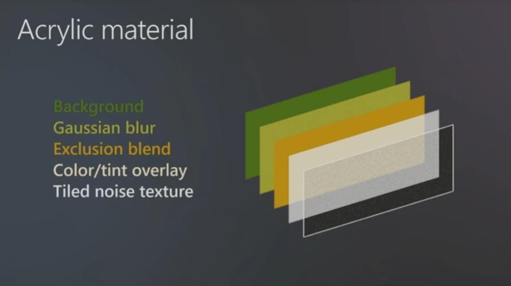
How the design concepts are applied:
- Light: light draws the user's attention. In the words of Microsoft, it's "warm and inviting", so it's a terrific way to illuminate information by establishing optimal contrast between the foreground and background elements in a natural way.
- Depth: soft shadows allow for layered elements, creating a sense of visual hierarchy.
- Motion: illuminating and harmonious UI transitions.
- Material/Scale: works with displays of varying sizes and resolutions, offering a natural and consistent sensory visual style across Windows as a whole.
Parallax

Parallax is becoming an increasingly trendy technique for establishing depth, where two or more objects need to shift at different rhythms as the user scrolls through the content. Parallax can be a pretty awful experience for the user when handled poorly, especially when there was no need to implement such an experience. Fluent Design lets us handle it with care.
How the concepts are applied:
- Depth: by designing emerging and submering elements, we can create the impression of deepness and immersion.
- Motion: combined with the Connected Animation features of the UWP framework, we can create scrolling effects that feel natural and expected while bringing content to life.
Reveal
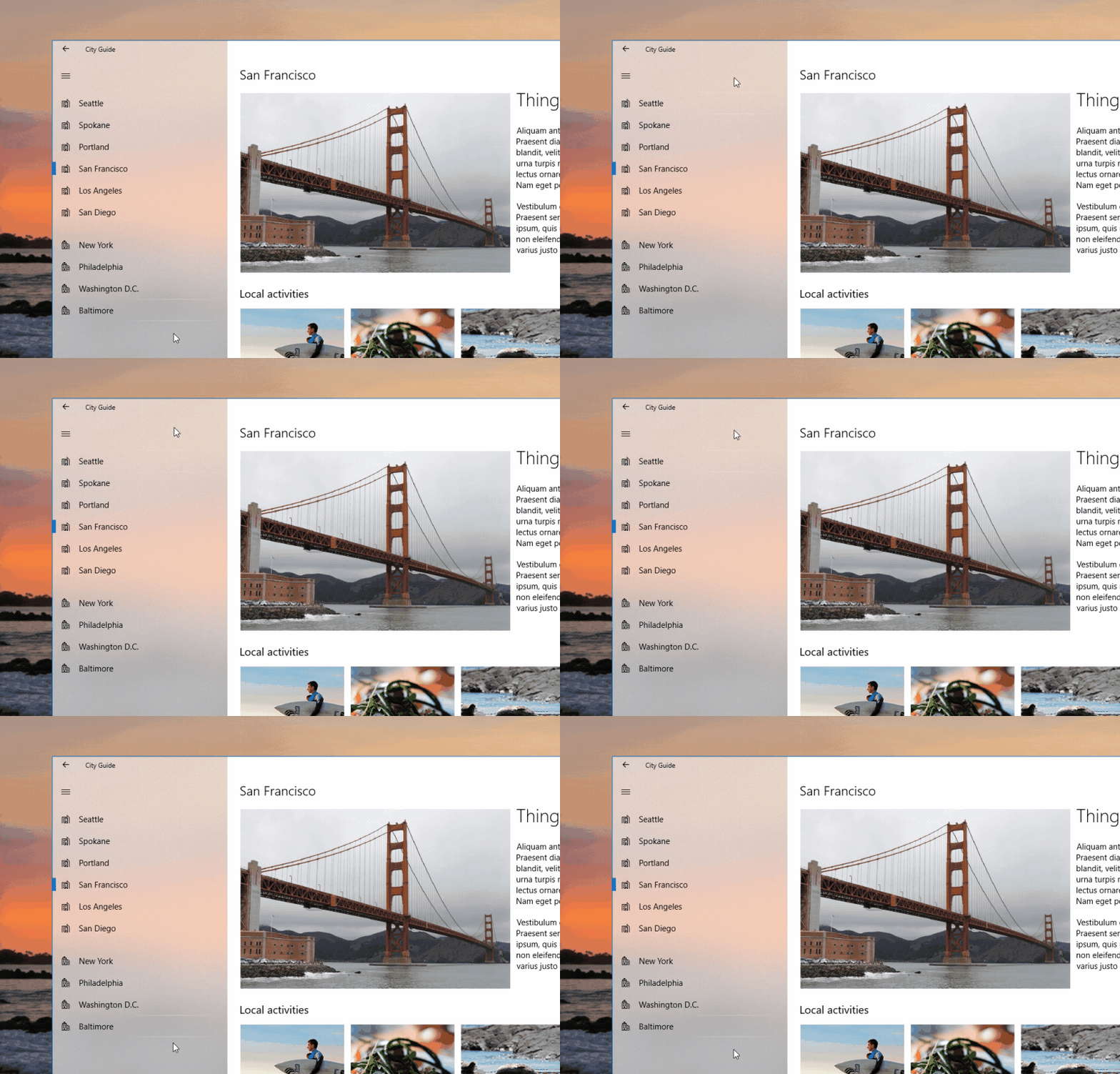
Reveal is an effect that uses lighting to assist the user when navigating through the UI. Not only can it be used it reveal, like the name suggests, hidden elements and borders, but it also helps to reaffirm the user selection by highlighting it.
How the concepts are applied:
- Light: like with the Acrylic features, reveal uses light to highlight user selection and reveal hidden borders and elements.
- Depth: you'll use depth to access hidden content in layers, revealing content in a relevant and contextual way.
- Material: a material outlook on revealed elements will offer a playful feel to the selection and navigation experience.
- Scale: reveal is an adaptive behaviour that will make sense on a variety of screen sizes, especially on Xbox where users are accustomed to an immersive, animated and layered experience.
Connected Animation

Page-to-page navigation has been the traditional way of navigating user interfaces for decades now. Fluent Design strives to change this by using their new Connected Animation features to retain seamless continuity as the user animates from one state to another state via a series of micro-interactions.
How the concepts are applied:
- Depth/Motion: with the use of Light, Motion and Material, we can establish a visual hierarchy that draws the user's attention to the next logical step, eliminating confusion and creating coordinated elements that users can interact with fluently. At any stage, the user will know what they've done, why they've done it, and what they need to do next, all because of intuitive animations that uses visual storytelling to suggest next steps.
- Scale: Connected Animation is used in a way that makes users feel comfortable regardless of input (mouse, touch screen, etc).
Conclusion
While there are various different design frameworks to choose from, knowing which one to choose largely depends on the audience. When it comes to designing cross-platform apps, then it may be a case of implementing several different design systems, for example Apple's Human Interface Guidelines for iOS/macOS, Google's Material Design for Android, and of course, Microsoft's Fluent Design System for devices that are running Windows.
Not only does Fluent design outline solid design concepts over the top of two already-established, systematic code frameworks (UWP for apps, and MWF for web), but they work in a manner that makes sense Windows users, much like iOS apps work in a very iOS-like manner, and Android apps work in a very Android-like manner.
By connecting the five design concepts outlined in Fluent Design — Light, Depth, Motion, Material and Scale — with the new features being added into the UWP App framework, we can design intuitive, seamless experiences that help users interpret interfaces as easy as they would interpret real life objects and interactions.
