The Final Nail in the Icon Fonts Coffin?
![]()
Using vector graphics as navigation icons has always made perfect sense.
But it seemed to be the arrival of the retina screen (2011-ish) that really lit a rocket under the idea.
Almost overnight icons that had looked fine on standard screens suddenly looked like they’d been brutally hacked from an old newspaper with rusty pocketknife. The minor niggles we might have had with scalable vectors suddenly seemed well worth tackling.
At the time – as the case is today – there were two ways to deliver vectors to browser and each had their pros and cons.
Web fonts vs. SVG
Although both technologies had been around for a long time, web fonts seemed to grab the early lead. Many of us were already comfortable working with fonts, and there’s no doubt that plug-n-play solutions like FontAwesome made getting started that much easier.
But things have been changing over the past year or so.
While people are beginning to appreciate the power and flexibility of SVG, some of the ‘gotchas’ attached to icon fonts have become more apparent. These include:
- an arcane patchwork of font-face support (and bugs)
- positioning limitations (CSS line-height, vertical-align etc)
- font file re-authoring overheads
- a lack of tonal/color options
We can now add a handful of new items to that list.
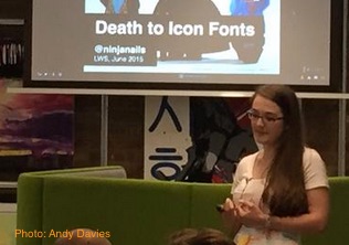
A couple of weeks ago Seren Davies (@Ninjanails) gave a talk at the London Web Standards group called ‘Death to Icon Fonts‘. Seren is dyslexic and detailed some of the issues that icon fonts introduce to her browsing experience.
Why Are Icon Fonts and Dyslexia a Bad Mix?
Font choice has a huge bearing on readability for dyslexic users. Ironically, for all the disdain that Comic Sans has attracted over the years, it’s often cited as one of the most readable typefaces for dyslexic users.
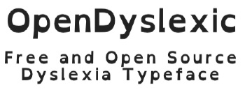
This has meant that it’s very common practice for dyslexic readers to override the default font on a site with their own more readable font – perhaps something like OpenDyslexic.

And this is where we hit problems.
To speed things up, font icons are generally bundled into a single site-wide font that also contains the alphanumeric characters. The icons are placed in an undesignated ‘private’ section of the font.
When a user overrides this font, they replace the alphanumeric characters but there are no replacements for these custom icons. We get left with big, ugly, unhelpful empty boxes instead.
![]()
Github provides a perfect example of where this problem presents. It’s not a pretty situation, is it?
Seren also talks about the way that screen readers treat icon fonts. Using a unicode star icon to denote a ‘Favorite’ button might feel very clever and resourceful.
That is, until you realize that a screen reader blithely announces that button as the far more cryptic ‘Black star.. favorite!..’.
Unfortunately when you encode a graphic as a typographic character you are almost demanding that any screen reader tries to try to make sense of it.
Perhaps we’re getting to the point where we realize that embedding pictures into fonts was a temporarily convenient detour rather than a true way forward.
I think that’s where I’m at anyway.
There are plenty of interesting insights in Seren’s slides, though currently nowhere to see to her full talk online.
Hopefully we’ll get that opportunity in the coming months.

