Dark UX: Dirty Tricks and Tactics to Avoid in 2017
Like most people, I was glued to my screens the night of November 8, 2016. The New York Times was my go-to media outlet for election results; after all, I trust its information more than any other source out there.
The publication included an “election forecast” dial at the top of the page.
The dial on the far left—“Chance of Winning Presidency” — was jittering like crazy. My anxiety was already high, but this drove it through the roof.

GIF: NYT Election Ticker animation.
As New York Magazine writer Jake Swearingen put it:
“It was agonizing for supporters on both sides, but also kept you glued to the dials—the feeling of immediacy was both intoxicating and anxiety-inducing compared to the staid talking-head roundtables, on network and cable news…”
But it turns out the constant swings back and forth weren’t real-time updates to Trump and Clinton’s chances. The New York Times designers had used JavaScript to code a randomized ‘jitter function’ into the dial. Presumably, they’d concluded that the ‘real’ data coming in wasn’t dramatic enough.
This is a classic case of “dark UX”: an interface crafted to trick, mislead, or manipulate users. Let’s examine four dark patterns and why it’s in your best interests to steer clear of each.
1. Forced Continuity
Forced continuity is one of the most common dark patterns. Chances are, you’ve been its victim at least once. In return for a free trial, you give a platform your credit card information.
I’ll just cancel the trial when it’s about to finish, you think.
The problem? These companies make unsubscribing as difficult as possible. You’re not given any reminders your trial is about to expire, and if you do manage to remember, you’re often forced through a confusing, frustrating cancellation process.

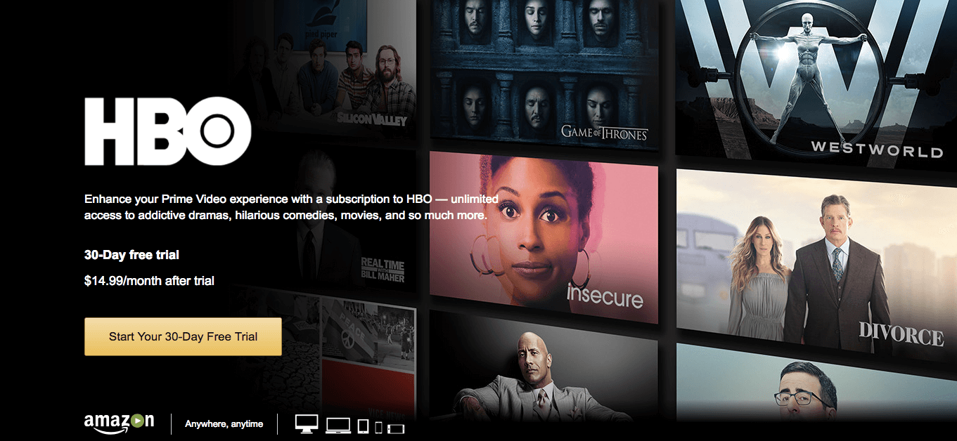
I recently reviewed my bank statement and found I’d been paying for HBO Go for the past six months.
Sure, HBO got my money for half a year—but at a high price. I no longer trust the company.
Beyond customer loyalty, there’s another business case for steering clear of this pattern. Requiring a credit card to enroll in a trial adds friction, so you’ll see fewer sign-ups.
Many users who have been previously burned (like me) will skip the trial altogether. Ultimately, your conversion rate will typically be higher typically be higher if you ask people for payment details after their trial has ended.
2. Opt-Out Emails
Most ecommerce sites require you to opt out of joining their newsletter. If you’re in a hurry, or not paying attention, you probably don’t notice the box marked “Sign me for up for announcements and promotions.”
In the long run, however, this tactic harms your relationship with your users. No one appreciates getting emails they don’t remember signing up for.
When comedian Louis C.K. created his site, he purposefully “made his design choices based on what he hated about the internet.”
“When my website guy said, ‘Do you want the button pre-chosen that says yes to the mailing list, or the no button pre-chosen?’, it’s always ‘yes,’ so I made it ‘no,’” he explains.
According to C.K., only the most committed fans receive emails from him. But the results have been spectacular: In one week, his site generated $1 million in sales.
Asking your customers or users to opt in rather than opt out can pay enormous dividends. Although you’ll collect fewer email addresses, your engagement and click-through rates will be higher—like Louis, you’ll only be emailing your biggest “fans.”
3. Unsubscribe Links
It’s pretty hard to avoid promotional emails—and unsubscribing is even harder. Computer scientist Lea Verou created Spot the Unsubscribe to document the complex or hidden options buried at the bottom of promotional emails.
Amazon, for example, get a little tricky by styling their Unsubscribe link in a markedly lower contrast style to all other links. As you can see, locating this link is pretty difficult.

Source: spottheunsubscribe.tumblr.com
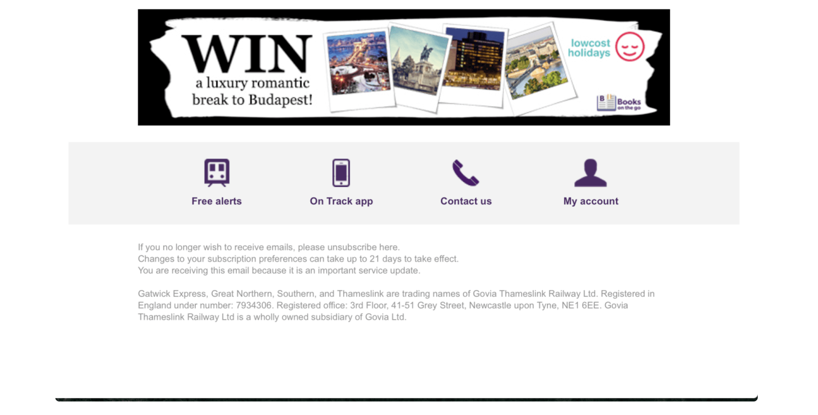
Other’s fall firmly in the realm of comic farce. We’ll leave you to Find Waldo in this example from a UK railway company.

Source: spottheunsubscribe.tumblr.com
You might be tempted to bury your Unsubscribe link, but keep in mind unengaged subscribers are usually the ones attempting to unenroll from your emails—and they’re not converting at high percentages, anyway.

If you’re concerned your unsubscribe rate is too high, offer subscription preferences. Recipients who can tailor the content and frequency of their emails are typically more engaged and satisfied.
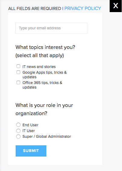
BetterCloud, a SaaS management platform, gives subscribers various options from the moment they sign up:
This two-question survey makes it far likelier the average subscriber will find value in the emails.
4. Friend Spam
According to Harry Brignull, UX consultant and founder of Dark Patterns, “friend spam” refers to the technique in which a site or game asks for your log-in credentials for a supposedly harmless reason—but goes on to post from your account without your knowledge or permission.
Think shady companies are the only ones who’d engage in friend spam? Think again. LinkedIn was hit with a $13 million lawsuit in October 2015 thanks to its “Add Connections” feature, which scraped users’ email addresses, then sent repeated messages to their contacts requesting they connect on the platform.
The victims said it was almost impossible to stop LinkedIn from sending these messages.
Although LinkedIn has pledged to be more transparent with users, it’s not the only popular social networking platform to use friend spam.
Facebook recently began auto-starting new conversations between two users who have just become friends. To give you an idea, if I accept a friend request from John Doe, I’ll get a notification saying I have a new message from John Doe—and John Doe will get a notification saying he has a new message from me.
Although you’ll probably avoid LinkedIn’s fate, friend spam still carries a high cost. If and when your users discover the subterfuge, they’ll feel betrayed. Our social identities are quickly becoming our identities, period. Co-opt those identities for profit and you’ll lose all credibility.
Dark UX might boost your bottom line in the short-term. But ultimately, these patterns are bad for business—so don’t exploit the Dark Side.