7 Trends That Will Define Web Design in 2016
Web design thrives equally upon two parts: innovation and imitation.
In other words, we all like to seize upon the latest and greatest trends and techniques, use them until they’re ubiquitous, and start looking for the next big thing. The first part of the year is the perfect time to start searching for such addendums, so let’s explore the techniques that will make a big splash in the latter half of this decade.
Based on discussions with the design team at UXPin, here are the 7 trends that we think will define 2016.
Diversity
One pretty consistent complaint about the web design world is how often it engages in, shall we say, less than original practices.
The proclivity of WordPress templates, responsive frameworks, and the desire to achieve a certain look (corporate, personal, portfolio, etc.) has led to a large degree of uniformity in design.
As we mentioned in the e-book Web Design Trends 2016, this can only last so long.
Websites don’t have to fit into a mold. Certainly there will be clients who’ll want their websites to match others in the same industry. But there are always calls for a "fresh" take, or something which “feels different.” Of course, many of these requests are only for superficial differences. However, as the web design industry matures and grows, it’s only natural that it should diversify in earnest.
This doesn’t mean you need to start putting together abstract and unfamiliar designs for novelty’s sake. Rather, you should feel free to push boundaries to see what can be different while remaining effective and considering the user experience. Never sacrifice usability for pizzazz.
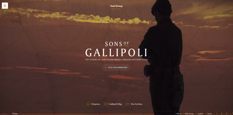
One space where this trend is taking off is in theatrical presentations.
The website for a documentary called Sons of Gallipoli, for instance, is extremely unique in navigation and presentation.
Video controls show progress in a semi-transparent overlay while the documentary is still playing.
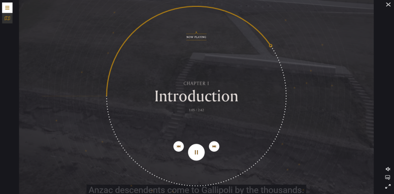
Unique layouts, grids on demand, CSS3 animations, wider font availability, and a number of other factors make a greater degree of variety possible now than ever before. However, you’ll notice that it doesn’t forsake usability. The site is still highly navigable.
In 2016, designers will begin to stretch their legs and take chances with traditionally winning formats, just to see what other avenues are available and indeed, desirable to the masses.
Rich Illustrations
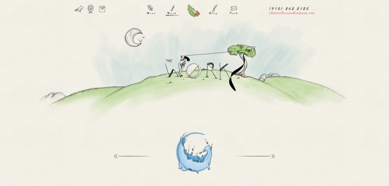
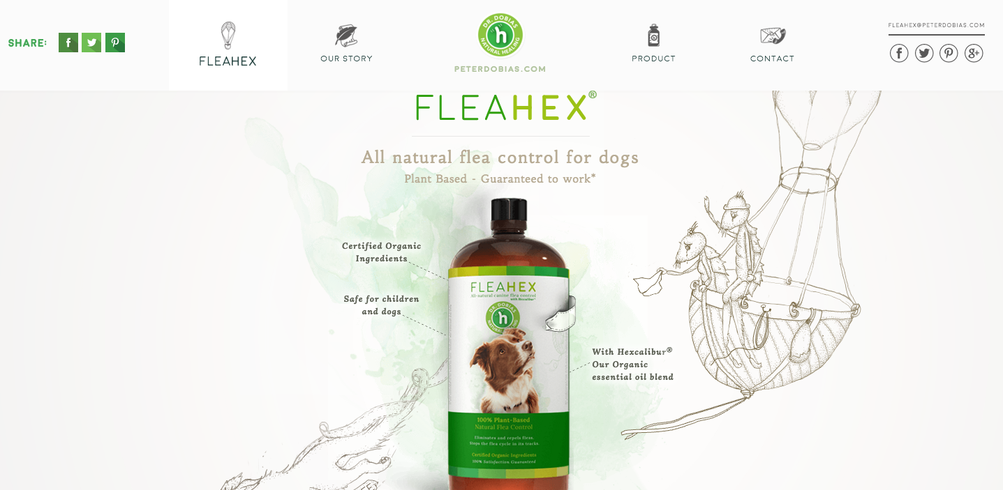
Diversity will rear its head in 2016 with the incorporation of handmade artwork on websites. Whereas stock photography and high-quality images have held a lot of sway in the past, more sites will rely on hand drawn art than graphics for their visual appeal in 2016.
Unique hand drawn websites offer a stunning depth of originality and warmth that simply can’t be matched by flat designs, which seem sterile in comparison. Moreover, they add an element of distinction to a design. Soon websites and their brands will be associated with the artwork style they contain.
For example, note how the FleaHex website’s art style (pictured below) resembles the design company that created it (pictured above). Imagine a world where Picasso’s blue period is played out on a digital space for all to see and appreciate. Integrating handmade artwork in your web designs can become something of a calling card for the designer/artist, and it’s guaranteed to be completely unique to the project.
Increased Role of A.I.
It’s all about context nowadays. Situational context, that is.
Where and when an interaction happens is now as important as how or why. Is it on a phone? A tablet? Indoors or outdoors? What are they doing in that moment? There are a variety of situations at play when users interact with a product.
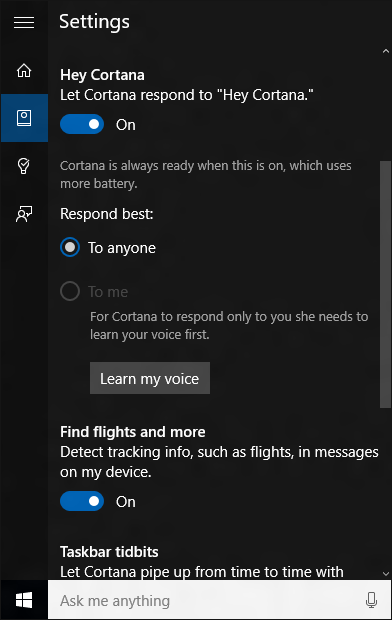
The UI designers of the world are in charge of making that response as seamless and helpful as possible. Of course, they can’t instantaneously read a user’s context in real time. But sophisticated and emergent AI engines can. Such as:
…and many other varying forms of artificial intelligence are beginning to automate the web.
The eventual outcome seems to be a greater reliance on AI to analyze and interpret user context, and then coordinate the best offers or solutions based on the collected data.
An interesting example of this is the development of online virtual assistants. Making speech interpretation smoother, and responses to user requests instantaneous is the current focus, and the results are becoming pretty impressive.
Programs like Cortana, Siri, and GoButler are in a race to completely obliterate the ability to discern between man and machine. Virtual assistants, such as these, will make a big impact in the way users interact with web and mobile apps going forward.
As far as using AI insight into your own work, you can, at least, get started by using various WordPress plugins like The Client Relations Factory, which actually puts an animated and autonomous customer service representative on your website.
Mobile/Wearable First
Mobile-first design will take firm hold in 2016, especially as wearables become more commonplace. Google Glass may have fallen a little flat, but HUD displays aren’t going to disappear completely. Not with Oculus Rift and other VR tech coming to the fore.
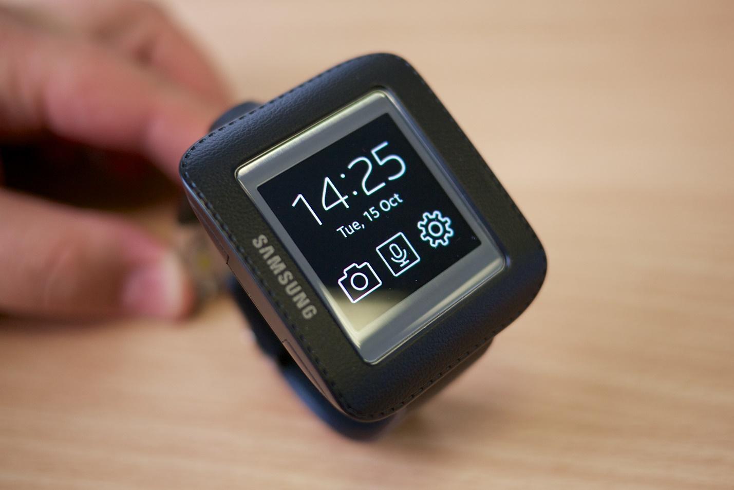
Designers have a whole new set of challenges making applications and even websites accessible on new formats like these. Mozilla is already working on a VR compatible website and this sort of experiment is only going to multiply in the coming years.
However, even though the screens may be smaller the principles of good UI design still matter. You’ll still want to consider color, typography, and, most of all, screen size.
Split screen layouts
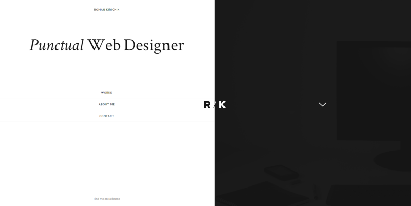
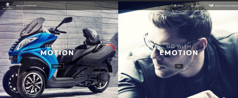
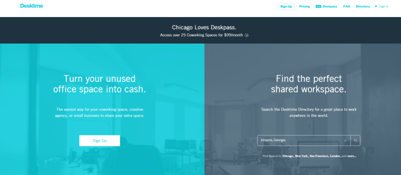
Another example of a break in the traditional layout scheme is the split screen.
Two distinct sections of content which contrast nicely. Each side contains different imagery, intentions, and CTAs. It’s become pretty popular already, and we can count on seeing this popularity continue in the near future.
Take a look at some of the smoother examples:
Roman Kirichik
Peugeot
Desktime
New Letters
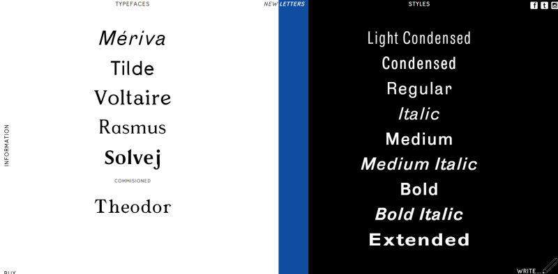
The advantage to the split layout gives your users clear binary options.
They can choose different paths as we see on a couple of the examples above. Or it can be an innovative way of getting more than one call to action on the page. Or just a simpler means of navigation, choosing the blue or the red pill. Of course, the biggest advantage is that it adds an element of visual interest to the page.
Microinteractions
As described in the free Web Design Book of Trends 2015-2016:
"…microinteractions are the momentary events that all add up to create the final experience. These can be either active (entering a password or clicking the Like button) or passive (a “ding" sound for a new message).”
Microinteractions have to feel as unobtrusive as possible. Each interaction should require as little thought and/or effort on the part of the user.
In the below Producthunt prototype (created in UXPin, you can see multiple microinteractions at play.
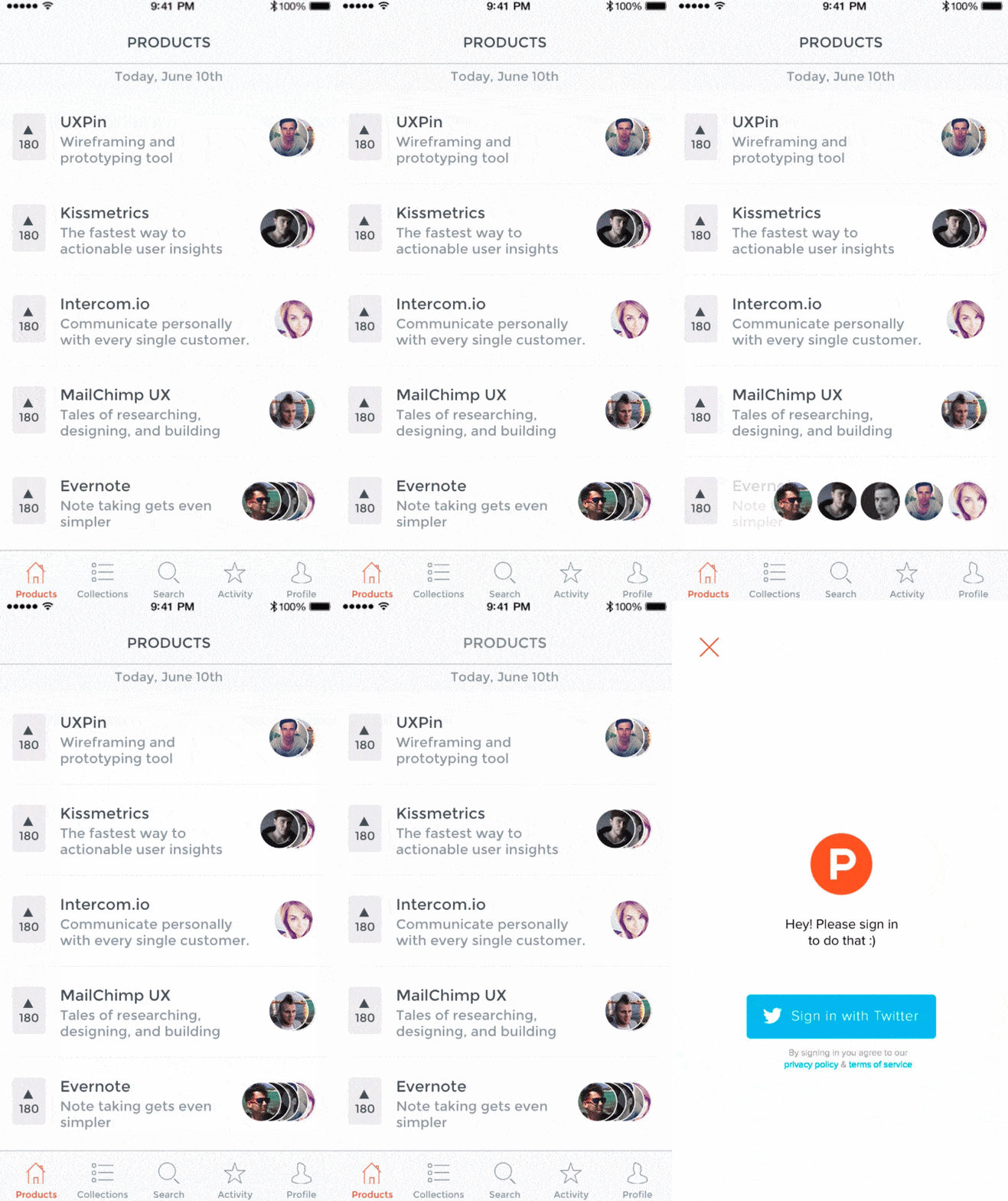
These can be achieved in a few clicks or perhaps in a more thorough process. In either case, a microinteraction should consist of 4 steps:
- Trigger
- Rule
- Feedback
- Loop/Mode
The trigger is the initiating action, such as a "read more" button or a notification. The rule is the predefined constraints which govern the interaction. This is usually intuitive, like the ubiquitous hamburger icon. A rule can also be a form that a user might need to fill out. Feedback is the response to the user’s action, and the loop is how long the interaction lasts or whether it’s repeated. Modes are necessary disruptions from the microinteraction. They’re usually unwanted, and should be used sparingly, if at all.
Richer animations
Finally, we get to the good stuff. The whole point of design is to look good after all. And what looks better than cool animations? More to the point, the web has never looked better or more dynamic than it has today, and that’s an ongoing trend.
Animations create engagement, enhance storytelling, and boost interactivity. Things such as:
- Parallax scrolling
- Animations triggered by mouse hovers
- Spinners
- Loading bars
These all make a website seem more like an interactive experience than a simple portal to find information about a certain business, product, service, or individual. To make the most of animations in 2016, it’s important that you don’t go overboard. While some are speculating minimalism is coming to a swift end, this isn’t the space to overindulge. Too much movement will scatter focus, distract, confuse, and irritate users.
Keep animations simple, unobtrusive, and thematically consistent. When I say "thematically" I mean from a storytelling perspective. Your site should unfold like a well-told narrative, revealing important details and guiding users down the path of your choosing. Use animations selectively to illustrate important points or to indicate a required action.
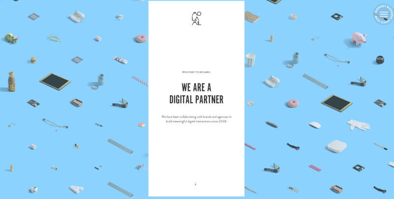
For example, the website molamil.com uses animations to highlight transitions. On their homepage, they begin by introducing their brand and then animate the transition to different entries in their portfolio.
Conclusion
That’s it for the year’s upcoming trends. One thing to keep in mind is that mobile will continue to challenge us as designers. With wearables, we’ll have to start thinking about how our devices are connected and how we interact with not just one device.
And if you’d like to learn more about trends to watch for in 2016, check out the free Web Design Book of Trends 2016. The 186-page ebook analyzes 165 examples of web design best practices.
