3 Overlooked Tweaks to Optimize Website Usability
According to Adobe, given 15 minutes to consume content, two-thirds of users would rather consume something that's visually appealing, than something plain. But, users also expect websites to load in less than 5 seconds at least, therefore designing a website (or app) for speed and satisfaction should be every designer's focus.
It's difficult to overlook visual design simply because we, as designers, love to design visually appealing things, and while aesthetics are still very important, given a limited amount of time, designers tend to drop the ball with usability. Optimizing app/website usability requires a deep understanding of your customer's goals, and can be measured in different ways:
- How clear is the UI?
- How many "roadblocks" are there?
- Does the navigation follow a logical structure?
Let's talk about optimizing these details for usability.
1. Fewer Choices
Making choices requires effort, so reducing that effort by unscrambling or even eliminating unnecessary roadblocks for users will reduce what's called analysis paralysis, which describes the moment when users become confused or frustrated as a result of having too many options to consider.

According to a study conducted by psychology experts Mark Lepper and Sheena Iyengar, who analyzed the behaviors of 754 consumers confronted with multiple choices, more choices tends to result in fewer sales. Here's how the study went:
On the first day, in an upscale food market, a table with 24 varieties of gourmet jam was set up, but on the second day, the table was set up with only 6 varieties of gourmet jam. The results showed, that the table with 24 varieties of gourmet jam attracted more interest than the table with only 6 varieties, however the 6-table surpassed the 24-table in sales. This is depicted in a well-known saying, "spoilt for choice".
An excessive number of choices can result in this analysis paralysis, which is when users are unable make a decision because they're faced with too many options. If you consider the different varieties of jam mentioned above, some of them may be cheaper, whereas others may be better tasting. Some of them might be larger, too. Our brains will try to decipher which offers the best bang for the buck, which takes time and thought, so the result is slower conversion, or even abandonment.
Further reading: Hick's Law. Hick’s Law states that the time it takes to make a decision increases with the number of options. This law validates this concept of reducing the number of choices to boost conversions. "Less is more", as they say.
Solution: Personalized Content
Anticipatory design (which is used by brands like Spotify, Netflix and Google) is used to help to reduce decision fatigue, where artificial intelligence (AI) is used to anticipate what the user wants. Possibly the most basic example of this of when apps and websites display their "Most Popular" content, where the logic is that users might be interested in a certain type of content simply because other users have done so previously.
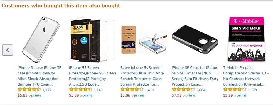
For retailers, an alternative could be to group "Best Selling" or "Most Wished For" items, like Amazon's "Customers who bought this item alo bought" recommendation engine. Fun fact: Amazon's recommendation engine is responsible for 30% of their total revenue, where the AI anticipates what the user will want to buy based on their Amazon search history, and what's currently in their basket!

2. Dead-Simple Navigation
For websites with multiple categories and sub-categories, navigation UX should become a top priority, especially on mobile devices where analysis paralysis can be even more confusing, simply because mobile websites are typically harder to navigate.
In order to improve usability, a fair number of menu items to include is a maximum of 7 (and the same applies to drop-down menus). Doing this also makes it easier to indicate the user's location within the website, which is known to lower bounce rates.
Why? Because users often forget what they were doing, especially when they have multiple tabs open!
3. Display Current Location Within Navigation
Progress trackers are a concept used to indicate the current location of a user within the interface. According to a study by Kantar and Lightspeed Research, these indicators are known to increase user engagement and customer satisfaction.
A typical web surfer (or app user) is known to have multiple tabs (or apps) open, so it's fairly easy to forget what you were trying to accomplish in at least one of them. Sometimes, users create the dilemma of analysis paralysis all by themselves!
Designers should be aware that their app or website isn't the only app or website the user may be using, and when users are faced with too many open tabs, forgetfulness is often the result. A visual indication of where the user "left off" can be helpful. Otherwise, the user may not only forget what they were doing, but stop caring about it altogether.
Solution: Breadcrumbs
Breadcrumbs are used to signify where the user is, and where they've come from. If you've ever heard of the classic fairytale of Hansel and Gretel, the brother and sister use a trail of breadcrumbs to help them find their way back home, and to ensure that they didn't keep going around in circles.
Breadcrumbs are used to illustrate the user's path, as seen on websites like Amazon, NewEgg, and other online retailers that need to display a lot of content, to help users remember where they left off (in case they've been away from the screen for any reason), and to help them find their way back should they reach a dead-end.

Conclusion
In short: you can significantly boost website usability by helping the user focus on what's important; guiding them gently, summarising when necessary, and basically optimizing the UX to ensure that users find what they're looking for.
