Is There a Perfect Paragraph Length for the Web?


The original Magna Carta document
This is the original Magna Carta written in 1215. Parchment was very expensive in the 11th century, so thrifty scribes wrote in tiny, densely packed latin.
While it's quite beautiful, the absence of paragraphs gives it a rather impenetrable look – even allowing for the latin. It's hard for our modern eyes to traverse that sheer wall of text.
Why do we even need paragraphs?
Paragraphs serve three useful purposes in writing. Firstly they help the writer to order and organise their thoughts. Secondly, they give the reader 'rest points' as they work through the text.
And finally, paragraphs give us entry and exit points into documents – shortcuts for navigating around text. This is particularly useful on the web, where we know that readers browse, scan and snack on text much more than they do on printed texts.
What is the ideal paragraph length?
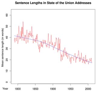
Sentence Lengths in SOTU over time – Source: Language Log
Predictably, there are lots of answers for this question, but the general consensus has been getting shorter for 200 years.
Mark Liberman from Language Log wrote a script that analyzed the structure of every US presidential 'Inaugural Address' and 'State of the Union' address since the late 1700's. Of course, sentence length and paragraph length are different, but there’s certainly a relationship.
As Mark’s chart shows, average sentence length has gone from over 40 words per sentence, to less than 20 words in 2011. I don't have a problem with this trend, but some do.
Whatever the driving forces, we've been continually selecting for shorter sentences and paragraphs for a long time.
Elsewhere Bob Brooke's Writers' Corner advises that you:
Try to limit your paragraph to five lines – not sentences. If it's too long, break it down into a series of paragraphs on subtopics.
Of course, on the web 'five lines' changes from device to device.
The Yahoo! Style Guide says:
Keep paragraphs short. Two to three sentences is often enough.
Which brings us to an interesting question
As FEDs/designers/UX people, we take responsibility for setting type sizing, line-heights, kerning, contrast, and all other typographic choices to create the best possible user experience.
1) Is it also our job to try to design the ideal paragraph lengths for our layouts? (I suspect most would say no).
2) The 'ideal' paragraph length surely must differ for different screen sizes? What is most comfortable to read on a Kindle or desktop surely isn't the same as what works best on an iPhone.
The utility of paragraphs disappears on small screens.
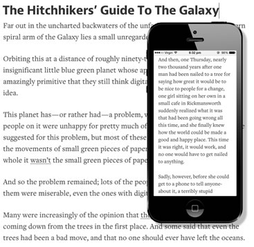
Take this example of the same text on two devices:
On the phone above, a lot of the usefulness of paragraphs starts to disappear when you can only see one or at best two paragraphs at a time. We get a more 'magna carta-esque' wall of text.
So, what can we do?
In a perfect world it might makes sense to rewrite the content for different devices – 'responsive content'. After all, we have different needs and expectations reading on a train than we do tucked up in bed, right?
Of course, the practicalities (and workload) of writing different content for each device/screen rules that out (for now at least).
But I’ve been thinking that there might be one layout trick that can help (a little) to fit more useful paragraphs onto mobile screens without needing to drastically shrink the text size.
On the web, paragraphs are almost always presented in the same way: They begin with non-indented text and end with a bottom padding equal to an empty line (like this very article).
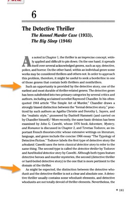
But this is only one way of presenting paragraphs – albeit the most common method we see today. Until relatively recently most books looked like this:
There was no extra bottom padding on paragraphs – just a short indent on the first sentence of a few spaces. Almost all books and newspapers used this style of paragraph for most of two hundred years, until it began to fall steadily out fashion in the 1960s-70s.
Maybe there's now good reason to re-introduce this old technique – JUST for our small screen layouts? Our wide screens won't change, but media queries allow us to use those paragraph breaks more usefully on mobile view only.
This lets us maintain the familiar breathing space on larger screens but potentially provide more readability and a better UX on small screens. It won’t be dramatic, but it may be enough to put three paragraphs onscreen, rather than two.
This needs some proper UX testing, but I think it has merit.
What do you think?
Originally published in the SitePoint Design Newsletter