Why Your Images Might Be Ruining Your Site
Fun fact of the day: the human brain processes imagery 60,000 times faster than text.(source). Despite this, we’re still seeing lots of professional sites whose only image content is their header and ads.
Visual spectacles like Tumblr and Pinterest are simply taking advantage of how the human brain works, making them not only extremely popular but also significantly more engaging than your average blog.

Don’t get me wrong, people are clearly using visual elements. The larger problem is that a lot of people aren’t investing in their image content because they either think their copy is good enough or they really don’t realize they’re costing their site.
Finding the best visual content for your site starts with understanding how powerful an image is, acknowledging your mistakes and finally moving in the direction to make better image choices.
The Power of Images
Interesting find: BrightLocal found that 60 percent of consumers are more willing to consider local search results that include images and another 23 percent are more likely to contact a business showcasing an image.
That’s a lot of power no matter the size. The point is you should never underestimate how a single element can be the difference between a user continuing or leaving. No users means no conversions which quickly leads to a dying business.
Let’s be honest though – ultimately the percentages quoted above are just numbers. What truly matters is how your visual content impacts on the human psyche. Advertising agencies do this every day.

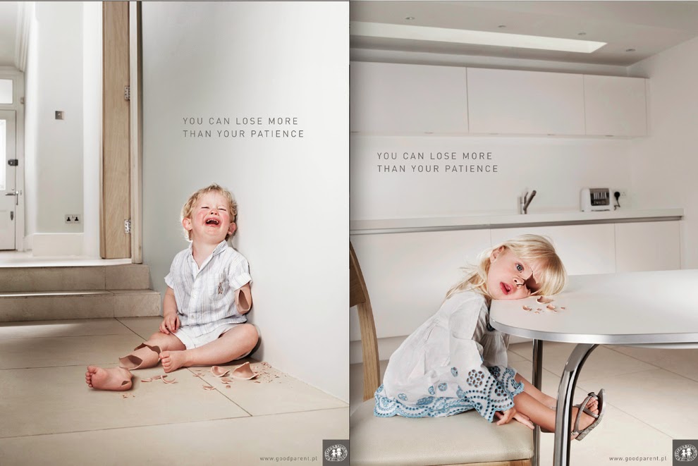
Broken children
The above image is for advocacy against child abuse. The image automatically resonates and calls up emotions to actually incite change regardless of whether it is put into effect or not. By the time the image is seen and ingested by the viewer it already makes an impact.
This is why a lot of viewers might deem advertisements for social change as “shocking” or “disturbing” – this is a strong image. Most of these types of images do not even require text to get their point across but the added accompanying text whether on the image, below or above it, amplifies these points.

And don’t worry: you don’t have to be advocating for social or environmental change in order to have a powerful image. You simply need an impactful image that drives the goal of your site.

Check Your Quality
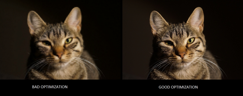
Images of low-resolution can have a significant impact on your users. Sometimes this can be the result of not optimizing your images properly or choosing small images and then scaling up.

Sites just starting out are more likely to have “ugly images” compared to well established ones. The “about” sections are notorious for this mostly because they opt for on-hand images that are typically small in size and low quality instead of taking new shots. Below is not only a good example of low-res images but also failure in visual consistency.
Lighting issues can also contribute to poor images. Take this bed and breakfast image for example. It may actually be quaint but the photos don’t translate that due to poor lighting and lack of editing.

This year make sure that your image quality is top of the line even if that means you have to take some time out to get new photos. It will make your site look professional even if you’re just starting out.

Leave the ‘Stock’ Out of Your Stock Photography

Do everything you can to avoid manufactured, “generic” or cliche stock photography.
For those who don’t understand what I’m referring to, just envision those cheesy photos of the self-satisfied business people huddling around a computer or smiling call center people. Or for that matter, any image that looks like the models were herded on set and told they can’t go home until they get it right. Even if they’re really, really ridiculously good looking.

Of course, that doesn’t mean don’t use stock images. Not everyone is a star photographer or has the means to hire one.
The issue is with people who use artless, generic stock that promotes friendly businesses, happy families, and thrilled customers. David Meerman Scott summed it beautifully when he asked “Who the hell are these people?”.
So, What Makes a Photo Look ‘Stock’?
Clearly it has nothing to do with the subject matter. The two images below tell the same essential story of a dinner party with friends – yet we instinctively know they are very different.

(Righthand image credit: https://www.flickr.com/photos/whatsthatpicture/3089020081/)
(Righthand image credit: https://www.flickr.com/photos/whatsthatpicture/3089020081/)
The left image is clinically lit and mathematically composed, framing a clutch of manicured models who hover over untouched food. They are paid to smile, not eat and drink.
The right image is soft, dark and imperfectly composed yet we get a sense of fun and warmth from it. This is a captured moment – not a pose.
Which image resonates with you?
If that isn’t enough to make you rethink your choice in generic stock and thinking any pretty, high-quality image will do then consider Tommy Walker’s great article on stock photography. He covers some great points and researched cases including how one girl’s image ended up being used by over eight companies.
Where’s the Message?
David Ogilvy, “The Father of Advertising”, conducted research to find the correlation of sales to imagery. He found that an image with no correlation to the content can reduce readership and, in consequence, have negative effects on sales. This is due to lack of consumer response. Every image needs a defined purpose.

UPS woman looks out window.
Recently I saw the image above while trying to track a UPS package and immediately wondered what this have to do with anything.
Sure, after a few seconds I noticed the unlit party lights, but while in university I knew of girls who habitually decorated their apartments with lights, no matter the month. I guess the woman is waiting for a package. I’m still not sure.
Regardless, the sad fact is, I spent time musing about the backstory of a random woman instead of tracking my parcel.
Surely that’s not a good result for either me or UPS.

Try to be sure that the visuals you choose are there to improve comprehension and not just decorate or fill space.
Quick Guide
Okay now that you have an idea why your images are causing your site troubles here are some quick, yet effective ways to reverse the damage:
- Get hi-res images and use only hi-res images. If you are unable to find an image in high quality for your content then go the graphics route. Try to find an illustration in the photo’s stead. This will avoid any nasty jaggies plus give your site some character.
- Learn the best image optimizing tricks to not only reduce loading times but to maintain image quality. Quicker loading times will keep people around for longer.
- Start taking your own pictures or have someone do them for you when you can. This is best for scenarios where it’s possible, e.g. a macro shot of strawberries or a sunset.
- If you must use stock photos then start learning to edit them so they don’t look so sanitized. Make sure you’re adhering to the license agreements.
- Re-evaluate your images and see if they match up to the content. Ask family and friends to give you their personal opinion.
- Choose images that encourage comprehension. Test your image by removing it and then re-adding it to see if it boosts your copy.
Stock Alternatives
There is no getting around stock photography unless you’re a talented photographer or you have the resources to commission someone to do it for you. That doesn’t mean you have to use the same stock sites as everyone else, though.
Here are a few stock sites to try out when Shutterstock, Dreamstime, and 123RF aren’t doing it for you. Oh and they won’t cost you anything:
Bottom Line
Humans have always been very visual creatures so it makes sense to lean on imagery in your websites. However, humans are also very visually discerning and incredibly quick to detect a fraud.
Ensure your imagery is always:
- Of high quality
- Sincere and on-brand
- Using clear and unambiguous messaging
Be sure that every image you select passes the test.
How important are images to you in web design? Do sites with little to no imagery bother you? Let us know in the comments.
