Top 5 Breakout Mobile Design Trends for 2016
If you want to enjoy a view from the front, you’re going to need to step up your mobile design.
Based on my conversations with the design team at UXPin, let’s deconstruct 5 useful mobile design trends for 2016.
1. Layered Interfaces
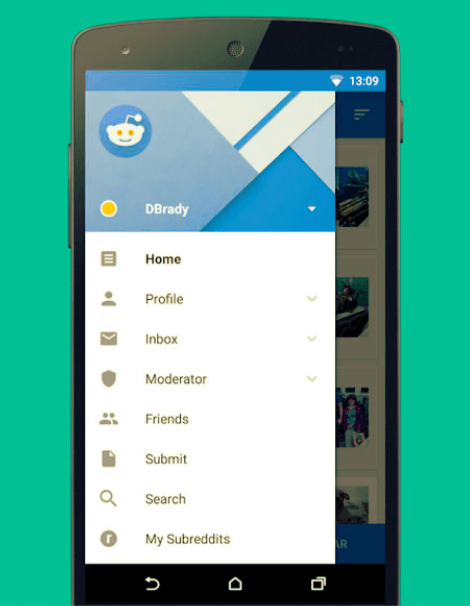
Obviously, the biggest difference between desktop and mobile screens is the size. Mobile sites and apps have less room, plain and simple. To help neutralize this drawback, more and more interfaces are implementing multiple layers, one on top of the other.
These “stacked” interfaces, like a pile of papers, allow users to open, close, pull out, switch tabs, swipe away, interact outside of, or simply remove windows more freely. This setup conserves space with only one relevant window at a time, but with easy access to the rest.

Photo credit: Reddit App via Google Play
Some common applications of the layered interface include:
-
Large drop-downs and drawers — A standard “hamburger menu” option for keeping all the common actions a user needs that aren’t immediately relevant on the opening screen.
-
Sticky menus — A minimal menu with only the essentials that remains on the screen at all times while the user interacts with the fluid screens outside.
-
Tabs — A digital version of the paper organizational method, with a small clickable area of different pages always visible.
-
Modals — Just like with desktops, you can superimpose entire windows over existing ones to ensure they’re noticed, such as logins, ads, or reminders.
Layered interfaces work within the principles of Google’s Material Design, which mimics how people organize and interact documents in the real world. Shuffling papers around with the most important on top is something we do without even thinking.
TIP: Consider gradient shadows or full fade out on the secondary layers to accent the layered format. This acts as a visual cue for how users can interact with different levels.
2. Creative Gestures

Photo credit: Clear via Realmac
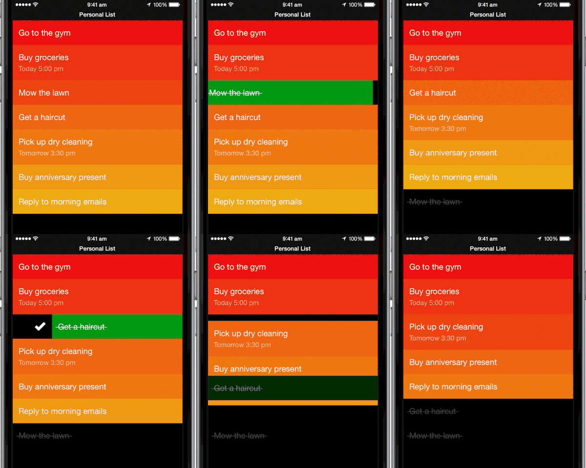
Swiping and tapping are as instinctual as pointing and clicking by now. They touch screens have so much more potential usability than cursors — almost endless potential, depending on your creativity. To set your mobile site or app apart, you’ll need to to draw on this creativity.
The next generation of gestures, which we call “complex gestures,” originate from gaming but are now infiltrating other interfaces. They typically follow a three-phase system:
-
Initiation – The action that triggers the sequence, usually a tap or hold.
-
Continuation — Stringing along other gestures, such as unique touch patterns or tapping, as simple or complicated as you think the user can handle.
-
Termination — Signalling the end of the interaction; could be merely stopping contact with the screen.
But a word of warning: Don’t reinvent the wheel, here. Creative gestures aren’t something that can be packed on — each one requires learnability and recall, and take the UI farther away from “intuitive.”
As explained in the free guide Mobile Design Trends 2016, only use a new gesture when they improve upon an old form of interacting, i.e., make it faster, more comfortable, or more natural. Otherwise, stay with what the user already knows. To paraphrase Mark Twain, “Don’t use a five-dollar gesture when a fifty-cent one will do.”
TIP: Consider physical limitations when designing new gestures, especially the different ways users can hold a mobile device. Vertical or horizontal, one or both (or no) hands, thumbs or pointers. User research will reveal which your target users prefer.
3. Practical Microinteractions
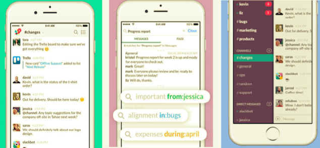
Microinteractions started as delightful little flourishes that enhanced an interface’s enjoyability, but little else. The UI equivalent of colorful sprinkles. But now, designers are realizing that these tiny, often unnoticed moments can serve deeper and more practical purposes. In the future, we’ll see them utilized more and more.

Photo credit: Slack via iTunes
A microinteraction can be anything from a momentary animation to a cutesy sound effect. The nature of the microinteraction has flexibility, but how it’s used should follow some predefined guidelines if you want to make the most of it.
In Dan Saffer’s book Microinteractions, he outlines three useful purposes for microinteractions:
- Communicate status
- Visualize the the consequence of an action (instant feedback)
- Influence what the user sees on the screen (points something out)
Using a microinteraction for any of the above reasons goes beyond mere enjoyability — it improves usability, learnability, and creates a more efficient functionality. In 2016, microinteractions will be used more and more to fill in the “cracks” of an interface.
TIP: The best microinteractions stay one step ahead of the user and almost predict what they’re thinking. Look for patterns in your user research to see which areas would benefit most with a little smoothing over. Microinteractions can be used at almost any point in a UI, so the question is less about what they are than where they are.
4. Meaningful Typography
The smaller the screen, the more meaningful the typography. Neglecting how your words are presenting on mobile devices — in other words, not changing the typography at all from the desktop version — creates a mobile site or app that’s hard to read and hard to use.
The trick with mobile typography is balancing legibility with space conservation. For this reason, simpler typefaces are often chosen, since they are easier to read at smaller sizes. Characteristics like sans serif and rounded edges also fit in with the aesthetic styles of minimalism and flat design, which are also trends of 2016.
Another concern is alignment, which tends to convolute layouts when confronted with unexpected breakpoints. Unfortunate alignment can lead to typographical faux-paus like widows, orphans, and rags.
While there’s no failsafe way to deal with these completely, following the advice below will eliminate many of the problems:
-
For large blocks of text, use a left alignment. This complements are natural reading rhythms when we dedicate ourselves to reading every word.
-
For small bits of text, use a center alignment. For headlines and calls-to-action, a center alignment improves visibility and looks less awkward with hanging text.
Right alignment should only be used in a controlled setting, such as a single short title, or with forced breaks after each word.
TIP: To ensure legibility in mobile devices, aim for 30-40 characters per line. This conservative estimate is half of the recommended 60-75 characters for desktop, but keep in mind some readers may have sight disability, and the rest will appreciate the convenience.
5. Bite-Sized Cards
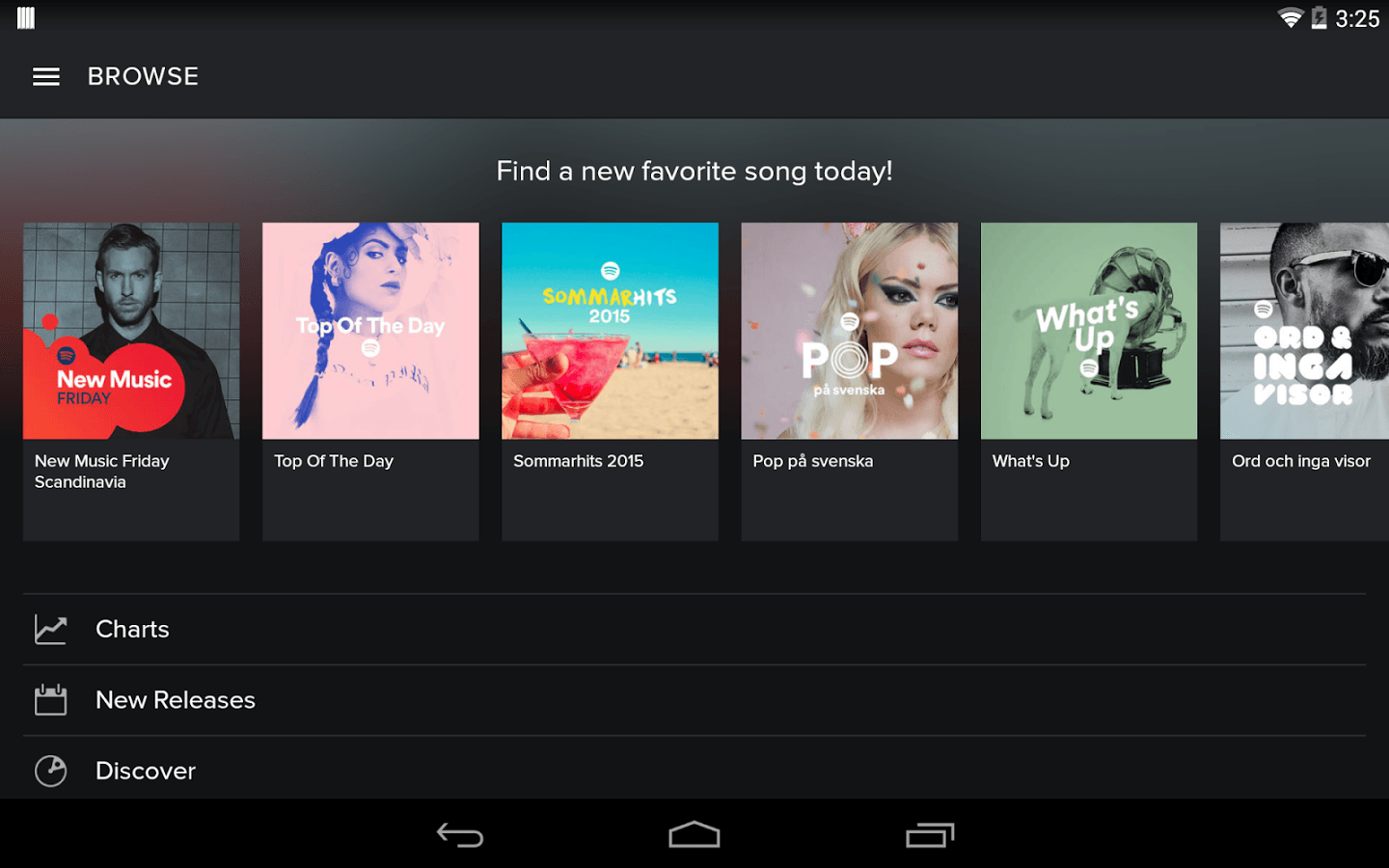
The card layout has already revolutionized both desktop and mobile browsing, so designers are exploring new ways to improve it. As time goes on, mobile cards are getting smaller, effortlessly transitioning into an offshoot of buttons.

Photo credit: Spotify via Google Play
Cards started as a way to organize a wealth of information into bite-sized doses so users can choose what they want to interact with or ignore. Social media giants like Facebook, Twitter, and especially Pinterest brought cards into the mainstream as a way to make sense of the otherwise chaotic mess of user-generated content.
The typical card format contains some or all of these common elements:
- Image
- Title
- Text description
- Control icons (Favorite, Like, Retweet, Download, etc.)
- Expand option
- Secondary description (author of content, date, etc.)
Cards did wonders for mobile UIs because they were less restricted by different screen sizes. If you break an entire page of content into manageable blocks, different devices with different screen sizes can reorganize the placement of these blocks without losing any meaning.
Cards are a responsive site’s best friend, and the more popular the layout pattern becomes, the more recognizable its usability.
Some companies compact cards even further, sometimes showing only an image and title. This can’t work for all products, but the spirit behind the trend is gaining popularity: show only the bare essentials on each card to conserve space, and reveal the full content only after clicking.
TIP: Don’t limit yourself to the standard grid or stack format. Consider experimenting with staggered rows and columns.
Takeaway
The tips here just scratch the surface of what’s in store for mobile design in 2016.
For a more complete treatment, check out the free Mobile Design Book of Trends 2016.
Across 124 pages, the guide dives into thorough detail on all the above trends, explaining why they’re useful and listing the best practices for applying each, plus links out to over 60 additional free online resources.
