7 Tips to Taking the Guess Work Out of Choosing Stock Imagery
This article was sponsored by Adobe. Thank you for supporting the sponsors who make SitePoint possible.
Stock imagery has become a huge part of the design process for graphic designers. The old adage is true that an image equals a thousand words.
Finding just the right image can reinforce the message you’re trying to send on behalf of your clients. One of the biggest decisions a designer can make is choosing the right image. It can be tough to sort through all of the images that will work and won’t work in a given design piece.
In this article we’ll take a look at some tips for choosing the perfect stock imagery for your project.
1. Lay Out the Content First
I know you’ll be tempted to hop onto Adobe Stock and start looking around for images first — that’s the fun part, after all — but this may get you into trouble. You never really understand how much content you have or how much space you really have to work with until you get a real look at how much content you have to fit on a page.
Begin arranging and grouping elements until you have an arrangement you’re happy with. This is a good starting point before you go searching for images because you’ll have a better idea of what you’ll really need, and actually use. How many times have you chosen a stock photo, downloaded it, and then you just couldn’t get the content to fit?
2. Plan the Image’s Destination
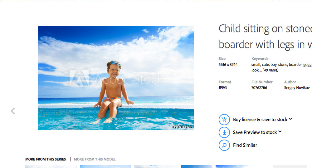
The placement of the image can make all the difference when it comes to choosing a type of image. If you have design elements or text around the edge of where the photo will be placed, you’ll want to pick an image that has plenty of breathing room built in. The last thing you’ll want is to have a crowded design.
Also, if there is an object or a person in the image, make sure that there is plenty of space around the edges of the image. This will give you room to scale and crop the image without having to worry about everything fitting in the design.
The example image above could be scaled, without losing the subject. It could be cropped, depending on the subject, only showing them from the waist up, still giving the impression they are in a tropical setting.
3. Leave Room for Text
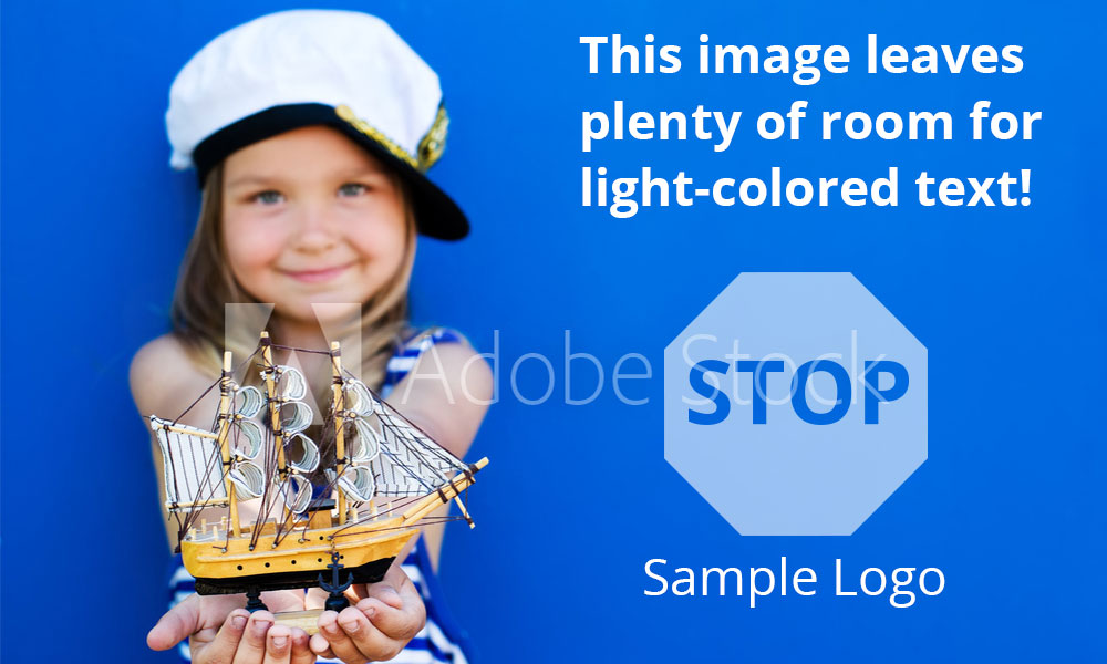
One of the most common design techniques is to place text over an image. The image you choose should have enough built in negative space to accommodate the text. It’s good to have an image that contains a flat surface, such as a wall or a block of color, where you can place text in a contrasting color.
Notice in the sample image, the girl is off to the left of the image, giving you plenty of room for text, graphics, a logo, and anything else you might need to place in the available space.
4. Contrast is Key
Sometimes, despite all of your efforts, you end up finding the perfect image for your design, but it just doesn’t have enough negative space to put text. If this is the case, you can at least resort to an image that has a light color area or a dark color area. This will enable you to place text over that portion of the image in a contrasting color. You’ll want to avoid an image with a neutral background or a noisy pattern. Otherwise, you’ll have to apply a drop shadow or a stroke to your text, which can ruin the look of your design.
Choosing an image that works well with the existing colors in your designs is a great way to create a seamless design solution. One standout feature of Adobe Stock is that you can select a color and they will narrow the search results to images containing that color. You can even type in a Hex value, so your color choice can be as precise as you need it to be.
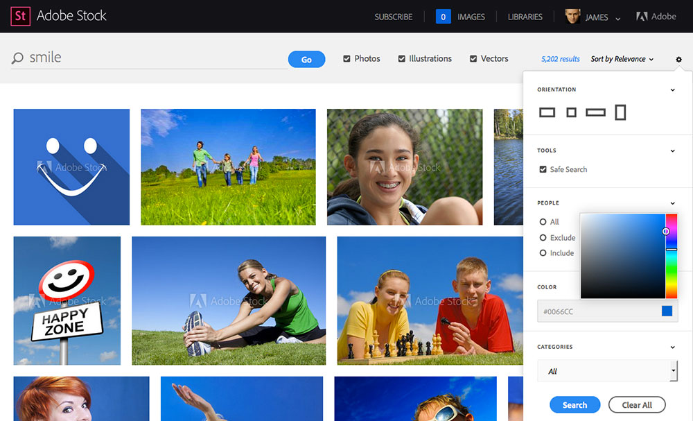
You can see from the screenshot above that I searched for smiles and narrowed the search results by images containing the hex value of #0066cc. This is an incredible time saver and will help you to find images that match your brand. Imagine looking for your company’s signature color, and finding a specific image with that color in it!
5. Consider the Orientation
The orientation of your image can have a huge impact on whether or not the content will fit. For example, if you’re designing a poster, you’ll likely want to stick to portrait images. If you’re designing a postcard, you’ll want to choose a landscape photo.
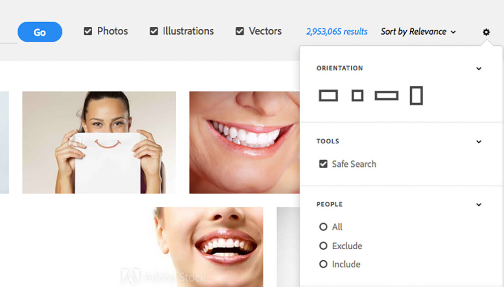
The content of the image and its orientation are important too. If you know you need an image whose main subject has a lot of space below it, so you’ll have a place to put text or accompanying graphics, you’re more likely to find that in a portrait image. Planning ahead like this will keep you from spending time on cloning sections of an image in Photoshop, or using Content Aware Fill to fake an extended area of an image.
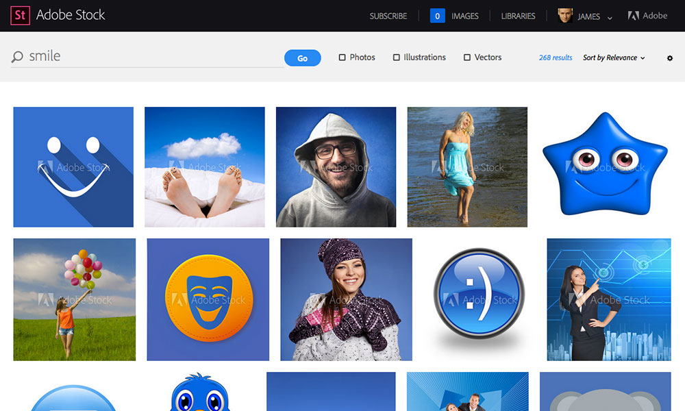
Adobe Stock gives you the ability to choose the orientation of the images in your search results. For example, you might need a square image, which Adobe Stock has an option for. You can find it by selecting the gear icon on the far right side. The results displayed above are all square formatted images.
6. Special Consideration for Images of People
Choosing the best images of people can be a tough decision. Every aspect of an image with a person in it needs to be considered. This includes, for example, their facial expressions, their clothing, and objects they are interacting with.
One of the most important aspects to bear in mind when choosing the right image containing a person is their position. Where are they looking? If you want to draw extra attention to an element in your design, choose an image with a person looking directly at it. This will draw the viewer’s eyes towards that element, emphasizing it further.
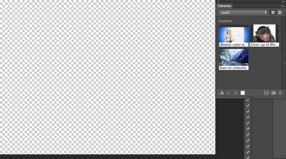
In the example, I chose an image of a woman holding a blank sign. This is a perfect image for calling extra attention to a message. The great thing about Adobe Stock is that I can see how an image looks before making a purchase.
Click on the small thumbnail on Adobe Stock’s site to bring up the larger image. Then, click the down arrow and you will see a variety of places to which you can download the image. I have a Creative Cloud library that I’ve named “stock”, because I want the image to be easily accessible in Photoshop when I’m working on this layout, so I’ll opt to download it there. Now the image is immediately available in Photoshop (as well as other desktop apps with Creative Cloud libraries) so I can drop it into my layout and try it out.

As you can see, I could place text and use it just like I’d purchased it, making sure that it is the right image for my work. To purchase, just right-click the image in the Libraries Panel and choose License Image, and it will automatically update. Any non-destructive edits made to the watermarked image will be retained when it’s replaced with the high-resolution, licensed image.
7. Narrow Your Search
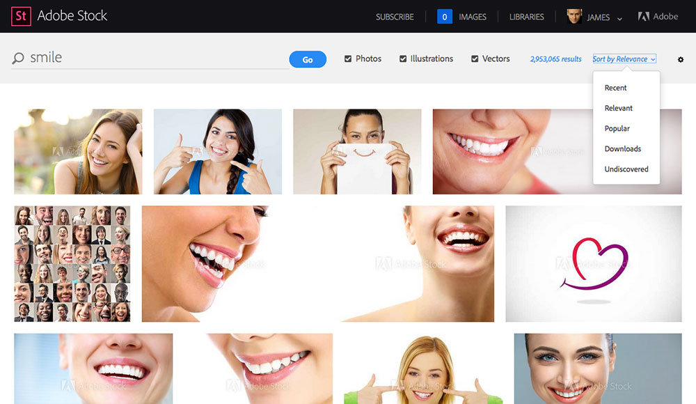
There’s nothing worse than searching through a lot of irrelevant images. That’s why most stock photo sites enable you to filter results. If you’re looking for photos, you can deselect the options for illustrations and vectors. Also, you can sort the search results. If you’re working with a big client and want to choose an image that wasn’t likely used by another promotion, you can sort by relevance, but you can also select undiscovered images.
Conclusion
Finding the perfect image isn’t as hard as it used to be. It used to take hours to find just the right stock photo for a project. With these 7 helpful tips, and using the Adobe Stock’s options to improve your search, you can save hours of time. Time you can spend focusing on creating a great design and delivering the best solution for your client.