What VR Can Teach Us About UX
Virtual reality is the ultimate user experience–after all, you’re literally being immersed in a new world.
So, as someone who’s passionate about great design, I’ve been closely watching the emergence of VR best practices.
And surprise, surprise: the same things that make for a good virtual reality experience make for a good user experience.
Let’s dive into what VR can teach us about UX.
Presence
The first rule of VR? Don’t break the presence.
Virtual reality researchers have been talking about the concept of “presence” for the past 10 years.
As AMD’s head of VR marketing explained, “Presence can be measured as the degree to which the virtual environment faithfully evokes a sense of reality that causes the user to suspend disbelief. The greater the suspension of disbelief, the greater the degree of presence achieved.”
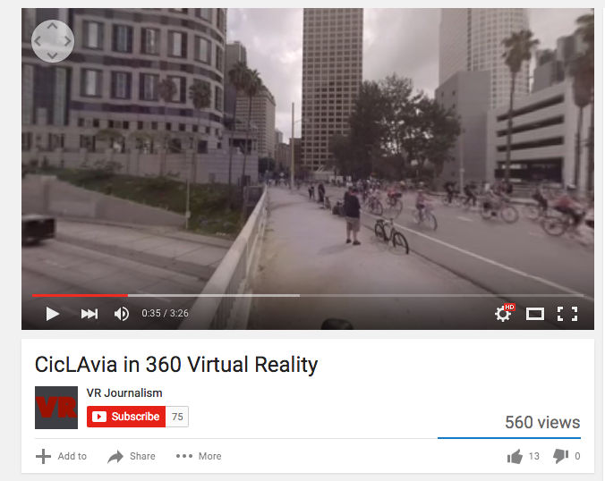
To enable presence, the mechanics of virtual reality must be as hidden as possible. That means sophisticated head-tracking technology, low latency, and high resolution.
Or, in practical terms, if you’re walking through a jungle, not only should the display be convincingly rendered, but when you turn your head, the world should immediately shift.
Applying It
Although no one will ever “forget” they’re browsing your website or app, presence is still extremely important.
You want visitors to feel like they’re having a seamless, human experience that they can navigate intuitively.
Wild-Touch’s Ice and Sky website is a fantastic example.
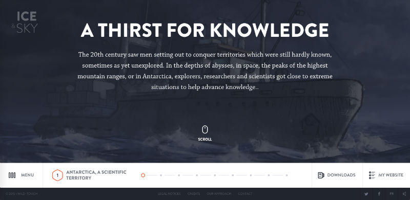
It’s very complex-as you move through a horizontal narrative timeline, you’re presented with short “chapters” that you scroll through vertically. There’s also audio, video, images, and interactive elements.
Yet despite the complexity, going through Ice and Sky is frictionless. That’s because the mechanics of the site are hidden, and elements work as you’d expect.
Presence is also accomplished by using familiar interface elements. Check out the Todoist homepage; whether you're a first-time user or an experienced one, you have no trouble understanding the information being presented and how you can respond.

That's because almost every icon on the page is familiar. To change your settings, you click the gear button. To see your schedule, you click the calendar button. To add a task, you click the "+" icon, and in a nice example of consistent design, to add a project, you click a bigger "+" button.
While doing something totally new with your user interface can pay off, don't forget to incorporate recognizable elements. Having a beautiful UI won't matter if it's not usable-your visitors can't be present when they're struggling to understand what to do.
Detail
Virtual reality developers have to construct their experiences with the expectation that viewers are going to look at everything up close and personal.
Unlike most video gamers or movie audience members, VR participants have agency: they choose what to look at, when, and for how long.
 s
s
At the 2015 Game Developers Conference, making every detail solid was one of the key themes.
"VR has a way of inviting players to inspect objects, props, surfaces and characters really closely," one participant explained. "Be prepared for close inspection, and make sure that your geometry and textures are tight."
Applying It
When it comes to user control, site and app UI is pretty similar to VR. You can't control what the users will do; you can only construct the environment, anticipate their responses, and make sure everything works as it should.
The lack of control means every facet of the interface should be well-thought-out.
The World of Swiss site, an interactive brand experience for Swiss Airlines, exemplifies this attention to detail.
As the visitor scrolls through the sky, small wisps of cloud "break" across the screen, so it feels as though one is moving both forward and up.

And although the site's vertical sidebar encourages up-and-down scrolling, you can also use right-and-left motions to navigate.
Other small details make the experience even richer. For example, when you hover your mouse over the close button, it spins-mirroring the circular elements present throughout the site.
If you're interested in diving into this topic, read Petras Bauky's excellent piece on micro-interactions.
Interactivity
Interactivity is one of the most important characteristics of VR. To truly immerse yourself in an environment, you have to be an active participant, not a passive bystander.
This is created in a couple different ways. First, movement: simply moving within the VR landscape is interactive.
For an example, check out The New York Time's 360 video of the Paris vigils. The video has a linear narrative form: as night turns to day, you listen to Parisians recount their stories of the attacks.
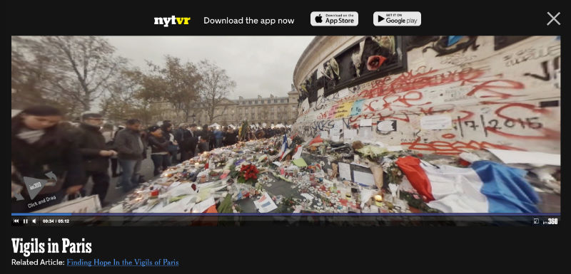
However, while they talk, you can move around and explore different angles of the shrine.
VR developers are further enabling interactivity with user-triggered responses. As the authors of the Leap Motion VR Best Practices Outline explain, every interactive object should respond to any casual movement. Let's say you push a button. Even if you didn't apply enough force to fully push it, there should still be some response.
Furthermore, there must be cues that show the user has interacted with this scene. The developers propose using a shadow of a hand over the button, a glow from the button reflecting on the hand, a click when the button has been pressed, or a downward motion on the button corresponding to how much pressured the user exerted.
"When done effectively, people will feel themselves anticipating tactile experiences as they interact with a scene," the authors conclude.
Applying It
Interactivity is a huge component of successful UX, as well. The more interactive your interface is, the more engaging and "sticky" it'll be.
For inspiration, look at e-commerce site Everlane. To demonstrate its transparent production, the company created an interactive map showing its factory locations. Each factory has its own page of pictures and text.
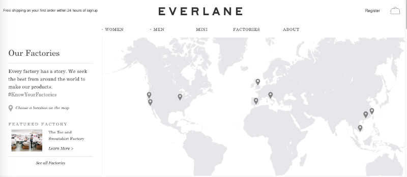
The site has other unexpected interactive features as well. Hovering over a product will change the display photo to a second photo with a different angle-a great way to both give the user some agency and allow them to browse more efficiently.
(Note that these examples help Everlane's ultimate objective: getting visitors to make purchases. Even though interactivity is necessary, it should also align with your purpose.)
The Science Friday site shows how interactivity can be achieved on a small scale. Almost every element on the site reacts when you hover over it.

Both of these examples prove you can incorporate interactivity into any type of site–you just have to be creative.
Next Steps
These three "best practices"-presence, detail, and interactivity-are just the beginning. The more you dive into virtual reality, the more inspiration you'll derive for traditional UX. If you're interested in exploring browser-based virtual reality, check out Facebook's 360 video channel, Mozilla VR's projects, and the Janus VR experience. And for just a couple bucks, you can buy the Google Cardboard headset on Amazon and experience VR on your phone.
How has virtual reality influenced your ideas of great design?