5 CSS Properties That Give Designers Fits
For the most part, styling a site with CSS is fairly simple. As long as you have marked up your HTML semantically and designed divs and classes in a sensible manner, the design process should be pretty easy. However, there are some CSS properties that elude the minds of most designers, and many of us have gotten hung up on the more cumbersome CSS properties. They aren’t so straightforward, and it takes a little explaining to understand how they work. Below are five of the more unwieldy CSS properties, as well as the best ways to harness them back under your control.
Clear
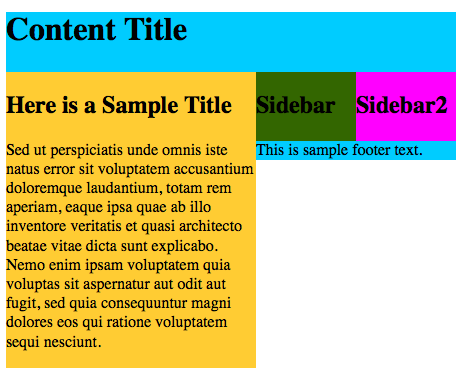
So let’s say you are building a website and styling it with CSS. You have a container div. Inside of that, you employ the “float” property and you have two more divs — one for your content and one for your sidebar. Once you are finished, you notice that your container doesn’t extend all the way down past your two div containers. It ends up jumbling everything around and just doesn’t look right. Here is the HTML code:
<div id="container">
<h1>Content Title</h1>
<div id="content">
<h2>Here is a Sample Title</h2>
<p>Sed ut perspiciatis unde omnis iste natus error sit voluptatem accusantium doloremque laudantium, totam rem aperiam, eaque ipsa quae ab illo inventore veritatis et quasi architecto beatae vitae dicta sunt explicabo. Nemo enim ipsam voluptatem quia voluptas sit aspernatur aut odit aut fugit, sed quia consequuntur magni dolores eos qui ratione voluptatem sequi nesciunt.</p>
</div>
<div id="sidebar">
<h2>Sidebar</h2>
</div>
<div id="sidebar2">
<h2>Sidebar2</h2>
</div>
<div id="footer">This is sample footer text.</div>
</div>
What we have here is a container where everything is held at a certain width and the content flows within that container. We have a content area, and two sidebars. It is all floated to the left so they are in a straight line. Then, we have a footer that is below that. Lets look at what you would expect your CSS to look like for these divs:
#container{
background:#0CF;
width:450px;
}
#content{
background:#FC3;
width:250px;
float:left;
}
#sidebar{
float:left;
background:#360;
width:100px;
}
#sidebar2{
float:left;
background:#F0F;
width:100px;
}
#footer{
}
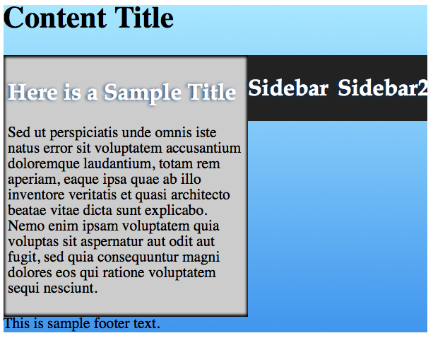
The results above are unexpected. The content column is longer than the sidebar content, and the container div doesn’t extend all the way past the content, shoving the footer in the space available. This can all be fixed with just one single line of CSS, and you won’t believe how simple it is. In the footer, you can place the following line of CSS:
#footer{
clear:both;
}
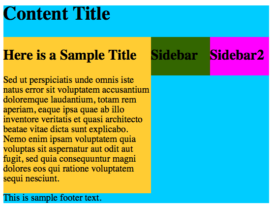
That’s it! Now you should have the container div with the H2 title inside of it. Below that, in one line, you will have the content div and the 2 sidebar divs. Under those will be the footer div, which has no background, so it will be the blue color of the container div. The container div extends all the way down and envelops your content now.
Box Shadows
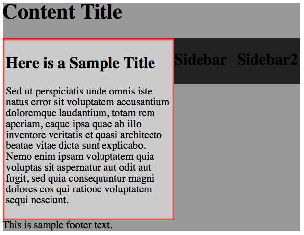
I am not sure why this gives designers so much trouble. Once you break down how it works, it ends up being fairly simple. Lets take our sample HTML and CSS from the last example. This time, on the content div, I am going to create an inner shadow in this div to make it look like it is recessed. The following CSS will create a red inset shadow:
#content{
background:#ccc;
width:250px;
float:left;
padding:5px;
-webkit-box-shadow: inset 0px 0px 2px 2px #f00;
box-shadow: inset 0px 0px 2px 2px #f00;
I did make some slight changes to our HTML. The sidebar widths are now 95px each, and I added 5px of padding so that the type wasn’t right on the edge. It is important to remember to include vendor prefixes so that your effects show up across most browsers. To break down how the CSS works is really simple. The first value of “inset” tells the browser to place the shadow inside of the box. Leaving this declaration off will place it on the outside by default. The first two pixel values will determine the horizontal and vertical placement of the shadow. Setting it to zero makes it equal on all sides. Positive numbers make the shadow go to the right or downward, and negative numbers will position the shadow to the left or upward. The third value determines the blur radius of the shadow, which will give it a softer appearance. The fourth value is the spread, and that brings the shadow inward more and makes it a more prominent shadow. You can use RGBA or hex values to determine the color of your shadow. The RGBA alternative to the hex value would be something similar to:
rgba(200, 0, 0, .5);
The code breaks down into red, green, blue, then alpha/transparency. The numeric values are 1-255, and the different combinations create different colors. Alpha is a decimal value from 0.1 to 1. 0.1 is 10%, 0.5 is 50%, etc. The result is shown below:
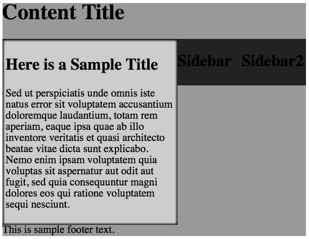
Obviously you would want something like black, or grey as the shadow color, but I used red just to demonstrate how the color system works. Here is the same box with a black inset shadow(#000, or rgba(0,0,0, .5);
Text shadow works in the same manner, but there is no spread value — it is simply the horizontal distance, the vertical distance, and the blur amount, with the color at the end.
h2{
Font-family:"Palatino Linotype", "Book Antiqua", Palatino, serif;
color:#fff;
text-shadow: -2px 0px 3px #003366;
}
Above, the CSS says that the typeface will be Palatino Linotype, and it will be white. It also says that there will be a text shadow that is 2px to the left, 0px up or down, and is blurred 3px. The shadow will be blue.
CSS Gradients
CSS gradients are nice, but they definitely give designers a lot of trouble. The concept isn’t difficult to understand, and implementing a CSS gradient isn’t difficult either. The hard part is making them show up on all browsers. Implementing all of the workarounds and CSS hacks is nearly impossible to do from memory. To create a gradient that goes from light blue to medium blue you would use the following CSS:
#container{
background: #a8e7ff; /* Old browsers */
background: -moz-linear-gradient(top,  #a8e7ff 0%, #4096ee 100%); /* FF3.6+ */
background: -webkit-gradient(linear, left top, left bottom, color-stop(0%,#a8e7ff), color-stop(100%,#4096ee)); /* Chrome,Safari4+ */
background: -webkit-linear-gradient(top,  #a8e7ff 0%,#4096ee 100%); /* Chrome10+,Safari5.1+ */
background: -o-linear-gradient(top,  #a8e7ff 0%,#4096ee 100%); /* Opera 11.10+ */
background: -ms-linear-gradient(top,  #a8e7ff 0%,#4096ee 100%); /* IE10+ */
background: linear-gradient(to bottom,  #a8e7ff 0%,#4096ee 100%); /* W3C */
filter: progid:DXImageTransform.Microsoft.gradient( startColorstr='#a8e7ff', endColorstr='#4096ee',GradientType=0 ); /* IE6-9 */
}
The results will look like this:
That is a nice gradient, all done without images… completely in CSS. The reason that this is so difficult is because you need eight lines of CSS in order to get it to display properly. The worst part is that they all have their own vendor prefixes as well. Each line is different. The actual CSS without all of the extras is rather easy. Lets take the actual base CSS:
(top, #a8e7ff 0%,#4096ee 100%)
All this is really saying is that you start at the top with #a8e7ff and fade it to #4096ee, that the color stop is 0, that the next color is #4096ee, and it stops at 100%, which means that it is not repeated. The last color in the sequence determines how many times the sequence is repeated.
Dropdown Menus
Everyone likes to have a nice dropdown menu on their site. Most people can style a single-tier menu, showing their main pages, but when they add their second level pages, things can get sketchy. You try to use the “display:none;” style to hide the submenu until someone hovers over the menu, but it just doesn’t work reliably. Here is the common problem:
The HTML
<div>
<ul>
<li><a href="#" >Home</a></li>
<li><a href="#" id="current">Products</a>
<ul> <li><a href="#">Sliders</a></li>
<li><a href="#">Galleries</a></li>
<li><a href="#">Apps</a></li>
<li><a href="#">Extensions</a></li>
</ul>
</li>
<li><a href="/about.html">About</a> <ul>
<li><a href="#">Company History</a></li>
<li><a href="#">Address</a></li>
<li><a href="#">Customer Service</a></li>
</li> <li><a href="/contact/contact.php">Contact</a></li>
</ul>
</div>
The CSS
.menubar{
border:none;
border:0px;
margin:0px;
padding:0px;
font: 67.5% "Lucida Sans Unicode", "Bitstream Vera Sans", "Trebuchet Unicode MS", "Lucida Grande", Verdana, Helvetica, sans-serif;
font-size:14px;
font-weight:bold;
}
.menubar ul{
background: rgb(109,109,109);
height:50px;
list-style:none;
margin:0;
padding:0;
}
.menubar li{
float:left;
padding:0px;
}
.menubar li a{
background: rgb(109,109,109);
color:#cccccc;
display:block;
font-weight:normal;
line-height:50px;
margin:0px;
padding:0px 25px;
text-align:center;
text-decoration:none;
}
.menubar li a:hover, .menubar ul li:hover a{
background: rgb(71,71,71);
color:#FFFFFF;
text-decoration:none;
}
.menubar li ul{
background: rgb(109,109,109);
display:none;
height:auto;
padding:0px;
margin:0px;
border:0px;
position:absolute;
width:200px;
z-index:200;
/*top:1em;
/*left:0;*/
}
.menubar li:hover ul{
display:block;
}
.menubar li li {
background: rgb(109,109,109);
display:block;
float:none;
margin:0px;
padding:0px;
width:200px;
}
.menubar li:hover li a{
background:none;
}
.menubar li ul a{
display:block;
height:50px;
font-size:12px;
font-style:normal;
margin:0px;
padding:0px 10px 0px 15px;
text-align:left;
}
.menubar li ul a:hover, .menubar li ul li:hover a{
background: rgb(71,71,71);
border:0px;
color:#ffffff;
text-decoration:none;
}
.menubar p{
clear:left;
}
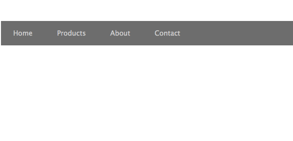
The menu should look like this normally:
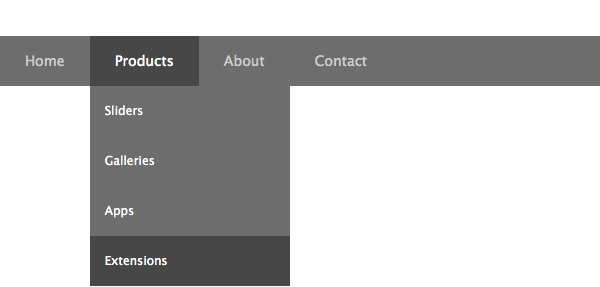
When you hover over one of the menu items and the sub menu, it should look like this:
The CSS gets confusing for your dropdown menu where you hover over the menu itself. There is a CSS style that must be present for your dropdown to even show up and for the color to change once you hover over it. Be sure to look for:
.menubar li:hover ul{
display:block;
}
This is what enables the submenu to appear at all. if this isn’t present, your submenu items won’t show up at all. In the CSS styles just before this one, we tell all unordered lists under list items should not display. Then, when your mouse hovers over an unordered list that is under a list item, it will display.
Border Radius
Using our same example from earlier, let’s apply a border-radius to our container div. Some of you might not know that you can actually determine a different radius for each corner. This is how you create different shapes with CSS. Below is the CSS for our container div.
#container{
background: #a8e7ff; /* Old browsers */
width:600px;
-webkit-border-radius: 20px 5px 115px 35px;
border-radius: 20px 5px 115px 35px;
}
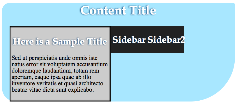
The code above starts in the top-left of our container and lists each value in a clockwise direction around the div, so that it says, top left-20px, top right is 5px, bottom right is 115px, and bottom left is 35px. This is set up just like padding or margin is, with the same syntax.
Notice how the content div with padding goes into the bottom left corner, disrupting the design. Keep this in mind when you are using border radius.
Conclusion
None of these CSS properties are impossible, it just takes some basic knowledge and understanding of how the CSS affects the layout and the look of your design. These are all useful things to know when designing your next website. Some of them can be troublesome, but with a little practice, your CSS will be headache-free in no time.
Which CSS properties give you the most problems? Have you encountered anything that you find difficult to master? If so, post them in the comments below.
