Creating Layouts with CSS Grid
The following introduction to CSS Grid is an extract from Tiffany’s book, CSS Master, 2nd Edition.
CSS Grid is a relatively recent layout specification, shipping in most browsers as of October 2017. Grid allows us to create layouts that were previously impossible, or only possible with lots of DOM operations.
Keep in mind that the CSS Grid specification is dense, and introduces several new concepts that are quite complex. Consider this an overview rather than a comprehensive look at Grid. Don’t worry, we’ll point you to lots of resources for learning more.
The Grid Formatting Context
Adding display: grid to an element triggers a grid formatting context for that element and its children. In a grid formatting context, three things happen:
- The element becomes a block-level element that participates in the normal flow.
- Its children—whether elements or text nodes—create block-like, grid-level boxes that can be arranged into rows and columns. Immediate children of a grid container are grid items.
- In a horizontal writing mode, each member in a grid row will have the same height as its tallest element (as determined by content), unless an explicit height value is set. When the document uses a vertical writing mode, it takes on the same length as its longest element (as determined by content).
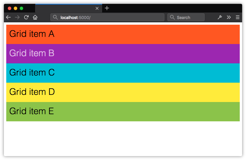 Using
Using display: grid creates a block-level container, and block boxes for its children
Using display: inline-grid works similarly. Children of inline-level grid containers create grid-level boxes, but the container itself participates in an inline formatting context.
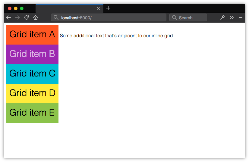 Using
Using display: inline-grid creates an inline-level box for the container, but block boxes for its children
By themselves, display: grid and display: inline-grid won’t automatically arrange these boxes into rows and columns. We also need to tell the browser where and how to place things.
Before creating your grid, determine whether you want a fixed number of columns and/or rows, whether you’d like the browser to calculate the number of columns and rows automatically, or whether you’d like a mix of the two. Knowing what kind of grid you want to create determines the approach you’ll take. Let’s look at a few techniques.
Defining a Grid Layout
After defining a grid container, we’ll need to tell the browser how many rows and columns our grid should contain. We can define the number of rows and columns using the grid-template-rows and grid-template-columns properties. They’re applied to the grid container.
Both grid-template-rows and grid-template-columns accept what’s known as a track list. The track list is a space-separated string that specifies grid line names and sizes of each position in the row or column.
Each value in a track list creates a new space—a track—within the row or column. You can use lengths, flexible length units (discussed later in this chapter), or percentages. You can also use sizing values such as auto, min-content and max-conent.
.grid {
    display: grid;
    grid-template-columns: 25rem 25rem 25rem;
    grid-template-rows: 10rem 10rem;
}
In the code above, we’ve defined a grid with three columns, each 25rem units wide and two rows, each 10rem units tall. Let’s apply it to the following HTML. Yes, this is all the markup required:
<div class="grid">
    <div>Grid item A</div>
    <div>Grid item B</div>
    <div>Grid item C</div>
    <div>Grid item D</div>
    <div>Grid item E</div>
</div>
Our grid items get organized into the columns and rows shown below.
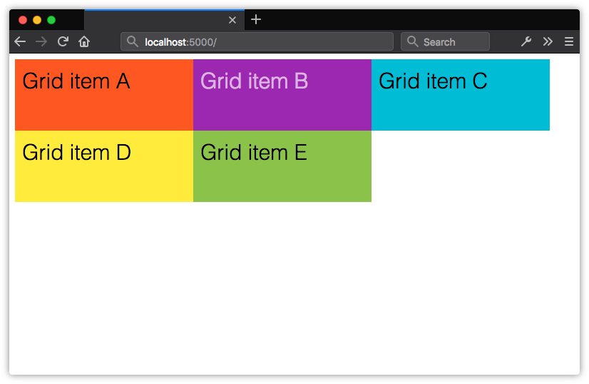 Creating an explicit grid with
 grid-template-columns and grid-template-rows
Here, we’ve created a grid of evenly sized rows and columns, but that isn’t a requirement of Grid. Let’s tweak our CSS slightly. We’ll change the value of grid-template-columns to 25rem 15rem 25rem:
.grid {
    display: grid;
    grid-template-columns: 25rem 15rem 25rem;
    grid-template-rows: 10rem 10rem;
}
Now the second column in our grid is narrower than the first and third.
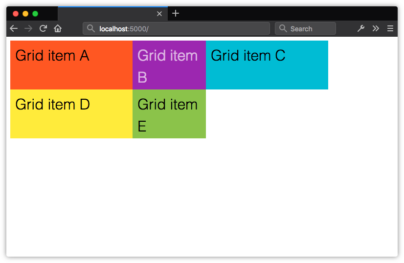 Grid columns and rows don’t have to be the same width
Explicit Grid versus Implicit Grids
In the previous section, we explicitly stated that this grid should have six available grid cells formed by three columns and two rows. This is what’s known as an explicit grid. Here, our grid container only has five children. The remaining position is empty. Let’s see what happens when we add more children to the container.
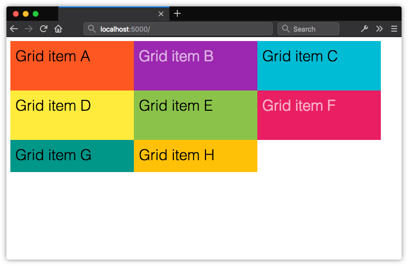 When grid items exceed the number of explicitly defined cells, the remaining items are arranged in an implicit grid
Now we have three rows. Notice, however, that our third row is only as tall as its contents and padding. It’s part of the grid because these items are the children of a grid container. Yet the row isn’t explicitly defined by grid-template-rows. What we have instead is an implicit grid—an explicit grid with additional grid items that exceed the defined number of explicit grid cells.
Items within an implicit grid are auto sized by default. Grid items will expand to accommodate their contents, or fill the remaining vertical space in the container—whichever is taller. If, for example, we set the height property of our container to 50rem, our implicit grid track will expand to be 30rem tall.
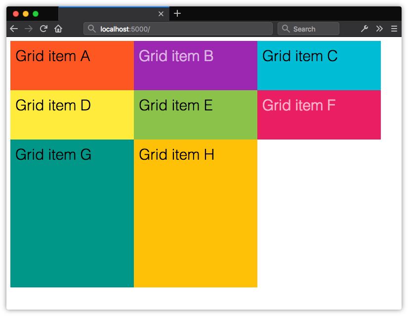 Implicit grid rows expand to fill the available height of the container
If we add enough items to create a fourth row, the height of our implicit grid items will be distributed evenly across the remaining 30rem of vertical space in the container. Their computed height will be 15rem each.
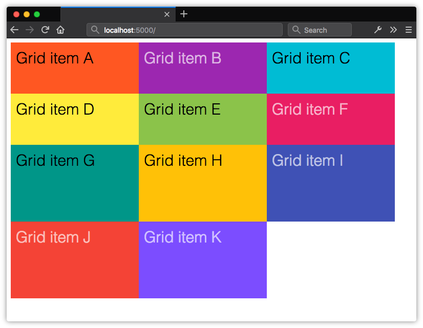 The height of implicit grid rows will be evenly distributed based on the remaining space in the grid container
In our original example, we’ve explicitly defined only two rows with a height of 10rem each, so our third row defaults to auto sizing. Its height will adjust to the size of its contents and padding.
Specifying Track Size for an Implicit Grid
It is possible, however, to set a kind of explicit, default height or width for implicit grid items using the grid-auto-rows and grid-auto-columns properties. Let’s update our CSS with grid-auto-rows:
.grid {
    display: grid;
    grid-template-columns: 25rem 15rem 25rem;
    grid-template-rows: 10rem 10rem;
    grid-auto-rows: 30rem;
}
Now items in our third row—and any subsequent rows—will be 30rem in height.
 Using
Using grid-auto-rows to specify the height of implicit grid items
There’s one drawback to using the grid-auto-* properties: when the contents of a grid item exceed its dimensions, they will overflow the container (shown below), and may be clipped visually by elements in other rows.
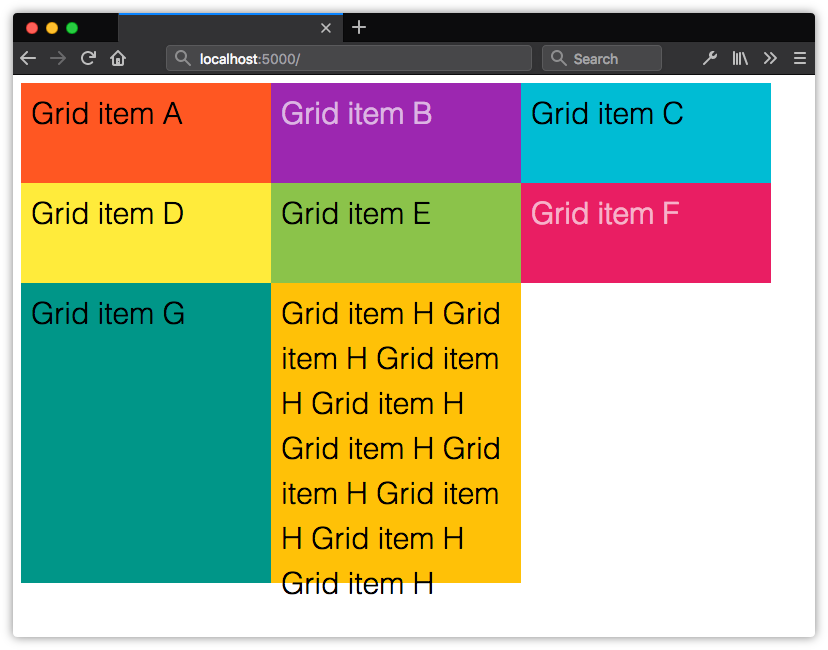 Contents of a grid container can overflow the container when using length or percentage units
One way to avoid this is to use the minmax() function. Let’s rewrite our CSS to use minmax():
.grid {
    display: grid;
    grid-template-columns: 25rem 15rem 25rem;
    grid-template-rows: 10rem 10rem;
    grid-auto-rows: minmax(30rem, auto);
}
As you may have guessed from its name, minmax() lets us define the minimum and maximum size of a track. It requires two arguments, the first of which is the minimum desired track size. The second argument is the maximum desired size.
In this case, our row will be at least 30rems high. But since we’ve set our maximum size to auto, our track will expand to accommodate the content of that cell. Arguments for minmax() can be lengths or percentages, or one of the auto, min-content, and max-content keywords. Here, minmax(30rem, max-content) would achieve much the same effect. Flexible units, discussed in the next section, are also valid.
Lengths and percentages can be used to define track sizes. Using them may mean that the grid items don’t fill the entire width or height of the container. For example, if our grid container is 70rem wide, grid-template-columns: 25rem 15rem 25rem; will only fill about 90% of its horizontal space. On the other hand, if our grid container is only 50rem wide, the total width of our columns will overflow the container’s bounds.
One way to avoid this issue is by using flexible length units.
Creating Flexible Grids with Flex Units
Flexible length or flex units are best understood as fractional units, and are expressed using fr. Flex units indicate to the browser what fraction or proportion of the leftover space in a grid container should be allocated to each grid item. They’re a ratio, not a true length value in the way px, em, or cm are.
There’s a formula for calculating the used width of an item when using flexible units: (flex × leftover space) ÷ sum of all flex factors. If, for instance, our grid container is 1000px wide, and the value of grid-template-columns is 3fr 2fr 1fr, our columns will be 500px, 333.33px and 133.33px wide. The width of each column is allocated proportionally from the space available, as shown below.
 Flexible length units maintain grid proportions, rather than absolute lengths
Because these units are ratios and not absolute lengths, grid-template-columns: 2fr 2fr 2fr is equivalent to grid-template-columns: 1fr 1fr 1fr. Both will result in columns of equal width for horizontal writing modes, and rows of equal height for vertical writing modes.
Note: fr units are not true length values. This makes them incompatible with other length units, such as px and rem and width percentages. It also means that you can’t use fr units with the calc() function. For example, calc(1fr - 1rem) is an invalid length value.
Using the grid-template Shorthand Property
We can also indicate the number of rows and columns using the grid-template property. Its syntax is as follows:
grid-template: [row track list] /
Consider this block of CSS:
.grid {
    display: grid;
    grid-template-columns: 25rem 25rem 25rem;
    grid-template-rows: 10rem 10rem;
}
We can combine the second and third lines using grid-template:
.grid {
    display: grid;
    grid-template: 10rem 10rem / 25rem 25rem 25rem;
}
For clarity, however, you may still wish to use the longhand properties.
Repeating Rows and Columns
In many cases, you’ll want grid columns or rows that repeat automatically; think of a list of store items or recipe search results. Grid offers a syntax for that—the repeat() function:
.grid {
    display: grid;
    grid-template-columns: repeat(3, 1fr);
}
repeat() accepts two arguments:
- the number of times to repeat the track list
- a track list to repeat
Arguments must be separated by a comma. The first argument may be a positive integer, or the auto-fit or auto-fill keywords. The above CSS produces the following grid. Our 1fr track list is repeated three times.
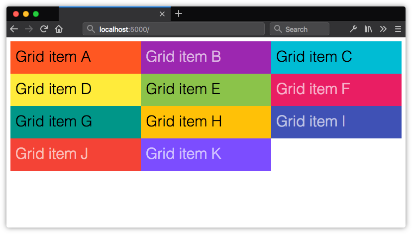 A repeating grid with
 fr units
We could also use a two-column pattern that repeats twice. For example, grid-template-columns: repeat(2, 1fr 3fr); produces a four-column grid. As the image below shows, the first and third columns are one third the width of the second and fourth. In both cases, the value of grid-template-rows is auto.
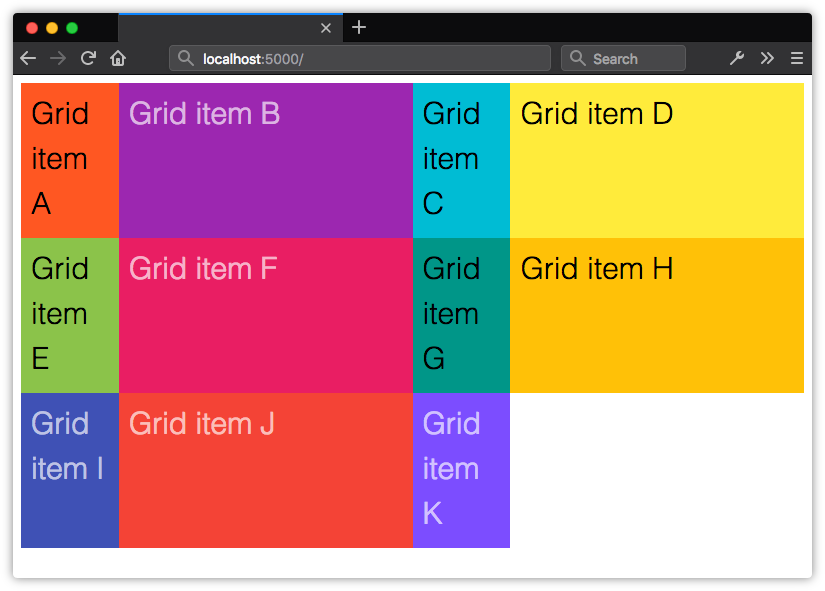 A repeating two-column grid pattern
Repeating Columns with auto-fit or auto-fill
Both of the preceding examples tell the browser: here’s a track list pattern; please repeat it X number of times. What you may want to tell the browser instead, though, is: please fit as many columns or rows as you can within this grid container. For that, we can use auto-fit or auto-fill as the first argument for repeat(), in combination with minmax().
What’s the difference between auto-fit and auto-fill? It’s subtle, but significant.
auto-fillfits as many grid items as it can within a track line, adding anonymous grid tracks if necessary.auto-fitfits as many grid items as it can within a track line, expanding or collapsing the dimensions of each track if necessary.
This difference becomes apparent when the grid container’s width exceeds the maximum total width of its grid items. Let’s compare some CSS:
.grid {
    display: grid;
    width: 800px;
}
.autofill {
    grid-template-columns: repeat(auto-fill, minmax(100px, 1fr));
}
.autofit {
    grid-template-columns: repeat(auto-fit, minmax(100px, 1fr));
}
And let’s apply this CSS to the HTML below:
<div class="grid autofill">
    <div>Grid item A</div>
    <div>Grid item B</div>
    <div>Grid item C</div>
    <div>Grid item D </div>
    <div>Grid item E</div>
</div>

<div class="grid autofit">
    <div>Grid item A</div>
    <div>Grid item B</div>
    <div>Grid item C</div>
    <div>Grid item D </div>
    <div>Grid item E</div>
</div>
The only difference between these two grid layouts is that one uses auto-fill and the other uses auto-fit. But compare the two grids in the image below.
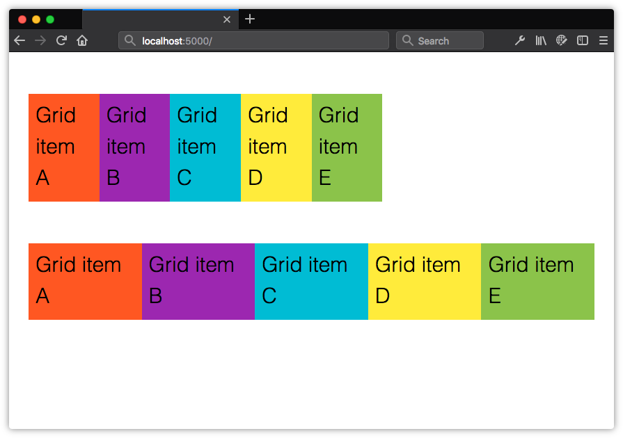 Comparing
 auto-fill with auto-fit
In both grids, the total maximum width of the grid items is less than that of the grid container. However, in the top grid—our auto-fill grid—that excess space is filled in by anonymous grid items.
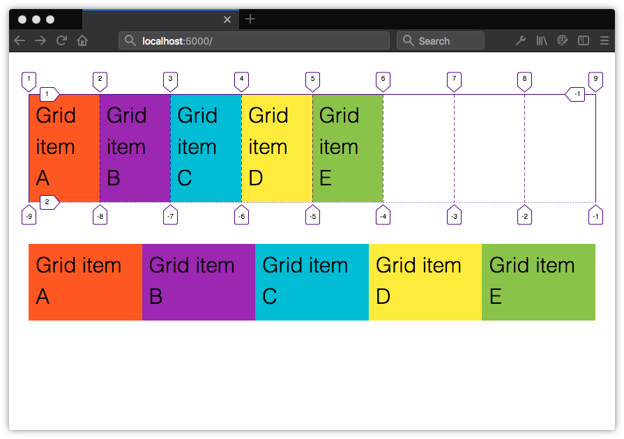 Visualizing the difference between
 auto-fill to auto-fit with the Firefox grid inspector
Compare that to the bottom grid, in which each grid item has been stretched to fit the available space. The image above illustrates what those anonymous grid cells look like using Firefox’s developer tools.
Note: If this still doesn’t make any sense, read Sara Soueidan’s “Auto-Sizing Columns in CSS Grid: auto-fill vs auto-fit”. It contains some video examples that illustrate the difference a little bit better than static images can.
This is an extract from the book CSS Master, 2nd Edition. Up to this point, we’ve covered simple grids that are neatly aligned rows and columns of boxes. The book goes on to explain the far more complex layouts Grid can handle, covering line-based grid placement, named grid areas, how to space grid items, and dealing with images within grids.
Conclusion
CSS Grid is a very dense topic. We’ve really just scratched the surface here. Luckily, there’s a wealth of resources that can help you learn more.
I believe in reading specifications where possible. In my opinion, the CSS Grid specification is quite readable, and it’s a good place to begin your own explorations of grid layout. But specifications do tend to contain a lot of jargon, because they’re targeted not only at web developers, but also those tasked with implementing the specification in browsers.
Rachel Andrew’s Grid by Example was created for a web developer audience. The site includes grid layout tutorials and a collection of common user interface patterns. Be sure to visit the site’s Resources section too. It’s a cornucopia of links that demonstrate what you can do with CSS Grid.
Jen Simmons’ Experimental Layout Lab is also chock-full of examples that illustrate Grid’s possibilities. If video is more your style, Simmons’ Layout Land YouTube channel includes video walkthroughs of grid and other layout topics.
When you need more of a cheatsheet-style reference, try “A Complete Guide to Grid”, by CSS-Tricks.
