Using Your Images to Create Color Palettes in Photoshop

Color is the one aspect of a design that can drastically change the tone of the entire project. Your color choices can make the difference between a polished, professional, perfected design and one that misses the mark altogether. Creating a color palette for your design doesn’t have to be guesswork; it can be easy done if you take a few simple steps, and use a few tools that are available to you.
There are several ways for creating your own color palettes, but one popular method is to sample colors from the project’s primary image and build your color palette from color values within it. If you are using multiple images, you may consider selecting images with similar color palettes, so that the entire piece has a sense of unity.
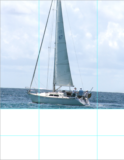
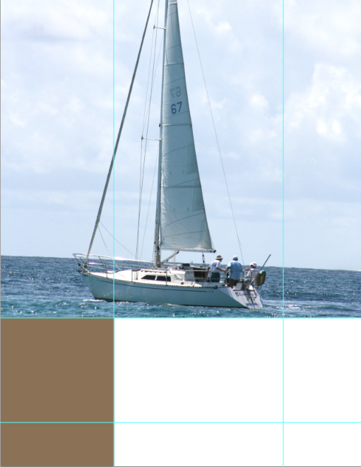
Step 1: Setting Up Your Canvas
For our example, I am going to create a nautical-style advertisement. I divided the canvas’s height into thirds and shifted the boat to the top two thirds of the document.

Step 2: Laying the Groundwork
For the bottom third, I created a new layer, took the marquee tool and drew a white rectangle on the bottom third of the image. This is where the bulk of our text and other content will go.
Step 3: Select your Palette’s Base Color
Select the eyedropper tool and select a good starting color for your color palette. The RGB value for the color used in my example is R:80, G:119, and B:139.
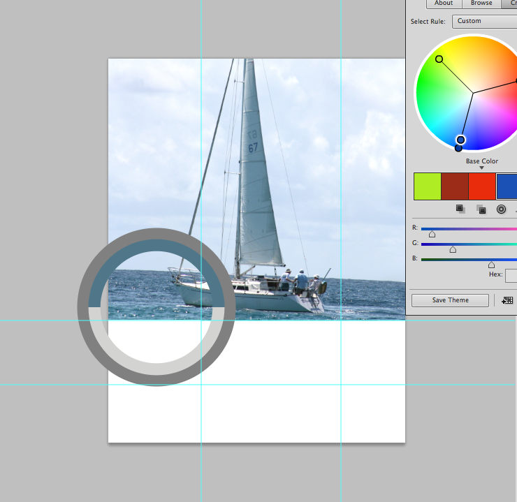
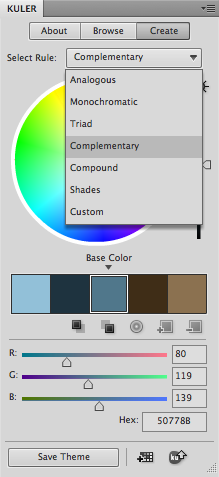
Step 4: Kuler, an Essential Color Plugin
For help with making color palettes, I use Kuler. To open Kuler’s panel, you go to “Window” > “Extensions” > “Kuler.” The panel should look like the example below:
Step 5: Bring Your base Color Into Kuler
Our foreground color is the color that we selected with the eyedropper tool. To bring it into Kuler to build our color palette, click the first square under the color blocks. This makes the color that we selected with the eyedropper tool our base color.
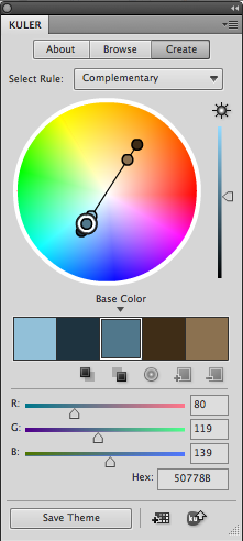
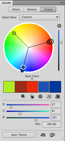
Step 6: Select the Right Color Theory For Your Work
Above the color wheel, you will see a drop down menu with different color rules, such as Complementary, Compound, Analogous, Shades, Triads, and more. Select the one that works best for your project. For our example, I chose complimentary.
Step 7: Saving Handy Swatches
When you have a color scheme that you like, you can add the color scheme to your swatches for later use. This is handy when you close your document and come back to it later, because your carefully-chosen color combinations will be saved in your swatches panel. Simply click the bottom-middle button, “add this theme to swatches,” and you will find those 5 colors saved in your swatches panel.
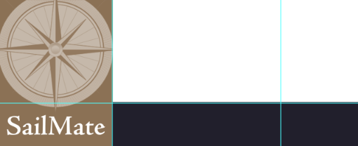
Step 8: Organize Your Content Area
I am also dividing the image via thirds horizontally, and I am going to place our logo is the bottom-left corner of our advertisement. I created a new layer and drew a rectangle in the bottom-left corner where the logo will go. I chose the lighter brown as the background area for the logo. This will make it stand out against all of the blue.
Step 9: Filling in Color Areas
With your rectangular selection made, hold down option/alt and hit the delete key to fill the selection with your foreground color. The RGB value for the light brown color in my example is R:139 G:113 B:80.
Step 10: Use Contrasting Colors For Visual Impact
Using Adobe Jenson, I typed in the words, SailMate, which is the name of our ficticious company. I made the text white in order to make it stand out against the chosen brown background.

Step 11: Bring In the Logo and Make it Stand Out
Next, I brought in the compass logo, and set the blend mode to “screen” so that it would be all white as well. I set the opacity for the compass layer to 0.

Step 12: Divide the Remaining Area
The final two thirds of the content area is going to be divided again. I divided this area by thirds once again. The top portion, where the text will go, is two thirds, and the bottom portion is one third.
Step 13: Add in a Dark Color For Contrast
Create a new layer and select the bottom third of your content area, excluding the logo portion, using the marquee tool.
Step 14: Pull Colors From Kuler to Your Foreground Color
In the Kuler Panel, double-click the dark blue/navy color to set it as your foreground color. Hold alt/option key and press delete to fill that area with navy blue.
Step 15: Capture Attention With a Large Headline
Select the text tool and set the size to 30, because we are going to create our headline. Type out your text and click the dark brown color in your swatches panel.

Step 16: Body Text in Photoshop
To create the body of text, select your type tool and draw out a rectangle that fits within the white area that remains. Leave some space between your body text and your headline. Breathing room will make your text easier to read.
Step 17: Select Your Text and Change Its Color
Type your body text, or paste it from a source document. To set the color, double-click the “T” icon in the layers panel, and click the desired color swatch from the swatches panel. I chose the original blue that was our base color.

Step 18: Create a Call to Action
In the navy rectangle at the bottom of the page, we will create our call to action and contact information. Here, you can use either white for the most contrast, or the sky blue color from the swatches that we created earlier.

Step 19: Create a Landscape Aside
Lastly, we are going to create a stand-out message that comes from the left side and bleeds off of the left margin. We are going to use the navy blue that we used at the bottom of the page, because it will stick out from the light blue background of the sky and the white found in the boat.

Step 20: Add in Details
For extra emphasis and detail, I added a white stroke inside of the blue rectangle that we just created. To do this, while you have the blue rectangle layer selected, hit command/ctrl + “J” to duplicated the layer.
Step 21: Add a Stroke with Layer Styles
Hit command/ctrl + “T” to transform the duplicated rectangle. Make it smaller than the original, set the fill to 0, and double-click the layer to bring up layer styles.
Step 22: Set the Size of the Stroke and Adjust to Taste
Add a 1-2px white stroke around the transparent layer, and it will give you a white inset stroke within the blue rectangle. Transform the rectangle again if it isn’t shaped the way you want it.

Step 23: Add Emphasis to Text
Select your text tool and type your tagline or blurb. I set the text color to white. In the example, I highlighted “you” and in the type controls, and I set the typeface to italic to emphasize this word.
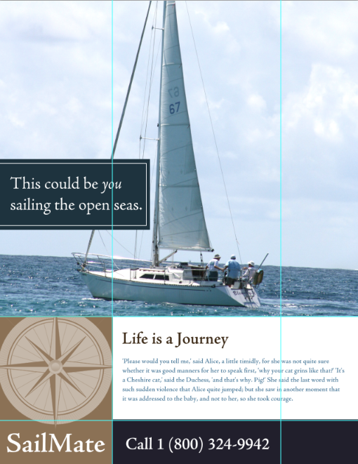
There is your finished product, with colors chosen entirely from the primary image.
Do you use tools like Kuler to determine these color choices, or do you consider them more of a constraint than a guide? Should colors be chosen pragmatically, or is color choice part of a designer’s artistic duties?