Finding Problem Areas on Your Website with Google Analytics

Finding out what users are doing on your website can tell you where UX may be falling short. While further investigation is required to find out why, taking an analytics-first approach to UX design will show you where to start. In this article, I’ll show you where to look for underperforming areas of your website using Google Analytics.
If you feel like you’re jumping in the deep end here, then read our introductory “Getting Started with Google Analytics” article first, or if you only missed the second installment in the series, then here’s our guide on “How to Perform User Research with Google Analytics”.
Okay, let’s begin.
Page-level Issues
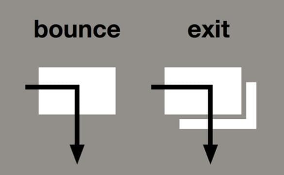
A great place to start looking for problem areas is to look at the performance of individual pages. Key metrics to look out for are Bounce Rate and Exit Rate. These two metrics often cause confusion, but it’s very important to understand the difference between them.
A bounce refers to a visit (or “session”) on a website, during which the user only views one page before leaving. An exit refers to the moment where a user leaves your website. Users can view multiple pages before exiting, which is where exits differ from bounces. Bounce Rate and Exit Rate is then the percentage of users who bounce or exit respectively.
Have a look at the metrics from my own website, lukehay.co.uk:
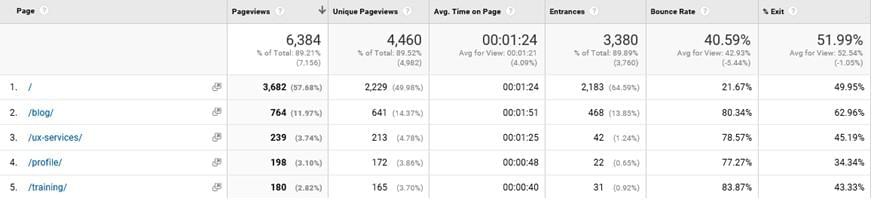
As you can see, the /training/ webpage has a high Bounce Rate, which suggests that it’s not leading visitors to view any other pages on the website. It appears that I need to make this web page more engaging!
The /contact/ page has a high Exit Rate, although this could be expected as it’s natural that users would want to exit the website after sending me a message. Always consider the user intent before making assumptions. In this case, the exit rate appears to be as expected.
Page Value
Page Value is useful for identifying which pages are contributing to conversions. Page Value is how Google Analytics gives a single web page a monetary value. For ecommerce sites, Google Analytics pulls in the values from Transaction Revenue, and for all other types of websites, it pulls in the Goal Value. Here’s how Page Value is calculated:

From a UX perspective, all you really need to know is that pages that contribute more to conversions (financial and non-financial) will generally have a higher Page Value. This means that you can often identify the key pages in the conversion process using this metric.
You can then focus your attention on any web pages that have a high Page Value but also a high Bounce Rate or Exit Rate, since these are the pages that can be thought of as “leaking” value from your website, potentially due to a critical flaw in the user experience.
You can also analyze on-page behavior (this is when a user interacts with a web page without loading a new web page in the browser) using event tracking, though this needs to be set up manually by a developer.
User Journeys
Looking at specific web pages in isolation will certainly give you an idea of how your website is performing, but in order to get the full picture, you’ll also want to look at user journeys. The behavior flow reports (Behavior → Behavior Flow) in Google Analytics help you to visualize how users are actually navigating through your website.
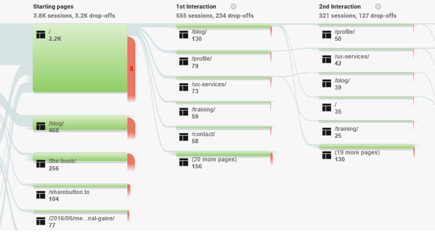
While these reports look cool, they can be hard to decipher. You’ll want to spend some time exploring these user journeys in detail if you want to find the really useful insights. Smaller websites with fewer user journeys are easier to analyze using these reports than large websites.
Conversion Funnels
Conversion Funnels can be used to gain a better understanding of where your users are dropping out of the conversion flow. These funnels will show each step in the journey to a certain conversion, and where your users enter and exit these journeys. The Conversion Funnel reports can be found under Conversions → Goals → Funnel Visualization.
The example below is taken from an ecommerce website:
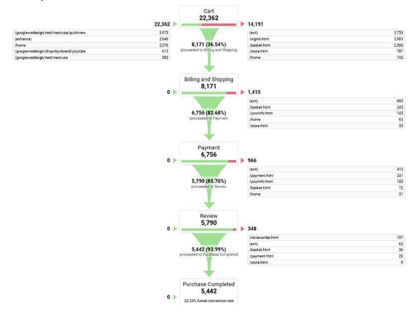
This report shows that, while over 22,000 users enter the shopping cart, only a total of 5,442 go on to complete a purchase. It also shows that the biggest dropout is at the first step, where 36% of users drop out between the shopping cart and the billing/shipping step, so we’ve identified a yet another problem area right there. Making improvements to these problem areas will likely to lead to big increase in sale conversions. The funnel reports also offer you a decent way to measure the impact of changes you’ve made to the steps in those user journeys.
Search Terms
Another report you’ll want to look at is the internal search report (Behavior → Site Search → Search Terms). This report will tell you which search terms users are entering in the search box on your website (if you have one). The most popular search terms typed into this box generally fall into two categories:
- The content/product exists on your website but is hard to find, so you’ll want to improve the discovery of it.
- The content/product doesn’t exist your website, and as a result you may want to source that content or begin stocking that product.
If you’re seeing a high number of searches for a particular term, you’ll need to consider what that means, and if there’s anything more you can do to help those users to find what they’re looking for.
Technology
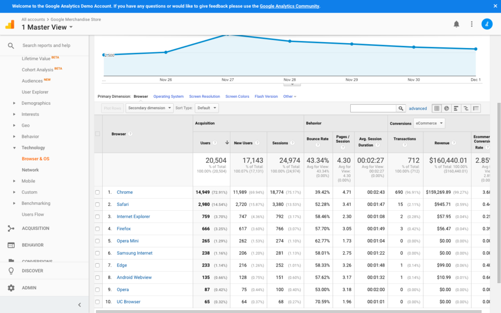
Browser (Audience → Technology → Browser & OS) and device (Audience → Mobile → Devices) reports can help you locate areas where your website is underperforming. While it’s perhaps to be expected that your conversion rates will be lower on mobile devices, the device overview report may still show you that there’s room for improvement. If, for example, your mobile conversion rate is ten times lower than your desktop conversion rate, you might want to look into why that is!
Your website also may be performing differently across different browsers, and this could point towards development issues/browser incompatibility. For example, if your website is converting poorly in Internet Explorer/Edge, you might want to check that your website renders correctly and performs as expected in that browser.
The same principle is true for Device Types. If your website metrics look poor for a particular device, you’ll want to have a good look at it on that device (or on an emulator) to find if there are any obvious issues.
Segmenting for Results
When analyzing the performance of your website, you could also segment your data to gain a better understanding of how it’s performing for specific user groups. As covered in my article on “How to Perform User Research with Google Analytics”, you can create segments in Google Analytics based on your key user groups. Doing this will allow you to discover whether only certain groups are having problems.
Segmenting could help you see, for example, that your older demographics are converting poorly on tablet devices, or that German users are dropping out at the payment stage of your conversion funnel due to payment restrictions. Remember, just because the overall metrics for your website look good, it doesn’t mean that all of your users are equally happy with it. There’s always room for improvement.
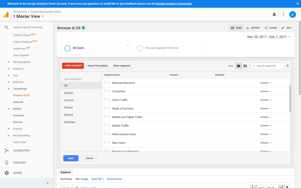
You can segment users by clicking the + Add Segment button at the top of the Google Analytics interface, where you can either choose a segment from the list or click + New Segment to define your own.
Conclusion
Taking an analytics-first approach to your UX design process is a fantastic way find out where to focus your more qualitative efforts. Google Analytics will tell you what is happening with your website, and then it’s up to you to find out why that might be. Google Analytics can be daunting to begin with, but it’s worth taking the time to learn how to use it, because there’s so much insight that can be taken from that data.
Make sure to check out all the articles in our UX Analytics series.
To learn in-depth about UX Analytics, check out SitePoint’s book Researching UX: Analytics.