Google’s Doodle and Why it Hertz my Brain!
How do we love Google Doodles? Let us count the ways.
They’re brilliant. In fact, I even enjoy getting up every day knowing that somewhere in Mountain View there are probably people shouting ‘Woohoo! It’s Robert Heinlein’s Dad’s birthday next week! I wanna make an animated rocket on Google today!‘
We all have our favorites. I loved the Pacman tribute. The playable Les Paul guitar. The amazing deep-sea Jules Verne tribute. It’s true, the bar has been set very high.
But when Dan Laidler pointed out today’s celebration of the great German physicist Heinrich Hertz, we all did a little doubletake.
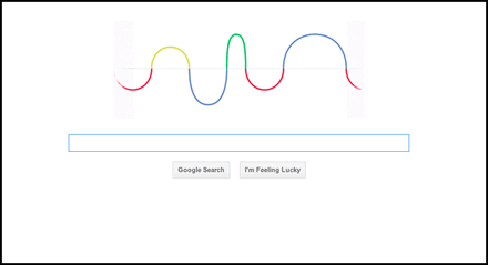
Hertz’s work was centered around waves — from light to radio — so Google paid tribute to his 155th birthday by evolving their famous logo into a gently moving wave that echoes the Google letter shapes.
That was a nice enough idea, but it was how they made it wiggle that had us scratching our collective heads.
For here we had (arguably) the most technically-adept web company on the planet choosing to animate the wave as a big-ass animated GIF.
More precisely, a 197kb, 49 frame, kinda jerky animated GIF. Brows were furrowed.
The obvious question is “Why?” Sure, we all know support for animated GIFs is ubiquitous, and often the simple solution is the best solution. However, for a company that so vigorously champions the power of HTML5 in particular, and the web in general, it seems like a strange decision.
So rather than just bleat about it — though we enjoy that too — we had a quick play around with alternatives. Here are the results so far.
The CSS3 Only Method
Easily the quickest method to get something working is CSS3. We start out with the simplest imaginable HTML.
Note: For the sake of clarity, I’m only going to show the W3C standard below, but the example contains all the prefixed CSS required.
<div id="wavelength"></div>The basic CSS setup isn’t much more complicated. We give the DIV width and height, and embed our wave graphic into the background.
#wavelength{
width:380px;
height:223px;
margin: 100px auto;
border:1px #ddd dashed;
background: url(https://i2.sitepoint.com/examples/css3/animation/hertz.png);
position:relative;
}
The keyframe animation code simply slides the background image position from the default (0px 0px) to 380px to the left.
@keyframes hertz {
0% {background-position:0px 0px;}
100% {background-position:-380px 0px;}
}Then we just attach the animation to the #wavelength DIV.
animation: hertz 4s infinite linear; /* w3c standard */As a final touch I’m using the :before and :after pseudo elements of the #wavelength DIV to provide the fluffy white edges that you see on the left and right sides of the original GIF.
Here are working demos on both Codepen> and JSFiddle.
See the Pen Google’s Hertz Doodle by Alex (@alexmwalker) on CodePen.
Run side-by-side with the GIF, the CSS3 version is certainly much visually smoother and file sizes are slashed drastically. Our wave graphic is now under 3kb, meaning — and even accounting for multiple prefixes — we only need a little over 1400 characters of CSS. That’s a combined weight of just over 4kb or less than 3% of the original.
Of course, we can’t pretend that CSS3 doesn’t have its drawbacks.
Google’s audience is as broad as they come, so a method that doesn’t work on older Internet Explorers (pre IE10) probably isn’t an option. Nevertheless, if you ran the GIF as a fallback using something like Modernizr to target older browsers, I think you’d have a very viable solution.
The JQuery Method
JQuery is the no-brainer way to target both old and new browsers with a single approach. There’s more than one way to do it, but here’s the simplest method we could think of (cheers Harley).
We’re starting with pretty much the same basic HTML and CSS as the previous example — minus the CSS animation code.
Next we create a simple function (waveloop();) that resets the our background X position to 0px.
function waveloop(){
 $('#wavelength').css({'background-position-x': 0});
    });
}
Then we need to animate the background position 380px to the left of screen (hence the minus) like this:
function waveloop(){
 $('#wavelength').css({'background-position': 5});
    $('#wavelength').animate({'background-position': '-380px'},3700,'linear';
    });
}
We found 3700 milliseconds is a fairly close match to the GIF timing, though it varies slightly from computer to computer.
At this point our wave animates nicely to the left, but stops after the first pass. We want it to loop without us having to retrigger it each time. The easiest method is to get the function to trigger itself again when it finishes. This is a callback and we can call like this:
function waveloop(){
 $('#wavelength').css({'background-position': 5});
    $('#wavelength').animate({'background-position': '-380px'},3700,'linear', function(){ waveloop();
    });
}
Finally we just need to call our function with jQuery’s document ready function.
$(document).ready(function() {
   waveloop();
});
And that’s it.
Here’s a working demo showing the Google GIF at the top as a comparison.
About half a dozen lines of code to a smoother, cross-browser, lower-bandwidth result. Granted, we need to include the minified jQuery library in the download, but even throwing in that 30kb file doesn’t get us anywhere near 40k, or a fifth of the GIF file size.
And jQuery is really overkill here — I just had other work to finish.
So, what do you think?
- Did Facebook poach the Google Doodlers?
- Perhaps you’ve got an even better way to do it?
- Am I under-estimating the power and beauty of the animated GIF?
Or am I just being a little tough on the poor guys?

