Bootstrap Card Component: a Complete Introduction
In this article, I’m going to introduce you to the Bootstrap card component and walk you through its many features and uses. By the end of this tutorial, you’ll be able to incorporate Bootstrap cards in your web projects for great layouts and page content organization.
Bootstrap is the most popular HTML, CSS, and JavaScript framework for quickly creating responsive and mobile-first web layouts.
Using Bootstrap offers many advantages to developers, including the following:
- you can easily and quickly build a responsive layout by having only some knowledge of HTML and CSS
- the library was built to be mobile-first from the core
- it’s compatible with all modern browsers etc.
- it uses Flexbox for its grid system
- it provides tons of features and components.
The latest release of Bootstrap offers many new, modern features — such as the support for Flexbox, and the new card component, which replaces panels, thumbnails and wells from earlier versions of the library.
What Is the Bootstrap Card Component?
Bootstrap introduces a new UI component for creating cards which provides a flexible and stylish container for showing content. Cards come with minimal styling, but you can easily extend them with extra styling options.
This component is built on top of Flexbox, and you can use the Bootstrap spacing utility classes for margins and padding.
Cards can conveniently accommodate different types of content like title, subtitle, body copy, and images etc., and optional header and footer sections. You can also include different sections (card blocks) to construct different types of cards depending on your use.
Including Bootstrap in Your Project
You can very easily start using Bootstrap in your website by either including it from a CDN or downloading it from getbootstrap.com.
For the sake of introducing the new Bootstrap card component, you’re going to create a simple HTML page with Bootstrap styling to demonstrate the basic elements of the card component. Go ahead and create the index.html file inside your project folder, then add the following content from the docs starter template:
<!doctype html>
<html lang="en">
  <head>
    <!-- Required meta tags -->
    <meta charset="utf-8">
    <meta name="viewport" content="width=device-width, initial-scale=1, shrink-to-fit=no">

    <!-- Bootstrap CSS -->
    <link rel="stylesheet" href="https://maxcdn.bootstrapcdn.com/bootstrap/4.0.0/css/bootstrap.min.css" integrity="sha384-Gn5384xqQ1aoWXA+058RXPxPg6fy4IWvTNh0E263XmFcJlSAwiGgFAW/dAiS6JXm" crossorigin="anonymous">

    <title>Bootstrap Card Example</title>
  </head>
  <body>
       <div class="container">
    </div>

    <!-- Optional JavaScript -->
    <!-- jQuery first, then Popper.js, then Bootstrap JS -->
    <script src="https://code.jquery.com/jquery-3.2.1.slim.min.js" integrity="sha384-KJ3o2DKtIkvYIK3UENzmM7KCkRr/rE9/Qpg6aAZGJwFDMVNA/GpGFF93hXpG5KkN" crossorigin="anonymous"></script>
    <script src="https://cdnjs.cloudflare.com/ajax/libs/popper.js/1.12.9/umd/popper.min.js" integrity="sha384-ApNbgh9B+Y1QKtv3Rn7W3mgPxhU9K/ScQsAP7hUibX39j7fakFPskvXusvfa0b4Q" crossorigin="anonymous"></script>
    <script src="https://maxcdn.bootstrapcdn.com/bootstrap/4.0.0/js/bootstrap.min.js" integrity="sha384-JZR6Spejh4U02d8jOt6vLEHfe/JQGiRRSQQxSfFWpi1MquVdAyjUar5+76PVCmYl" crossorigin="anonymous"></script>
  </body>
</html>
We’ve included Bootstrap files and their dependencies (jQuery and popper.js) from different CDNs, then created a container division.
Minimal Styling for Cards
In order to create a basic card, we need to —
- use
.cardwith adivtag to create the outer container - add the
.card-bodyclass to an innerdivtag to create the card body - use
.card-titleandcard-subtitleclasses with heading tags for adding the title and the subtitle - use the
card-textclass with<p>tags to add textual content - use the
card-img-topclass with the<img>tag to add an image to the top of the card.
These are the basic elements that constitute a full but basic card layout, as we can see from the following example:
<div class="card">
  <img class="card-img-top" src="https://source.unsplash.com/daily" alt="Card image top">
  <div class="card-body">
    <h3 class="card-title">Card title</h3>
    <h4 class="card-subtitle">Card subtitle</h4>
    <p class="card-text">This is a simple Card example</p>
  </div>
</div>
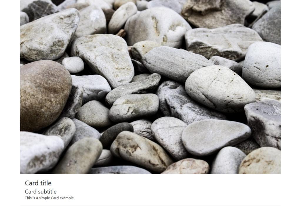
This is a screenshot of the result:

As can be seen, the card takes the full width of its container div.
By simply switching the card-body class with the card-img-overlay class, we can use the image as an overlay:

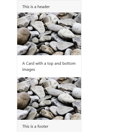
We can also use the class .card-img-bottom with the <img> tag to add the image at the bottom of the card:
<div class="card">
  <div class="card-header">
      This is a header
  </div>
  <img class="card-img-top" src="https://source.unsplash.com/daily" alt="Card image top">
  <div class="card-body">
      <p class="card-text">A Card with a top and bottom images</p>

  </div>
  <img class="card-img-bottom" src="https://source.unsplash.com/daily" alt="Card image top">

  <div class="card-footer">
          This is a footer
  </div>
</div>

The card top and bottom images are called image caps.
Controlling Bootstrap Card Component Width and Height
By default, cards take all the available width in their parent container, but you can use the width and max-width classes to control take control of the card’s dimensions. So, let’s change the previous example by reducing the width of the card:
<div class="card" style="width:20rem;">
  <img class="card-img-top" src="https://source.unsplash.com/daily" alt="Card image top">
  <div class="card-body">
    <h3 class="card-title">Card title</h3>
    <h4 class="card-subtitle">Card subtitle</h4>
    <p class="card-text">This is a simple Card example</p>
  </div>
</div>

Normally, the height of the card will be adjusted to vertically fit the content of the card, but we can also control it using custom CSS (for example, style=" height: 10rem;") or Bootstrap’s sizing utilities (for examle, <div class="card h-200">).
Please, note that the latest release of Bootstrap has switched to rem units instead of px units because rem is a scalable measurement unit — so it works better with user settings, which makes text much more accessible. The result is that all elements in the page will scale with the screen size. (You can find out more about the new features of Bootstrap in SitePoint’s “Bootstrap: Super Smart Features to Win You Over” article.
Another option for controlling the width of the Bootstrap card component is to use the Bootstrap grid (rows and columns):
<div class="row">
    <div class="col-sm-3">
        <div class="card">
            <img class="card-img-top" src="https://source.unsplash.com/daily" alt="Card image top">
            <div class="card-body">
                <h3 class="card-title">Card title</h3>
                <h4 class="card-subtitle">Card subtitle</h4>
                <p class="card-text">This is a simple Card example</p>
            </div>
        </div>
    </div>
</div>

Bootstrap Card Component Header and Footer
A Bootstrap card component can optionally have a header and footer by adding heading (<h*>) and div tags with .card-header and .card-footer classes respectively.
Continuing with our example, let’s add a header and footer to our Bootstrap card component:
<div class="row">
    <div class="col-sm-3">
        <div class="card">
            <div class="card-header">
                This is a header
            </div>
            <img class="card-img-top" src="https://source.unsplash.com/daily" alt="Card image top">
            <div class="card-body">
                <h3 class="card-title">Card title</h3>
                <h4 class="card-subtitle">Card subtitle</h4>
                <p class="card-text">This is a simple Card example</p>
            </div>
            <div class="card-footer">
                    This is a footer
            </div>
        </div>
    </div>
</div>
This is the screenshot of the result:

Adding Navigation
Another nice feature of the Bootstrap card component is the possibility of adding advanced navigation patterns to the header section such as tabs and navigation pills.
So let’s change our simple example by adding a tabbed navigation element to the header section of the card with the .nav-tabs and .card-header-tabs classes on the <ul> tag:
<div class="card-header">
  <ul class="nav nav-tabs card-header-tabs">
    <li class="nav-item">
        <a class="nav-link active" href="#">Tab 1</a>
    </li>
    <li class="nav-item">
        <a class="nav-link" href="#">Tab 2</a>
    </li>
  </ul>
</div>

In the same way, we can add navigation pills by simply replacing .nav-tabs with nav-pills and .card-header-tabs with card-header-pill on the <ul> list tag:
<div class="card-header">
  <ul class="nav nav-pills card-header-pill">
    <li class="nav-item">
        <a class="nav-link active" href="#">Tab 1</a>
    </li>
    <li class="nav-item">
        <a class="nav-link" href="#">Tab 2</a>
    </li>
  </ul>
</div>

You can find out more information about this in the Bootstrap navigation components documentation.
Adding Links to the Bootstrap Card Component
We can quickly add links inside cards using the <a> tag with a .card-link class:
<div class="card">
<div class="card-body">
  <h3 class="card-title">Adding Links</h3>
  <p class="card-text">These are simple links</p>
  <a href="#" class="card-link">Link 1</a>
  <a href="#" class="card-link">Link 2</a>
</div>
<div class="card-footer">
      This is a footer
</div>
</div>

Aligning and Transforming Text in Bootstrap Card Components
We can use different Bootstrap classes (text utilities) to align text within a card component such as .text-left (align text to left), .text-right (align text to right), .text-center (center text), .text-justify (justify text) and .text-nowrap (prevent text from wrapping).
We can also apply text transformation with .text-lowercase (transform text to lowercase), .text-uppercase (transform text to uppercase) and .text-capitalize (transform the first letter of each word to uppercase).
Customizing Bootstrap Card Component Background, Foreground and Border Colors
A Bootstrap card component’s background and foreground colors can be fully customized using Bootstrap text and background color utilities — text-primary, text-white, bg-primary and so on.
Using the Bootstrap’s border utilities (for example, border-primary) we can quickly set the border color of a card.
The CodePen demo below shows all the different kinds of cards we can create with Bootstrap. Feel free to experiment with it on your own:
See the Pen Bootstrap 4 Card Examples by SitePoint (@SitePoint) on CodePen.
Creating Advanced Layouts with the Bootstrap Card Component
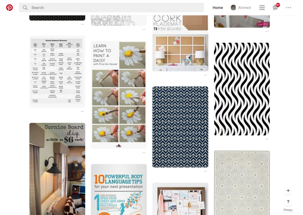
The card is a modern UI component that’s utilized in many websites as a way to display items of mixed and different content types (such as text and images etc.) as a single/grouped entity, but more commonly as a collection of similar items with a different or the same width and height. A popular layout where cards can be used is the Masonry layout, also called the Pinterest-like Layout

Cards can be used for creating layouts for image albums, blog posts, ecommerce products etc. Big companies like Google and Facebook are making use of cards for their different web platforms.
Normally, if we want to create complex layouts based on cards, we’d need to have deep knowledge of CSS and HTML. However, thanks to the latest features of Bootstrap, we can quickly build such layouts by wrapping our set of cards inside divs with some special classes such as .card-group, .card-deck and .card-columns.
Grouping/Nesting Cards
Groups are used to display multiple Bootstrap card components as single and attached elements with uniform sizing — that is, cards have the same width and height. This is achieved using the display: flex; property.
We can create a group of cards using the .card-group class with a wrapper div that contains the child cards.
Let’s add the following code to create a group with three cards:
<div class="card-group">
<div class="card text-white">
<img class="card-img-top" src="https://source.unsplash.com/featured/" alt="Card image top">
<div class="card-img-overlay">
<h3 class="card-title">Card title</h3>
<h4 class="card-subtitle">Card subtitle</h4>
<p class="card-text">This is a simple Card example</p>
</div>
</div>
</div>
This is a screenshot of the result:

As can be seen, the three cards are attached and have the same width and height.
Card Decks
Decks provide you with a layout similar to the previous one (that is, same width and height for each card) but with the one difference that cards are not attached to each other.
We can simply add a .card-deck class to a parent div element to create a card deck:

As we can see, the cards are of the same size with some margin between them.
Card Columns
Just like groups and decks, card columns can be used to lay out a set of cards in a Masonry-like style. We can achieve this popular layout style simply by wrapping our cards in a div and adding the .card-columns class. That’s all we need to do and Bootstrap will take care of the rest without having to use a JavaScript/jQuery plugin.
Bootstrap uses CSS columns to create the Masonry-like layout where cards are added from top to bottom and left to right. However, if we need a different kind of behavior based on some algorithm, we’ll have to resort to a JavaScript library or a jQuery plugin like Masonry.
Here’s a Masonry layout demo using Bootstrap cards in action:
See the Pen Bootstrap 4 Masonry Layout by SitePoint (@SitePoint) on CodePen.
Conclusion
The Bootstrap card component is a powerful addition to the Bootstrap framework, which allows developers to create modern-style web pages without going deeply into how CSS works. You can add card layouts to represent image galleries, dashboard widgets, to display blog posts or products for an ecommerce website, by just adding a bunch of CSS classes.
As a result of the new features and components, Bootstrap continues to be a powerful CSS framework available to everyone, particularly to developers who need to create their own responsive and modern-style layouts but lack enough time and budget, or the deep knowledge of CSS, necessary to produce custom code.
If you’ve got the basics of Bootstrap under your belt but are wondering how to take your Bootstrap skills to the next level, check out our Building Your First Website with Bootstrap 4 course for a quick and fun introduction to the power of Bootstrap.
