A Deep Dive into the Bootstrap Form Component
In this article, you’ll learn how to style form elements with the Bootstrap form component, and how to take advantage of the grid system to align these elements. Also, we’ll see horizontal and inline forms in action, as well as discuss form validation.
I still remember the (not so good) old days when we had to code all the styling for websites manually. There were very few solid CSS solutions, and creating complex UIs used to be a huge pain. It was like an arcane lore that developers were sharing with each other: they told tales on how to make rounded circles, how to highlight focused elements or create a gradient background … I don’t really miss those days. Luckily, there are many new technologies out there that help us to speed the process of styling web applications. One such technology is Bootstrap, and today we will discuss one of its most-used component: forms.
There are loads of predefined styles that can be applied to forms, and by using them you can create fancy UIs with little effort.
Getting Started
If you’d like to follow along, create the following boilerplate HTML:
<!DOCTYPE html>
<html>
<head>
  <meta charset="utf-8">
  <link href="https://maxcdn.bootstrapcdn.com/bootstrap/4.0.0/css/bootstrap.min.css"
        rel="stylesheet">
</head>
<body>

    <div class="container">
    </div>

    <script src="https://code.jquery.com/jquery-3.2.1.slim.min.js"></script>
    <script src="https://cdnjs.cloudflare.com/ajax/libs/popper.js/1.12.9/umd/popper.min.js"></script>
    <script src="https://maxcdn.bootstrapcdn.com/bootstrap/4.0.0/js/bootstrap.min.js"></script>
</body>
</html>
We load the Bootstrap’s styles and some scripts that will be required in one of the examples. This is it! All the markup should be placed inside the container block that acts as a main element for our page.
We can proceed to the next section and start crafting our first form.
Creating a Simple Form
Suppose we’re creating a registration form for our new shiny website. Our form should provide, at the very least, fields for an email address and a password:
<div class="container">
    <p class="h1">Register</p>

    <form>
        <label for="email">Email address</label>
      <input type="email" id="email" placeholder="Enter email">

        <label for="password">Password</label>
        <input type="password" id="password" placeholder="Password">
    </form>
</div>
Now let’s style these fields a bit. First and foremost, the label and input should be wrapped inside an element with the Bootstrap form component form-group class, which is going to add a small top margin. Also, we assign a form-control class to the inputs to make them look nicer:
<form>
    <div class="form-group">
        <label for="email">Email address</label>
      <input type="email" id="email" placeholder="Enter email" class="form-control">
    </div>

    <div class="form-group">
        <label for="password">Password</label>
        <input type="password" id="password" placeholder="Password" class="form-control">
    </div>
</form>
Note that Bootstrap automatically reboots form elements so that the new styles can be applied easily.
Why don’t we also display some help text beneath the email form to inform users that we won’t be using their data in any malicious way? In Bootstrap 3, help text is marked with the help-block class, but the latest release of the framework uses a class called form-text. Let’s place it right beneath the input (inside the form-group). Also, let’s make the text look more subtle by applying the Bootstrap form component text-muted class:
<div class="form-group">
  <label for="email">Email address</label>
  <input type="email" class="form-control"
     id="email" aria-describedby="emailHelp" placeholder="Enter email"> <!-- #1 -->
  <small id="emailHelp" class="form-text text-muted"> <!-- #2 -->
    For authentication purposes only. We will never share your email with anyone!
  </small>
</div>
Note how we added the aria-describedby attribute (point #1) for the input to explain that this field is being described by our help block (#2).
Why don’t we also make our two fields a bit larger to emphasize their importance? Inputs can be easily sized with the Bootstrap form component’s form-control-lg and form-control-sm classes:
<div class="form-group">
  <label for="email">Email address</label>
  <input type="email" class="form-control form-control-lg"
     id="email" aria-describedby="emailHelp" placeholder="Enter email"> <!-- #1 -->
  <small id="emailHelp" class="form-text text-muted">
    For authentication purposes only. We will never share your email with anyone!
  </small>
</div>

<div class="form-group">
  <label for="password">Password</label>
  <input type="password" class="form-control form-control-lg"
     id="password" placeholder="Password"> <!-- #2 -->
</div>
Here’s the result:
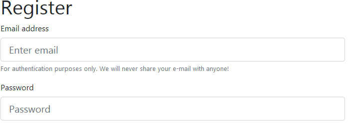
The form looks very clear, and the currently selected input gets a nice blue border. Cool!
Bootstrap Form Component Read-only Elements
Suppose now we’d like to introduce multiple pricing plans for our users, but at the moment only a “Basic” plan is available. Let’s add a Bootstrap form component read-only input styled as plain text. It’s as simple as assigning the form-control-plaintext class:
<div class="form-group">
  <label for="pricingPlan">Pricing plan</label>
  <input type="text" readonly class="form-control-plaintext"
     id="pricingPlan" value="Basic" aria-describedby="pricingPlanHelp"> <!-- #1 -->
  <small id="pricingPlanHelp" class="form-text text-muted">
    Basic is the only plan so far, but we'll introduce more soon!
  </small>
</div>
Here’s the result:

Other Types of Input Supported by the Bootstrap Form Component
Bootstrap supports styling for inputs of all types. For example, we may opt for a dropdown to allow users to choose their role:
<div class="form-group">
  <label for="role">Your role</label>
  <select class="form-control" id="role">
    <option>Developer</option>
    <option>Designer</option>
    <option>Manager</option>
  </select>
</div>
Once again, we’re simply wrapping everything inside a container with the Bootstrap form component form-group class and assigning the form-control class to the dropdown.
What about the textarea? We just follow the same principle:
<div class="form-group">
  <label for="comments">Comments (optional)</label>
  <textarea class="form-control" id="comments" rows="3"></textarea>
</div>
File uploading control? No problem here either:
<div class="form-group">
  <label for="photo">Your photo</label>
  <input type="file" class="form-control-file" id="photo">
</div>
Checkboxes? Easy! The only thing to remember is that checkboxes and radios should be wrapped inside an element with the form-check, not form-group, class. This class adds some extra padding to make these elements look nicer. Also, we assign form-check-input (#1) to the checkbox and form-check-label (#2) to the label so that they are aligned properly:
<div class="form-check">
  <input class="form-check-input" type="checkbox" value="1" id="userAgreement"> <!-- #1 -->
  <label class="form-check-label" for="userAgreement"> <!-- #2 -->
    I accept <a href="#">user agreement</a>
  </label>
</div>

<div class="form-check">
  <input class="form-check-input" type="checkbox" value="1" id="newsletter">
  <label class="form-check-label" for="newsletter">
    I'd like to receive newsletters
  </label>
</div>
Let’s reload the page and observe the result:
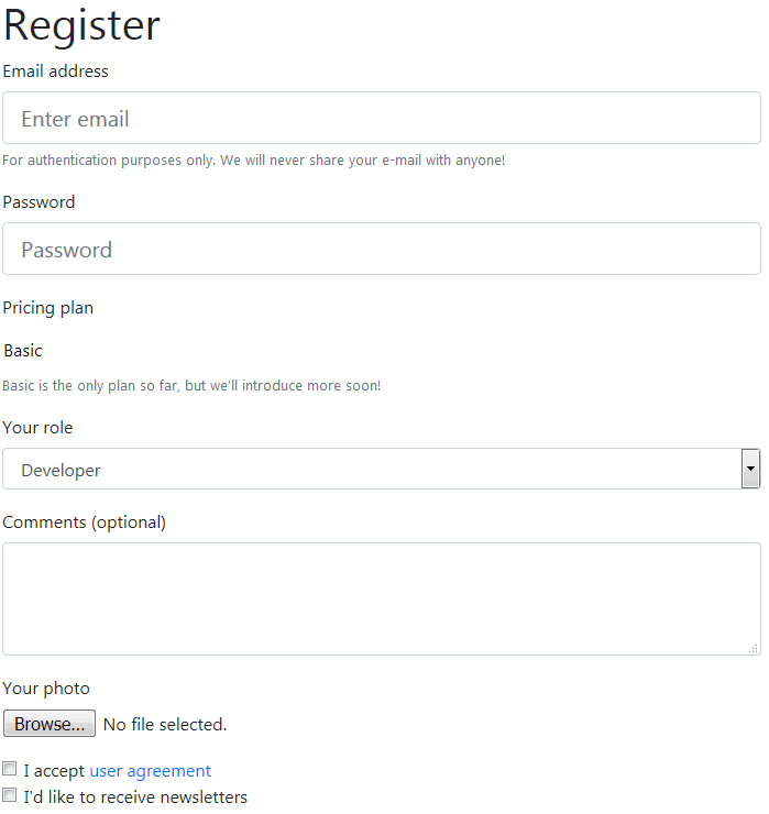
Looking quite nice for a page that has no custom styles at all.
Buttons
Next, we’re going to add a Submit and a Back button to the bottom of the form. Buttons can be styled with Bootstrap as well: there’s a variety of available colors, sizes and states to choose from.
Interestingly, predefined classes don’t work just with buttons. For example, a link may act as a button and can be styled as such using the same classes. At the very least, the element should be assigned a class of btn:
<!-- other form elements go here... -->

<div class="mt-3">
  <button type="submit" class="btn">Register!</button>
  <a href="#" class="btn">Back</a>
</div>
mt-3 sets a small top margin for our buttons. The Register! button is obviously the main star, so we’re going to mark it as primary and make it larger. The Back link doesn’t have to attract all the attention, so we’ll style it as a button link:
<div class="mt-3">
  <button type="submit" class="btn btn-primary btn-lg">Register!</button>
  <a href="#" class="btn btn-link">Back</a>
</div>
Now, the primary button visually stands out thanks to the blue background:

If you don’t like this background, the button can also be styled as outlined with the help of btn-outline-* classes:
<button type="submit" class="btn btn-outline-primary btn-lg">Register!</button>

Input Groups
Another cool feature of Bootstrap is input groups. Let’s say we want to allow users to choose their unique profile URL looking like http://SUBDOMAIN.PROFILE.example.com, where:
SUBDOMAINis eithermy.,private., orown.PROFILEis defined by the user.
So, the URL might be http://my.superpage.example.com or http://private.dashboard.example.com. Of course, we can provide a basic text input and say something like “Enter your unique profile name”, but the user might not understand what’s going on. Instead, we want to offer a visual example of how this profile name is going to be used.
In order to do this, we’ll provide additional help to the text input in the following way:
<div class="form-group">
  <label for="profileUrl">Your profile URL</label>

  <div class="input-group mb-3">       <!-- #1 -->
    <div class="input-group-prepend">       <!-- #2 -->
      <span class="input-group-text">http://</span> <!-- #3 -->

      <button class="btn btn-outline-secondary dropdown-toggle">  <!-- #4 -->
        type="button" data-toggle="dropdown"
        aria-haspopup="true" aria-expanded="false">my.</button>
      <div class="dropdown-menu">       <!-- #5 -->
        <a class="dropdown-item" href="#">private.</a>
        <a class="dropdown-item" href="#">own.</a>
      </div>
    </div>

    <input type="text" id="profileUrl" class="form-control">

    <div class="input-group-append">       <!-- #6 -->
      <span class="input-group-text">.example.com</span>
    </div>
  </div>
</div>
Let’s walk through the code above step by step:
- #1. This is where our input group opens. Each input group contains an input and one or more “add-ons” to be placed before or after this input.
- #2. We’re prepending two elements to our text input.
- #3. This is going to display an add-on with the
http://text. - #4. Here things become a bit more complex. We’re displaying a button with a text “my.” (which is our subdomain). When this button is clicked, a dropdown is displayed with two other options: ”private.” and ”own.”. Don’t forget that the dropdown relies on JavaScript, so make sure you’ve hooked up all the necessary scripts as explained at the beginning of this article.
- #5. That’s the actual dropdown menu, initially hidden. It may be further styled as explained by the docs.
- #6. This
divwith the class ofinput-group-appendrepresents the last add-on that should be appended to the text input.
Whew! As a result, we’ve achieved the following piece of UI:

Looking quite nice and, what’s more important, our users will understand right away what this input is for!
This wraps up the first section of this article. You may find the final result on CodePen:
See the Pen Sitepoint Bootstrap 4 Simple Form by SitePoint (@SitePoint) on CodePen.
Forms With Grid
It’s All About Rows and Columns
Another quite common task is to make forms more compact by placing multiple inputs on the same row. This can be done using the Bootstrap form component form grid system, which relies on Bootstrap’s generic grid.
To place multiple inputs and labels on the same row, our form groups should be wrapped with either the Bootstrap form component’s row or form-row (the only difference is that the latter class adds smaller gutters between the columns). Next, we assign the col-{viewport}-{columns} class to the form groups themselves. For instance, that’s how we can modify the first three groups from the registration form created in the previous section:
<div class="form-row"> <!-- #1 -->
  <div class="form-group col-sm-4"> <!-- #2 -->
    <label for="email">Email address</label>
    <input type="email" class="form-control form-control-lg"
       id="email" aria-describedby="emailHelp" placeholder="Enter email">
    <small id="emailHelp" class="form-text text-muted">
      For authentication purposes only. We will never share your email with anyone!
    </small>
  </div>
  <div class="form-group col-sm-4">
    <label for="password">Password</label>
    <input type="password" class="form-control form-control-lg"
       id="password" placeholder="Password">
  </div>

  <div class="form-group col-sm-4">
    <label for="pricingPlan">Pricing plan</label>
    <input type="text" readonly class="form-control-plaintext"
       id="pricingPlan" value="Basic" aria-describedby="pricingPlanHelp">
    <small id="pricingPlanHelp" class="form-text text-muted">
      Basic is the only plan so far, but we'll introduce more soon!
    </small>
  </div>
</div>
Take a look at the result:
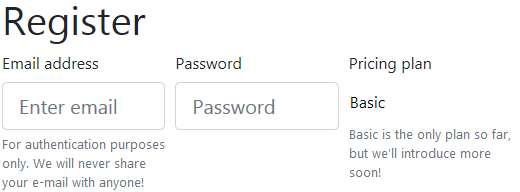
For very small viewports, these groups will be stacked on top of each other.
We then proceed to the pricing plan and profile URL. The latter group probably requires quite a lot of space, so let’s use an md (medium viewport) breakpoint in this case:
<div class="form-row">    <!-- #1 -->
  <div class="form-group col-md-4">    <!-- #2 -->
    <label for="role">Your role</label>
    <select class="form-control" id="role">
      <option>Developer</option>
      <option>Designer</option>
      <option>Manager</option>
    </select>
  </div>

  <div class="form-group col-md-8">    <!-- #3 -->
    <label for="profileUrl">Your profile URL</label>
    <div class="input-group mb-3">
      <div class="input-group-prepend">
        <span class="input-group-text">http://</span>
        <button class="btn btn-outline-secondary dropdown-toggle"
          type="button" data-toggle="dropdown"
          aria-haspopup="true" aria-expanded="false">my.</button>
        <div class="dropdown-menu">
          <a class="dropdown-item" href="#">private.</a>
          <a class="dropdown-item" href="#">own.</a>
        </div>
      </div>
      <input type="text" id="profileUrl" class="form-control">
      <div class="input-group-append">
        <span class="input-group-text">.example.com</span>
      </div>
    </div>
  </div>
</div>
Our second row:

So far, so good. Next, we’re going to place the Comments textarea, Photo file control and both checkboxes on the same row for medium and larger viewports:
<div class="form-row">  <!-- #1 -->
  <div class="form-group col-md-4">  <!-- #2 -->
    <label for="comments">Comments (optional)</label>
    <textarea class="form-control" id="comments" rows="3"></textarea>
  </div>

  <div class="form-group col-md-4">  <!-- #3 -->
    <label for="photo">Your photo</label>
    <input type="file" class="form-control-file" id="photo">
  </div>

  <div class="col-md-4">  <!-- #4 -->
    <div class="form-check">
      <input class="form-check-input" type="checkbox" value="1" id="userAgreement">
      <label class="form-check-label" for="userAgreement">
        I accept <a href="#">user agreement</a>
      </label>
    </div>

    <div class="form-check">
      <input class="form-check-input" type="checkbox" value="1" id="newsletter">
      <label class="form-check-label" for="newsletter">
        I'd like to receive newsletters
      </label>
    </div>
  </div>
</div>
Note that we’ve wrapped both checkboxes in one column (#4) for a nice layout.

Lastly, let’s style the buttons. I think they can occupy a single column:
<div class="form-row mt-3">
  <div class="col-xs-12"> <!-- #1 -->
    <button type="submit" class="btn btn-outline-primary btn-lg">Register!</button>
    <a href="#" class="btn btn-link">Back</a>
  </div>
</div>
This is how our form looks now:
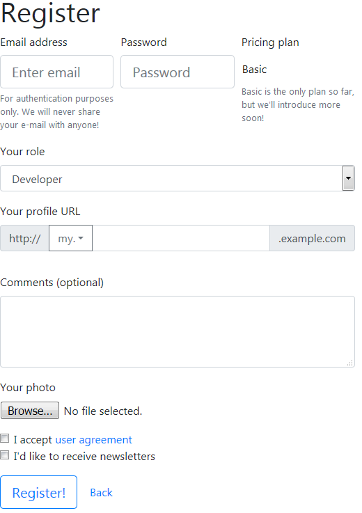
Here’s the final result on CodePen:
See the Pen Sitepoint Bootstrap 4 Form With Rows by SitePoint (@SitePoint) on CodePen.
Horizontal Forms
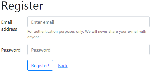
The grid system may also be leveraged to create horizontal forms — that is, forms that have the label and input elements on the same row. To achieve this result, the Bootstrap form component offers the col-form-label class to be added to the labels.
Let’s create a small demo representing a horizontal form:
<div class="container">
  <p class="h1">Register</p>

  <form class="mt-3">
    <div class="form-group row">  <!-- #1 -->
      <label for="email" class="col-sm-2 col-form-label">Email address</label> <!-- #2 -->
      <div class="col-sm-10">  <!-- #3 -->
        <input type="email" class="form-control"
           id="email" aria-describedby="emailHelp" placeholder="Enter email">
        <small id="emailHelp" class="form-text text-muted">
          For authentication purposes only. We will never share your email with anyone!
        </small>
      </div>
    </div>

    <div class="form-group row">
      <label for="password" class="col-sm-2 col-form-label">Password</label>
      <div class="col-sm-10">
      <input type="password" class="form-control"
         id="password" placeholder="Password">
      </div>
    </div>

    <div class="form-group row mt-3">
      <div class="col-10 offset-2"> <!-- #4 -->
        <button type="submit" class="btn btn-outline-primary">Register!</button>
        <a href="#" class="btn btn-link">Back</a>
      </div>
    </div>
  </form>
</div>
The main things to note here are:
- #1. Each form group is assigned a
rowclass - #2. Labels are assigned the
col-form-labelclass - #3. Inputs (and accompanying help blocks) are wrapped into separate
divs - #4. For buttons we are additionally providing the
offset-2class, so that they’re moved to the right and vertically aligned with the inputs.
This is how the form looks:
What about the checkboxes? Well, we can also apply some offset and vertically align them with the buttons and inputs:
<div class="form-group row"> <!-- #1 -->
  <div class="col-10 offset-2"> <!-- #2 -->
    <div class="form-check">
      <input class="form-check-input" type="checkbox" value="1" id="userAgreement">
      <label class="form-check-label" for="userAgreement">
        I accept <a href="#">user agreement</a>
      </label>
    </div>

    <div class="form-check">
      <input class="form-check-input" type="checkbox" value="1" id="newsletter">
      <label class="form-check-label" for="newsletter">
        I'd like to receive newsletters
      </label>
    </div>
  </div>
</div>
And that’s our final version of the form:
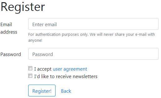
All elements have nice spacing so the UI is not visually cluttered. The source code for this example can also be found on CodePen.
See the Pen Sitepoint Bootstrap 4 Horizontal Form by SitePoint (@SitePoint) on CodePen.
Inline Forms
Inline forms are also very common these days. Such forms may be employed to display search or sign in features. Let’s see them in action by creating a “Subscribe to newsletter” form:
<div class="container">
  <p class="h1">Subscribe to our newsletter</p>

  <form class="form-inline"> <!-- #1 -- >
    <label class="sr-only" for="email">Name</label> <!-- #2 -- >
    <input type="text" class="form-control mb-2 mr-sm-2 form-control-sm" id="email" placeholder="Email">  <!-- #3 -- >

    <div class="form-check mb-2 mr-sm-2">  <!-- #4 -- >
      <input class="form-check-input" type="checkbox" id="partners" value="1">
      <label class="form-check-label" for="partners">
        Receive news from our partners
      </label>
    </div>

    <button type="submit" class="btn btn-primary mb-2 btn-sm">Subscribe</button>  <!-- #5 -- >
  </form>
</div>
The main things to note here are:
- #1. The form must be assigned a Bootstrap form component
form-inlineclass. Note, however, that the form elements will appear inline only for viewports larger than 575px. For smaller screens, they’ll be stacked. - #2. We’re hiding the label and displaying it only for screen readers.
- #3. The input has right margin for small and larger viewports with the help of the
mr-sm-2class. We don’t require this margin for extra small screens because the elements will be stacked, as explained above. Apart from that, the input is made smaller with theform-control-smclass. - #4. The checkbox also has a right margin.
- #5. The button is made smaller as well using the
btn-smclass.
Here’s the result:

The source code can also be found on CodePen:
See the Pen Sitepoint Bootstrap 4 Inline Form by SitePoint (@SitePoint) on CodePen.
Form Validation
Another very important thing is validation of users’ input. As a rule of thumb, we should never blindly trust the data submitted by users because they can make mistakes and provide incorrect values. This, in turn, might lead to the web application not working correctly, or worse. So we should always perform validations.
The first line of defense is client-side validation. Of course, we could rely on the browser’s predefined validation rules (for instance, modern browsers check the email’s format entered in the field with the corresponding type) but it’s not generally recommended by Bootstrap. Instead, we can make use of the Bootstrap form component’s custom validation styles.
To take advantage of these styles, we should disable the browser’s default validation mechanism by adding the novalidate attribute to the form. Also, we should add a needs-validation class:
<div class="container">
  <p class="h1">Register</p>

  <form class="needs-validation" novalidate> <!-- #1 -->
    </form>
</div>
Next, we simply display all the necessary fields as usual:
<form class="needs-validation" novalidate>
  <div class="form-group">
    <label for="email">Email</label>
    <input type="email" class="form-control" id="email"
           placeholder="Email" required> <!-- #1 -->
  </div>

  <div class="form-group">
    <label for="password">Password</label>
    <input type="password" class="form-control" id="password"
       placeholder="Password" required minlength="6"> <!-- #2 -->
  </div>

  <div class="form-group mt-3">
    <button class="btn btn-primary" type="submit">Register!</button>
  </div>
</form>
Note that we’ve provided the require attribute for both inputs (#1, #2) as well as minlength for the password field (#2). This will make sure that users don’t send an empty form.
What’s interesting is that each input may also contain two optional Bootstrap form component help blocks: valid-feedback and invalid-feedback. The first one is displayed when the data is correct, whereas the latter is shown only if users make a mistake. Let’s add these blocks now:
<div class="form-group">
  <label for="email">Email</label>
  <input type="email" class="form-control" id="email"
    placeholder="Email" required>
  <div class="valid-feedback"> <!-- #1 -->
    Looks good!
  </div>
  <div class="invalid-feedback"> <!-- #2 -->
    The email is required!
  </div>
</div>

<div class="form-group">
  <label for="password">Password</label>
  <input type="password" class="form-control" id="password"
     placeholder="Password" required minlength="6">
  <div class="valid-feedback">
    Great!
  </div>
  <div class="invalid-feedback"> <!-- #3 -->
    The password must contain at least 6 characters!
  </div>
</div>
Lastly, we need some JavaScript to perform the actual validation and prevent the form from being submitted if an error is found:
<!-- your form goes here... -->

<script>
  (function() {
    window.addEventListener('load', function() {
      var forms = document.getElementsByClassName('needs-validation');

      var validation = Array.prototype.filter.call(forms, function(form) {
        form.addEventListener('submit', function(event) {
          if (form.checkValidity() === false) {
            event.preventDefault();
            event.stopPropagation();
          }
          form.classList.add('was-validated');
        }, false);
      });
    }, false);
  })();
</script>
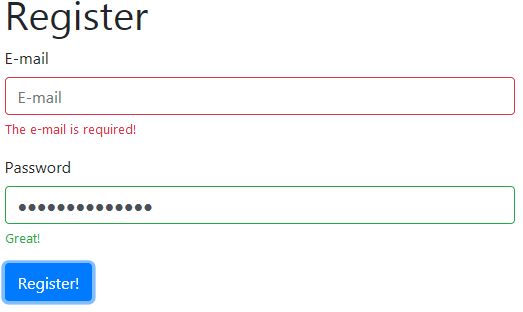
Here, we grab all the forms that require validation and check if the entered data is correct. If it’s not, we prevent the submission process. Also, note that we must add a Bootstrap form component was-validated class to the form. Each child field is also assigned either an :invalid or :valid pseudo class. These classes add a green or a red border around the input accordingly and display the proper feedback message.
Here is the result:
On CodePen:
See the Pen Sitepoint Bootstrap 4 Form Validation by SitePoint (@SitePoint) on CodePen.
This is how the style applied to the :valid pseudo class looks in the browser’s developer tools:

Lastly, note that the Bootstrap form component supports server-side validation as well. All we have to do is mark the inputs with either the is-valid or is-invalid classes. Feedback blocks also work fine with this type of validation.
Conclusion
In this article, we’ve taken quite a long journey through the features of the Bootstrap form component and discussed various types of forms that come bundled with the latest release of Bootstrap. We’ve seen how to style various form elements, how to create forms based on the Bootstrap grid system, how to craft horizontal and inline forms. On top of that, we’ve discussed how the client-side validation rules can be implemented and how to style valid and invalid form inputs.
I really hope that by now you’re ready to apply all this knowledge into practice and start building your own fancy forms!
For more questions, don’t hesitate to use the comments section below.
If you’re building a site with Bootstrap that requires a login portal, check out our Creating a Login Portal with Bootstrap 4 course, which helps you get to grips with cards, forms, buttons and grids.
