Variable Fonts: What They Are, and How to Use Them

In this article, we’ll take a look at the exciting new possibilities surrounding variable fonts — now bundled with the OpenType scalable font format — which allows a single font to behave like multiple fonts.
How We Got Here
When HTML was created, fonts and styles were controlled exclusively by the settings of each web browser. In the mid ’90s, the first typefaces for screen-based media were created: Georgia and Verdana. These, together with the system fonts — Arial, Times New Roman, and Helvetica — were the only fonts available for web browsers (not exactly the only ones, but the ones we could find in every operating system).
With the evolution of web browsers, innovations like the <font> tag on Netscape Navigator and the first CSS specification allowed web pages to control what font was displayed. However, these fonts needed to be installed on the user’s computer.
In 1998, the CSS working group proposed the support of the @font-face rule to allow any typeface to be rendered on web pages. IE4 implemented the technology but the distribution of fonts to every user’s browser raised licensing and piracy issues.
The early 2000s saw the rise of image replacement techniques which substituted HTML content with styled-text images. Each piece of text had to be sliced in programs like Photoshop. This technique had the major advantage of allowing designers to use any typeface available without having to deal with font licensing.
In 2008, @font-face finally made a comeback when Apple Safari and Mozilla Firefox implemented it. This came out of the necessity of providing a simple way for designers and developers to use custom fonts rather than inaccessible images.
It wasn’t until the arrival of the CSS3 Fonts Module in 2012 that font downloading became viable. Once implemented, a font downloaded by a web page could only be used on that page and not copied to the operating system. Font downloading allowed remote fonts to be downloaded and used by the browser, meaning that web designers could now use fonts that were not installed on the user’s computer. When web designers found the font they wished to use, they just needed to include the font file on the web server, and it would be automatically downloaded to the user when needed. These fonts were referenced using the @font-face rule.
To use the @font-face rule we have to define a font name and point to the font file:
@font-face {
  font-family: Avenir Next Variable;
  src: url(AvenirNext_Variable.woff);
}
The font file can be one of five different formats: TTF, WOFF, WOFF2, SVG or EOT. Each has its own advantages and disadvantages. Putting it simply, EOT was created by Microsoft and only is supported by Internet Explorer. TTF is the basic type font created by Microsoft and Apple, and it works almost perfectly everywhere. SVG is based on image replacement techniques and is only suitable for the Web. Finally, WOFF and WOFF2 were also created exclusively for the Web and are basically TTF files with extra compression.
Variable Fonts
Version 1.8 of OpenType (the computer scalable font format) was released in 2016. A brand new technology shipped with it: OpenType font variations, also known as variable fonts.
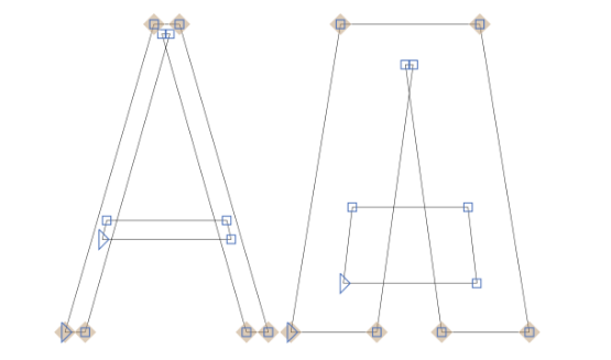
This technology allows a single font to behave like multiple fonts. It’s done by defining variations within the font. These variations come from the fact that each character only has one outline. The points that construct this outline have instructions on how they should behave. It’s not necessary to define multiple font weights because they can be interpolated between very narrow and very wide definitions. This also makes it possible to generate styles in between — for example, semi-bold and bold. These variations may act along one or more axes of the font. On the image below, we have an example of this outline interpolation on the letter A.
Why are Variable Fonts Relevant?
Variable fonts can bring both simplicity to our font structure and performance improvements. Take for example a situation where our website needs five font styles. It would be significantly smaller and faster to provide a single variable font capable of rendering those five styles than to have to load five different font files.
Using Variable Fonts
There are currently two different ways to use variable fonts. First, we’ll look at the modern way of implementing those. The CSS specification strongly prefers using font-optical-sizing, font-style, font-weight and font-stretch for controlling any of the standard axes.
font-optical-sizing
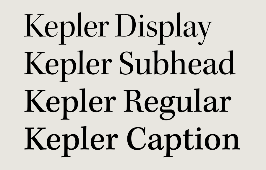
This property allows developers to control whether or not browsers render text with slightly different visual representations to optimize viewing at different sizes. It can take the value none, for when the browser cannot modify the shape of glyphs, or auto for when it can. On a browser that supports font-optical-sizing, a font where the value is set to auto can vary like the font in the image below:
With the value set to none there would be no variation to the font.
font-style
This property specifies whether a font should be styled with a normal, italic, or oblique face from its font family. It can take the normal, italic or oblique values.
font-weight
This property specifies the weight (or boldness) of the font. One thing to note is that, with normal fonts, named instances can be defined. For example, bold is the same as font-weight: 700 or extra-light is the same as font-weight: 200. The font-weight property can also be any number between 1 and 1000, but when using variable fonts, due to the interpolarity, we can have a much finer granularity. For example, a value like font-weight: 200.01 is now possible.
font-stretch
This property selects a normal, condensed, or expanded face from a font. Just like the font-weight property, it can be a named instance like extra-condensed or normal or a percentage between 0% and 100%. Also, named instances will map to known percentages. For example, extra-condensed will map to 62.5%.
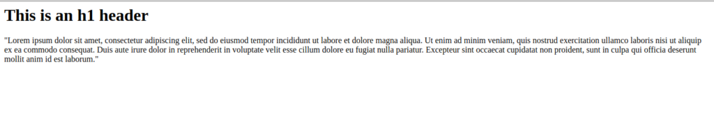
For this example, I created a very simple page with a single <h1> heading and <p> paragraph.
See the Pen Variable Fonts HTML by SitePoint (@SitePoint) on CodePen.
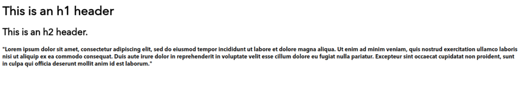
Currently, our unstyled webpage looks like this:
To use a variable font, we must find a suitable file. The v-fonts project provides a font repository where we can search and experiment with all type of variable fonts. I decided to use the AvenirNext font and link it from its official GitHub page.
Then we need to create a CSS file to load this new font:
@font-face {
  font-family: 'Avenir Next Variable';
  src: url('AvenirNext_Variable.ttf') format('truetype');
}

body {
  font-family: 'Avenir Next Variable', sans-serif;
}
See the Pen Loaded variable font by SitePoint (@SitePoint) on CodePen.
Due to browser support issues, this example will only apply font variations in Safari and Chrome.
With our font loaded, we can now use the font-weight property to manipulate the weight axis of our variable font.
h1 {
  font-family: 'Avenir Next Variable';
  font-weight: 430;
}
See the Pen SourceSans variable font by SitePoint (@SitePoint) on CodePen.
Most of the time we’ll also need two different font files: one for italic and one for regular fonts (roman). This happens because the construction of these fonts can be radically different.
Using font-variation-settings
The second way of using variable fonts is by using the font-variation-settings CSS property. This property was introduced to provide control over OpenType or TrueType font variations, by specifying the four-letter axis names of the features you want to vary along with their variation values. Currently, we have access to the following aspects of the font:
- wght — weight, which is identical to the
font-weightCSS property. The value can be anything from 1 to 999. - wdth — width, which is identical to by the
font-stretchCSS property. It can take a keyword or a percentage value. This axis is normally defined by the font designer to expand or condense elegantly. - opsz — optical sizing, which can be turned on and off using the
font-optical-sizingproperty. - ital — italicization, which is controlled by the
font-styleCSS property when is set toitalic. - slnt — slant, which is identical to the
font-styleCSS property when it’s set tooblique. It will default to a 20 degree slant, but it can also accept a specified degree between -90deg and 90deg.
According to the specification, this property is a low-level feature designed to handle special cases where no other way to enable or access an OpenType font feature exists. Because of that, we should try to use @font-face instead.
Using the same webpage and font as above, let’s try to set the weight and width on our font using the low-level controller:
p {
  font-variation-settings: 'wght' 630, 'wdth' 88;
}
See the Pen Variable fonts 1 by SitePoint (@SitePoint) on CodePen.
The declaration is equivalent to the following CSS declaration:
p {
  font-weight: 630;
  font-stretch: 88;
}
Performance
Performance is a key advantage of variable fonts. The AvenirNext_Variable.ttf font file is only 89kB but creates a range of weights. A comparable standard font may have a smaller file but would only support one weight and style. Further options require additional files and raise the page weight accordingly.
But we can go even further. When we talked about font formats, we said that WOFF2 files are essentially TTF files with extra compression. WOFF2 files are smaller because they use custom preprocessing and compression algorithms to deliver ~30% file-size reduction over other formats.
Google offers a command line tool that will compress our file converting it to a woff2 format.
On the tool’s official GitHub page, we can find all the information about it. To install it on a Unix environment, we can use the following commands:
git clone --recursive https://github.com/google/woff2.git
cd woff2
make clean all
After installing it, we can use it to compress our variable font file by using:
woff2_compress AvenirNext_Variable.ttf
And we end up with a 42kb file, which halved the file size. To use this file, we just need to modify the sourced file and its format to accommodate this new file:
src: url('AvenirNext_Variable.woff2') format('woff2');
We now have a single 42Kb file which could be used for all the font weights on our page. The only downside to the woff2 format is that it’s not supported by Internet Explorer.
Serving Different Files for Different Browsers
While some modern browsers already support variable fonts (Firefox developer editions have some level of support, Chrome 62, Chrome Android, Safari iOS, and Safari), there might be the case where we find one that doesn’t.
To get around this, we’ll need to either serve non-variable for those browsers or use an operating system font fallback.
Browsers that support variable fonts will download the file marked as format('woff2-variations'), while browsers that don’t will download the single style font marked as format('ttf'). This is possible because we can repeat references to variables in each rule. If the first fails, the second will be loaded. Just like the following:
@font-face {
  font-family: 'Avenir Next Variable';
  src: url('AvenirNext_Variable.woff2') format('woff2-variations');
  src: url('AvenirNextLTPro-Bold.otf') format('truetype');
}

html {
  font-family: 'Avenir Next Variable', sans-serif;
}

h1 {
  font-family: 'Avenir Next Variable';
  font-weight: 430;
}

h2 {
  font-family: 'Avenir Next Variable';
  font-weight: 630;
}
The next example uses a different file format from the one we’re working with, but uses the same principle:
See the Pen Multiple fonts by SitePoint (@SitePoint) on CodePen.
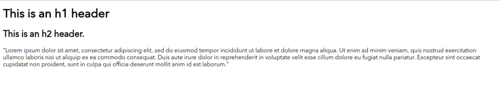
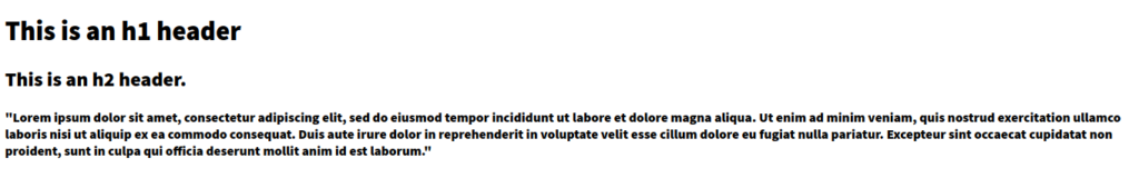
If we check the result on a browser that supports variable fonts, like Chrome, we can see the following:
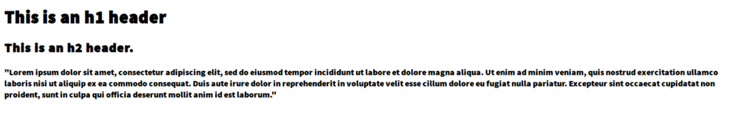
On a browser that doesn’t support variable fonts, like Firefox, the second font will be loaded and the result will look like this:
But if we still have to serve non-variable fonts to browsers that don’t support variable ones, don’t we lose all the performance we just gained with the variable font? If a browser can only load the standard font, we lose the performance and rendering benefits of variable fonts. In those situations, it may be preferable to fallback to a comparable operating system font rather than substitute it with many fixed fonts.
Conclusion
Despite being available for several years now, variable fonts are still in their infancy. Browser support is scarce and there are few fonts to choose from. However, the potential is enormous, and variable fonts will permit better performance while simplifying development. For example, SitePoint’s own front page currently loads eight font files with a total of 273kB. Variable fonts could reduce this dependency and cut page weight further.