10 Ways to Make Your Website More Mobile Friendly

Does your website offer an optimized mobile experience when accessed via a smartphone or phablet? It’s not the end of the world if it doesn’t, as modern browsers have made the experience more bearable with innovations such as pinch-to-zoom and automatic font size adjustment. If you don’t have the time or money to make your website mobile friendly, here are ten simple things you can do today to make your website more bearable for mobile users.
1. Set Form Input Attributes
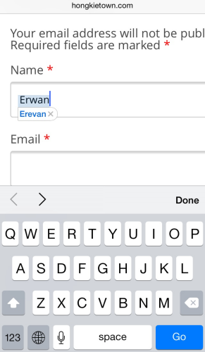
If your website uses input fields to ask for the user’s name or address, then turn off autocorrect and turn on autocapitalize.
What's your name: <input type=text size=20 autocorrect=off autocapitalize=words>If you don’t, the phone will change their name (e.g., “Erwan”) to something else (e.g., “Erevan”) if it isn’t found in the dictionary. Setting auto-capitalize to words will save them from having to toggle the capslock key for each successive name (e.g., “Ken burns” becomes “Ken Burns”).
Think of all the trouble your user’s will save.
While you’re at it, if your website asks for the user’s email, then use the email specific input field so that the user gets presented with the @ key without needing to switch to the numeric/symbol keyboard.
What's your email: <input type=email size=20>2. Set a Mobile Friendly Preferred Width
Load your website in a desktop browser and resize the window to the narrowest width, while keeping your website still readable. This is your minimum viewing size. Now, get the size of that window and set it as your website’s preferred viewport width by adding this meta tag to your page’s head.
<meta name=viewport content='width=700'>The next time your website is viewed on a mobile device, it will automatically show your website at this size with all the extraneous space on the left and right side of your website removed, so the user doesn’t need to zoom out or zoom in on their first visit.
This website has a lot of wasted space on the right.
This website is zoomed just right.
If your website is already built based on fluid percentages and works with all screen sizes, your job is even easier. Just experiment with a width that makes the view on a mobile device pleasant and readable and use that width in the meta tag.
3. Set Image Widths to 100%
Now that your website is set with a preferred width, some images will naturally be too wide. This didn’t happen before, because desktop screens are quite wide and most images fit within the screen with no problem.
To remedy this, give your images a maximum width of 100% so that they are automatically resized if they get too big for the mobile device. Add this to your website’s CSS stylesheet.
img {
  max-width: 100%
}
If your images are set as background images and not as img tags, simply set the background-size CSS property to contain. This will cause the background image to resize when the screen is too small.
.header {
  background: url(header.png) 50% no-repeat;
  background-size: contain
}
Wait a minute, won’t the image lose clarity when made smaller? Not if you’re on a modern mobile device. When a user zooms in on a picture, the browser will bring back the clarity as you zoom in. However, make sure your website doesn’t have the user-scalable=no property set in a meta tag. If so, the user won’t be able to zoom in and out.
<!-- DON'T DO THIS! -->
<meta name=viewport content='user-scalable=no'>
4. Set Input Widths to 100%
After giving your images a max-width, perform a similar trick on the input fields. Simply add this to your website’s CSS stylesheet.
input, textarea {
  max-width:100%
}
When your website is viewed on a mobile device with a preferred width set, the input fields won’t extend beyond the edge of the screen.
5. Use Care When Disabling Submit Buttons
Does your website disable form submit buttons after the first click to prevent multiple submissions? If so, don’t do it (unless absolutely necessary)!
Unlike desktop computers, mobile devices experience frequent network disruptions. If you disable the button, the user cannot click again to re-submit. I’m not only talking about network disruptions due to poor signals or tower switching. If a user receives a phone call while submitting the form, the mobile browser is closed to show the caller screen, and the browser may not be able to recover from that interruption when it re-opens.
If you must disable the submit button, disable it for a few seconds only.
6. Use word-wrap with Long Strings
Sometimes it is necessary to display long strings, such as reference codes, bank account numbers, or even URLs. If your website is too narrow to display the whole number on a mobile device, it may extend off the edge of the screen.

To remedy this, simply wrap any long strings with a word-wrap style. Now the text will break to the next line when it reaches the edge, allowing the user to see the whole text without needing to scroll around.
Your passcode is:
<span style='word-wrap:break-word'>435143a1b5fc8bb70a3aa9b10f6673a8</span>
7. Use Extra Spaces Cautiously
When showing long strings of numbers to users, a common technique is to split them up into 5 letter groups with a blank space in between them (e.g., 43514 3a1b5), so that users can memorize five digits at a time, while typing them up in another application. For the smart user, they simply copy and paste the whole string and then delete the blank spaces.
On a desktop computer, deleting the blank spaces in a trivial matter. But on a mobile device, it is much more time consuming. To remedy this, rather than displaying blank spaces in between the five letter groups, simply wrap the five letter groups in an element with some padding in between.
<style>
.split m {
  padding: 0em 0.5em
}
</style>

Your passcode is:
<span class='split'><m>43514</m><m>3a1b5</m><m>fc8bb</m></span>
Now the groups will have a space in between them, but when copying and pasting them, the spaces won’t appear. This is a time saver for your users.
8. Take Advantage of Media Queries
When all else fails, you don’t want to have to adjust your website and make things smaller so that they look better on a mobile device, only to have them look too small on your desktop computer. That’s where media queries come in.
You can create custom style rules that only come into effect when viewed on a mobile device (or viewed in a small browser window) and not come into effect on your desktop browser. Simple add targeted styles inside a media query, as shown below.
<style>
/* regular css */
.tabs {
  padding: 10px 2em
}

@media screen and (max-width: 500px) {
/* applies only if the screen is narrower than 500px */
  .tabs {
    padding: 3px 1em
  }
}
</style>
Now you can make small tweaks to make your website look good on the desktop and on a mobile device.
9. Avoid fixed Positioning
If your website has a fixed header or sidebar with its CSS position property set to fixed, be aware that when a user zooms in on your website, your header will also zoom in and potentially obscure the whole screen.
The easiest solution is to disable the fixed position when your website is viewed on a mobile device. You can do this with the media query method from the previous tip.
<style>
/* regular css */
#header {
  position: fixed
}

@media screen and (max-width: 500px) {
/* applies only if the screen is narrower than 500px */
  #header {
    position: static
  }
}
</style>
10. Use Standard Fonts
Using custom fonts gives your website a professionally designed look, but users need to download large font files before your website can be viewed. On a mobile device, the download can take many seconds during which the user is presented with a blank space where the text should be.
If you are using the Google Font Loader to load your fonts, you can choose to display the text in a default font first, and then re-render the page in the new font when the font has downloaded. To do this, you will need to write two sets of CSS rules everywhere you reference the custom font. One set of rules that uses the default font, and one that becomes active when the font has downloaded. This way, the user gets the best of both worlds. They can read the text while waiting for the download and they can enjoy your custom font after it downloads.
<script src='//ajax.googleapis.com/ajax/libs/webfont/1.4.7/webfont.js'></script>
<script>
WebFont.load({
  google: {
    families: ['Open Sans']
  }
});
</script>
<style type='text/css'>
.header {
  font-family: Arial
}
.wf-opensans-n4-active .header {
  font-family: 'Open Sans'
}
</style>
Notice the .wf-opensans-n4-active class selector that is dynamically added to the website by the Font Loader after the font has finished loading.
Conclusion
The ten things described in this article are meant to be small changes you can make to your existing website. They will mean that users don’t need to pull their hair out in frustration while trying to interact with your website using a small screen and keyboard. I encourage you to implement them on your website(s) today!