The Joy of Subsets: Crossbreeding Web Fonts

95% of web design is typography. The remaining 5% is spent trying to fix infinite task runner recursion and swearing. However, when we say “web typography”, we rarely mean type design. Choosing, pairing and setting fonts are the more commonplace activities, with type design regarded as a more specialist and esoteric occupation.
Accordingly, when I published my primer on “font hacking”, most of the interest was in the described way font subsets could be used in font stacks to mix and match character sets.
body {
    font-family: Punctuation Font, Alphanumeric Font, Fallback Font;
}
Unfortunately, actually ‘subsetting’ a font (reducing its intrinsic character set to just those characters you wish to render) requires the use of font design software that is one of eye-wateringly expensive, not available on your platform or liable to fill your swearing quota within moments of the wretched thing’s installation.
Until now. Thanks to “one weird trick” I discovered using Google Fonts, I can now offer you a way to be inventive with subsets without the need to deconstruct those fonts manually. It’s all about Google Fonts’ URL text parameter.
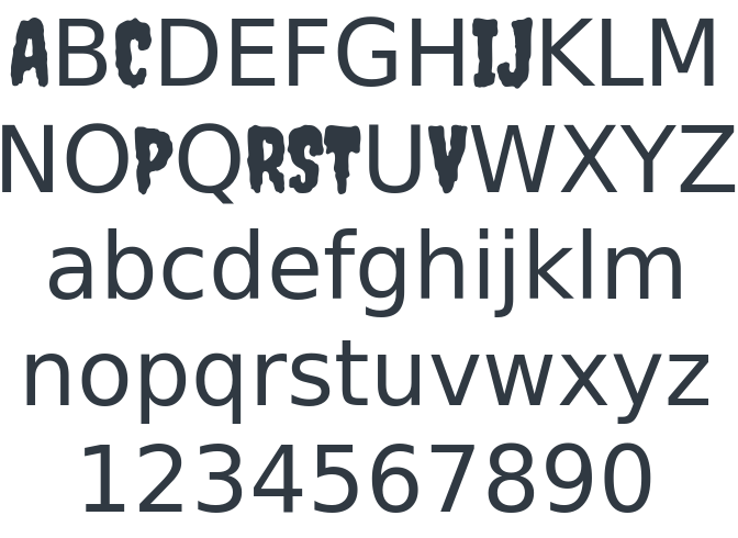
J A V A S C R I P T
No, JavaScript is not required to achieve this (I wouldn’t do that to you). I’m talking about the string javascript. For the redesign of the Neontribe website, I decided to use the burgeoningly popular Ghost blogging platform, which is built on JavaScript. Since I’m a bit of a wag, I thought it would be fun to advertise this fact rendering the term ‘JavaScript’ in a ghoulish font. You see?

Now, I appreciate this isn’t a very good joke — if you can even call it a joke. What would make it even less funny, though, would be if I were to fetch a whole 150-or-more-characters font just for this discreet instance of typographical whimsy.
Instead, I did this:
<link type="text/css" rel="stylesheet" href="http://fonts.googleapis.com/css?family=Creepster&text=JAVSCRIPT">Note the aforementioned text parameter. This tells Google Fonts that you’re only interested in the supplied set of characters (yes, the 2nd “A” is missing; we only need one referenced in the parameter). It prompts Google to dynamically build a subsetted version of the Creepster font and send it to me. Note the kit parameter below.
@font-face {
    font-family: "Creepster";
    font-style: normal;
    font-weight: 400;
    src: local("Creepster"), local("Creepster-Regular"), url("http://themes.googleusercontent.com/licensed/font?kit=qZohWPV4p-yb_ujchMXyh1S856IudzFr_gkPycOOILA") format("woff");
}
When I open up Chrome’s developer tools and preview the font, this — delightfully — is what I see. It costs just 2.9KB before it’s cached.
Using the text parameter will certainly keep the infamous Perf’ Crusaders from banging on your door, but it gets more interesting when you bring font stacks into the picture. What if we used one font to plug the character holes left by another?
Ampersandwich
Let me describe a simple example, for which a CodePen demo is available. Let’s pretend our style guide dictates that the font Bevan should be used for second level headings (<h2>s). Chunky! The thing is, we’d prefer that any instances of ampersands used letterforms from a rather more elegant font, like Lobster 2. It’s really just a nuance, but we like nuance.
Here’s what that would look like:

What we want to avoid is having to add any markup. This would either complicate the editorial process (which we’d prefer to be done in Markdown) or necessitate the incorporation of some horrible content-parsing JavaScript.
/* No, thank you */
<h2>Rock <span class="amp">&</span> Roll</h2>
/* Yes, please */
## Rock & RollInstead, we’ll start by using Google Fonts’ text parameter again to fetch just a Lobster 2 ampersand. That’s just 2KB, to you; the complete Lobster 2 is 78.8KB! We have to URL encode the ‘&’, hence %26.
@import url(http://fonts.googleapis.com/css?family=Lobster+Two&text=%26);We also import Bevan, but the whole font. You may want to subset it to Basic Latin if it’s for headings, but I’m pulling the whole thing in for brevity in the code example.
@import url(http://fonts.googleapis.com/css?family=Bevan);Finally, we edit the CSS file with a font stack for <h2> elements:
h2 {
    font-family: Lobster 2, Bevan, serif;
}
Thanks to font stack inheritance, Lobster 2 will cover any instances of ampersands. For all remaining characters we defer to Bevan and then — just to be sure — a generic system font. No markup additions, no JavaScript and no FontForge.
The Separation of Concerns
What we have here is an unusual manifestation of the W3C’s “separation of concerns” design principle. By making the task of differentiating that ampersand one of CSS and its imported font files alone, we eliminate the necessity of having to change the underlying document. This not only makes the document clearer and more maintainable, but — by making <span class="amp" /> obsolete — enables non-technical content contributors to write the text more easily.
## Rock & Roll
/* or */
h2. Rock & Roll
/* or simply in a text input... */
Rock & Roll
Here’s the CodePen demo if you want to have a closer look:
See the Pen viBGh by SitePoint (@SitePoint) on CodePen.