Learn a CSS Framework in 6 Minutes with Bulma


In this tutorial, we’ll be getting started with Bulma, a modern CSS Framework built on Flexbox. For best results, follow along with the video at the end by OpenSource Craft. If you want to learn why you should care about Bulma, check out this video.
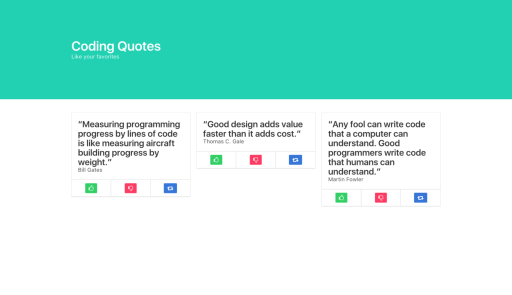
We’ll be building a Coding Quotes page, utilizing Bulma’s UI components including a Hero banner, Columns, Cards, Buttons and more.
First, let’s install Bulma. You can quickly do so from the command line with npm install Bulma, or you can import the project like I have, with the following lines of code. The first line imports the Font Awesome library so we can use their icons.
<link rel="stylesheet" href="https://maxcdn.bootstrapcdn.com/font-awesome/4.7.0/css/font-awesome.min.css"/>

<link rel="stylesheet" href="https://cdnjs.cloudflare.com/ajax/libs/bulma/0.5.1/css/bulma.min.css"/>
Next, we’ll create the Hero banner with a section element and the Bulma class hero and a div with the class of hero-body.
<section class="hero">
   <div class="hero-body"></div>
</section>
Then we’ll add some modifier classes to give the banner the primary color of our design with is-primary, and we’ll adjust its size with is-medium. Bulma’s class names and modifiers are readable and quite literal.
<section class="hero is-primary is-medium">
  <div class="hero-body"></div>
</section>
Within our hero-body div, we’ll add a container div for our h1 and h2, which we’ll style as a title and subtitle, respectively. Giving the title an is-1 modifier will make it large.
<div class="container">
     <h1 class="title is-1">
        Coding Quotes
     </h1>
     <h2 class="subtitle">
        Like your favorites
     </h2>
 </div>
That completes the top of our site, now let’s build some columns. First, we’ll section them off, then we’ll make a container for them.
<section class="section">
    <div class="container"></div>
</section>
Inside our container, we’ll put our columns parent div.
<section class="section">
    <div class="container">
        <div class="columns"></div>
    </div>
</section>
Then we’ll put three column divs within as children. They’ll automatically divide into thirds of their viewport, whether viewed horizontally or vertically (on mobile). Bulma is inherently fully responsive.
<section class="section">
    <div class="container">
        <div class="columns">
            <div class="column">1</div>
            <div class="column">2</div>
            <div class="column">3</div>
        </div>
   </div>
 </section>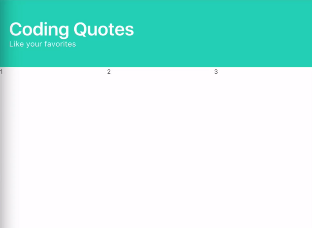
Within each column, we’ll insert a Bulma card, whose card-content will be a title and subtitle, for the quote and the programmer who said the quote.
<div class="card">
    <div class="card-content">
        <h2 class="title">"Quote"</h2>
        <h3 class="subtitle">Programmer</h3>
    </div>
</div>
To make our like, dislike and share buttons, we’ll need a card-footer, then three card-footer-items, one for each button to live in. To color the buttons, we’ll add Bulma modifiers to turn them green (is-success), red (is-danger), and blue (is-info). Within the buttons, we’ll use Font Awesome’s classes to get a thumbs-up, thumbs-down and share icon.
<div class="card">
    <div class="card-content">
        <h2 class="title">"Quote"</h2>
        <h3 class="subtitle">Programmer</h3>
    </div>
    <footer class="card-footer">
        <span class="card-footer-item">
            <a href="#" class="button is-success">
                <i class="fa fa-thumbs-o-up"></i>
            </a>
        </span>
        <span class="card-footer-item">
            <a href="#" class="button is-danger">
                <i class="fa fa-thumbs-o-down"></i>
            </a>
        </span>
        <span class="card-footer-item">
            <a href="#" class="button is-info">
                <i class="fa fa-retweet"></i>
            </a>
        </span>
    </footer>
</div>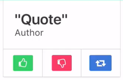
Now that we’ve successfully crafted one column, we can simply copy and paste that column’s code to make our three columns, and our site is ready.
<section class="section">
    <div class="container">
        <div class="columns">

            <div class="column">
                <div class="card">
                    <div class="card-content">
                        <h2 class="title">"Quote"</h2>
                        <h3 class="subtitle">Programmer</h3>
                    </div>
                    <footer class="card-footer">
                        <span class="card-footer-item">
                            <a href="#" class="button is-success">
                                <i class="fa fa-thumbs-o-up"></i>
                            </a>
                        </span>
                        <span class="card-footer-item"> <!-- these will automatically resize just like columns -->
                            <a href="#" class="button is-danger">
                                <i class="fa fa-thumbs-o-down"></i>
                            </a>
                        </span>
                        <span class="card-footer-item">
                            <a href="#" class="button is-info">
                                <i class="fa fa-retweet"></i>
                            </a>
                        </span>
                    </footer>
                </div>
            </div>

            <div class="column">
                <div class="card">
                    <div class="card-content">
                        <h2 class="title">"Quote"</h2>
                        <h3 class="subtitle">Programmer</h3>
                    </div>
                    <footer class="card-footer">
                        <span class="card-footer-item">
                            <a href="#" class="button is-success">
                                <i class="fa fa-thumbs-o-up"></i>
                            </a>
                        </span>
                        <span class="card-footer-item">
                            <a href="#" class="button is-danger">
                                <i class="fa fa-thumbs-o-down"></i>
                            </a>
                        </span>
                        <span class="card-footer-item">
                            <a href="#" class="button is-info">
                                <i class="fa fa-retweet"></i>
                            </a>
                        </span>
                    </footer>
                </div>
            </div>

        </div>
    </div>
</section>
If you’re interested in learning more about Bulma, check out the example sites and documentation on Bulma.io. And for more content like this, visit Open SourceCraft.