Viewport Resizer: a Better Responsive Web Design Bookmarklet

If you’re manually resizing your browser window to test responsive designs, you’re making life unnecessarily difficult for yourself! A Responsive Design View tool appeared in Firefox 15 and there’s a Responsive Web Design Bookmarklet which works in most browsers.
But bookmarklets can always be bettered! Viewport Resizer is an stunning responsive design tool created by Malte Wassermann.
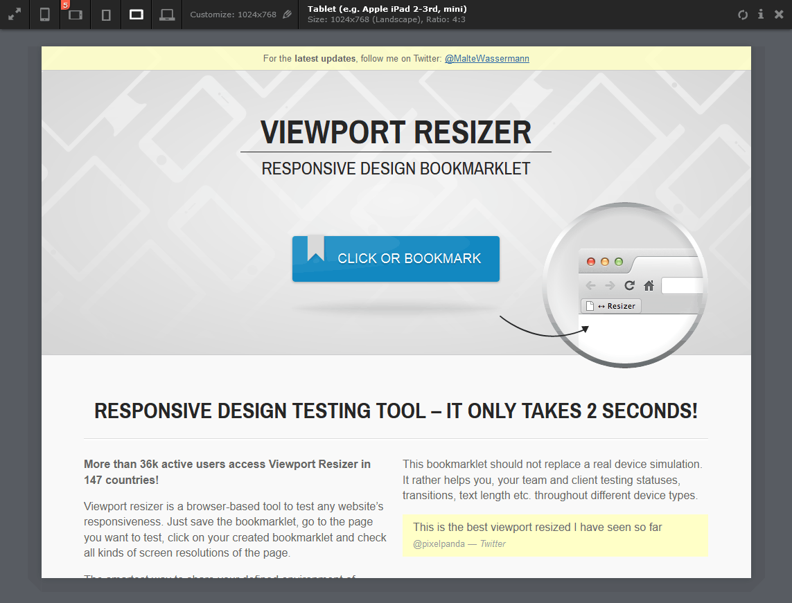
The bookmarklet loads a toolbar at the top of the screen. The icons on the left allow you to switch between various sizes which are described in the text section on the middle of the bar. Note that some icons provide a hint, i.e. “5” is for an iPhone 5 resolution. You can click an icon multiple times to switch between landscape and portrait view. On the right, there are icons to refresh the page, display information and close the toolbar.
The best part: Viewport Resizer is totally configurable. The home page allows you to select an initial range of screen resolution sizes and build your own custom bookmarklet. You can also add sizes on the fly and re-save the bookmarklet again.
However, what stands out most is the attention to detail. CSS3 animations are used throughout, but they’re subtle and useful rather than obtrusive. It’s an impressive piece of work. Viewport Resizer is certainly the best responsive web design tool I’ve seen, and possibly the best bookmarklet ever devised!
Even if you have no interest in responsive web design, visit lab.maltewassermann.com/viewport-resizer/ using Firefox, Chrome or Safari for the best experience. The bookmarklet also works in Opera but few of the animated effects are shown. IE10 loads the toolbar but not the page — I hope that can be fixed soon.
Viewport Resizer is an amazing free tool — get it today.