Where Things Are at in the CSS Grid Layout Working Draft

The Grid Layout specification has brought us a new method for laying out elements that is much more flexible and better suited for modern web design. Specifications evolve in this day and age of the web, as such, a few things have changed in the latest draft of the Grid Layout module.
In this article, I thought I’d look at all those changes briefly to help everyone get up to speed. If you are new to the whole grid layout concept or the details are a bit hazy, I would like to suggest that you go over my introductory grid layout article to refresh your memory.
We’re Not Sure How to Handle Percentages in Margins and Padding
Before proceeding any further, I would like to tell you something unrelated — but important — that you should be aware of. The margin that you apply to adjacent grid items does not collapse. This happens because grid items are contained within the containing block of their own grid areas independent of other items.
Now, let’s discuss how the spec is going to handle percentages in margins and padding. When margins or padding for different grid items are specified as percentages, they could be resolved against either the inline axis of the grid or individual grid item’s own axis:
- With the inline axis — all the left/right/top/bottom percentages will be resolved against width of the grid.
- With their own axis — left and right percentages will be resolved against width, while top and bottom percentages will be resolved against height.
A little CSS and a diagram should help make things a bit clearer. Here is the CSS to create two grid elements with their padding set in terms of percentage:
.grid-container {
  display: grid;
  grid-template-columns: 150px 20px 350px;
  grid-template-rows: auto;
}

.grid-element {
  background-color: #444;
  color: #fff;
  font-size: 2em;
  padding: 10%;
}

.element-a {
  grid-column-start: 1;
  grid-column-end: 2;
  grid-row-start: 1;
  grid-row-end: 2;
}

.element-b {
  grid-column-start: 3;
  grid-column-end: 4;
  grid-row-start: 1;
  grid-row-end: 2;
}
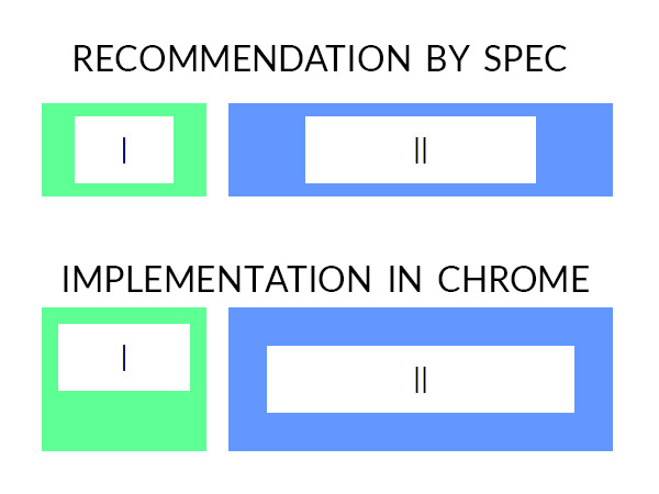
According to the spec, the CSS above should create two grid items. .element-a has top/bottom padding equal to 13px (based on the computed height which was 130px) and left/right padding equal to 15px. Similarly, .element-b should have top/bottom padding equal to 13px and left/right padding equal to 35px.
However, in Chrome and Opera, all paddings have a value of 15px for .element-a and 35px for .element-b. In Firefox 48, the padding values are equal to the values specified in the spec but you will have to explicitly set the height of grid rows. When I tested it in Firefox 42, the padding values were based on the width and height of the grid instead of individual elements. Consequently, all items had equal padding.
This is the demo if you want to open it up in different browsers:
See the Pen Grid Item Margins and Paddings — CSS Grid Layout by SitePoint (@SitePoint) on CodePen.
The diagram below shows the difference between correct and current implementation:

As you can see, there is no consensus among the implementations or within the CSSWG regarding the right behavior. Therefore, the group has undefined what happens when margins and padding are specified as percentages. The CSSWG hopes that browsers will soon agree upon one of the behaviors and the spec will then be updated to require that behavior to be implemented.
Until then, I suggest developers out there avoid percentages when specifying padding or margin on grid items as you will get different behavior in different browsers.
Guidelines for Drag and Drop Tools
The spec has also added guidelines about reordering and accessibility. Grid layout gives us the power of moving elements around without worrying about the actual ordering of them. However, you are supposed to use this feature responsibly.
The grid-placement property does not affect the ordering of elements in non-visual media such as speech. Similarly, rearranging grid items visually won’t affect the default traversal order of sequential navigation modes such as cycling through links on the page.
When creating the markup of your website, the ideal order of elements in the DOM is the one in which you want them to appear on the smallest screen size that you are targeting. On larger screen sizes, use the grid-placement properties to visually reorder elements. While these guidelines have been mentioned before in the spec, this time it additionally states that any drag and drop tool or stylesheet that uses grid-placement properties to perform logical ordering is non-conforming.
By following the above guidelines, you will make sure that non-visual media and non-CSS based user agents can rely on the logical source order of the webpage to present content properly.
A Simplified Subgrid has Been Proposed
A subgrid, as you may have guessed, is a grid within a grid. To make a grid item a subgrid you will have to use the display: subgrid property. If you read my introductory grid layout article, you might have noticed that there has been no mention of subgrids. That’s because even though the concept sounds simple enough, a subgrid with all its tiny details is pretty hard to explain in a single section of an introductory tutorial. It’s even harder to implement.
For this reason, no web engine or polyfill supports them yet. If you are interested in learning more about them, you can read this excellent article on subgrids. To move things ahead, a reduced subgrid proposal has been presented which asks implementations to follow the rules or guidelines listed below.
From now on, the subgrid will lay itself out as an ordinary grid item within its parent grid. The placement of items is also supposed to happen before sizing. For sizing purposes, the subgrid will act as if it is completely empty and only take up space defined by its border, margin and padding properties.
The grid items of the subgrid itself will be sized as if they were actually the grid items of its parent. However, if one of the subgrid’s grid items is placed in the first or last track of the subgrid, it will behave as if it had an additional margin on that edge equal to the subgrid’s margin+border+padding on the edge. This may sometimes result in improper alignment within the subgrid but with respect to the parent grid, the elements will still be aligned properly.
One more simplification has been proposed. Until now, you could set the values of properties like grid-template-columns and grid-template-rows to be a subgrid. This way, you could create subgrids only in one direction. For example, if you set grid-template-columns to subgrid, the size of columns would be calculated based on the track size defined in the main grid but the rows will be auto-sized.
Now, subgrid might become a display value instead of a grid-template-* value. This will disallow subgridding behavior along a single axis. In cases where a subgrid is not a grid item in its parent grid, its display value will compute to grid.
New Rules for Counting Columns in an Implicit Grid
Before we go further, I would like to explain the difference between implicit and explicit grid:
- Explicit Grid — Properties like
grid-template-rows,grid-template-columnsandgrid-template-areasdefine a fixed number of tracks that form an explicit grid, a grid that you have explicitly created by supplying your own values. - Implicit Grid — If you position some of the grid items outside the bounds of this grid, the grid container will generate implicit grid tracks by adding implicit grid lines to the grid. These lines along with the explicit grid form our implicit grid.
Consider the following CSS:
.grid-container {
  display: grid;
  grid-template-columns: 100px 100px 100px;
  grid-template-rows: auto;
  grid-auto-columns: 100px;
}

.element-b {
  grid-column-start: 2;
  grid-column-end: 6;
  grid-row-start: 1;
  grid-row-end: 2;
}
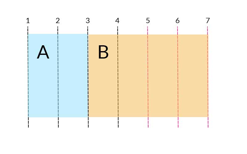
Here, I have explicitly specified the width of first 3 columns for my grid using grid-template-columns. Width of the rest of the columns if they need to be created will be equal to 100px each. For the element B, I have set the starting column to be 2 and the ending column to be 6. Since the original grid did not have 6 columns, the browser will automatically create the rest of the columns to fit .element-b. The complete grid structure, including the grids that the browser created, forms the implicit grid:

You can take a look at the below CodePen to see a live demo of implicit grids and experiment with different values:
See the Pen Explicit and Implicit Grid — CSS Grid Layout by SitePoint (@SitePoint) on CodePen.
While creating these explicit grids, there were some edge cases which posed problems. Therefore, rules regarding the determination of the number of columns in the implicit grid have changed to accommodate all those scenarios.
Initially, the number of columns in the implicit grid was set to be the larger of the following:
- Number of columns in the explicit grid
- Largest column span of all items
- Largest positive column-end line index minus 1 for all items with a definite column position
In the recent changes to the grid layout, you now have to start with the columns of the explicit grid and then add columns to the beginning or end of the implicit grid to accommodate all items with definite column position. Finally, if the largest column span among all items with no definite column position is still larger than the width of the implicit grid, we add columns to the end of the implicit grid to accommodate the column span.
Another thing that has changed is that grid items are now supposed to be auto-placed into the implicit grid instead of the explicit grid.
Other Changes
There have been a few minor updates as well:
- The spec has now clarified that negative gutter values are invalid and gutters will be omitted at fragmentation breaks. Fragmentation breaks are now also allowed between grid columns.
- Earlier, the spec mentioned that if the placement of a grid item contains two lines, and the start line is further end-ward than the end line, the two lines should be swapped. There was no mention about how to handle when the start line is equal to the end line. The newer version of draft states that in this case the end line should be removed.
- The spec has also defined a better grid shorthand syntax that allows us to set all the explicit and implicit grid properties as well gutter properties in a single declaration.
Final Thoughts
Those are the main changes in the Grid Layout working draft so far! Areas like subgrids are expected to change and evolve quite quickly as they are discussed further. You can go over a summary of all these changes on the Grid Layout Module’s draft page if you’d like to look into it some more. I hope the exploration above has helped give you an idea of where grid layouts are headed.
Remember, the future of web development is open to developer input, so if you’ve got any feedback related to the module you should send it to CSSWG by filing an issue in GitHub or by sending mail to the archived public mailing list www-style@w3.org with the spec code ([css-grid]) and your comment topic in the subject line. You can also email one of the editors of the module and ask them to forward your suggestion.