A Primer on CSS3 Transforms
Editor’s note: Last week, we gave our Tech Times newsletter subscribers a treat by including an exclusive excerpt from HTML5 & CSS3 for the Real World on CSS3 Transforms (and yes, if you haven’t yet subscribed to TT, you should).
However, the authors were pretty keen to share some of this with our online readers, so Louis Lazaris has come up with this primer on CSS3 Transforms – with a few extra tips and tricks for good measure.
One of the exciting new additions to CSS3 is the set of features that comprise the CSS3 2D Transforms module in the CSS specification.
With these additions to the spec, developers are able to modify elements in unconventional ways. In this article, I’ll introduce you to CSS3 transforms with some code examples and some suggestions for use.
Why Do We Need CSS3 Transforms?
Whatever we can do with CSS3 transforms can also be done using other web technologies. For example, using JavaScript, SVG, or Canvas, you could theoretically find ways to do anything that CSS3 transforms can do.
But the overhead and maintainability costs of using those other methods for simple element transformations is a huge drawback, and so the CSS3 Transforms module helps alleviate some of those problems.
With simple CSS-based syntax, and (ideally) no unnecessary JavaScript, element transformations become much easier to work with. Let’s start with the basic syntax.
The Basic Syntax
A typical CSS3 transform looks something like this:
#element {
    transform: function(a, b);
}
Aside from the value, a CSS3 transform looks exactly the same as any other CSS property – so you can see immediately how easy it is to learn to use transforms in your projects.
So what about the not-so-typical value that appears after the colon? In the example above, you’ll notice the value is in italics to indicate that this part of the transform is fairly flexible.
Similar to a JavaScript function, the transform property accepts one or more functions each of which will have one or more parameters. The number of allowable parameters depends on the function being used.
Defining Multiple Transforms on a Single Element
If you want to apply more than one function to a single element, you do so with a single transform property and functions separated by spaces. Here’s an example with two functions defined:
#element {
    transform: function(a, b) function(a, b);
}
If you inadvertently use commas to separate the functions, the entire value will be rendered invalid and none of the functions will apply, so that’s something to keep in mind.
Now that we’ve introduced the syntax, let’s look at the functions defined in the spec.
The Translate Function: An Alternative to CSS Positioning
The first transform function we’ll introduce is the translate function. The translate function sounds more complicated than it actually is.
Customarily, if you want to move an element relative to the viewport or relative to its parent element, you would use the CSS position property, along with the top, bottom, left, and right properties.
The translate function gives you something similar, but is a little easier to work with. Here’s an example:
#element {
    transform: translate(25px, 50px);
}
In the example above, the translate function is passed two parameters: The first represents positioning along the X axis, while the second parameter (which is optional) represents positioning along the Y axis. So in this case, the element in question will be positioned 25px to the right (or horizontally) and 50px down (or vertically).
The second parameter (the position along the Y axis) is optional, but if omitted its initial value is zero. You also have the option to use other units (percentages or ems, for example), and negative values are permitted – so there is some flexibility there.
Finally, you can also declare translation functions for the X and Y axes individually using the translateX and translateY functions, each of which accepts a single parameter.
Other Transform Functions
The CSS3 transform property offers some other useful functions along with their respective parameter values.
Scaling an Element
The scale function, which accepts one or two parameters, will grow or shrink an element along the X and Y axes. The following example illustrates how it’s used:
 #element {
    width: 200px;
    height: 200px;
    transform: scale(3, 3);
}
The element targeted above has a set height and width (200px by 200px), but because of the scale function with the specified parameters, the element will appear three times larger than those stated dimensions.
Thus, the value of each parameter must be a number without units. Decimal notation is permitted, and if the second parameter is omitted, it will assume the same value as the first parameter (which is different from the translate function that defaults the second missing parameter to zero). So a value of scale(3)will be the same as what’s shown in the example above.
A value of scale(1) will keep the element at its current size (which would be the same as omitting the transform property altogether). A value of “0” would shrink the element down to nothing, which is virtually equivalent to display: none.
As with the translate function, you can use either scaleX or scaleY to scale along only a single axis.
Rotating an Element
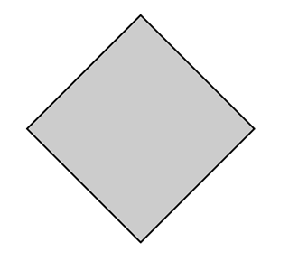
CSS3 transforms also have a rotate function, which, believe it or not, lets you rotate an element either clockwise (a positive value) or counter clockwise (a negative value). Here’s an example:
#element {
    width: 200px;
    height: 200px;
    background: #ccc;
    border: solid 2px black;
    transform: rotate(45deg);
}
If I remove the transform property from that element, it would look like this:

With the 45 degree rotation applied, it would change to:

The rotate function takes just one parameter and, as mentioned, positive or negative values will determine in what direction the element is rotated. The unit used for defining the angle of rotation is degrees (expressed as “deg”) and you are permitted to use decimal notation.
Skewing an Element
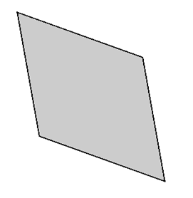
Another function defined in the spec is the skew function, which skews (or slants) an element along the X or Y axes. Here’s how the same element from above would be skewed:
#element {
    width: 200px;
    height: 200px;
    background: #ccc;
    border: solid 2px black;
    transform: skew(45deg, 30deg);
}
And here’s what it would look like in the browser:

Both parameters are expressed in degrees, and the second parameter is optional. If the second is omitted, a value of “0” is assumed for the skew along the Y axis (which means there is no skew).
Again, you have the option to use skewX and skewY to target a single axis.
The transform-origin Property
The last transformation-related feature we’ll introduce here is the transform-origin property. This is a completely separate property that works along with the transform property to determine where each transformation originates.
Let’s clarify how exactly this works. Remember the scale example I used earlier? Well, if that scaled element were placed in the top left corner of a page, part of the element, upon being scaled up, would be cut off. This is because the scaling takes place, by default, from the center of the object outwards (assuming you’re not using negative values).
But we can change that behaviour. In a case like that, to ensure the element stays fully visible, you want it to be scaled downwards and to the right. Here’s how we would do that:
#element {
    width: 200px;
    height: 200px;
    transform: scale(3);
    transform-origin: top left;
}
This ensures that the “origin” of the transform is the top left corner of the element. The transform-origin property accepts values in the form of percentages, pixels, ems, or the keywords top, left, center, right, and bottom.
The initial value of the transform-origin property is “50% 50%”, and a value of “center” is assumed for the second value if it is omitted.
Take Note of Occupied Space
One important thing to keep in mind when adding transformations to elements is that the transformations will not affect the flow of elements around them. For example if you scale an element up or down, this will not cause the elements around it to move to accommodate the element’s new size.
Similarly, if you use the translate function to move an element vertically or horizontally, it will not push other elements in the translated direction.
Also, whatever space the element occupies before the transform is applied will remain intact. This is similar to how visibility: hidden works; it will make an element disappear visually but its occupied space will remain.
Suggestions for Use
CSS3 Transforms are not animations. These “transformations” do not occur over time, but, like customary CSS rules, are applied immediately.
The real power of transforms is harnessed when you combine them with scripting-based effects, CSS hover states, CSS3 transitions, and even CSS3 keyframe-based animations.
So while in some cases there could be value in applying transforms to static objects, you’ll find many more possibilities for transforms in the context of a transition or animation.
Browser Support
Support for CSS3 transforms is, relatively speaking, quite strong. The only browsers that have a significant market share that don’t currently support transforms are IE6-8. All other browsers – even IE9+ – support transforms.
There’s one catch, however: As of this writing, no browser supports the standard syntax, so the code examples I’ve used in this article will not work. So, as is the case with a number of CSS3 properties, you’ll need to use vendor prefixes, as the example below demonstrates:
#element {
    -webkit-transform: scale(3, 3);
    -moz-transform: scale(3, 3);
    -o-transform: scale(3, 3);
    -ms-transform: scale(3, 3);
    transform: scale(3, 3);
    -webkit-transform-origin: top left;
    -moz-transform-origin: top left;
    -o-transform-origin: top left;
    -ms-transform-origin: top left;
    transform-origin: top left;
}
Although the standard syntax is not supported, you should include it last (as I’ve done for both properties above) to ensure that the code is future-proof and the browser is using the most recent implementation.
And if you want compatibility with IE6-8, you can use a jQuery plugin called Transformie, or a JavaScript library called cssSandpaper, both of which will add compatibility in IE6-8 for many transform-related features.
That does it for this primer. If you’ve used transforms in any of your projects, let us know in the comments, and if you have any suggestions or recommendations for using any of the transform functions, I’d be happy to hear them.
