Media Queries: A Look at Different Media Features
If you have worked with responsive design, you have probably used media queries. Media queries are a clean and simple way to create responsive websites using CSS. They work by allowing you to change the style of the page when the user’s screen is a certain size. Here is a simple example:
@media (max-width: 700px) {
    p {
        color: red;
    }
}This media query causes the paragraph’s text to turn red when the screen’s width is 700px or smaller. If you wanted to turn the text red when the screen is larger than 700px, you would use “min-width” instead. You can also set two separate queries such as “max-width” and “min-width”. Here’s how that would look:
@media (max-width: 700px) and (min-width: 500px) {
    p {
        color: red;
    }
}Awesome! The text will only be red if the width of the screen is between 500px and 700px (inclusive).
Now what if you want some styles to be applied if the screen’s width is smaller than 500px or bigger than 700px? You can do that using a comma to separate the queries, like this:
@media (max-width: 500px), (min-width: 700px) {
    p {
        color: red;
    }
}Notice in the demo that if the window is between 500px and 700px wide (non-inclusive), the text will not be red.
Media queries can be written in many different ways as well.
Directly in your HTML:
<link rel="stylesheet" media="(max-width: 700px)" href="example.css" />And in addition to the method we’ve used above, you can write them using @import in CSS:
/* @import */
@import url(example.css) (max-width: 700px);

/* @media */
@media (max-width: 700px) {
    /* CSS goes here... */
}
Editor’s Note: @import is not recommended but we’re just demonstrating the fact that media queries can be defined in this way with it.
So far, pretty simple stuff, and you may have known much, if not all of that, already. But let’s go a little further.
In most cases, media queries are used to change styles depending on the screen’s width. Although width is the most common application, there is a whole list of other types of queries, involving various media features.
Width and Height
We can use height the same way that we used width in the earlier examples. For instance, using the same method as before, we could change the background color to yellow when the height of the browser is 600px or smaller:
@media (max-height: 600px) {
    body {
        background: yellow;
    }
}We can also prefix height and width with device-. If we do this, it will use the entire screen’s width and height as a value instead of the width and height of the browser window, or viewport:
@media (max-device-height: 600px) {
    body {
        background: red;
    }
}
Orientation

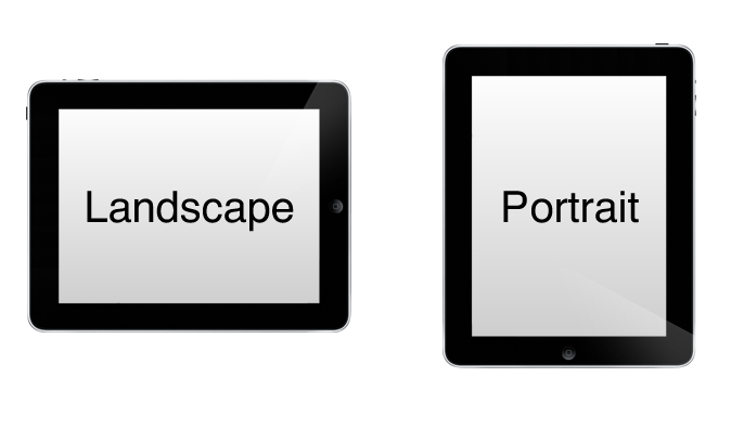
The orientation of the device can be used to create custom layouts. This may be useful for positioning menus and buttons in places that are easily accessible to a user’s thumbs. For example, to set specific styles that apply to layouts that are in landscape mode, you can use the following:
@media screen and (orientation: landscape) {
    menu {
        float: left;
    }
}
This example would apply float: left to any device that is in landscape mode. You could do the same thing with portrait mode:
@media screen and (orientation: portrait) {
    menu {
        float: right;
    }
}
To learn more about the orientation media feature and how it can be used, check out this article.
Color
The color media feature can be used many different ways. The first way is to check if the device is color-compatible by using (color). If we want to target only non-colored devices, we can use something that looks like this:
@media not (color) {
    body {
        background: black;
        color: white;
    }
}
The code above uses the not keyword, which can be used with all of the different media features. The code we used could be useful to keep your text easy to read on black and white devices.
Another thing we can do with color is target devices with a minimum (or maximum) number of bits per color component. Let’s say you want to remove a background image if the device has 4-bit color or lower. Here’s what that would look like:
@media (max-color: 4) {
    body {
        background-image: none;
    }
}
We can also apply styles depending on whether or not a device uses indexed color. To apply style to such a device, you could do this:
@media all and (color-index) {
    body {
        background-image: url(wood-texture.jpg);
    }
}
In this example, we’re using the all keyword, to select all devices, which is the default with media queries.
Let’s say you want an alert to display if the user’s indexed color device has less than 256 colors. That would look something like this:
@media (max-color-index: 255) {
    .alert {
        display: block;
    }
}
Monochrome
This feature applies to grayscale devices. To apply specific styles to all monochrome devices, we can use the (monochrome) value. We can also use this value to give style to devices with a certain number of bits per pixel. For instance, if you want to remove images on all devices that have 8 bits per pixel, we could use this code:
@media (max-monochrome: 8) {
    img {
        display: none;
    }
}
One awesome thing that we can do with the monochrome value is set different styles for color printing versus black and white printing. We do this by putting print in front of or behind our normal use of monochrome. Here’s what our CSS might look like:
/* Black and White Print */
@media (monochrome) and print {
    body {
        color: black;
    }
}

/* Color Print */
@media not (monochrome) and print {
    body {
        color: #09f;
    }
}
Aspect Ratio
Aspect ratios have changed a lot since the birth of smartphones and tablets. Older displays commonly have aspect ratios of 4:3 and 5:3, but now with new HD video standards, we see displays at 16:9 and 16:10.
There are two ways to use aspect ratio; You can use the ratio of the browser (using aspect-ratio), or the ratio of the device (using device-aspect-ratio).
The following example will make the background yellow if the browser is square or landscape:
@media (min-aspect-ratio: 1/1) {
    body {
        background: yellow;
    }
}What if you wanted to hide some content on widescreen monitors? You could use something like this:
@media screen and (device-aspect-ratio: 16/9), screen and (device-aspect-ratio: 16/10) {
    p {
        display: none;
    }
}In that example, if the display has a standard 16:9 or 19:10 aspect ratio, paragraph elements will not display.
Grid
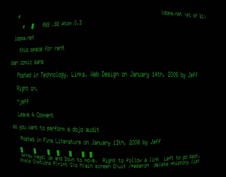
The grid media feature refers to terminal-like devices. This can be a terminal app like the one shown in the image, or an older phone display that uses a single font.

This example will remove all images if the user is on a grid-enabled device:
@media (grid) {
    img {
        display: none;
    }
}
One thing to keep in mind is the “em” unit. When creating a display for grid devices, the “em” unit changes its meaning. The unit will instead be the exact size of one cell of the grid.
Resolution
The resolution media feature can be used to give styles to output devices with a certain dpi (dots per CSS ‘inch’) or dpcm (dots per CSS ‘centimeter’). For example, if you wanted to set a different font for screen with a resolution smaller than 150dpi, your code could look like this:
@media (max-resolution: 150dpi) {
    body {
        font-family: 'comic sans', cursive;
    }
}
One thing to consider when working with the resolution feature is printing. For printers, the dpi and dpcm correspond to the screening resolution.
Scan
Scan refers to the scanning process that TV devices use. The value can be set to progressive or interlace. The query could be set up like this:
@media tv and (scan: interlace) {
    video {
        display: none;
    }
}
Again, this method works only on TV devices.
Media Types
Media types refer to the different types of displays that can be targeted with styles. Here’s a list of the current types:
braille– For use with braille displays. (Example 1 | (Example 2)embossed– For use with a futuristic idea known as embossed displays. (Patent | Experimentation)handheld– For use with cellphones, pda’s, and other small devices.print– For use with printers.projection– For use with small-scale and large-scale projectors.screen– Most common type. For use with all screened devices.speech– For use with speech-generating devices. (Example).tty– For use telecommunication devices for the deaf. (Example).tv– For use with televisions.
There have been rumors of the 3d-glasses media type becoming valid, although it has not been defined in any W3C specifications. It is, however, mentioned in this W3C specification. If the 3d-glasses did become defined, it would still work because from HTML4 and on, media types are backwards compatible.
Further Reading
Here are some links for more research in this area:
- Beginner’s Media Queries article on SitePoint
- Media Queries Level 3 spec on W3C
- Media Queries Level 4 spec on W3C
Conclusion
That wraps up this overview of the many different options you have to target specific devices, windows, and lots more. If you’ve been able to use any of these features of media queries, we’d love to hear about your experience in the comments.
If you’re interesting in learning more about Responsive Web Design, check out our new book, Jump Start Responsive Web Design, written by Chris Ward.