SitePoint’s Tiles: A Case Study in Components, Theming and Flexbox

Editor note: the SitePoint homepage was re-launched soon after this article was published. Sorry Kitty!
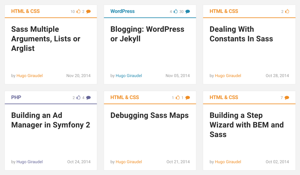
I have long been a writer for SitePoint, and I always found their article tiles quite appealing from a design perspective. They provide all the necessary information about articles: title, author, date, category and even community metrics (number of comments and likes).
I figured such a tile is probably an interesting component to build, both from the HTML and the CSS perspective. In this article, we will build this component step by step, trying to make it the best we can: accessible, maintenable, themable and SEO-friendly.
Starting With Content
A component should almost always be created following this order: content first, then markup, then styles, and finally JavaScript (if needed). We won’t depart from this rule and start with our content.
HTML & CSS

8 comments

A Tale of CSS and Sass Precision

by Kitty Giraudel

May 12, 2016
From there, we can start wrapping our content with HTML. The whole container will be an <article> element as this seems to be a correct use case for it. Inside of it, we’ll have a container for the top part, a container for the title (although that is not entirely mandatory), and a footer for the metadata.
<article class="c-article-tile">
  <div class="c-article-tile__header">
    HTML & CSS

    8 comments
  </div>
  <div class="c-article-tile__body">
    A Tale of CSS and Sass Precision
  </div>
  <footer class="c-article-tile__footer">
    by Kitty Giraudel

    May 12, 2016
  </footer>
</article>
Note: we use a BEM-flavored convention for naming classes, with namespaces; feel free to use whatever you prefer.
Next, we need sub-containers for our elements. One for the category, one for the comment count, a proper heading for the title, a container for the author, and one for the date. Let’s also add links.
<article class="c-article-tile">
  <!-- Tile header -->
  <div class="c-article-tile__header">
    <a class="c-article-tile__category"
       href="https://www.sitepoint.com/html-css/">
      HTML & CSS
    </a>
    <a class="c-article-tile__comment-count"
       href="https://www.sitepoint.com/a-tale-of-css-and-sass-precision/#comments">
      8 comments
    </a>
  </div>

  <!-- Tile body -->
  <div class="c-article-tile__body">
    <h2 class="c-article-tile__title">
      <a href="https://www.sitepoint.com/a-tale-of-css-and-sass-precision/">
        A Tale of CSS and Sass Precision
      </a>
    </h2>
  </div>

  <!-- Tile footer -->
  <footer class="c-article-tile__footer">
    <span class="c-article-tile__author">
      by
      <a href="https://www.sitepoint.com/author/hgiraudel/">
        Kitty Giraudel
      </a>
    </span>
    <time class="c-article-tile__date"
          datetime="2016-05-12T12:00">
      May 12, 2016
    </time>
  </footer>
</article>
It’s looking good! A few interesting things to note:
- We do not use a
<header>element for the top part as a header typically contains a heading, which is not the case here. - We use
<span>elements rather than<p>elements as nothing here is a paragraph of content per sé. - We use a proper
<time>element and itsdatetimeattribute rather than a<span>to describe the date.
Let’s replace the “comments” word with a proper accessible icon now. We won’t go too deep into explanations, feel free to read A Working SVG Workflow for Accessible Icons to learn more about this method.
<svg style="display: none">
  <symbol id="icon-bubble" viewBox="0 0 32 32">
    <path class="path1" d="M16 2c8.837 0 16 5.82 16 13s-7.163 13-16 13c-0.849 0-1.682-0.054-2.495-0.158-3.437 3.437-7.539 4.053-11.505 4.144v-0.841c2.142-1.049 4-2.961 4-5.145 0-0.305-0.024-0.604-0.068-0.897-3.619-2.383-5.932-6.024-5.932-10.103 0-7.18 7.163-13 16-13z"></path>
  </symbol>
</svg>

<!-- … -->

<a class="c-article-tile__comment-count"
   href="https://www.sitepoint.com/a-tale-of-css-and-sass-precision/#comments">
  8
  <svg class="icon icon-bubble"
       aria-label="comments">
    <use xlink:href="#icon-bubble"></use>
  </svg>
</a>
Note how we use the aria-label attribute to make the icon accessible to assistive techology users.
Finally, we can add microdata to our code to make it easier to crawl and index by search engines. Feel free to have a look at the Schema.org reference for articles.
<article class="c-article-tile"
         itemscope
         itemtype="http://schema.org/Article">
  <!-- Tile header -->
  <div class="c-article-tile__header">
    <a class="c-article-tile__category"
       href="https://www.sitepoint.com/html-css/"
       itemprop="keywords">
      HTML & CSS
    </a>
    <a class="c-c-article-tile__comment-count"
       href="https://www.sitepoint.com/a-tale-of-css-and-sass-precision/#comments"
       itemprop="commentCount">
      8
      <svg class="icon icon-bubble"
           aria-label="comments">
        <use xlink:href="#icon-bubble"></use>
      </svg>
    </a>
  </div>

  <!-- Tile body -->
  <div class="c-article-tile__body">
    <h2 class="c-article-tile__title"
        itemprop="headline">
      <a href="https://www.sitepoint.com/a-tale-of-css-and-sass-precision/">
        A Tale of CSS and Sass Precision
      </a>
    </h2>
  </div>

  <!-- Tile footer -->
  <footer class="c-article-tile__footer">
    <span class="c-article-tile__author">
      by
      <a href="https://www.sitepoint.com/author/hgiraudel/"
         itemprop="author">
        Kitty Giraudel
      </a>
    </span>
    <time class="c-article-tile__date"
          datetime="2016-05-12T12:00"
          itemprop="datePublished">
      May 12, 2016
    </time>
  </footer>
</article>
Before jumping into the styles, I would like to have a few words about component encapsulation and proper design implementation. A component, per definition, should be reusable. To be properly reusable in a responsive context, it is usually better for it not to have fixed dimensions and contextual spacing, and to let it spread naturally in its container.
That implies that the container itself specifies some kind of boundaries for the encapsulated component. In our case, a container could be a list item, part of a list component dedicated to displaying tiles (or cards, or what else).
Here is how it could look like:
<ul class="c-tile-list">
  <li class="c-tile-list__item">
    <article class="c-article-tile">…</article>
  </li>

  <li class="c-tile-list__item">
    <article class="c-article-tile">…</article>
  </li>

  <li class="c-tile-list__item">
    <article class="c-article-tile">…</article>
  </li>
</ul>
At this stage, we are entirely done with the markup. It is clean, accessible and SEO-friendly; not much more we can do. It’s time to style it!
Applying Some Styles
For the CSS part, we will assume a proper box model for all elements. We will also heavily rely on flexbox, because y’know, why not?
List Container Component
Our list component is very thin, so there is not much to style there. It has to provide a grid-like layout for tiles, handle spacing between tiles, and make sure that all tiles on the same line are the same height. This should not be too hard thanks to flexbox.
/**
 * 1. Reset default list styles
 * 2. Flexbox used for a grid-like layout for the tiles.
 */
.c-tile-list {
  list-style: none; /* 1 */
  margin: 0; /* 1 */
  padding: 0; /* 1 */
  display: flex; /* 2 */
  flex-wrap: wrap; /* 2 */
}
And now the list items:
/**
 * 1. Flexbox used for equal-height tiles on a same line.
 * 2. Make sure a time never looks distorded.
 * 3. Spacing between tiles.
 */
.c-tile-list__item {
  display: flex; /* 1 */
  flex-direction: column; /* 1 */
  flex: 0 0 300px; /* 2 */
  margin: 10px; /* 3 */
}
Article Tile Component
Let’s move on to the actual beast: the article tile component. There are a lot of elements to style, starting with the tile itself.
As mentioned earlier, the tile should not have fixed dimensions and relies on its parent container for sizing. We will also make the tile itself a flex container so that it is possible to align its footer at the bottom, no matter the computed height of the tile.
/**
 * 1. Make it possible to bottom align the footer in a tile that has a minimum
 *    height.
 * 2. Make sure the tile spread across the full height of the parent if inside
 *    a flex container.
 */
.c-article-tile {
  display: flex; /* 1 */
  flex-direction: column; /* 1 */
  flex: 1 0 auto; /* 2 */
  border: 1px solid rgba(0, 0, 0, 0.1);
  background-color: rgb(255, 255, 255);
}
We can move one level deeper and style the sub-containers (header, body, footer) of the tile. They all are responsible for some horizontal padding, and to make further positioning easier, we can make each container a flex one.
.c-article-tile__header,
.c-article-tile__body,
.c-article-tile__footer {
  display: flex;
  padding-left: 20px;
  padding-right: 20px;
}
The content is slightly smaller in the header and the footer of the tile, essentially because it is meta information that should not take too much space visually speaking. We can safely decrease the font size of both containers.
.c-article-tile__header,
.c-article-tile__footer {
  font-size: 80%;
}
We have laid down the ground work for our containers. Let’s move to proper styling, starting with the header. It needs some vertical spacing and the emblematic bottom border that visually makes it look like a header.
/**
 * 1. Rely on the `color` property for the border color by not setting any color
 *    value, making it super convenient for theming.
 */
.c-article-tile__header {
  padding-top: 15px;
  padding-bottom: 10px;
  border-bottom: 2px solid; /* 1 */
}
The default direction for a flex container is row, which is why we did not explicitly specify it for our sub-containers. To align the comment count on the right of the header, there are 2 solutions. The first solution would be to set justify-content: space-between on the header to space our items out. The other solution, which we’ll use, is to set margin-left: auto on the counter, relying on flexbox’s best kept secret.
/**
 * 1. Right align the comment count container in the header.
 */
.c-article-tile__comment-count {
  margin-left: auto; /* 1 */
}
The header now works as expected. We can move on to the body and the article title. The body just needs a bit of vertical spacing, and the tile needs some typographic styles.
.c-article-tile__body {
  padding-top: 20px;
  padding-bottom: 20px;
}

.c-article-tile__title {
  margin: 0;
  color: #333;
  font-size: 150%;
}
Lastly, we can sort out the footer, which is the most interesting part of the tile if you ask me. For starters, the footer should be aligned to the bottom of the tile.
Secondly, it should always be on a single line. Fortunately, we can force that behaviour with white-space: nowrap. However, we do not control the length of the author’s name, so we need to make sure that the layout doesn’t break when the name is too long. I am well aware that “truncation is not a content stra…”, but in this case, I think that’s the lesser of two evils.
/**
 * 1. Bottom align the footer in the tile.
 * 2. Prevent any content from the footer from wrapping, effectively forcing it
 *    on a single line at all time.
 */
.c-article-tile__footer {
  padding-top: 10px;
  padding-bottom: 15px;
  margin-top: auto; /* 1 */
  white-space: nowrap; /* 2 */
  color: #949494;
}

/**
 * 1. Prevent the author and the date from overlapping in case they both don’t
 *    fit on the line; add an ellipsis to the author name.
 * 2. Visually no effect when both the author and the date fit; however make
 *    sure they are slightly spaced from each other if they meet on the line.
 */
.c-article-tile__author {
  text-overflow: ellipsis; /* 1 */
  overflow: hidden; /* 1 */
  margin-right: 5px; /* 2 */
}

/**
 * 1. Right align the date container in the footer.
 */
.c-article-tile__date {
  margin-left: auto; /* 1 */
}
That’s it for the tile layout! We have one last thing to complete before we are done.
Proper Theming
You might have noticed that we did not tackle theming at all. The reason why is because I believe color schemes should be decoupled from component layout: they do not serve the same purpose and therefore cannot (and should not) be handled the same way.
When it comes to theming, I like to rely on component-agnostic t- namespaced classes. So let’s start by applying a theme class to our tile:
<article class="c-article-tile t-sass"
         itemscope
         itemtype="http://schema.org/Article">
  …
</article>
From there, we can apply some styles to our tile based on this class. We apply a specific color to the tile and all its links. This will effectively have an impact on the border color from the header, but not on the footer text which has a specific color (#949494) already.
.c-article-tile.t-sass,
.c-article-tile.t-sass a {
  color: #c69;
}
Everything is fine but the headline, which ends up being pink when it should be black, only to turn pink when hovered or active. A solution would be to force the link to inherit the color of its parent (#333) when the latter is not hovered or active. To do that, we can use the :not() pseudo-class in a smart way:
/**
 * 1. Make the title link inherit the color only when not active / hovered,
 *    effectively making it themed when active / hovered.
 */
.c-article-tile__title:not(:hover):not(:active) > a {
  color: inherit; /* 1 */
}
Wrapping Things Up
That’s it! Phew, that was a long run, but I hope you enjoyed it. I feel like this small example is a perfect candidate for proper component encapsulation, theme management, and playing around with flexbox. Feel free to try it out, and if you find any way to make it even better, be sure to share!
See the Pen SitePoint Tile Concept Example by SitePoint (@SitePoint) on CodePen.