CSS Debugging and Optimization: Browser-based Developer Tools

The following introduction to CSS code-quality tools is an extract from Tiffany’s new book, CSS Master, 2nd Edition.
On your road to becoming a CSS master, you’ll need to know how to troubleshoot and optimize your CSS. How do you diagnose and fix rendering problems? How do you ensure that your CSS creates no performance lags for end users? And how do you ensure code quality?
Knowing which tools to use will help you ensure that your front end works well.
In this article, we’ll delve into the browser-based developer tools for Chrome, Safari, Firefox, and Microsoft Edge.
Browser-based Developer Tools
Most desktop browsers include an element inspector feature that you can use to troubleshoot your CSS. Start using this feature by right-clicking and selecting Inspect Element from the menu. Mac users can also inspect an element by clicking the element while pressing the Ctrl key. The image below indicates what you can expect to see in Firefox Developer Edition.
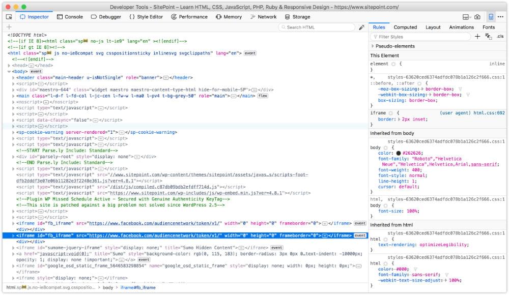 The developer tools of Firefox Developer Edition
In Firefox, Chrome and Safari you can also press Ctrl + Shift + I (Windows/Linux) or Cmd + Option + I (macOS) to open the developer tools panel. The image below shows the Chrome developer tools.
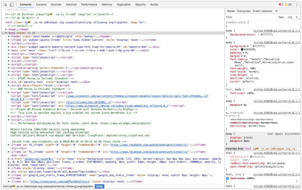 Chrome Developer Tools
While in Microsoft Edge, open developer tools by pressing the F12 key, as seen in below.
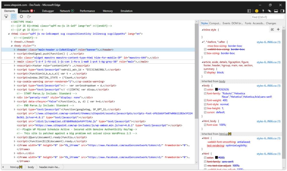 Microsoft Edge Developer Tools
You can also open each browser’s developer tools using the application’s menu:
- Microsoft Edge: Tools > Developer Tools
- Firefox: Tools > Web Developer
- Chrome: View > Developer
- Safari: Develop > Show Web Inspector
In Safari, you may have to enable the Develop menu first by going to Safari > Preferences… > Advanced and checking the box next to Show Develop menu in menu bar. The view for Safari developer tools is illustrated below.
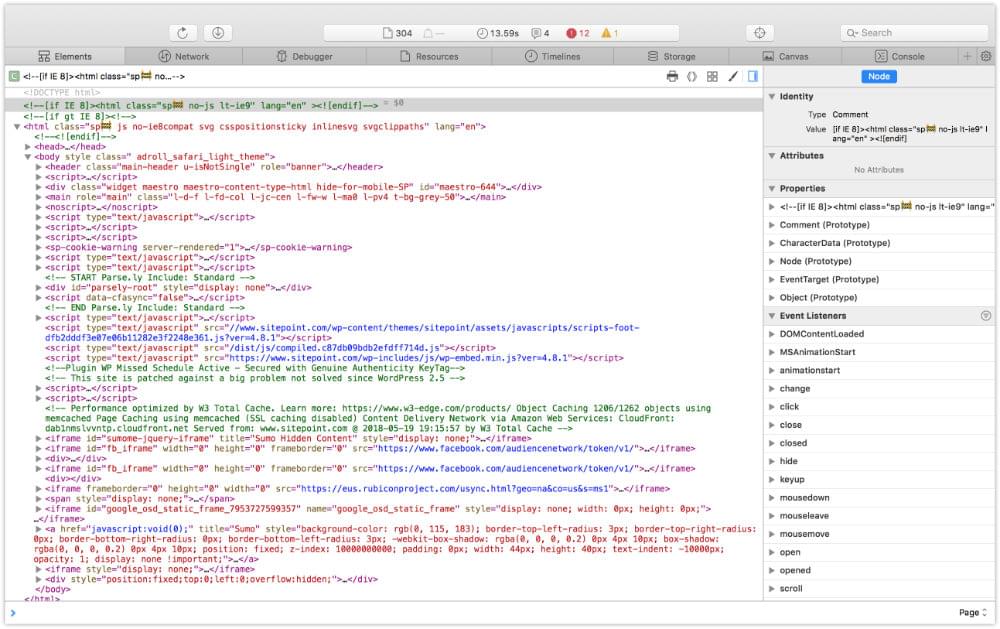 Safari 11 developer tools
After opening the developer tools interface, you may then need to select the correct panel:
- Microsoft Edge: DOM Explorer
- Firefox: Inspector
- Chrome: Elements
- Safari: Elements
You’ll know you’re in the right place when you see HTML on one side of the panel, and CSS rules on the other.
Note: The markup you’ll see in the HTML panel is a representation of the DOM. It’s generated when the browser finishes parsing the document and may differ from your original markup. Using View Source reveals the original markup, but keep in mind that for JavaScript applications there may not be any markup to view.
Using the Styles Panel
Sometimes an element isn’t styled as expected. Maybe a typographical change failed to take, or there’s less padding around a paragraph than you wanted. You can determine which rules are affecting an element by using the Styles panel of the Web Inspector.
Browsers are fairly consistent in how they organize the Styles panel. Inline styles, if any, are typically listed first. These are styles set using the style attribute of HTML, whether by the CSS author or programmatically via scripting.
Inline styles are followed by a list of style rules applied via author stylesheets—those written by you or your colleagues. Styles in this list are grouped by media query and/or filename.
Authored style rules precede user agent styles. User agent styles are the browser’s default styles. They too have an impact on your site’s look and feel. (In Firefox, you may have to select the Show Browser Styles option in order to view user agent styles. You can find this setting in the Toolbox Options panel.)
Properties and values are grouped by selector. A checkbox sits next to each property, letting you toggle specific rules on and off. Clicking on a property or value allows you to change it, so you can avoid having to edit, save and reload.
Identifying Cascade and Inheritance Problems
As you inspect styles, you may notice that some properties appear crossed out. These properties have been overridden either by a cascading rule, a conflicting rule, or a more specific selector, as depicted below.
 Identifying property and value pairs that have been superseded by another declaration
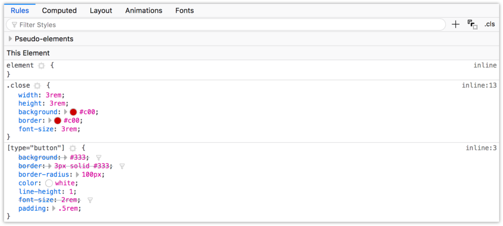
In the image above, the background, border, and font-size declarations of the [type=button] block are displayed with a line through them. These declarations were overridden by those in the .close block, which succeeds the [type=button] in our CSS.
Spotting Invalid Properties and Values
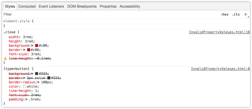
You can also use the element inspector to spot invalid or unsupported properties and property values. In Chromium-based browsers, invalid CSS rules both have a line through them and an adjacent warning icon, which can be seen below.
 Spotting an invalid CSS property value using Chrome
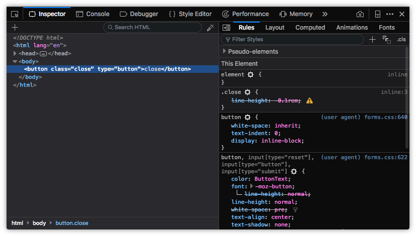
Firefox also strikes through invalid or unsupported properties and values. Firefox Developer Edition also uses a warning icon, as shown below. Standard Firefox displays errors similarly, but doesn’t include the warning icon.
 How Firefox Developer Edition indicates invalid properties and values
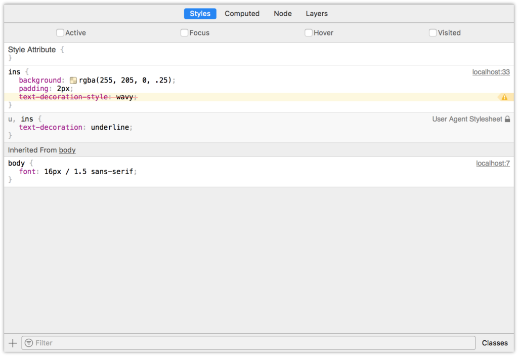
In the screenshot below, Safari strikes through unsupported rules with a red line, and highlights them with a yellow background and warning icon.
 An invalid CSS property value in Safari
Microsoft Edge instead uses a wavy underline to indicate unsupported properties or values.
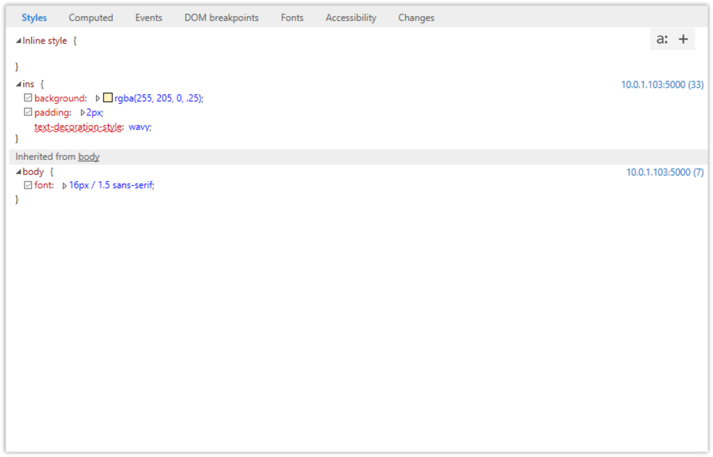 An unsupported CSS property value in Microsoft Edge
When it comes to basic debugging and inheritance conflicts, whichever browser you choose doesn’t matter. Familiarize yourself with all of them, however, for those rare occasions when you need to diagnose a browser-specific issue.
Debugging Responsive Layouts
On-device testing is always best. During development, however, it’s helpful to simulate mobile devices with your desktop browser. All major desktop browsers include a mode for responsive debugging.
Chrome
Chrome offers a device toolbar feature as part of its developer toolkit. To use it, click the device icon (pictured below) in the upper-left corner, next to the Select an element icon.
 Chrome’s Responsive Design Mode icon
Device mode lets you mimic several kinds of Android and iOS devices, including older devices such as the iPhone 5 and Galaxy S5. Device mode also includes a network throttling feature for approximating different network speeds, and the ability to simulate being offline.
Firefox
In Firefox, the equivalent mode is known as Responsive Design Mode. Its icon resembles early iPods. You’ll find it on the right side of the screen, in the developer tools panel, as shown below.
 Firefox’s Responsive Design Mode icon
In responsive mode, you can toggle between portrait and landscape orientations, simulate touch events, and capture screenshots. Like Chrome, Firefox also allows developers to simulate slow connections via throttling.
Microsoft Edge
Microsoft Edge makes it possible to mimic Windows mobile devices—such as the Surface—with its Emulation tab. Select Windows Phone from the Browser profile menu, as shown below.
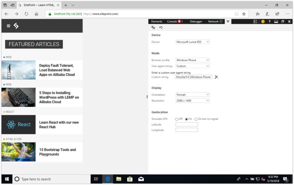 SitePoint.com using Microsoft Edge’s device emulation mode
In addition to mimicking orientation and resolution, emulation mode enables you to test geolocation features. However, you can’t use its emulation mode to simulate network conditions.
Safari
Safari’s Responsive Design Mode is in its developer toolkit. It’s similar to Emulation Mode in Firefox, but adds the ability to mimic iOS devices, as illustrated below.
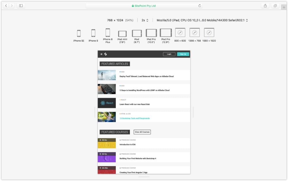 SitePoint.com as viewed using Safari’s responsive design mode
To enter Safari’s responsive design mode, select Develop > Enter Responsive Design Mode, or Cmd + Ctrl + R.
Tiffany’s book goes on to discuss debugging for UI responsiveness, covering reflows and repaints and other browser-based performance tools, such as working with each browser’s Timeline tool.
To read more on CSS debugging and optimization, check out Tiffany’s book, CSS Master, 2nd Edition.
Related articles: