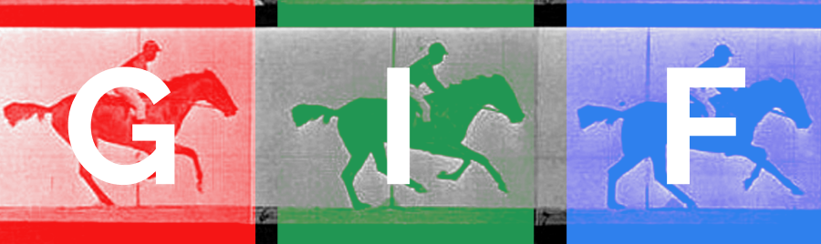
5 Ways to Delight with UX Details Combining GIFs and CSS

User Experience is not only about Usability but also about making your product or website pleasant to use and even delightful. One way you can create a delightful experience on your site is to create meaningful transitions, interactive or visual elements that match the look and feel of your site, and one way to accomplish this is combining GIF’s and CSS.
With a number of examples below you can consider how you might use GIF’s and CSS in a modern and stylish way – not to distract or even impress, but just to create better experiences. GIF’s aren’t just for cats and spamming your coworkers on slack anymore.
Here are 5 example utilizing GIFs and CSS in web design that might help you delight the visitors to the sites you design and develop:
1. Making a GIF play on rollover
Whether it’s icons displaying your differentiating features or an icon you want communicate meaning to your site visitor – one pleasant and fairly simple way to do this is with GIFs and CSS. You can have a static starting version of the GIF as the background, and then when someone rolls over the area, swap it out with the animated GIF version.
<div class="play-GIF-on-hover"></div>.play-GIF-on-hover {
width: 200px;
height: 200px;
background-image: url('path-to-your-folder/this-is-the-static-version.GIF');
background-size: 100%;
background-position: center center;
}
.play-GIF-on-hover:hover {
background-image: url('path-to-your-folder/this-is-the-animated-version.GIF');
}2. Using them as a GIF Preloader
If you’ve never created the CSS for a preloading overlay before, you will need to create the HTML and the CSS that constitutes the overlay screen first. You can then position your own custom pre-loader GIF over the top of it. If you don’t have a preloader GIF queued up, Codrops has a very nice set of them you can check out here (examples below.)
If you need more information on how to make solid GIFs check out “7 Tips For Designing Awesome Animated GIFs”
3. Create an animated menu
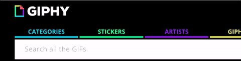
Giphy recently replaced their menu, but this previous version of it was brilliant (and topical!) Giphy’s menu plays a GIF on Roll over and gives you an idea of the kind of content you would see behind door number one, two, three and so on. The trick here is to keep things fairly subtle and not too ‘in your face’ lest you make it feel a bit cheap.
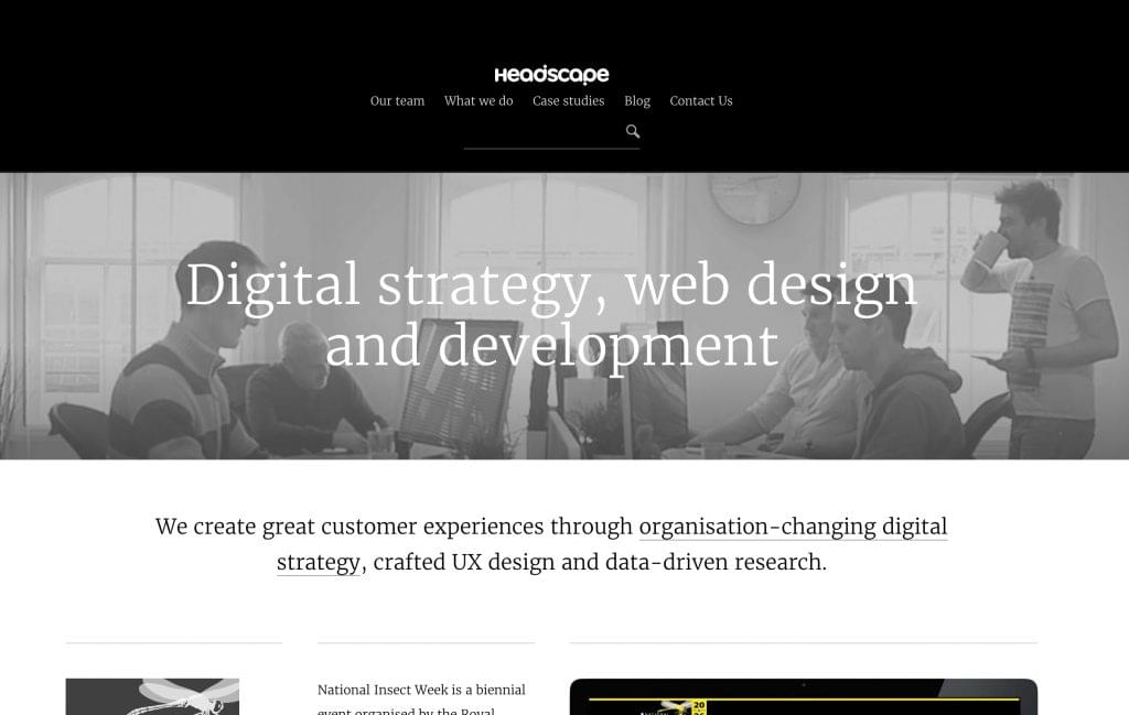
4. As a background like HeadScape
Once again, subtlety is key here. Instead of going for a really in your face set of movements within the GIF – they only have a couple indication of live action. This allows the viewer to not notice, and then discover that something is moving in the background, perhaps pleasantly surprising them on closer inspection.
Technically, this is a nice example of what is known as a GIF ‘cinemagraph’ and weighs in at a fairly respectable 1MB. However, if you want to get much fancier with the animation, this may be a better job for a video background (30-40 second tops) that loops.
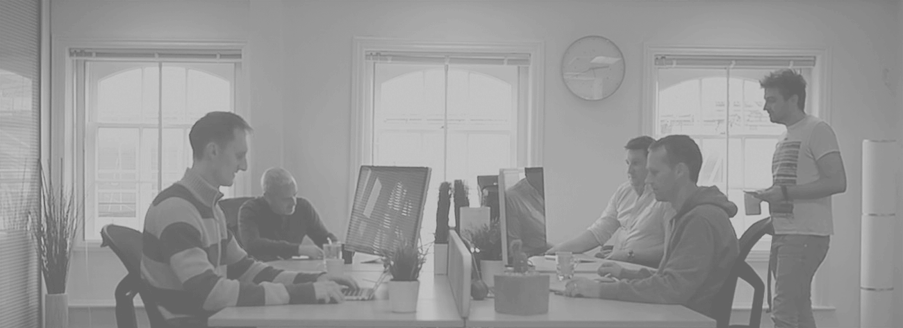
This is what that background looks like in context – as a sort of billboard/hero section, and of course using – background: cover with CSS keep its dimensions fitting in the space.
Although GIF doesn’t typically compress moving imagery like this as well as standard video, it does have one great advantage – variable frame rates. This means you can set a single frame to display for 2 minutes before suddenly animating and then resetting. Overlapping several semi-transparent GIFs with different timings can produce interestingly random results.
5. Hover states on your buttons
Now, because there are no hover states on mobile sites, that limits the applications here. You might want to use this on a site where you can incorporate a more subtle GIF with a light looping pattern that’s moving softly, to increase the interactive feeling without it looking cheesy.
Just because something is not available to use on mobile, doesn’t mean you totally forget ways to progressively enhance on desktop, without making it something crucial to navigation or overall functionality.
Code snippet, originally here.
GIFs aren’t just for decoration
As with any design detail, it’s important to not get wrapped up in adding frills just for the sake of our own creative indulgence. Whenever I add a feature utilizing GIFs and CSS, I want to make sure that I’m doing it to improve communication. The hover state above indicates some type of meaning, helping a visitor know they are indeed hovering over a button – and it might even make them curious what will happen when they take the next step.
Every detail we add to a design should help communicate meaning and lead the visitor down the path we’d like them to take – or at least make it easier and more enjoyable to get where they want to go.
Some Final Thoughts
With the love of GIFs in a kind of renaissance, I think they have a place amongst all of the new SVG animations and CSS post processors, if for nothing else that ease of use and the level of detail that you can reach – up to even short video like GIFs. Keep them in your arsenal to create cool little details like those above.
Bonus: A Tool for Making GIFs Easily
If you need an easy way to create GIFs for making your UX delightful, give CloudApp a go.
We’ve created a cheat sheet to help you learn how to use CloudApp’s features and keyboard shortcuts quickly. Keep it at hand on your computer’s desktop or print it out, and you’ll be slinging screenshots efficiently in no time. Grab it here: