5 Apps to Enhance Google Analytics

After looking at 5 Great Google Analytics Alternatives in a previous article, we thought it would be useful to look at services that allow you to enhance your existing Google Analytics data.
It is quite easy to connect your Analytics account to a third party app, and to look at your visitor data in a different way. This can be useful for SEO purposes, or for a deeper drill-down into your visitor data.
To show you what can be done, I’ve selected 5 services that allow you to enhance your Google Analytics data — all you need is a working Google Analytics account.
Panguin Tool 2.0
The Panguin Tool (who’s name is inspired by Google’s Panda and Penguin updates) allows you to see what effect each Google algorithm update has had on your website traffic. Google has released many updates to their algorithm to improve their search result quality, and some of these changes can have a significant effect on your own rankings.
But it can be difficult to find a correlation between an increase or decrease in traffic, and a specific update. And it can be difficult to keep track of all of them. This is where the Panguin Tool comes in, using a visual overlay on your stats with each of the Google updates.
The tool requires you to login to your Analytics account, and select the profile of the site you want to examine. I used Panguin Tool to find out why one of my sites, Heathrow-Jobs.com had lost almost all of its visitors in 2012. Turns out, I was hit by the Penguin update (twice actually).
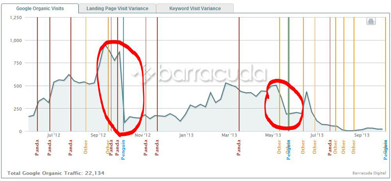
As you can see, there have been numerous updates and changes, but I can quickly define which one hit me the hardest. The Panguin Tool gives a nice insight into the second hit. Traffic was climbing steadily, and then Penguin hit again. Penguin was targeting sites that used bad link building tactics, and they weren’t exactly wrong with this site :-).
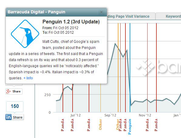
As I mentioned, the Panguin Tool also gives you insight into each of the updates, and when you click on the word “Penguin” you get a nice pop-up with some background information.
The Panguin Tool gives you filters to focus even more, and some additional functionality for your landing pages and keyword strategy. Great tool, and it’s free to use.
Chartio
Chartio allows you to use all of the variables Google Analytics collects, and present them in any way you like. This is much easier and more detailed than how GA itself allows you present them, and you can make specific dashboards for different focus areas (e-commerce, SEO, and so on).
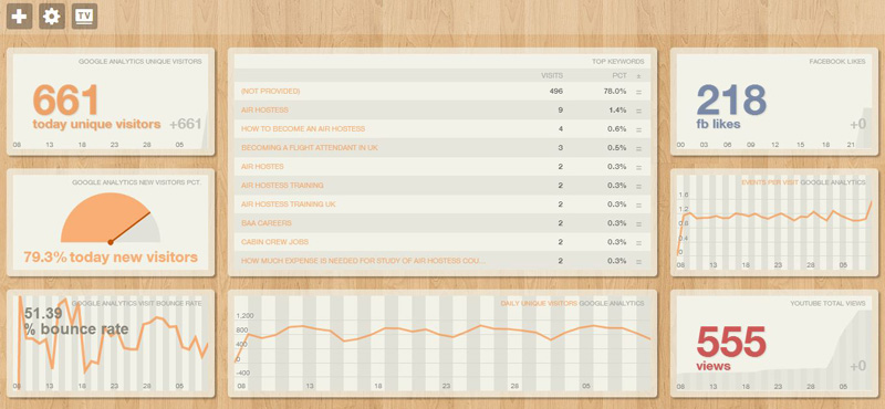
Connecting to your GA account is done in a few steps, after which you can be building for hours in your dashboards. I personally like pie charts a lot for a quick overview, but you can also use lines, bars, and focus areas. It works much like Microsoft Excel when building graphs, so if you’re already familiar with that, you should find it very easy to use. In around 5 minutes I whipped together this dashboard:
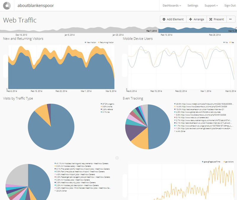
(Note: I took away some of the visitor numbers).
These are just some basic charts, but these can be very powerful in analyzing your traffic. Additionally, you can build complete formulas and make as many cross references as you want. You are in no way limited in displaying what you want, and this functionality goes far beyond what GA itself has to offer. You can also combine it with other sources like your database or cloud providers.
UserReport
A different approach is taken by UserReport. It uses its own code and reporting along with Google Analytics. This allows you to gather data that GA itself isn’t collecting, and combine that with your GA data.
For example, UserReport allows you to focus on different patterns between male and female visitors. By combining the data, you can see what part of your visitors is female for example, and track their behavior up to a purchase or configured event.
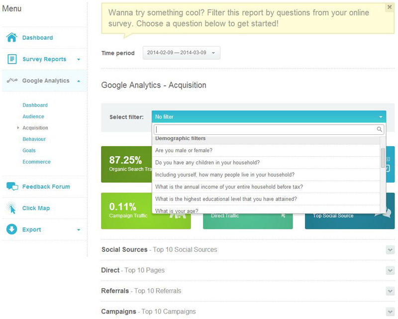
You can combine your data with click maps, but more importantly with surveys. So you can ask your visitors specific questions, combine this with your visitor data, and gain valuable information about purchase behavior or site engagement. It’s a pretty cool way to interact with your visitor and get to know them better, while still keeping track of their actions on your site. And, it also displays your Analytics data in a different way than GA does itself, making it easier to read.
SkyGlue
If you want to focus on event tracking on an individual basis, you will find SkyGlue helpful. I admit both their sales page and admin look a little bit outdated, but the tool itself is very powerful.
You need to add a little extra code to your site, which hooks on events that can take place on your site (clicks, forms, Ajax elements, and so on). You can check to see it’s working by using an overlay for your site, which uses colors to indicate if an event is tracked or not. After that, you can drill down to visitor level, or look at specific events (like a purchase) and see how each visitor reached that event.
While drilling down is useful, it doesn’t aggregate data. Unlike the other four tools discussed here, SkyGlue is mostly focused on enhancing Google Analytics data collection.
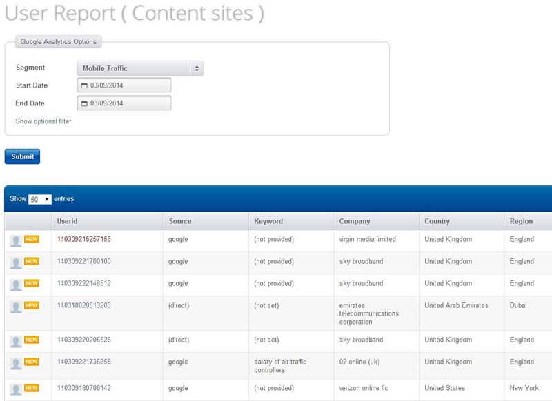
SkyGlue provides individual user reports, which is missing in GA. For aggregate data, clients can generate such reports inside GA or with 3rd party tools. It integrates with Google Analytics quite nicely, and uses your segments to start your drill down — so, for example, you can select all of your mobile visitors.
It would be great if they could find a way to aggregate data inside SkyGlue itself, so you won’t need 3rd party tools tool for this. And if they could make it as excellent as their integration technique, SkyGlue would become a very interesting tool for data analysis based on Google Analytics.
Ducksboard
To conclude this list, there’s Ducksboard. It’s an odd name for a tool that allows you to build dashboard. Once inside, you don’t mind the name, since this is a fantastic tool.
Google Analytics is one of the more prominent sources you can display, but you can also connect it to your Facebook page, SalesForce Desk, MailChimp, WordPress and many more. By using widgets, you can display all the relevant information in one place. And you can combine multiple sites if you like, which makes this a great way to have a quick look at all your important metrics within seconds.
If you you really want to go all the way, they even have a “TV Mode”, which you can use to display your dashboard at full screen. Even on a Full HD TV this looks amazing and really clean.
Ducksboard is very easy to use and intuitive, and it’s real fun to build your own dashboard (or different dashboards for each customer in your service, for example). Of course there’s a lot of eye candy in it, but it’s a professional tool with extensive capabilities. Would be nice if they included Google Analytics real-time though, because that would look amazing on a TV!
Conclusion
All of these tools are either free or offer a free trial, so you can check them all out at no cost. It takes just a few seconds to set them up, and anywhere from a few minutes to many hours to play with.
All options give you an extra insight into your Google Analytics data, some with excellent presentation and others with extensive analysis features. Let me know which of these you prefer, and if you know of any others you’ve tried, we’d love to hear about them.