The Most Popular React UI Component Libraries

In this article, we’ll review some of the best React UI component libraries, and how to choose the right one for you. The article is written primarily for beginner React developers, but you’ll need some familiarity with specific terms in React.
Table of contents
React powers the user interfaces (UI) of close to 10 million websites around the world. While the base library of React is solid, there are multiple component libraries filled with valuable design elements for your React app or web development project.
To help you find the best React UI library for your current project, let’s take a look at the most popular React UI libraries on GitHub. We’ll analyze their application in development and bring examples, as well as look at their popularity among developers based on usage statistics from GitHub and npm.
Let’s start with why you should be thinking about using a React UI library in the first place.
Do I need a React UI Component Library?
Different React UI component libraries each have their pros and cons, which we’ll discuss more in detail below. But in general, using any component library can have many benefits that will help you when working on your React project:
- Beginner-friendly. UI libraries consist of prebuilt components like buttons, form fields, etc. So, as a beginner, you won’t have to figure out how to create any of the necessary elements from scratch. Instead, you can focus on the implementation and customization with the help of the documentation.
- Faster prototyping. With ready-made React components at your disposal, you can quickly create several functioning prototypes. This means you can prove that the design concept is functioning without having to spend too much time on any of the details.
- Saves time. Using a component library saves time not only when prototyping, but also when already working on your React project. It enables you to write less code, as you won’t have to write all the styles yourself.
- Recognizable components by users. Innovation to a certain extent helps your project stand out. But too much innovation in designing UX/UI can put users off. As the UI elements in libraries are designed to be universal, they won’t cause any friction for your users.
- Customizable components. Despite being universal, most elements can be customized at least to some extent. Each library gives you a different amount of control over the customization, but you’ll be able to make sure your website doesn’t look to much like many others.
- Proven compatibility across devices. Most prebuilt UI components are mobile-responsive by default, which means you won’t have to put a lot of extra effort into ensuring your React project works on different types of devices.
- Accessible by default. Most popular React UI component libraries have built-in accessibility features or even fully adhere to WCAG or other standards and best practices. Thanks to this, you won’t have to worry about self-coding semantic tags or keyboard navigation.
- Crowd-sourced. UI component libraries often have their communities centered around GitHub. This means users can raise issues, request features, and also easily become contributors to the libraries.
Despite these many upsides, even the best React UI component libraries have some downsides that you should consider before you commit to one:
- Customizing components can be difficult. Depending on the specific library you choose, the ease of customizing components differs. With some React libraries, you get primitive components that are meant to be heavily customized by the developer, but with others, getting the result you want can be tricky.
- Similar web design with other sites. Each React UI library has its design system, so if you choose to use a popular library but don’t customize the components or theme enough, your site can end up looking very similar to other sites using the same library — in some cases, even unoriginal. However, depending on your project, that might not be an issue at all.
- Support relies on the community. Most React UI libraries don’t offer official support but instead guide their users to Stack Overflow, GitHub, Discord, or other similar channels. With less popular libraries, the community is smaller, and getting help can be more complicated.
So, with these important considerations out of the way, let’s take a look at the most popular libraries based on GitHub statistics. We’ve listed the libraries based on their number of active projects on GitHub, starting with the most popular.
By the end of this post, you’ll hopefully have found the best React-based UI components library for your web or mobile app development project.
1. MUI (formerly Material-UI)
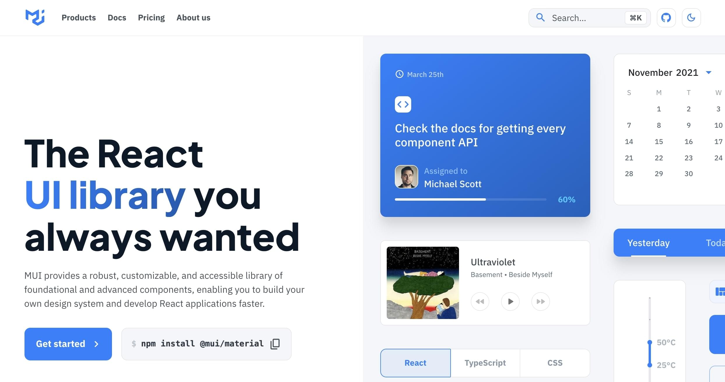
Used by more than 745,000 projects on GitHub, MUI is a straightforward and customizable React components library based on Google’s Material Design. So, MUI is not simply a component library, but an entire design system. It features a wholesome system of guidelines, design principles, and best practices of UI design. MUI is built on 63.9% JavaScript and 36.1% TypeScript.
You can use MUI with its large set of components to easily create a user interface in React applications. Either use the existing Material Design components, customize them, or create your own design system. Thanks to MUI’s ready-made components and in-depth documentation, you can create clean and beautiful mobile or web apps fast — even with little previous design experience.
As the Material-UI design system that MUI is based on was created by Google, it’s also used on Google’s own platform. Therefore, MUI components can have a distinctly Google-like look and feel. On the one hand, this means MUI can be an especially great choice for building Android apps, as the app’s visuals will fit well with the operating system.
But on the other hand, any website or app created with this library — if not customized enough — could be easily associated with Google.
Still, seeing how much MUI is used and how many GitHub stars it has, it’s one of the best React UI component libraries out there. It offers a large number of React components, suitable for a wide variety of general-purpose development projects. MUI is used by medium.com, Scale AI, and UNIQLO, among others. If you;d like to consider an alternative, Enlite Prime, covered in our guide to the best Material UI themes, is also a good option.
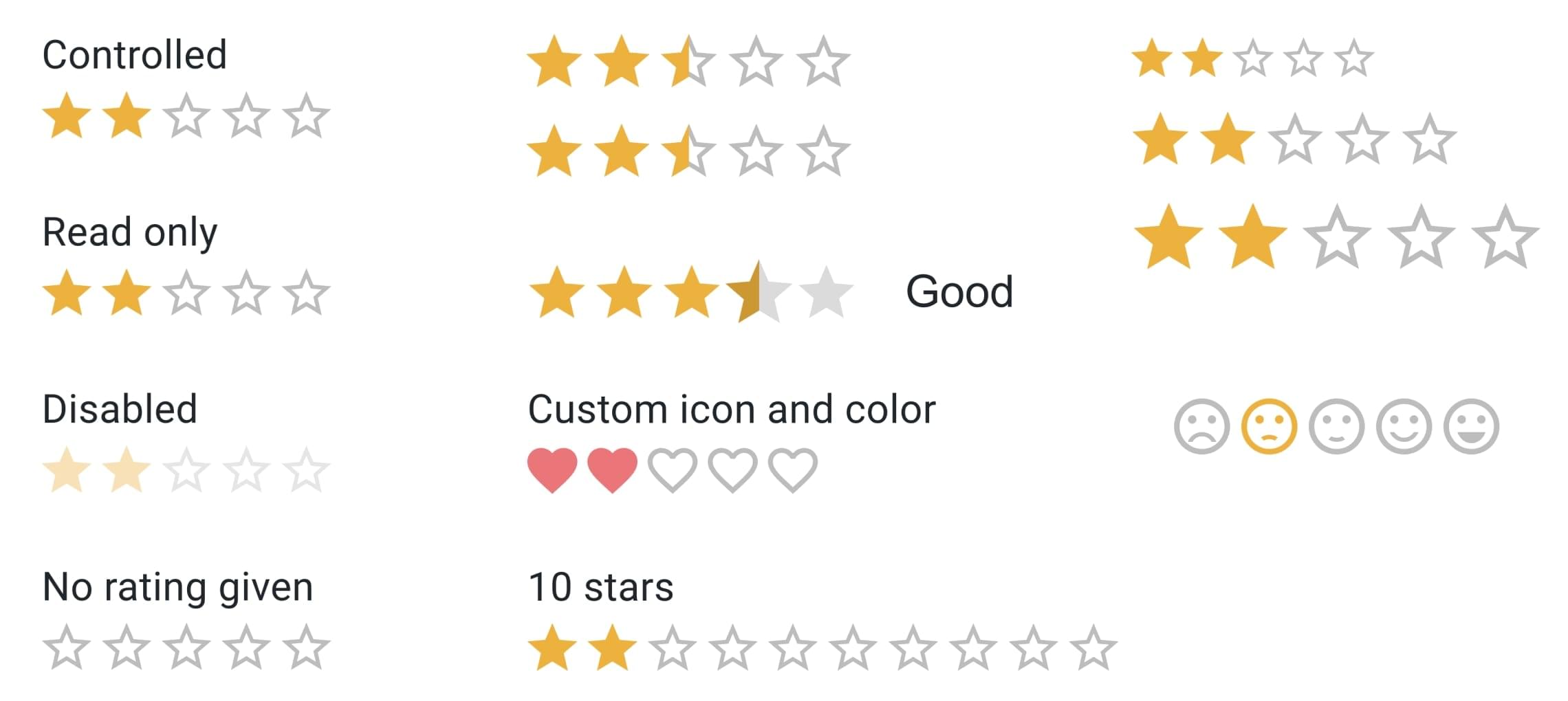
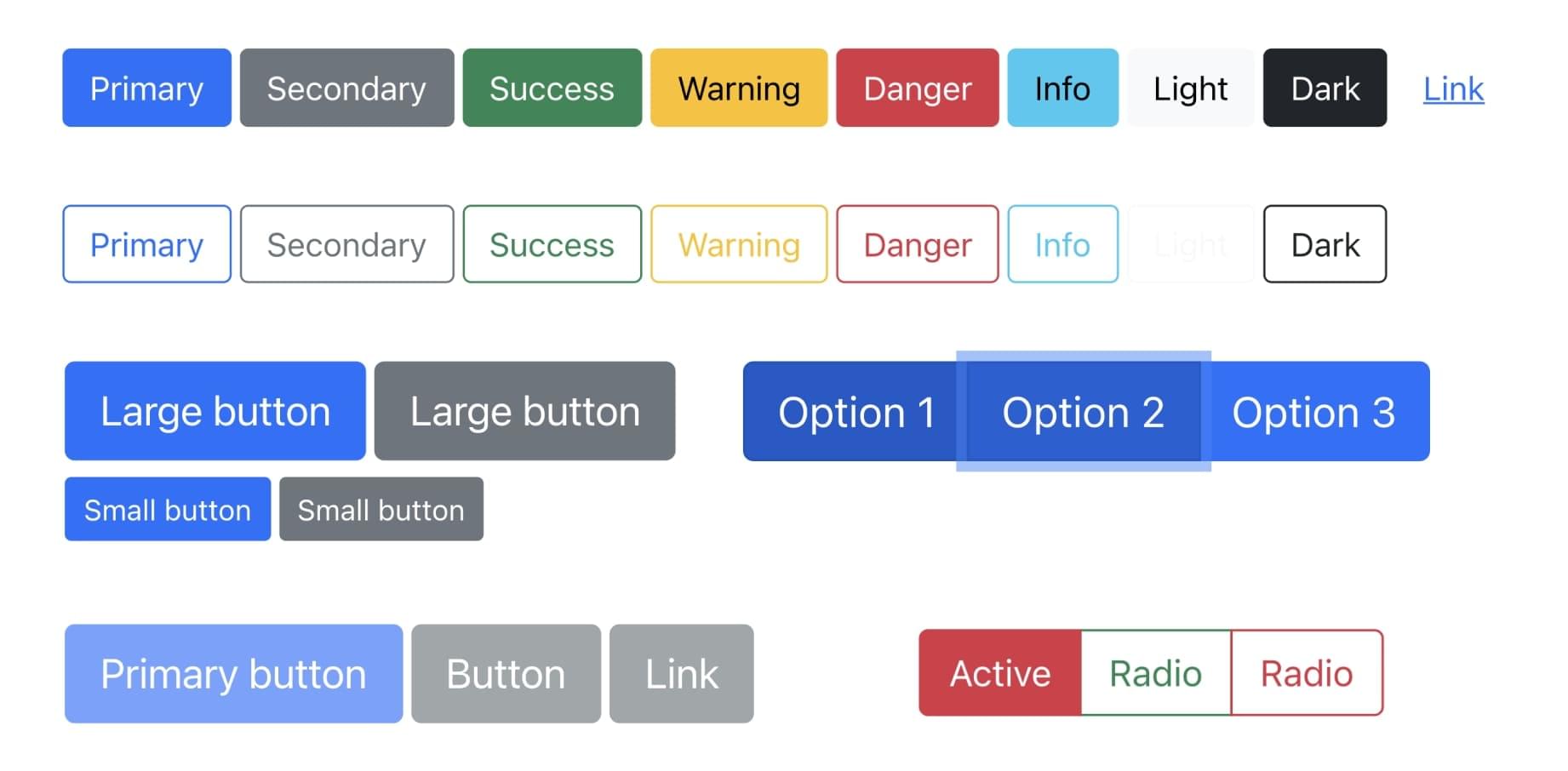
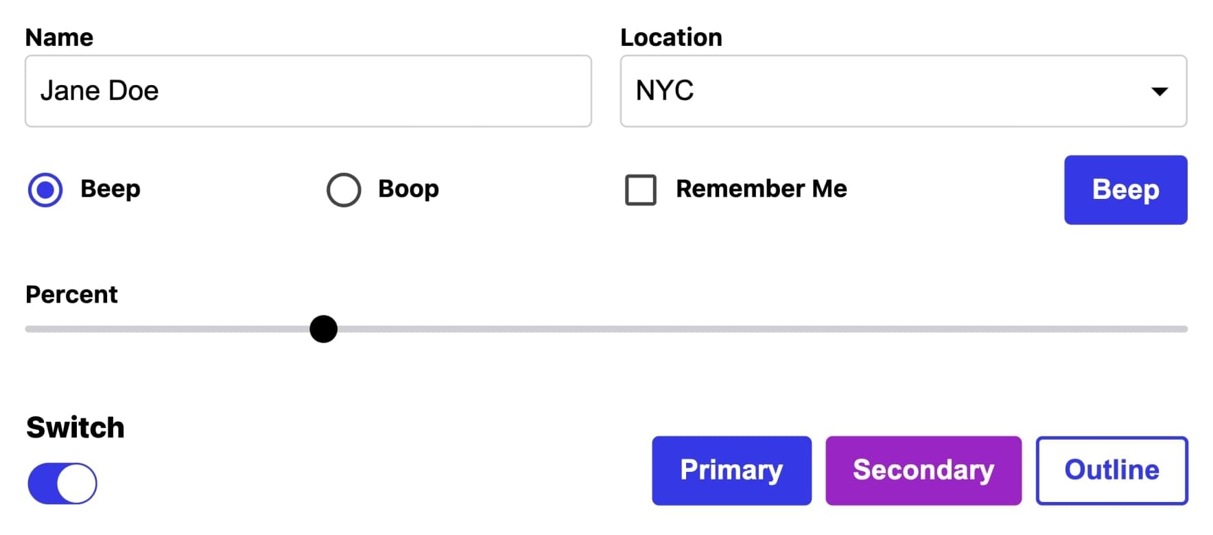
The picture below shows an example of MUI rating variants.
You can install the MUI components library using npm:
npm install @mui/material @emotion/react @emotion/styled
Or yarn:
yarn add @mui/material @emotion/react @emotion/styled
2. React-Bootstrap
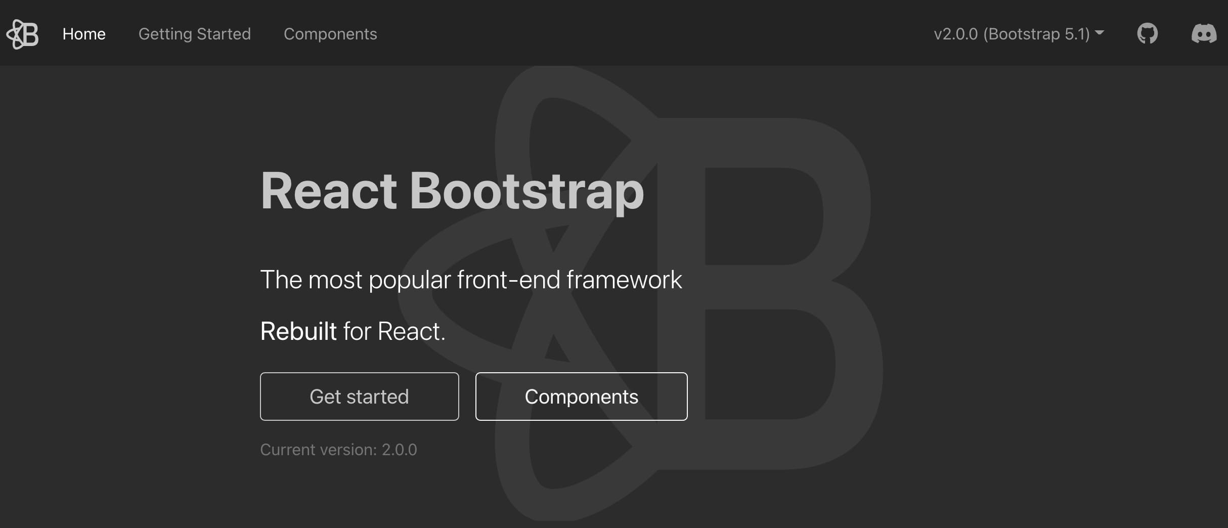
Used by 605,000+ projects on GitHub, React-Bootstrap is one of the oldest React UI component libraries out there. In a nutshell, it’s the popular frontend framework Bootstrap completely rebuilt in React. The library consists of ready-made components that are fully responsive and accessible. All the design elements are also highly customizable.
React-Bootstrap can be used for UI foundations, websites, and designing applications. The library is built on 59.4% JavaScript, 38.3% TypeScript, and 2.3% SCSS, and the latest release is compatible with the most recent Bootstrap version, 5.1.
One important upside to using React-Bootstrap is the fact that it’s compatible with the thousands of Bootstrap themes out there. Also, creating custom themes is easy when you keep in mind the classes and variants defined in Bootstrap. On top of that, with React-Bootstrap, you can import only the individual components you’re using, which can help minimize the total amount of code. It’s also a beginner-friendly library, thanks to its proper documentation.
However, as a downside, if you’re familiar with Bootstrap and decide to choose React-Bootstrap for your development project, you’ll have to learn a new API. Moreover, when compared to some other libraries, like MUI or Ant Design, React-Bootstrap has a somewhat smaller set of components.
In the end, React-Bootstrap’s popularity is a clear sign that it’s a great choice for a wide variety of development projects. And if you’re already familiar with Bootstrap, it can feel natural to use React-Bootstrap, too.
The image below shows an example of React-Bootstrap’s button variants.
How to install:
npm install react-bootstrap
You can install React-Bootstrap components using yarn:
yarn add react-bootstrap
3. Ant Design
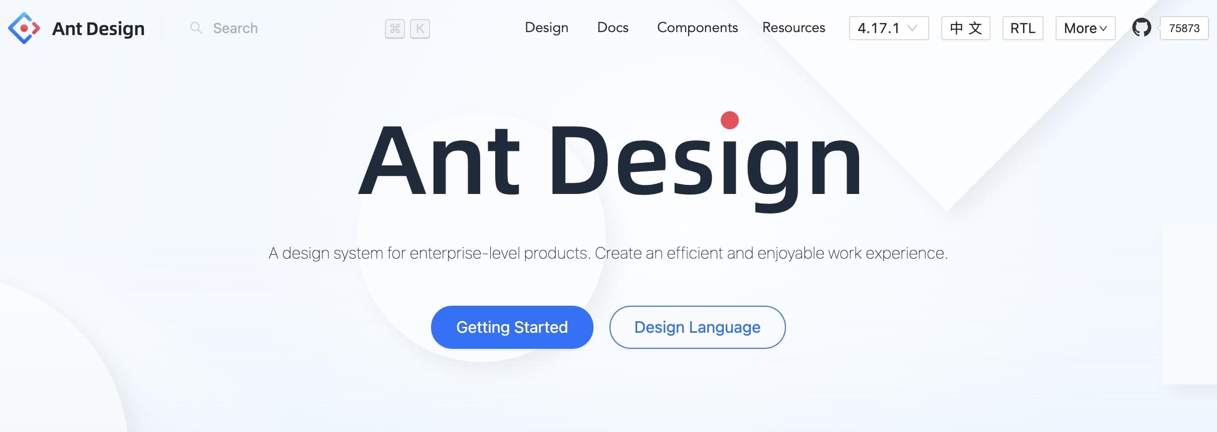
Used by over 255,000 projects on GitHub, Ant Design describes itself as a React UI library and design system for enterprise-level users, meaning that the elements are designed for business use. It was created by Alibaba, the Chinese tech giant.
Ant Design offers a large set of high-quality components that are great for building entire UI frameworks quickly — or you can just use individual components. The library is built on 43.7% TypeScript, 31.1% JavaScript, 24.9% Less, and 0.3% unspecified code.
Ant Design is a great React component library, in part thanks to its great documentation that includes plenty of guidelines, examples, and variants. In addition to that, it’s also a robust platform when it comes to customizing the existing components and themes in detail.
Furthermore, what’s great about Ant Design is its compatibility with lots of third-party React libraries and several of their own products, like AntV Data Visualization, Ant Design Charts, and Ant Design Mobile. These help expand the number of use cases that you can cover with their libraries.
Ant Design might seem like a huge library to fully include (at 1.2 MB), but it’s a tree shake structure, which means that, on compiling, only used components will be added to the production build.
In addition to Alibaba, Ant Design is also used by the likes of Lenovo and Toyota, so it’s a great choice for high-level business projects. And the thorough resources can still make it a great option for beginners. On top of that, it has even more stars on GitHub than MUI does, which is more evidence of its greatness.
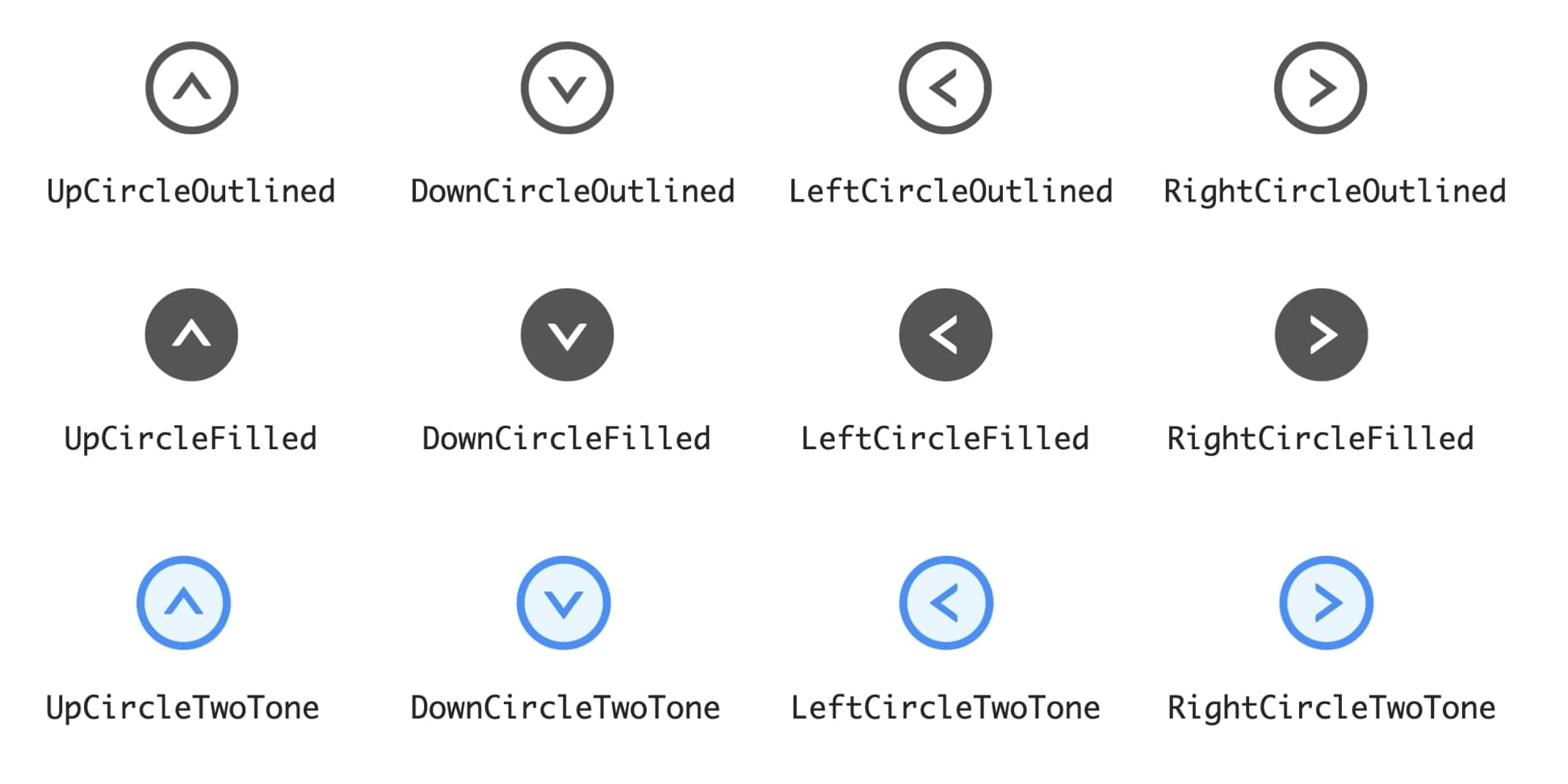
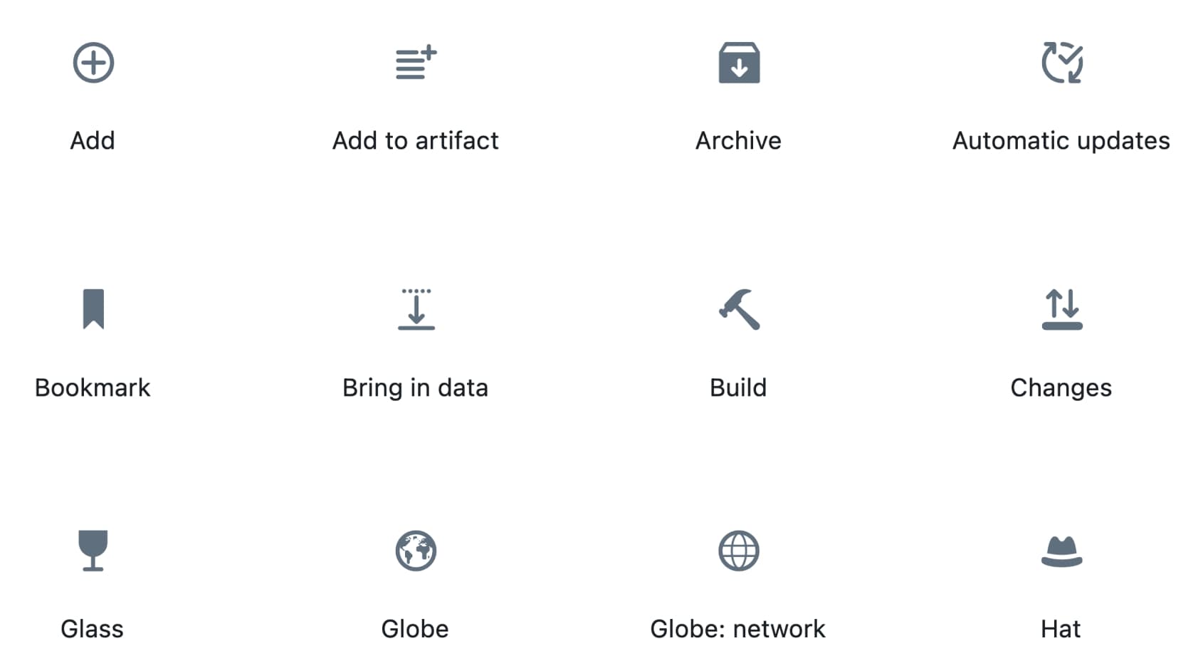
The image below shows an example of icon variants in Ant Design.
You can install Ant Design components using npm:
npm install antd
Or yarn:
yarn add antd
4. Reactstrap
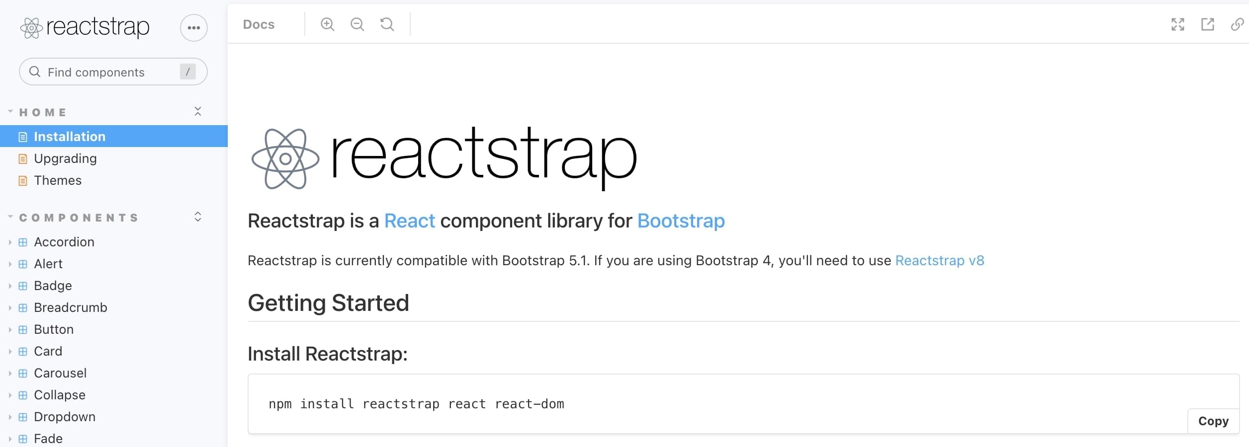
Used by 241,000+ projects on GitHub, Reactstrap offers straightforward and self-contained components for Bootstrap 5.1. The UI elements are responsive, simple in design, and applicable for a variety of projects. Reactstrap is built on 74.7% JavaScript, 24.9% TypeScript, and 0.4% Shell.
You can use Reactstrap for complete UI development or only use individual components. It offers great flexibility and prebuilt validation, which is great for quickly building beautiful forms with a great user experience.
As Reactstrap is a younger component library than some other mentions on this list, it does have slightly fewer components available. Then again, this can be a good thing if you’re aiming for a simple design and you don’t want to be overwhelmed by too many options.
The official Reactstrap documentation is thorough, but it mainly consists of code and doesn’t have a lot of explanations. However, as it’s quite a straightforward library, it’s still easy to understand and work with — even for beginners. On top of that, there’s a decent community around Reactstrap and you can speed up your development thanks to the many free and premium Reactstrap themes available.
All in all, Reactstrap is similar to React-Bootstrap, with a few small differences. If you like working with Bootstrap, you can easily choose either for your project.
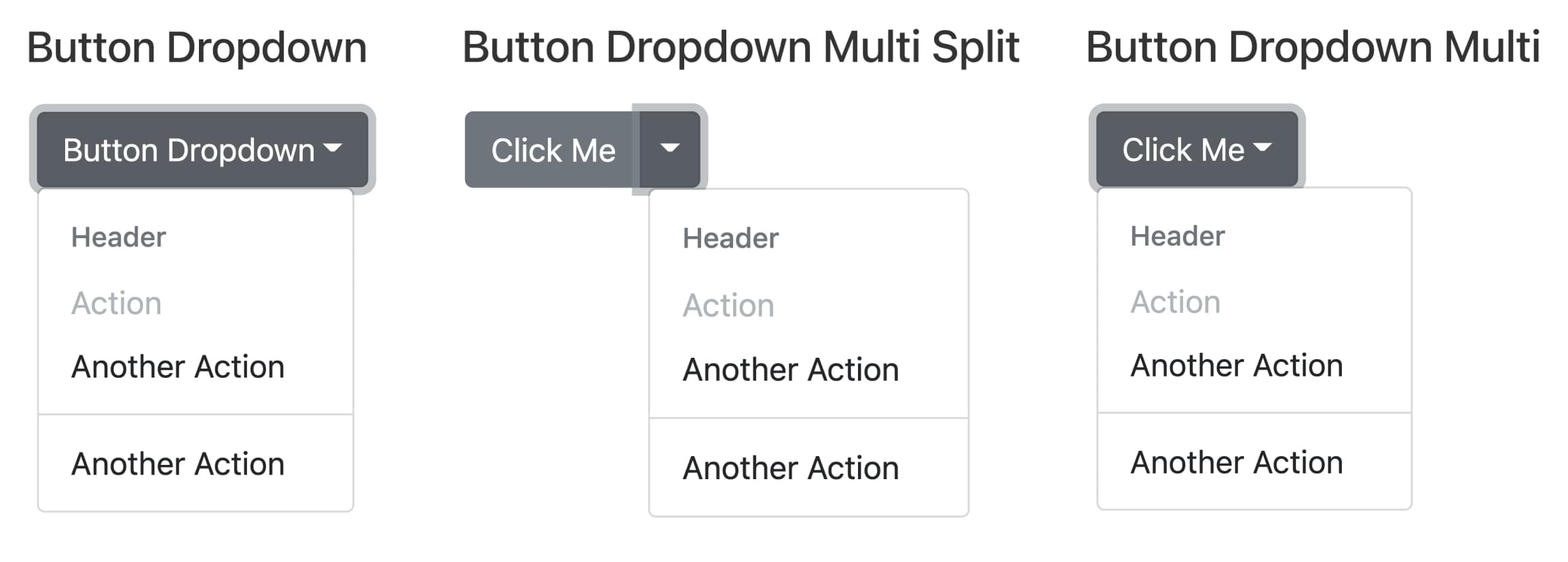
The image below shows an example of button dropdown variants in Reactstrap.
To use Reactstrap, you first need to install Bootstrap:
npm install bootstrap
Or:
yarn add bootstrap
Then you can install Reactstrap using npm:
npm install reactstrap react react-dom
Or using yarn:
yarn add reactstrap
5. Semantic UI React
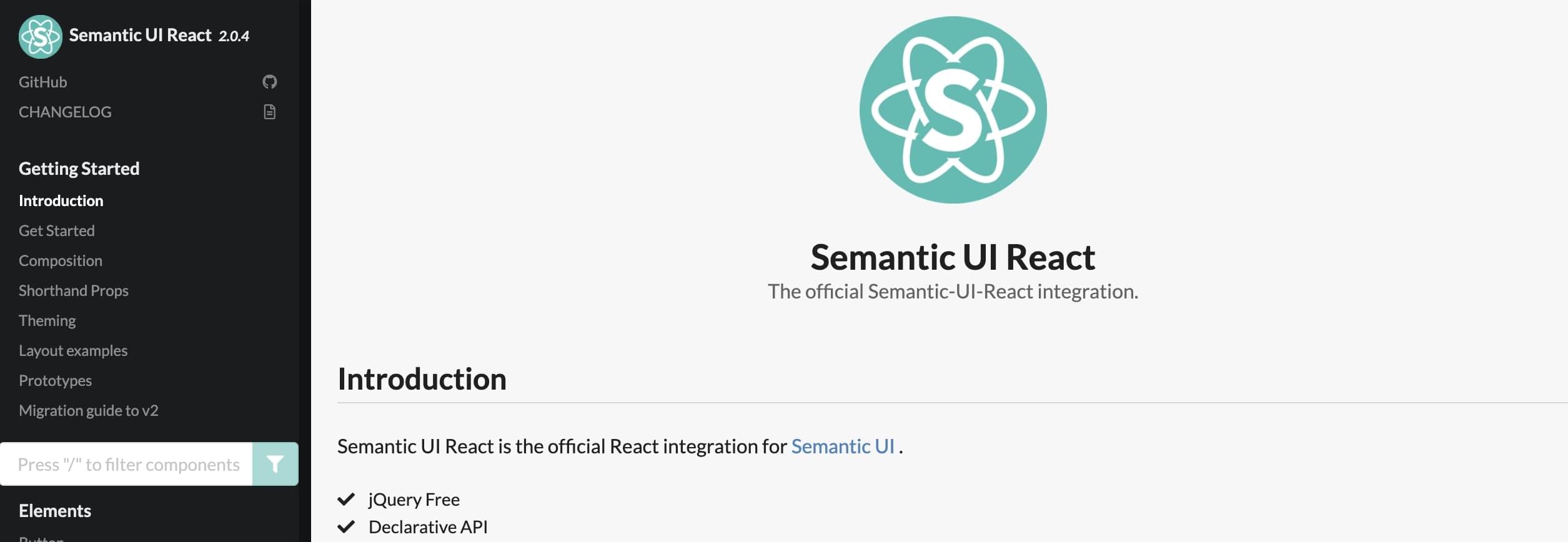
Used by more than 132,000 projects on GitHub, Semantic UI React is a frontend component library for ready-made, mobile-responsive solutions. As the name suggests, it’s the official React integration of the Semantic UI development framework, known for its responsive, human-friendly HTML code. Semantic UI React is built on 99.9% JavaScript and 0.1% TypeScript.
In the Semantic UI React library, there are multiple variations of each component, so you’ll most likely be able to find an existing component that’s suitable for your use case and avoid spending too much time on customizing components. Still, you can make sure each component fits your design by modifying the SCSS stylesheets. You can use the Semantic UI React library for your whole project or only install individual elements.
As Semantic UI — the framework that Semantic UI React is based on — was created for web development, its React equivalent is also more suited for web development projects than mobile apps.
However, if you choose Semantic UI React for your project, you should keep in mind that you’ll have to do some extra work, as not all the components are fully accessible by default. In addition to that, the original Semantic UI framework is no longer maintained.
Nevertheless, Semantic UI React is going strong and, on the whole, it’s a good choice for beginners looking to build responsive web apps. It has human-friendly code, great documentation with plenty of examples, and a code sandbox for trying out each component.
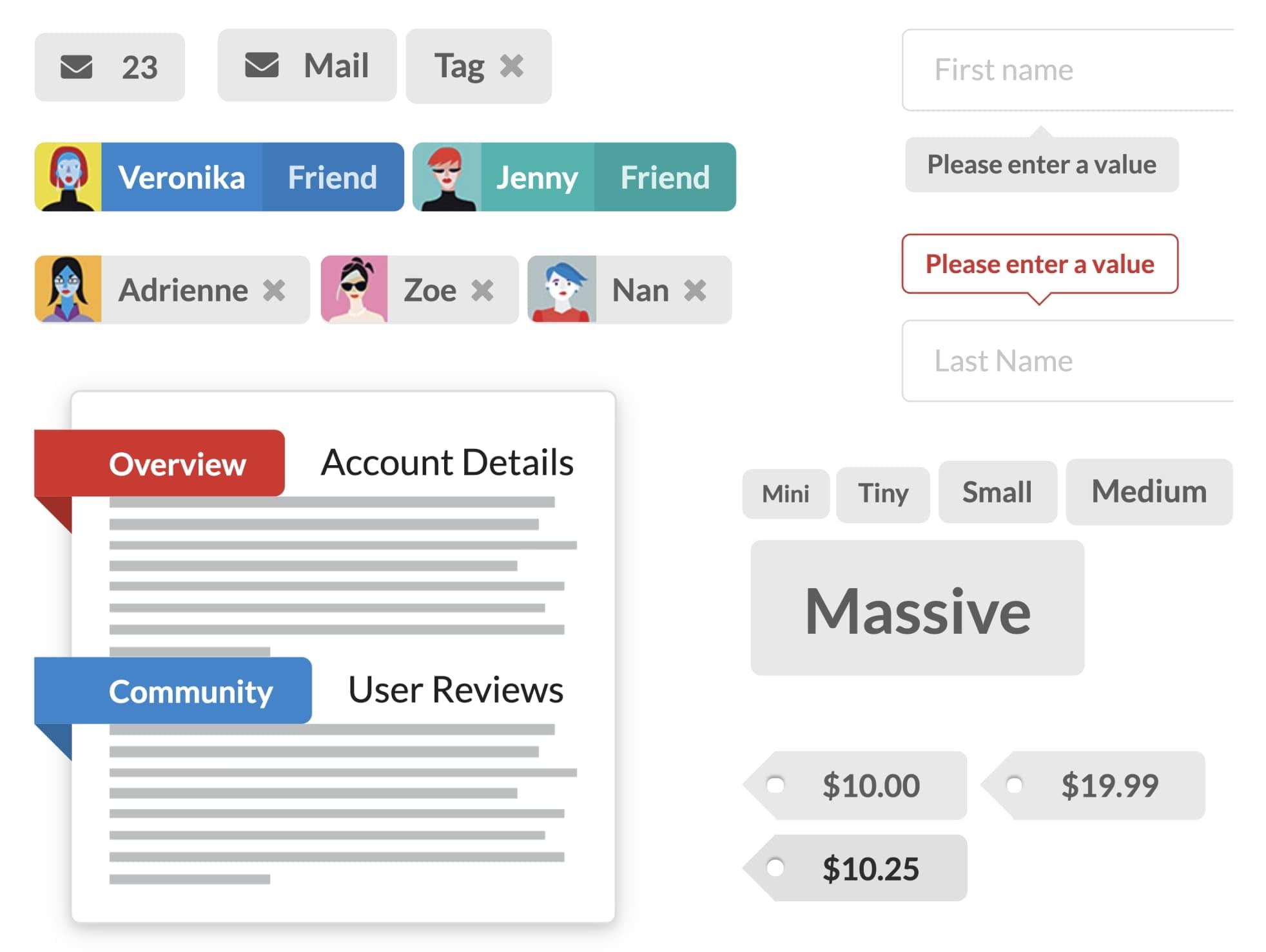
The image below shows an example of label components in Semantic UI React.
You can install Semantic UI React components using npm:
npm install semantic-ui-react semantic-ui-css
Or yarn:
yarn add semantic-ui-react semantic-ui-css
6. Chakra UI
Used by over 20,000 projects on GitHub, Chakra UI offers straightforward, modular, and customizable React components to support application and web development. All elements are also optimized for dark mode, and unlike some other UI component libraries, Chakra UI is fully compatible with the WAI-ARIA accessibility standard. Chakra UI is built on 97.5% TypeScript, 1.9% JavaScript, and 0.6% unspecified code.
You can use Chakra UI to easily create your own design system, or you can install only some of its components. Customizing the components and themes is quite easy thanks to the use of style props.
Simplicity is really one of the keywords to use when describing Chakra UI. Its library focuses a lot on the process of development, too, with a promise that you’ll spend less time writing code and more time building a great user experience. The decent documentation will definitely help with that.
However, as Chakra UI is relatively new when compared to the more popular React UI component libraries, and it’s still lacking some functionality and components. Therefore, it’s best used for small to medium-level development projects that don’t require a lot of components or advanced features.
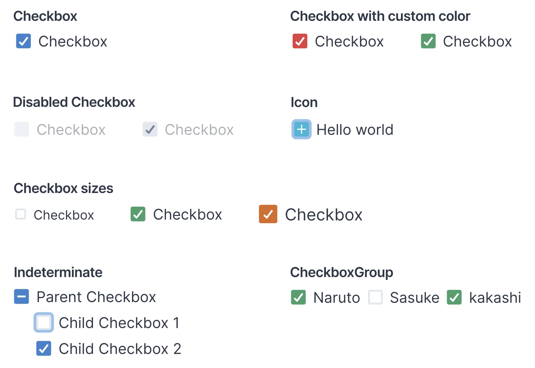
The image below shows an example of checkbox variants in Chakra UI.
You can install Chakra UI and its components using npm:
npm install @chakra-ui/react @emotion/react@^11 @emotion/styled@^11 framer-motion@^4
Or yarn:
yarn add @chakra-ui/react @emotion/react@^11 @emotion/styled@^11 framer-motion@^4
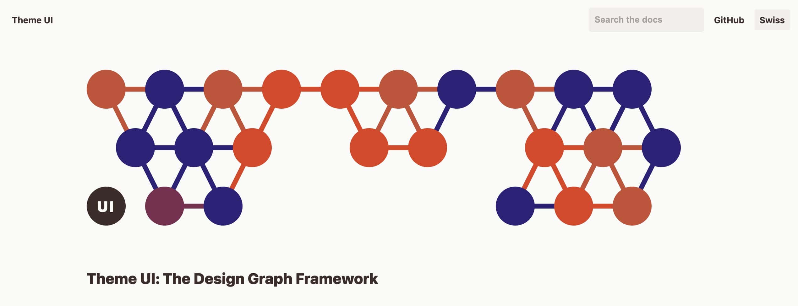
7. Theme UI
Used by over 15,000 projects on GitHub, Theme UI is mainly a library for building React UI themes with over 30 primitive UI components. The core concept of Theme UI relies on constraint-based design principles. Theme UI is built on 74.9% TypeScript, 24.9% JavaScript, and 0.2% unspecified code.
You can use Theme UI for customizing base components, creating themes, or developing your own design systems. It’s highly valued among its users due to the speedy workflow, really easy-to-use styling and theming capabilities, and support for variations.
Theme UI also offers some great features like built-in dark mode and mobile-first responsive styles. On top of that, if you’re a fan of static site generators, you’ll be able to fully enjoy their benefits with Theme UI. Thanks to their Gatsby plugin, Theme UI can be used with any Gatsby sites and themes, and it’s used in official Gatsby themes.
The Theme UI React component library can easily be used to build web applications. But because it’s quite a young library, it doesn’t have as many base components or active community members yet and it’s not fully compatible with accessibility standards by default. It also hasn’t gathered as many GitHub stars as the other UI libraries on this list.
Luckily, though, Theme UI is becoming more popular, and more components and features are bound to be added. In addition to that, the existing documentation is decent and includes plenty of examples, tools, and extensions to ease your work.
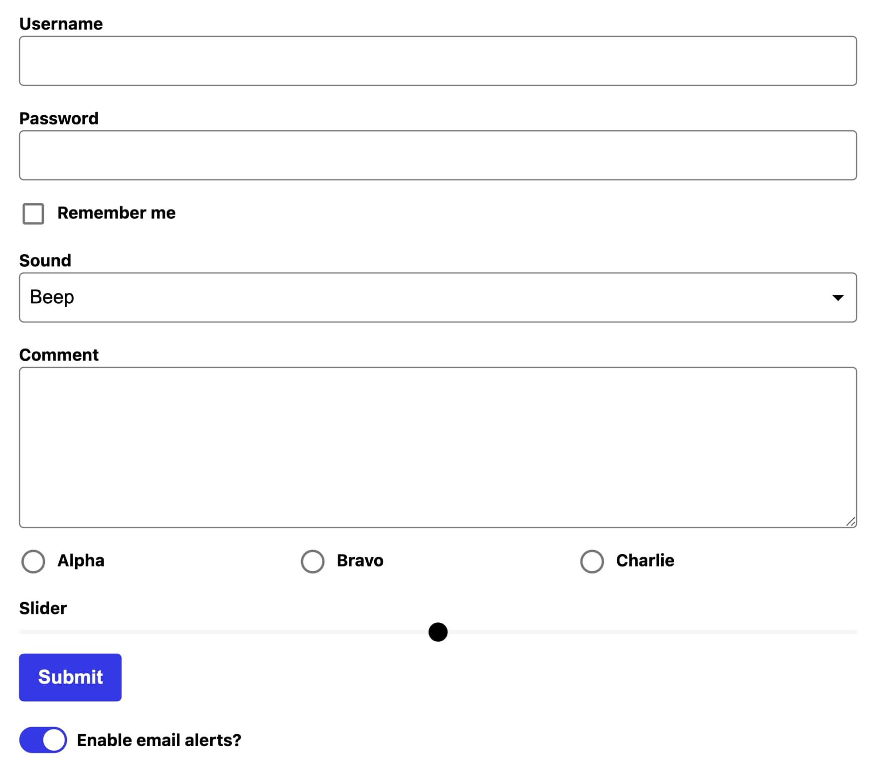
The image below shows an example of forms options in Theme UI.
You can install Theme UI components using npm:
npm install theme-ui
Or with yarn:
yarn add theme-ui
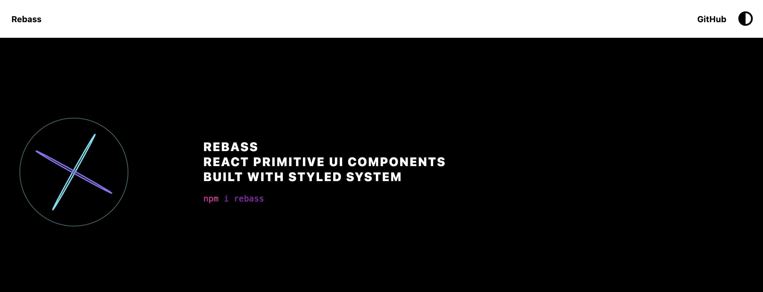
8. Rebass
Used by 10,000+ projects on GitHub, Rebass features primitive React UI components with a straightforward system for further designing. The components are responsive, minimalistic, and flexible. On top of that, it’s a really lightweight library, with only a 43kB bundle size. Rebass is 100% built on JavaScript.
You can use Rebass for creating a minimalistic design style and for customizing the base components as you wish. The use of Styled System at its core reduces the need to write custom CSS in your application, which means you can build your project faster.
Rebass supports theming, and although it doesn’t come with prebuilt themes, it offers enough flexibility and customization for creating your own theme. The Rebass library is also fully compatible with Theme UI so you can combine these two if you like.
Rebass is a great choice if you’re not interested in finalized components or themes, but prefer to create your own design system without having to do it from scratch. With the available primitive components, you can create a highly customized design quickly.
But keep in mind that Rebass is also a newer library and the community is still relatively small — as evidenced by the smaller number of projects on GitHub. The documentation is there and even includes some guides, but in general, it’s not very thorough. Also, with Rebass, you should keep in mind that while some accessibility features are supported by default, the library doesn’t officially adhere to any standards.
The image below shows an example of form components in Rebass.
You can install Rebass’s components using npm:
npm install rebass
Or with yarn:
yarn add rebass
9. Blueprint

Used by more than 9,800 projects on GitHub, Blueprint features over 40 modern-day components in its library. The main focus is on building a React UI for complex data-dense desktop applications and therefore it’s not fully mobile-responsive. Blueprint is built on 88.9% TypeScript, 8.2% SCSS, 2.2% JavaScript, and 0.7% unspecified code.
You can install Blueprint’s core package that has all the fundamental components and add any additional component packages depending on your specific needs. For example, there are separate Datetime, Icons, and Table packages with more advanced components available. Or, you can only import the individual components you need.
Blueprint doesn’t offer any prebuilt themes, except for the default light theme and a dark mode theme. Still, there’s enough room for customizing and building your own theme. You can customize classes, color themes, and typography, which lets you personalize the way your design will look.
Blueprint is probably the best React component library for you if you want to build a data-dense desktop application with beautiful pre-made components. It has great in-depth documentation, but similar to Theme UI and Rebass, the community isn’t very large yet, which means finding help could be challenging. And of course, it’s not very suitable for mobile apps.
The image below shows an example of icon variants in Blueprint.
You can get started with Blueprint’s core components and install them using npm:
npm install @blueprintjs/core
Or, using yarn:
yarn add @blueprintjs/core
Create Unique Designs by Using a React UI Component Library
Building an application can be much more straightforward if you’re using ready-made React UI components. By customizing the components to your specific needs, you won’t have to start from scratch and you can create a unique design fast.
Here’s a quick summary of the suitable use cases of the libraries covered in this post:
- For a large number of prebuilt components and great documentation, you should look into MUI, Ant Design, Semantic UI React, and Blueprint.
- If you’re looking for a library for mobile app development, then try MUI, React-Bootstrap, and Ant Design. You can use these for both Android and iOS apps, although MUI is better suited for Android.
- Blueprint is especially suitable for data-dense desktop applications.
- If out-of-the-box accessibility is important in your React project, then you should consider MUI, React-Bootstrap, Chakra UI, or Blueprint.
- React-Bootstrap and Reactstrap are good for compatibility with Bootstrap themes, and Theme UI with Gatsby themes.
- For primitive components, take a look at Theme UI and Rebass.
We recommend you explore the most popular React UI component libraries covered in this post. They’ll help kickstart your React app or web development project.
Which React UI component libraries have you used and which one from the list would you use for your next project? Share your thoughts on Twitter and tag @sitepointdotcom.
FAQs About React UI Component Libraries and Material UI
A React UI component library is a collection of pre-designed, reusable user interface elements (components) for building web applications using React. These libraries provide a consistent and efficient way to create a user interface with React.
Using a UI component library saves time and effort in UI development by providing ready-made, well-tested components that follow best practices. It ensures a consistent look and feel throughout your application and can improve development speed.
Popular React UI component libraries include Material-UI, Ant Design, Semantic UI, Bootstrap, React-Bootstrap, and Chakra UI, among others.
Yes, React UI component libraries are compatible with various state management solutions. You can integrate them into your application regardless of the state management library you choose.
Yes, most React UI component libraries are designed to be responsive, ensuring that the components adapt well to different screen sizes, including mobile devices and tablets.
Material-UI is a popular open-source library that provides a set of customizable, high-quality React components following the Material Design guidelines. It allows you to create visually appealing and responsive user interfaces quickly.
To get started, you can install Material-UI using npm or yarn. Then, you can import and use Material-UI components in your React application.
Material-UI provides extensive theming support. You can create a custom theme using the createTheme function and override theme variables to match your app’s design. You can also use the makeStyles hook to customize styles for individual components.
Yes, you can integrate Material-UI components with your custom CSS styles. Material-UI components allow you to pass className and style props, so you can apply your own styling alongside Material-UI’s styling.