Scale Your React App with Storybook and Chromatic

This article explains how to integrate Storybook and Chromatic to scale your React application’s component library and benefit from clear documentation, visual regression testing and team efficiency.
Why Use Storybook?
Storybook is an invaluable tool for engineers, product owners and stakeholders alike. Storybook allows frontend engineering teams to build component libraries to facilitate collaboration and prevent the development of components from being blocked by more significant project architecture decisions.
It acts as a standalone application within your more extensive project that can document components and their variations. Storybook comes packed with a ton of features which can be customized and configured to your liking. Below are some of the features I use on everyday projects:
- web accessibility audits
- unit, interaction and snapshot testing
- document component functionality for engineers and stakeholders
- easy publishing and hosting
- integration with Chromatic for visual regression testing (VRT)
This article explores installing and configuring Storybook in a sample Create React App project, installing add-ons, writing stories, generating automated documentation and publishing your Storybook to the Web.
Setting Up and Configuring Storybook
Let’s first look at installation.
Installing Storybook
Storybook was developed to fit into a plethora of different project types. The most effective way to get started with Storybook is to install it into a pre-existing application and run a simple command at the root of your project:
npx storybook@latest init
The above command will look at your project dependencies and determine the most appropriate way to install Storybook.
If you need help determining whether your project would support Storybook, read through the Frameworks page in the documentation.
Note: you can install Storybook manually, but this generally results in errors and mismanaged dependencies, which can cause problems.
Configuring Storybook
One of the more complex aspects of Storybook is configuring it to align with technologies present in your application. Further customization will be required to ensure Storybook behaves in a manner aligned with your application’s technology stack.
Configuring Storybook is primarily done through the main.js file. You can specify everything here — from how documentation is presented, to extending Storybook’s UI with add-ons. You can even extend Webpack.
Storybook supports TypeScript out of the box, but you must set up your CSS architecture. Many flavors of CSS are supported. You can find more information in the Styling and CSS documentation.
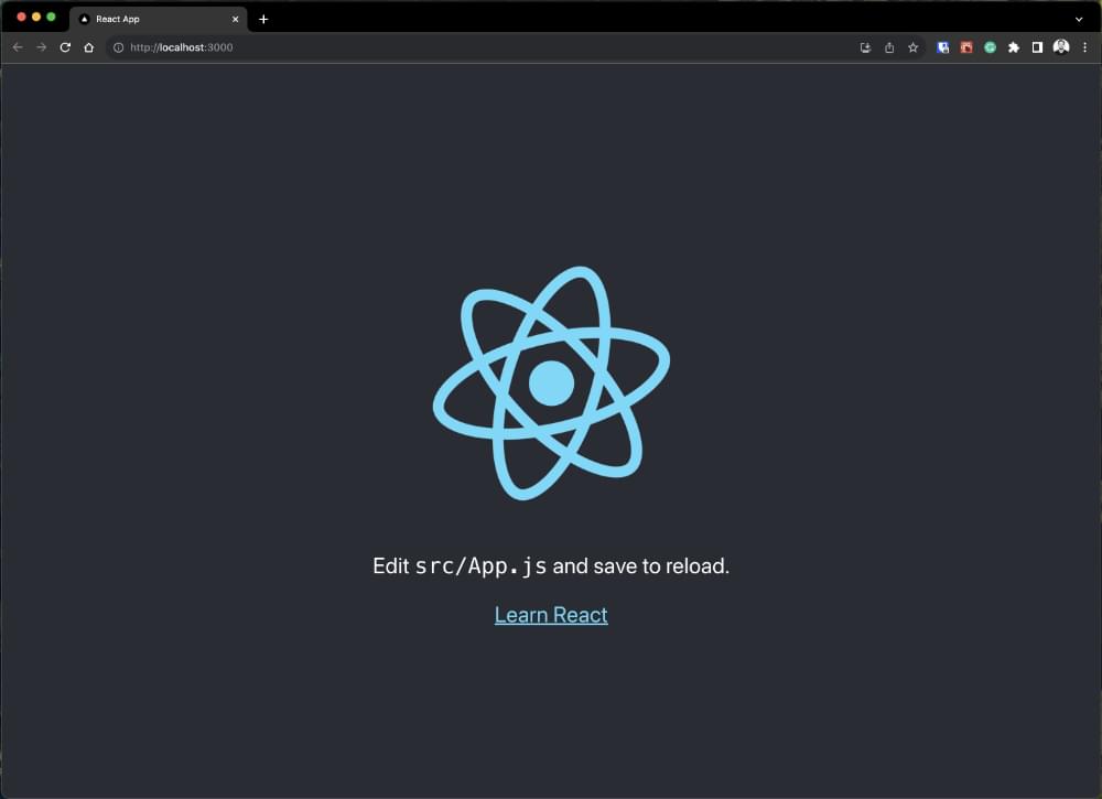
Let’s spin up a Create React App instance:
npx create-react-app my-scalable-component-library
The above command will bootstrap a basic React application. We’ll be using Create React App for this article, though other frameworks are also supported. Let’s make sure your application is working correctly by running npm run start. You should see something similar to what’s pictured below.
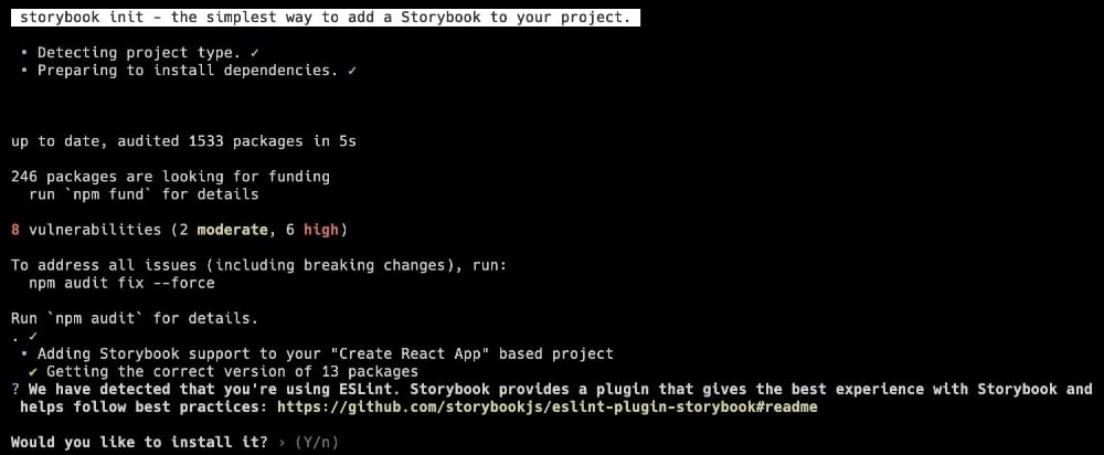
Let’s install Storybook next. Run the following line in the root of your application:
npx storybook@latest init
The script will do a bit of thinking and then prompt you to confirm a few details. Storybook is smart enough to detect that we’re using Create React App (CRA), and it will likely need to update a few dependencies to work seamlessly with your project. Hit Y when you see the prompt pictured below.
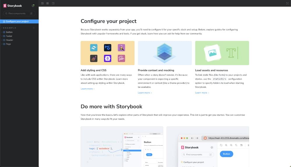
If all goes according to plan, Storybook will launch in your browser, and you’ll see what’s pictured below.
At this point, it’s worth looking at what’s changed in our project. Storybook added a .storybook folder where your configuration files live. You’ll also notice a stories folder added to the src directory. There are generally three related files for each “story”. We’ll uncover that in more detail a bit later.
Both the package.json and package-lock.json have been updated. Updates to these files pertain primarily to dependencies, but package.json also has two new scripts:
"storybook": "storybook dev -p 6006",
"build-storybook": "storybook build"
Run npm run storybook to spin up a dev environment and npm run build-storybook when you’re ready to publish your first Storybook.
Let’s run npm run build-storybook. The output is a folder called storybook-static: this is a “published” Storybook that can be made publicly accessible.
At this point, Storybook and CRA are entirely set up. You may want to add the storybook-static folder to your .gitignore if you don’t plan to track the static files.
It’s also worth noting that a handful of components have been added to your directory. You can remove them if need be. However, I recommend keeping them for reference, if for nothing else. Before we move on, let’s briefly take a look at main.js:
/** @type { import('@storybook/react-webpack5').StorybookConfig } */
const config = {
  stories: ["../src/**/*.mdx", "../src/**/*.stories.@(js|jsx|mjs|ts|tsx)"],
  addons: [
    "@storybook/addon-links",
    "@storybook/addon-essentials",
    "@storybook/preset-create-react-app",
    "@storybook/addon-onboarding",
    "@storybook/addon-interactions",
  ],
  framework: {
    name: "@storybook/react-webpack5",
    options: {},
  },
  docs: {
    autodocs: "tag",
  },
  statistics: ["../public"],
};
export default config;
There are a few essential parts to this file. Firstly, the stories key tells the Storybook where to look for component stories. As you update your file/folder architecture in CRA, update these paths to avoid losing your stories in Storybook.
framework is generally different for each project type. docs tells Storybook to document components automatically.
I would highly recommend reading the Configure page in the Storybook docs for more information about what can be handled through main.js.
Deciding on Storybook Add-ons
You can think of Storybook add-ons as “plugins”. They are pre-written packages that extend the core Storybook APIs and perform tasks like integrating JS/CSS frameworks or enhancing the default behavior of Storybook.
What add-ons you install will depend on your project and your team’s goals. There are effectively two types of add-ons: UI-based and preset-based. “UI-based” add-ons customize the functional appearance of Storybook. “Preset-based” add-ons allow you to integrate with other technologies like TypeScript or Tailwind. You can find a collection of all add-ons on the Integrations page.
Note: some add-ons are maintained by the Storybook team, while others are community-driven. Community-driven add-ons may yield unexpected results or may not be compatible with the latest version of Storybook.
Before you go on the hunt for a collection of add-ons you feel will be best to integrate, make sure you take a look at what Storybook installs by default:
addons: [
    "@storybook/addon-links",
    "@storybook/addon-essentials",
    "@storybook/preset-create-react-app",
    "@storybook/addon-onboarding",
    "@storybook/addon-interactions",
  ],
@storybook/addon-linkslets you link Stories to build prototypes.@storybook/addon-essentialsinclude all add-ons located here: https://storybook.js.org/integrations/tag/essentials/.@storybook/preset-create-react-appis a preset-based add-on that enhances the integration with CRA.@storybook/addon-onboardingprovides a guided tour of Storybook features.@storybook/addon-interactionsallows you to debug the interaction state of your components. If you’re interested, you can read more about Interaction tests.
Let’s say you want to add another add-on to your configuration. Let’s install the Accessibility add-on:
npm install @Storybook/addon-a11y
Next, we need to tell Storybook to initialize the add-on. This can be done by adding the add-on to the addons key in main.js:
addons: [
    "@storybook/addon-links",
    "@storybook/addon-essentials",
    "@storybook/preset-create-react-app",
    "@storybook/addon-onboarding",
    "@storybook/addon-interactions",
    "@storybook/addon-a11y",
  ],
Save main.js, and then let’s boot up Storybook again by running npm run storybook.
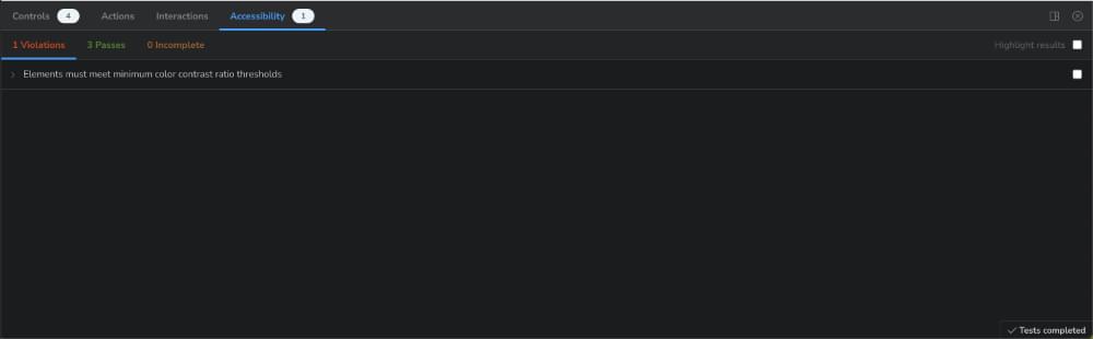
You can see now that the “Accessibility” tab has been added to all story instances and is already flagging problems with a11y in our components. “UI-based” add-ons only require a little configuration. “Preset-based” can be more complex. The reason for this is that “preset-based” add-ons often need further configuration, such as:
- placing configuration files at the root of your project
- configuring options / Webpack configurations that must align with your CRA application settings
This can cause a lot of friction, and remediation can depend on the framework of choice. Use caution when extending Storybook with “preset-based” add-ons and ensure parity with your application.
Writing and Documenting Component Stories
It’s now time to write stories. A story in Storybook is usually tied to a component and its variations. Stories are highly dynamic files written in React, Markdown, or a combination of both technologies. Stories are passed parameters that align with props the React component accepts.
These props can be configured to output variations of each component. This allows engineers to interact with prop values within the Storybook UI. Let’s review our Button story that was added through our bootstrapping of Storybook:
import { Button } from './Button';

export default {
  title: 'Example/Button',
  component: Button,
  parameters: {
    layout: 'centered',
  },
  tags: ['autodocs'],
  argTypes: {
    background-colour: { control: 'color' },
  },
};

export const Primary = {
  args: {
    primary: true,
    label: 'Button',
  },
};

export const Secondary = {
  args: {
    label: 'Button',
  },
};

export const Large = {
  args: {
    size: 'large',
    label: 'Button',
  },
};

export const Small = {
  args: {
    size: 'small',
    label: 'Button',
  },
};
The above illustrates the format you can follow when creating a Story. There must always be a default export. This is the main component. It’s where essential settings are configured. Most of them are self-explanatory. However, I would like to call out the following:
- Parameters are a set of static, named metadata about a story, typically used to control the behavior of Storybook features and add-ons.
- Tags will auto-generate documentation for each component story. Read more about AutoDocs.
- argTypes specify the behavior of
argsor annotate args. Read more aboutarchetypes.
Any named export after the initial default export is a variation. Each variation is an object with an args key. args in this context should align with the props passed to your component. Each variation will be output in Storybook under the Button component, and you can interact with them as needed.
Understanding Decorators goes a long way if you plan on building more complex stories. A decorator provides a way to wrap stories in extra context and functionality. Stories can be passed to a decorator by setting the decorator key in the story parameters:
decorators: [
    (Story) => (
      <div style={{ margin: '3em' }}>
        {/* 👇 Decorators in Storybook also accept a function. Replace <Story/> with Story() to enable it  */}
        <Story />
      </div>
    ),
  ],
In the example above, we add a <div> that wraps our component, and we assign it 3em of margin.
Stories can also consume components from other Stories. Just be mindful that this will rely on how your component renders and how much detail you plan on adding to your application overall.
In the Storybook docs, you can read about Sub Components in detail.
Writing a Story for our application
Let’s put this all to the test. We’re going to add a component to our application called Footer. This will require three files:
Footer.jsxFooter.stories.jsfooter.css
Create those files in the src/stories folder. Our Footer.jsx is going to be simple:
import React from 'react';
import PropTypes from 'prop-types';

export const Footer = ({ siteOwner, showCopyRight }) => (
  <footer>
    <div className="footer">
      {showCopyRight && (
        <div>
          <span>
            <span role="img" aria-label="copy">©️</span> 2018 {siteOwner}.
          </span>
        </div>
      )}
    </div>
  </footer>
);

Footer.propTypes = {
  siteOwner: PropTypes.string.isRequired,
  showCopyRight: PropTypes.bool,
};

Footer.defaultProps = {
  showCopyRight: true,
};
It takes two props: siteOwner and showCopyRight. Next up, let’s write a story for the Footer:
import { Footer } from './Footer';

export default {
  title: 'Example/Footer',
  component: Footer,
  tags: ['autodocs'],
  parameters: {
    layout: 'fullscreen',
  },
};

export const WithSiteOwner = {
  args: {
    siteOwner: 'Jane Doe',
    showCopyRight: true,
  },
};

export const WithOutCopyRight = {
  args: {
    siteOwner: 'Jane Doe',
    showCopyRight: false,
  },
};
This is a relatively contrived example, but it illustrates how easy it is to add a story. Add the above to Footer.stories.js. The result will be an auto-documented, multi-variant story that allows users to interact with the component’s props.
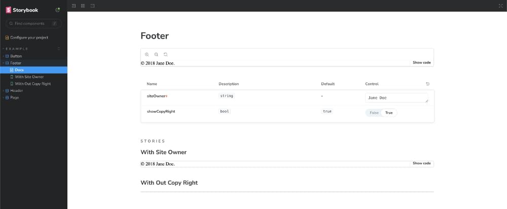
Try updating the siteOwner value directly in the story controls. If you want to style the Footer, import footer.css into Footer.jsx and reference the class names. If you’re interested in seeing how the component behaves in your React application, import it:
import { Footer } from './stories/Footer';
...
<Footer siteOwner='Daine Mawer' showCopyRight />
Nice! You’ve just created your component and a corresponding story! Next, we’ll discuss publishing your storybook on the Web.
Publishing Your Storybook
Engineers can easily view and develop locally on Storybook, as the configuration is tracked through your preferred version control system. However, a URL to access the published Storybook would be far more manageable for non-technical stakeholders.
When you run a production build of Storybook, its output is a collection of static files that are outputted into a build folder. Thankfully, the Storybook team has made this relatively easy to achieve. All you need to do is run this:
npm run build-storybook
The build will terminate if it comes across any build errors, so there’s no way of publishing a broken Storybook. Now that we have a production build, we need somewhere to host it.
There are several ways to do this: GitHub Pages, Netlify, and AWS S3. Some of these options require more configuration than others.
If you don’t plan on setting up Chromatic (recommended), I recommend running with GitHub Pages, as you can add a GitHub Action to make short work of the configuration and setup.
Setting Up Chromatic for VRT
Chromatic is a powerful tool that lives alongside Storybook. The Storybook team maintains Chromatic, so integrating the tool into your pre-existing application and CI requires minimal effort.
By integrating Chromatic, you can be sure that visual regressions, even interaction bugs, don’t make it to your production environment. The application allows for seamless collaboration within teams and goes a long way to ensuring bugs are caught early and often.
What’s more, Chromatic is free — with limitations, of course.
Let’s say we want to integrate Chromatic with our published Storybook. Sign up for a Chromatic account and grab a Project Token. Next, you’ll need to install the Chromatic npm package into your project:
npm install --save-dev chromatic
Then add a chromatic script to your package.json:
"scripts": {
    "chromatic": "chromatic"
}
You’ll then need to ensure that you have a .env file with the following environment variable defined: CHROMATIC_PROJECT_TOKEN. You can add the Project Token from your Chromatic account as the value.
Run npm run chromatic. This will publish your Storybook to your Chromatic project. You can then access an impressive UI to review components and their changes. The problem with this setup is that you’ll need to run Chromatic each time you change components.
This may be okay for smaller projects, but committing changes to your application and having a CI pipeline handle this hard work is far better. Chromatic CI integrates directly into pull requests.
If you’re using GitHub, you can quickly get up and running with GitHub Actions by adding a workflows folder to your .github directory. Follow the steps in Chromatic Docs outlined at Automate Chromatic with GitHub Actions to get up and running.
You have now published a component library that runs UI Tests and Reviews each time you commit changes to your components.
Conclusion and Takeaways
Storybook and Chromatic tools will empower your team to deliver higher-quality code. Use Storybook to automate and iterate on your shared component libraries.
Above all else, these two tools will ensure your engineering team can develop in confidence, ship features and bug fixes more efficiently and ensure that your product is always well-documented, scalable and extensible.