20 Simple Ways to Style the HTML details Element

In this article, we’ll look at some simple ways to style the HTML <details> element, which is a very useful element for revealing and hiding bits of content on a web page.
It’s handy to have a simple disclosure element in HTML that doesn’t require JavaScript, but the default styling of the <details> element might be a turn-off for some. Fortunately, it’s quite easy to change the styling of this element.
The table of contents below is an example of the <details> element in use. We’ve added a simple border to it, along with some padding.
Introducing the details Element
Here’s the basic code for the <details> element:
<details>
  <summary>Click me!</summary>
  <p>Peekaboo! Here's some hidden content!</p>
</details>
Basically any HTML content can be placed inside the <details> element. The <summary> element provides the prompt for the user to click on the element to reveal more content, and it must be the first child of the <details> element.
Here’s a live example of this code:
Click me!
Peekaboo! Here’s some hidden content!
Let’s look at all the ways we can use CSS to enhance the appearance of our <details> element.
Background Colors, Borders and Padding
A really simple way to enhance the look of the <details> element is to add some padding along with a border or some background colors.
Adding a border
As shown in the table of contents above, a simple border can do a lot to enhance and define the <details> element, along with some padding and a slight border radius:
details {
  padding: 10px;
  border: 5px solid #f7f7f7;
  border-radius: 3px;
}
That’s the simple code we’ve used above to style our ToC.
Adding some background color
Let’s add a background color to our <details> element instead of a border:
details {
  padding: 10px;
  background-color: #e4eaef;
  border-radius: 5px;
}
The result is shown in the Pen below.
See the Pen
Styling the HTML details element: adding padding and a background color by SitePoint (@SitePoint)
on CodePen.
The background color gives the element better definition, and the padding helps to create some space inside it.
We can also give a different background color to the <summary> element to distinguish it from the rest of the content, and change its text color:
summary {
  background-color: #2196F3;
  color: white;
  padding: 10px;
}
See the Pen
Styling the HTML details element: adding a background color to the summary element by SitePoint (@SitePoint)
on CodePen.
Note that changing the text color of the <summary> element also changes the color of the marker arrow. That’s because the marker is actually attached to the <summary> element just as markers (such as bullets) are attached to list items. We’ll see below how to style them separately.
Styling the Marker
The <summary> element is set to a display of list-item. So the default arrow (▶) that comes with it can be altered just like the default markers on HTML list items. We can change the character that’s used, and independently change its color.
Changing the marker color
Let’s set the default marker to a different color. Just for fun, let’s also bump up the font size of the marker. We can do this with the ::marker pseudo-element:
summary::marker {
  color: #e162bf;
  font-size: 1.2em;
}
The result is shown below.
See the Pen
Styling the HTML details element: changing the marker color by SitePoint (@SitePoint)
on CodePen.
It’s a nice, simple solution, although ::marker unfortunately isn’t supported in Safari, so see other options below if that’s a dealbreaker.
Changing the marker spacing
By default, the marker arrow is pretty close to the summary text. Its list-style-position is set to inside. If we change it to outside, we can add space between the summary text and the marker by adding some left padding. We also need to add some left margin so that the triangle doesn’t hang outside the container:
summary {
  list-style-position: outside;
  margin-left: 30px;
  padding: 10px 10px 10px 20px;
  border-radius: 5px;
}
The result is shown below.
See the Pen
Styling the HTML details element: spacing marker arrow and summary text by SitePoint (@SitePoint)
on CodePen.
I’ve exaggerated the spacing between the arrow marker and the summary text just to make it obvious. Unfortunately, using list-style-position: outside; with the <summary> element doesn’t work in Safari. Fortunately, there are other options, as we’ll see below.
Changing the marker shape
The marker on our <summary> element doesn’t have to be a triangle. We can replace it with any character we please:
summary {
  list-style-type: '⬇ ';
}
Note that we’ve used '⬇ ' (with a space next to the arrow), which is an alternative to the spacing we tried above.
We now have a down arrow instead of a triangle. But … that down arrow won’t change when the <details> element is open. That’s because the <details> element has two states — closed and open — and we’ve only set the marker style for the closed state. So let’s also set a marker for the open state:
details[open] > summary {
  list-style-type: '⬆ ';
}
This time, we’ve used an up-pointing arrow. This gives us the result shown below.
See the Pen
Styling the HTML details element: changing the summary marker with list-style-type by SitePoint (@SitePoint)
on CodePen.
Damn! Once again, Safari lets us down, as it doesn’t support list-style-type on the <summary> element either. Don’t despair, though, as we’ll look at fancier solutions below.
We can try all sorts of other characters, such as + and –, ✓ and Χ or ✗, ⋁ and ⋀ , and even have fun with other characters like ★ or colorful fruits like 🍏 🍌 🍓 🍋 and 🍐, but remember that these characters may not work on all systems, so be a little careful, and once again, list-style-type certainly won’t work in Safari.
Creating a Custom Marker for the summary Element
As we saw above, even though we can set a different character for the default marker, and give it styles such as color and font size, there can be issues with doing so. A better option might be to remove the marker altogether and create a completely custom alternative.
Removing the custom marker
As with list item markers, we can remove the marker altogether:
summary  {
  list-style: none;
}

/* sigh, Safari again */

summary::-webkit-details-marker {
  display: none;
}
The standard list-style: none works on all browsers except … (can you guess?) … Safari. At least there’s a proprietary -webkit- option in this case.
Note: another way to remove the marker from the <summary> element is to give the <summary> element a display value of something other than list-item — such as block or flex. This works in every browser except … (do I even need to say it?) … Safari.
Now our element has no marker.
See the Pen
Styling the HTML details element: a details element with no marker by SitePoint (@SitePoint)
on CodePen.
Having no marker gives no visual prompt at all that this element is clickable, so it’s not a great idea to leave it at that.
Using a background image as a marker
We could place an image on the background, like so:
summary {
  list-style: none;
  padding: 10px 10px 10px 40px;
  background: url(arrow.svg) no-repeat 14px 50%;
  background-size: 18px;
  font-weight: bold;
}
The result is shown below.
See the Pen
Styling the HTML details element: a background image on summary as marker by SitePoint (@SitePoint)
on CodePen.
The downside of using a background image directly on the <summary> element is that we can’t rotate it when the <details> element is open, because animations can’t be set directly on background images in CSS. (We could, of course, use a different image for the open state, but we still couldn’t animate it, which is much more fun.) So if we’re going to use a background image, it’s better to place it on an element that can be rotated and/or animated.
Using a background image as a marker with ::after
Let’s put the background image within an ::after pseudo-element:
summary {
  display: flex;
}

summary::after {
  content: '';
  width: 18px;
  height: 10px;
  background: url('arrow.svg');
  background-size: cover;
  margin-left: .75em;
  transition: 0.2s;
}

details[open] > summary::after {
  transform: rotate(180deg);
}
Here’s a live demo of this code.
See the Pen
Styling the HTML details element: a background image on summary::after as marker by SitePoint (@SitePoint)
on CodePen.
We’ve used display: flex on the <summary> element to make it easy to position the arrow horizontally.
The nice thing about this setup is that we can add animation to the arrow. (The animation doesn’t seem to work in Safari, but the behavior is good enough, and I’m getting a bit fed up with this browser!)
Making the summary element look like a tab
We’ve been setting the <summary> element to full width, but it doesn’t have to be. We could make it look more like a tab, with this simple change:
summary {
  display: inline-flex;
}
An example is shown below.
See the Pen
Styling the HTML details element: the summary element displayed as a tab by SitePoint (@SitePoint)
on CodePen.
Limiting the width of the details element
In all of our examples so far, the <details> element has stretched to the full width of its container, because it’s a block-level element. We can give it a different width, however, if we don’t want it so wide, such as width: 50%;. Or we could could set it to an inline display so that it’s just as wide as its content:
details {
  display: inline-block;
}
Click on the tab below to reveal the narrower width of the <details> element.
See the Pen
Styling the HTML details element: the details element displayed inline by SitePoint (@SitePoint)
on CodePen.
Try changing display: inline-block to width: 50% in the Pen above.
Placing the marker arrow at the far end of the summary
Let’s do something a bit different now, placing the marker arrow on the right-hand side of the <summary> element. Because we’ve been using display: flex, moving the arrow to the far right is as easy as adding justify-content: space-between to the <summary> element:
summary {
  display: flex;
  justify-content: space-between;
}
See the Pen
Styling the HTML details element: a background image on summary::after as marker, right aligned by SitePoint (@SitePoint)
on CodePen.
Using ::after as a marker without a background image
There are other ways we could use ::after without an actual image. Here’s an example that uses just ::after with borders:
summary::after {
  content: '';
  width: 0;
  height: 0;
  border-top: 10px solid #15171b;
  border-inline: 7px solid transparent;
  transition: 0.2s;
}
Here’s a live demo.
See the Pen
Styling the HTML details element: right-aligned marker using summary::after and borders by SitePoint (@SitePoint)
on CodePen.
Now we have an arrow that rotates between the closed and open state. We’ve also added a nice drop shadow to the <details> element.
Another way to use ::after without an image is to place Unicode characters within the content property:
summary::after {
  content: "\25BC";
  transition: 0.2s;
}
This sets a triangle shape (▼) as our marker, as shown in this CodePen demo.
There are thousands of Unicode symbols, and they’re quite fun to explore. Each comes with a code like U + 25BC or U + 025BC. To use that code inside the content property, take the characters after the + and place them inside the content quotes, with a \ at the front: content: "\25BC". If there’s one or more zeros at the start, you can leave them out. (For example, U + 02248 can become "\02248" or "\2248".)
Miscellaneous Extras
So far, the things we’ve done above are more than enough, but there are other things we can have fun with, so let’s just play with a few of them here.
Hover effect on the details element
We can set various hover effects on the <details> element. For example, we might do something like this:
details {
  transition: 0.2s background linear;
}

details:hover {
  background: #dad3b1;
}
While we’re at it, let’s also transition the <summary> text color in the open state:
details > summary {
  transition: color 1s;
}

details[open] > summary {
  color: #d9103e;
}
The result is shown below.
See the Pen
Styling the HTML details element: background and text transition effects by SitePoint (@SitePoint)
on CodePen.
We could also just set a background change on the <summary> element instead.
Animating the opening and closing of the details element
Haha, fooled ya! It appears it’s not possible to animate the opening and closing of the <details> element. According to MDN:
Unfortunately, at this time, there’s no built-in way to animate the transition between open and closed.
Nevertheless, we can have a bit of fun by animating the contents of the <details> element. For example, we could set the contents to fade in once revealed:
details article {
  opacity: 0;
}

details[open] article {
  animation: fadeIn .75s linear forwards;
}

@keyframes fadeIn {
 0% {
   opacity: 0;
 }
 100% {
   opacity: 1;
 }
}
The result is shown below.
See the Pen
Styling the HTML details element: fading in the contents of the details element by SitePoint (@SitePoint)
on CodePen.
Another trick might be to slide in the content, like so:
details {
  overflow: hidden;
}

details[open] article {
  animation: animateUp .5s linear forwards;
}

@keyframes animateUp {
  0% {
    opacity: 0;
    transform: translatey(100%);
  }
  100% {
    opacity: 1;
    transform: translatey(0);
  }
}
The result is shown below.
See the Pen
Styling the HTML details element: sliding in the contents of the details element by SitePoint (@SitePoint)
on CodePen.
It’s a bit cheesy, and perhaps overkill, but worth trying anyway. Unfortunately, these animations only work the first time the element is clicked (unless the browser devtools are open, for some weird reason!). You basically need the intervention of JavaScript to make the effect work repeatedly.
Changing summary content in open and closed states
In the demos above, the <select> has always had the same text, whether the <details> element is open or closed. But we could change that. Firstly, let’s leave the current “Click me” text in place, but also add some extra text for each state using the ::after pseudo-element:
summary::after {
  content: " to show hidden content";
}

details[open] summary::after {
  content: " to hide extra content";
}
That gives us the result shown below.
See the Pen
Styling the HTML details element: toggling the select text by SitePoint (@SitePoint)
on CodePen.
Changing the summary cursor
The default cursor (or mouse pointer) for the <details> element is kind of weird. It’s a standard arrow for the most part, and a text pointer (or I-beam) when hovering over the <summary> text.
For fun, let’s change to the hand cursor (or “pointer”):
summary {
  cursor: pointer;
}
This sets the mouse pointer to a hand when hovering anywhere over the <summary> element, as shown below.
See the Pen
Styling the HTML details element: Changing the summary cursor to a hand (pointer) by SitePoint (@SitePoint)
on CodePen.
We could set the cursor on the <details> element instead, which would force the hand cursor across the entire <details> element. I prefer to keep it just on the thing we’re meant to click, though.
Changing the accessibility focus styles
If we’re navigating a page via the keyboard, we can tab to the <details> element and then open it by hitting return. During focus, the <summary> element has a default outline. The image below shows what this looks like in various browsers.
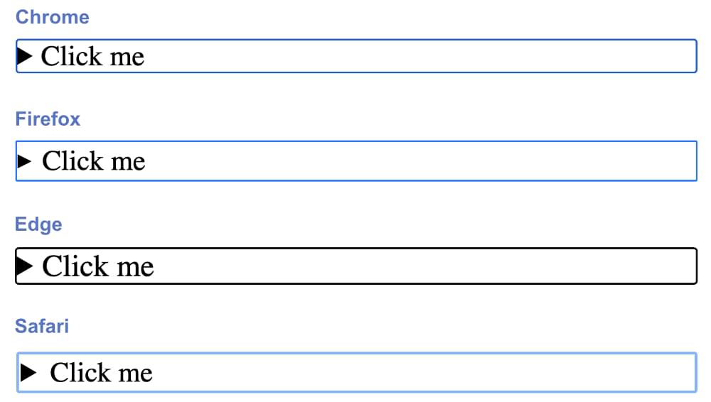
They’re much of a muchness: mostly a simple, dark (blue or black), solid outline that’s about 3px wide.
There are many styles we could set for the focused <details> element, but let’s do something simple here as proof of concept, changing the outline to a red dotted line:
summary:focus {outline: none;}
summary:focus-visible {outline: 3px dotted #ff0060;}
summary {padding: 10px;}
By default, the focus outline doesn’t display when we click on the <summary> element. But if we change the focus style, that style does display even to non-keyboard users (that is, when we click on the <details> element with a mouse). So in the code above, we’ve set the outline to none and instead used focus-visible to set the styles, as this means the focus styles will only be visible to keyboard users (for whom it’s actually useful).
The image below shows our new styling.

Here’s a live demo.
See the Pen
Styling the HTML details element: styling the focus outline by SitePoint (@SitePoint)
on CodePen.
We could have a lot of fun with this, using animations, background colors and so on when the <details> element is in focus. I’ll leave it to you to experiment further.
Using multiple details elements like an accordion list
There are proposals to coordinate multiple details elements in such a way that one closes when another one opens. The HTML specification even proposes a shared name attribute between multiple <details> elements for this purpose.
There’s currently no way to do this with HTML and CSS alone, but there are some nifty examples of doing it with JavaScript (such as here, here, and here).
The best we can do with CSS is to style the currently open element differently from the others, using some of the techniques we’ve covered above.
Here’s a simple example:
details {
  background-color: #2196F3;
}

details[open] {
  background-color: #ce0e99;
}
See the Pen
Styling the HTML details element: working with multiple details elements by SitePoint (@SitePoint)
on CodePen.
Styling a heading inside the summary
Some developers, concerned about the structure of their HTML, like to place a heading element inside the <summary> element. Whether that’s useful or not is up for debate, but the default rendering is not nice, with the heading sitting on the line below the arrow. This can be fixed by setting the heading to display: inline or display: inline-block:
summary h2 {
  display: inline;
}
You can see check out a demo of this on CodePen.
Conclusion
As we’ve tried to show above, there are lots of simple ways to style the <details> element. Setting borders, padding and background colors is easy, and these in themselves improve the look greatly. Some of the methods for styling the default marker are very handy, but given that Forrest’s fruit company () has so many issues with styling the marker, it may be better to steer away from that option, in favor of creating a completely custom marker element. (That said, styling the marker doesn’t break the <details> element in Safari.)
There have been attempts to animate the opening and closing of the <details> element just with CSS, but they are hacky at best, so it’s not worth trying to go down that rabbit hole. If you really want animated opening and closing, you’ll need JavaScript.
To learn more about the <details> element, check out the following:
If you come up with any other cool ways to style the <details> element, let me know on Twitter, and we might feature them here.