How to Apply CSS3 Transforms to Background Images
CSS transformations are great, but they don’t (yet?) apply to background images. This article presents a workaround for those times when you really do want to rotate a background image, or to keep a background image fixed while its container element is rotated.
For more advanced CSS knowledge like this, check out our book CSS Master, 3rd Edition.
Scaling, Skewing and Rotating Elements
Scaling, skewing, and rotating any element is possible with the CSS3 transform property. It’s supported in all modern browsers without vendor prefixes:
#myelement {
  transform: rotate(30deg);
}
Great stuff. However, this rotates the whole element — its content, border and background image. What if you only want to rotate the background image? Or what if you want the background to remain fixed while the content is rotated?
There’s no W3C CSS proposal for background-image transformations. It would be incredibly useful, so perhaps one will appear eventually, but that doesn’t help developers who want to use similar effects today.
One option would be to create a new background image from the original, say rotated by 45 degrees. This could be achieved using:
- a server-side image manipulation process
- a client-side canvas-based image handling code, or
- APIs provided by some image-hosting CDN services.
But all these require additional effort, processing, and costs.
Fortunately, there’s a CSS-based solution. In essence, it’s a hack which applies the background image to a ::before or ::after pseudo element rather than the parent container. The pseudo element can then be transformed independently of the content.
Transforming the Background Only
The container element can have any styles applied, but it must be set to position: relative, since our pseudo element will be positioned within it. You should also set overflow: hidden unless you’re happy for the background to spill out beyond the confines of the container:
#myelement {
  position: relative;
  overflow: hidden;
}
We can now create an absolutely positioned pseudo element with a transformed background. The z-index is set to -1 to ensure it appears below the container’s content:
#myelement::before {
  content: "";
  position: absolute;
  width: 200%;
  height: 200%;
  top: -50%;
  left: -50%;
  z-index: -1;
  background: url(background.png) 0 0 repeat;
  transform: rotate(30deg);
}
Note that you may need to adjust the pseudo element’s width, height and position. For example, if you’re using a repeated image, a rotated area must be larger than its container to fully cover the background.

Fixing the Background on a Transformed Element
All transforms on the parent container are applied to pseudo elements. Therefore, we need to undo that transformation. For example, if the container is rotated by 30 degrees, the background must be rotated -30 degrees to return to its original position:
#myelement {
  position: relative;
  overflow: hidden;
  transform: rotate(30deg);
}

#myelement::before {
  content: "";
  position: absolute;
  width: 200%;
  height: 200%;
  top: -50%;
  left: -50%;
  z-index: -1;
  background: url(background.png) 0 0 repeat;
  transform: rotate(-30deg);
}
Again, you’ll need to adjust the size and position to ensure the background adequately covers the parent container.
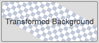
Here are the relevant demos live on CodePen.
See the Pen
CSS3 Transforms on Background Images by SitePoint (@SitePoint)
on CodePen.
The effects work in all major browsers and Internet Explorer back to version 9. Older browsers are unlikely to show transformations but the background should still appear.
FAQs on How to Rotate Background Image CSS
Let’s end by looking at some frequently asked questions about rotating background images with CSS.
Can you rotate background image in CSS?
Technically, you can’t. There’s currently no W3C CSS proposal for background-image transformations on the horizon. However, you can quite easily “fake it”! All you have to do is create a pseudo-element, attach the image to that instead, and then apply desired transforms to the pseudo-element. The result if visually the same, even if you had to be creative about it.
How can you rotate a background image in a container?
The easy way to rotate a background image is to place it in a pseudo-element and rotate that instead. You do this with CSS3 transform property, such as transform: rotate(30deg) to rotate a pseudo-element holding the background image. The container must have position: relative, and the pseudo-element must be set to position: absolute for this to work.
How do I rotate an image 90 degrees in CSS?
You can easily rotate an image 90 degrees in CSS with the CSS transform property. It’s as simple as doing this: transform: rotate(90deg). You rotate it in the other direction with transform: rotate(-90deg), or transform: rotate(270deg). You can do the same for background images with our clever pseudo-element hack.
What is rotate() in CSS?
The rotate() function in CSS is one of several options available with CSS Transforms. The rotate() function serves to spin an element around a fixed point, known as the transform origin, which is the center of the element by default.